My UX audit checklist for a live SaaS product, from first data to report
A UX audit checklist for a live SaaS product: goals and data, heuristics, core flows, forms, accessibility, speed, states and trust, then severity and a report.

My UX audit checklist for a live SaaS product runs in a fixed order over five working days. I start with your goals and your data (analytics funnels and support tickets), then walk the product against Nielsen's 10 usability heuristics. Next come the core flows: sign-up, activation, the main job, billing and settings. Then the cross-cutting checks: forms, content, accessibility, speed, states, consistency and trust.
Every finding gets a severity score from 0 to 4, its evidence and a fix. The week ends with a report and a prioritised list your team can start on the next morning.
This is for founders and product leads whose product already has users and whose numbers say something is wrong, but not what. If you're about to hire a product designer for SaaS, an audit is often the best first piece of work, because it shows what to fix before anyone redesigns anything.
My UX audit checklist, day by day
An audit is an expert review of a live product, not usability testing: no outside user tries it while we watch. It finds a lot quickly but can't say how often real users hit a problem, so I pair it with your data.
My week runs Sunday to Thursday in Dhaka:
| Day | What happens | What comes out |
|---|---|---|
| 1 | Goals, access, funnels, support tickets | Three to five questions the audit must answer |
| 2 | Heuristic pass and core flows, each reviewer alone | Raw findings with screenshots |
| 3 | Forms, content, accessibility, speed, states | Cross-cutting findings |
| 4 | Consistency, trust; severity rated alone, then merged | One scored list |
| 5 | Report, prioritised list, walkthrough call | A backlog your team owns |
Before day 1, I need a test account for each role, read access to analytics, an export of recent support tickets, and 30 minutes with whoever owns the numbers. Late access is what slips an audit, never the review itself.
Start with goals and data: funnels and support tickets
I don't open the product first. I ask what the business needs from it this quarter, then which numbers would show it. Google's HEART framework paper (CHI 2010) gives the order: goals, then signals, then metrics, across happiness, engagement, adoption, retention and task success.
Then the funnel. A GA4 funnel exploration shows how many people complete each step of a task and where they drop, with up to 10 steps. A closed funnel counts only people who start at step one; an open one lets them enter anywhere. I build one closed funnel from sign-up to first value, because that's the path I walk on day 2.
Support tickets explain the drops. I read the last few hundred, tag each by flow and goal, and count the tags. Five tickets asking "where is my invoice" are a finding with evidence. A screen I dislike is not.
A heuristic pass with Nielsen's 10 usability heuristics
Jakob Nielsen's 10 usability heuristics date from 1994; NN/g last reviewed them on 30 January 2024. Here is what each means in a SaaS product.
| Heuristic | What I look for |
|---|---|
| 1. Visibility of system status | Saves, imports and payments always show their state |
| 2. Match with the real world | Your users' words, not your database's |
| 3. User control and freedom | Undo, cancel, and leaving a flow without losing work |
| 4. Consistency and standards | One name, one pattern, one place for each thing |
| 5. Error prevention | Confirmations before destructive or costly actions |
| 6. Recognition rather than recall | Recent items and visible filters, nothing to memorise |
| 7. Flexibility and efficiency | Bulk actions, shortcuts and saved views for daily users |
| 8. Aesthetic and minimalist design | Each screen leads with its main task |
| 9. Recognise, diagnose, recover from errors | Plain messages that say what happened and what to do |
| 10. Help and documentation | Help in context, written for the task |
Don't run this alone. Nielsen found that, averaged over six of his projects, single evaluators found only 35% of the usability problems, and recommends about five evaluators, at least three. NN/g's current how-to (2023) says three to five, each timeboxed to about 1 to 2 hours: one pass to learn the product, a second to note problems. So I bring in at least one more reviewer, and we compare findings only after each of us has finished alone.
The core flows: sign-up, activation, the main job, billing and settings
Every SaaS product has these five flows. I walk each one per role, on desktop and on a phone, with the funnel open beside me.
| Flow | What I check |
|---|---|
| Sign-up | Fields before value, social sign-in, email checks, what a typo does |
| Activation | Steps to the first moment of real value, the first empty screen |
| The main job | The task people pay for, done once, then done fast the tenth time |
| Billing | Plan, next charge, card update, invoices, upgrade, downgrade, cancel |
| Settings | Invites, roles, notifications, data export, account deletion |
Billing needs extra care, as mistakes cost money and trust. A useful benchmark is a ready-made portal: Stripe's customer portal documentation lists updating billing details and payment methods, changing and cancelling subscriptions, and paying, viewing and downloading invoices. If your billing screen can't do all of that, it's a finding.
Forms, content and microcopy
Forms are where SaaS products quietly lose people. Baymard studies e-commerce checkouts, not SaaS, but the lessons carry. Their 2024 article on checkout form fields found an average of 11.3 fields, while most sites need only 8. In their research on inline validation (January 2024), 31% of sites had none.
My form checks:
- Every field earns its place. If you never use the phone number, don't ask for it.
- Labels stay visible above the field, not as placeholders that vanish on typing.
- Validation at the right moment: check a field when the person leaves it, never before they finish, and clear the error as soon as it's fixed.
- Errors keep the input. NN/g's error message guidelines (May 2023) ask for messages next to the problem, in plain words, with a remedy, without blame, and with the input kept.
For the copy, I read every button and message aloud. The GOV.UK Service Manual's writing for user interfaces is my reference: one idea per sentence, key words first, nothing that leans on colour or position. I flag every term that changes between screens; it's the cheapest fix in the audit.
Accessibility and speed: the quick checks
An audit week has room for quick checks, not a conformance audit, and the report says so. W3C's own Easy Checks warn that a page can pass them and still have significant barriers.
The target is WCAG 2.2 level AA, which W3C published on 5 October 2023 with nine new success criteria. My quick pass:
- Contrast: at least 4.5:1 for normal text, 3:1 for input borders and icons.
- Keyboard: every flow done with Tab, Enter and Escape, focus visible and never fully hidden behind a sticky header (2.4.11).
- Targets: at least 24 by 24 CSS pixels, or enough space around them (2.5.8).
- Sign-in: no memory test or puzzle without an alternative, so password managers and pasting must work (3.3.8).
- Names: icon buttons and fields announce a name to a screen reader.
You'll probably find something. The WebAIM Million 2026 detected WCAG failures on 95.9% of a million home pages, with low-contrast text on 83.9%. For fixes in code, see my WCAG 2.2 checklist for React components.
Speed is experience too. Google's Core Web Vitals count as good a Largest Contentful Paint within 2.5 seconds, Interaction to Next Paint within 200 milliseconds and Cumulative Layout Shift of 0.1 or less, at the 75th percentile, for mobile and desktop separately. A signed-in app often has too little public field data, so I also time the main job by hand on a mid-range phone.
States, consistency and the design system
Audits find problems in the states nobody designed:
- Empty: NN/g's empty state guidelines (2021) ask you to say whether it's loading, broken or simply empty, teach what the feature does, and link to the action that fills it.
- Loading: Nielsen's three response time limits still hold: 0.1 seconds feels instant, 1 second keeps the flow of thought, and past 10 seconds people need a percent-done indicator and a way to stop.
- Partial failure: one widget fails, or the connection drops mid-save.
- Edge content: very long names, thousands of rows, a brand-new account, a role without permission.
My guide to designing dashboards founders open daily covers these states for data-heavy screens.
Then consistency. I screenshot every button, input, table, modal and toast, and pin them side by side. NN/g's Design Systems 101 defines a design system as a complete set of standards for managing design at scale with reusable components and patterns. If you have one, I check the live product still matches it; if not, the audit says where to start.
Trust and privacy: the checks founders skip
The US Federal Trade Commission's September 2022 staff report, Bringing Dark Patterns to Light, highlights four kinds: disguised ads, subscriptions or charges that are hard to cancel, buried terms and junk fees, and tricks that get people to share data.
My trust checks:
- Cancelling is as easy as signing up. A faint cancel link below a sales banner is a finding.
- Prices and renewals are visible before the charge, not only in the terms.
- Consent can be withdrawn as easily as given, the rule in Article 7(3) of the GDPR.
- Permissions are explained where they're asked for, especially integrations that read email or files.
- Data export and account deletion can be found from settings.
Selling into Europe? My notes on SaaS UX rules for German buyers go further. I'm a designer, not a lawyer, so the report flags legal points for your counsel.
How to score severity and prioritise fixes
Unordered findings get fixed easiest first. So every finding gets a score on Nielsen's severity ratings for usability problems (1994):
| Score | Meaning |
|---|---|
| 0 | Not a usability problem at all |
| 1 | Cosmetic: fix only if extra time is available |
| 2 | Minor: fixing it is low priority |
| 3 | Major: important to fix, high priority |
| 4 | Catastrophe: imperative to fix before release |
The score weighs frequency, impact (how hard it is to overcome), persistence (once, or every time) and market impact. Nielsen calls one evaluator's ratings too unreliable to trust and finds the mean of three good enough for most purposes. So each of us rates alone, before we discuss, and I report the average.
Severity alone doesn't set the order, because effort matters. My grid:
| Severity | Small fix (hours) | Large fix (weeks) |
|---|---|---|
| 4 | Fix this week | Stopgap now, real fix scheduled |
| 3 | Next sprint | Plan it, test the new design first |
| 2 | Batch with nearby work | Backlog, review next quarter |
| 1 | Polish pass | Drop, unless nearly free |
A problem on a high-traffic step moves up a row. That's how I approach SaaS products that already have users: fix what costs the most first, so improvements ship while bigger changes are still being designed.
The UX audit report template I reuse
Copy it if it helps:
- Summary, one page: the three to five findings that matter most, a verdict per flow, the first three fixes.
- Scope and method: product version and date, flows, roles, devices, reviewers, data sources, what was out of scope.
- Goals and data: the quarter's goal, the funnel's biggest drops, ticket themes with counts.
- Findings by flow: one block per finding.
- Cross-cutting findings: accessibility, speed, states, consistency, trust.
- Prioritised list: every finding with severity, effort, owner and status.
- What works: what to keep, so a redesign doesn't break it.
- What to test next: questions only real users can answer, written as tasks.
- Appendix: each reviewer's raw ratings and the ticket sample.
Each finding block holds an ID, the flow, a screenshot with a numbered callout, what happens, the rule or evidence, severity, the fix, effort and owner. An illustrative example, not from a client: "B-02, billing. A declined card clears every field. Heuristic 9. Severity 4. Fix: keep the input, name the failure beside the field. Small; front end."
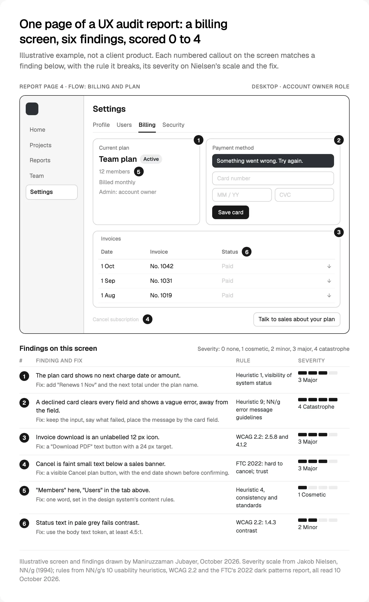
Every finding also goes into your issue tracker. A report nobody can assign from gets read once.
Where I would start
No time for a full audit this month? Do day 1 yourself. Write the quarter's goal in one sentence, build one closed funnel from sign-up to first value, and tag your last 200 support tickets by flow. Then try to cancel your own plan. You'll have a short list by Friday.
For the whole checklist, run from outside the team, book a free 30 minute intro call; a written scope and one fixed quote follow. I work as a design engineer, so my team can also ship the fixes in React and Next.js. The rest is on the page for my product design work for SaaS teams.
Frequently asked questions
What is a UX audit checklist?
It's the ordered list of checks a reviewer runs on a live product: goals and data, a heuristic pass, the core flows, forms, content, accessibility, speed, states, consistency and trust. Each finding gets evidence, a severity score and a fix. It keeps reviewers consistent, so findings can be merged.
How long does a UX audit take?
For one SaaS product with a handful of core flows and two or three roles, I plan five working days: data on day 1, reviews on days 2 to 4, the report and walkthrough on day 5. More roles, platforms or languages add time, and late access is the usual reason an audit slips.
What should a UX audit report include?
A one-page summary, scope and method, goals and data, findings by flow, cross-cutting findings, a prioritised list with owners, what already works, and what to test with users next. Each finding needs a screenshot, the rule or evidence behind it, a severity score, a suggested fix and an effort estimate.
How do you rate the severity of usability problems?
I use Jakob Nielsen's 0 to 4 scale: 0 is not a problem, 1 cosmetic, 2 minor, 3 major and 4 a catastrophe to fix before release. The score weighs frequency, impact, persistence and market impact. Each reviewer rates alone and the scores are averaged, because Nielsen found one person's ratings unreliable.
What is the difference between a UX audit and usability testing?
An audit is an expert review: reviewers inspect the product against heuristics, standards and your data. Usability testing watches real users try real tasks. An audit is faster and finds many problems, but can't show how often users hit them, so I end every audit with questions for a usability test.
Does a UX audit cover accessibility?
A good one includes quick checks against WCAG 2.2 AA: contrast, keyboard use, visible focus, target size, sign-in and labels. Those checks aren't a conformance audit. W3C warns that a page can pass quick checks and still have serious barriers, so if the audit finds problems, plan a full accessibility review.
Sources and method
I read every source on 10 October 2026. The method is how I work, not a client's story; the billing screen and finding B-02 are illustrative. Baymard's figures come from e-commerce, not SaaS. The FTC page blocked automated checks but opened in a browser.
- NN/g, 10 Usability Heuristics (1994, reviewed 30 January 2024), read 10 October 2026: nngroup.com
- NN/g, Severity Ratings for Usability Problems (1994), read 10 October 2026: nngroup.com
- NN/g, The Theory Behind Heuristic Evaluations (1994) and How to Conduct a Heuristic Evaluation (2023), read 10 October 2026: nngroup.com, nngroup.com
- Google Research, the HEART framework paper (CHI 2010), read 10 October 2026: research.google
- Google Analytics Help, GA4 funnel exploration, read 10 October 2026: support.google.com
- Stripe Docs, the customer portal, read 10 October 2026: docs.stripe.com
- Baymard Institute, checkout form fields (26 June 2024) and inline form validation (9 January 2024), read 10 October 2026: baymard.com, baymard.com
- NN/g, Error-Message Guidelines (14 May 2023), read 10 October 2026: nngroup.com
- GOV.UK Service Manual, Writing for user interfaces (updated 16 April 2018), read 10 October 2026: gov.uk
- W3C, WCAG 2.2 and What's New in WCAG 2.2, read 10 October 2026: w3.org, w3.org
- W3C WAI, Easy Checks (updated 9 August 2023), read 10 October 2026: w3.org
- WebAIM, The WebAIM Million 2026 (February 2026 data), read 10 October 2026: webaim.org
- web.dev, Web Vitals (updated 31 October 2024), read 10 October 2026: web.dev
- NN/g, Response Times: The 3 Important Limits (1993), read 10 October 2026: nngroup.com
- NN/g, Designing Empty States in Complex Applications (19 September 2021), read 10 October 2026: nngroup.com
- NN/g, Design Systems 101 (11 April 2021), read 10 October 2026: nngroup.com
- US Federal Trade Commission, Bringing Dark Patterns to Light (September 2022), read 10 October 2026: ftc.gov
- EUR-Lex, Regulation (EU) 2016/679 (GDPR), Article 7(3), read 10 October 2026: eur-lex.europa.eu