


Product design · Fintech
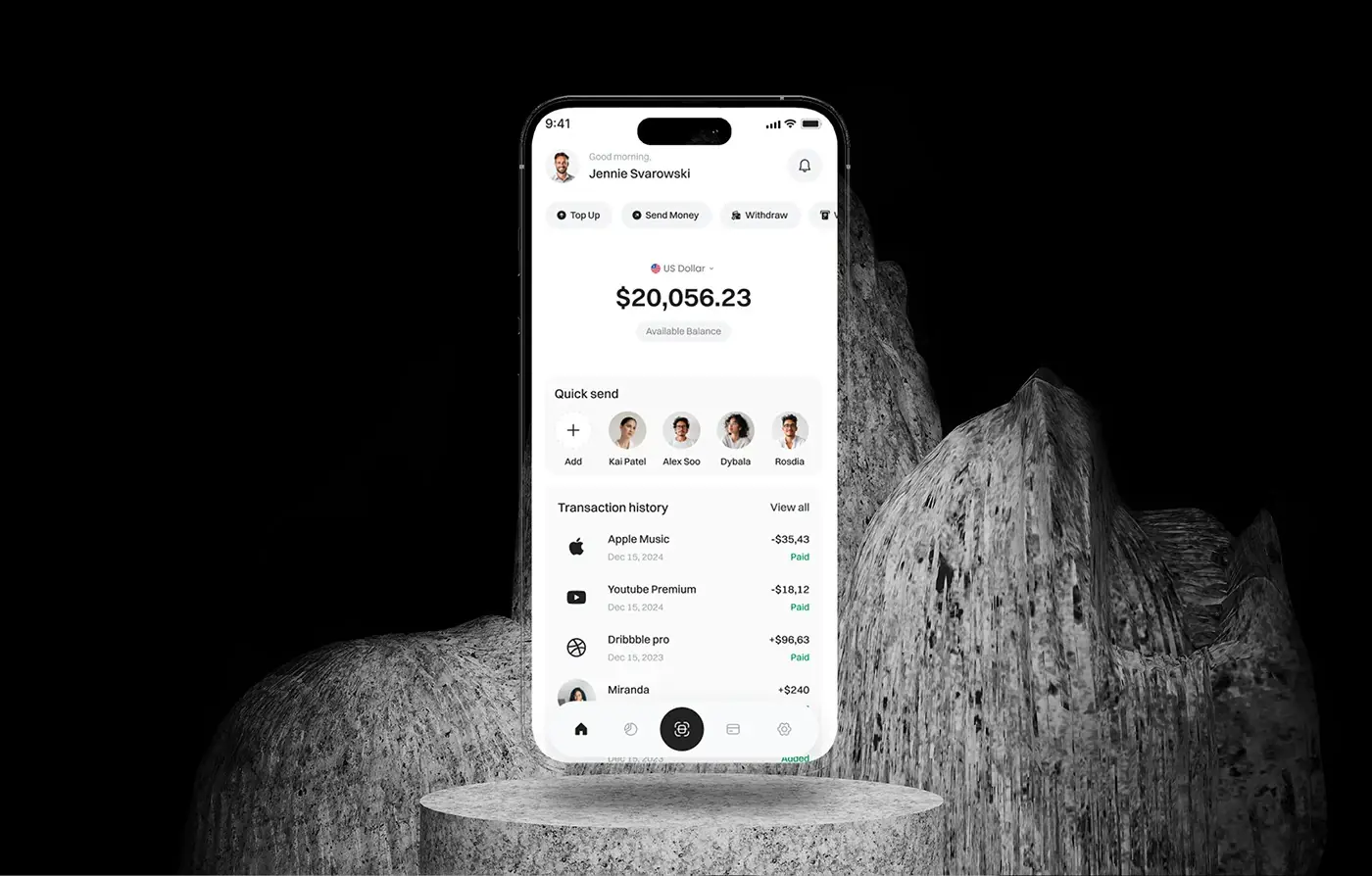
ZenPay
A fintech app for payments, expense tracking and budgets, with its research, user flow and UI design.
View case studyFintech product design and build, from Dhaka
I'm Maniruzzaman Jubayer, and with the senior team I lead I design and build fintech products: wallets, investing and personal finance dashboards, lending flows and the websites that sell them. Every money screen we draw answers four questions before the button: who it goes to, what it costs in total, when it lands and how to take it back.
7 fintech case studies on this site · Built in React, Next.js, React Native and Flutter







Design engineer and product design lead, with a senior team behind me
04 problems
Most fintech briefs start with one of these four. Each comes with what I do about it.
Sign-up goes well until the ID scan, then the funnel falls off a cliff. Much of that is design, not law. I add a screen before the first field that says what you need, how long it takes and why, autofill from the scanned document, make retakes easy, show honest pending times, and design the route for people whose check fails before the happy path. My guide to fintech app design sets out the order.
When a transfer screen hides the fee, shows a tick before the money moves or fails with an error code, people stop trusting the app. I design one review screen for every money flow, with the recipient, the total, every fee and the arrival date before the button, then name each state honestly: processing, needs action, succeeded, failed. On ZenPay, every payment has a PIN step and a receipt with a transaction ID.
Fee pages, risk warnings and cancel flows are judged on whether customers understood them, not on whether the words were somewhere in the terms. I put the total cost beside the button, give risks the same weight as benefits, make leaving as easy as joining, and test understanding with real questions, then keep a record of what changed and why. My guide to Consumer Duty UX covers the UK case.
Balances, holdings, forecasts and charts pile up until nobody can find the one figure they opened the app for. I lead with that figure, line columns up with tabular figures, start bars at zero, mark forecasts as forecasts, and put any AI insight beside the number it explains, so people can check it. That is how my team approached WealthWise, an AI personal finance dashboard.
A mobile wallet, two AI finance dashboards, and four websites and landing pages for finance products, all designed by my team.
Product design · Fintech
A fintech app for payments, expense tracking and budgets, with its research, user flow and UI design.
View case study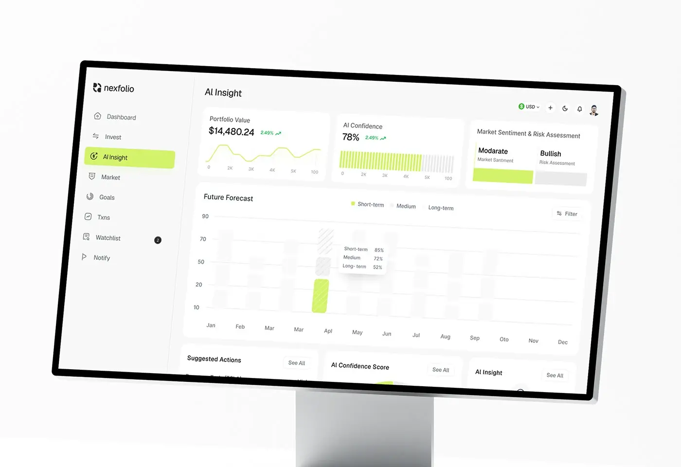
Product design · Fintech
Portfolio management, market forecasts and AI insights in a web app made for modern investors.
View case study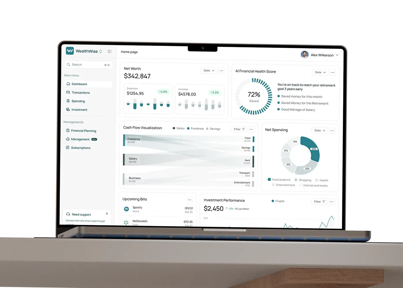
Product design · Fintech
Cash flow, investments and financial goals in one AI-assisted web dashboard.
View case study
Website design · Fintech
A fintech marketing site, from the homepage and feature pages to the type and design process.
View case study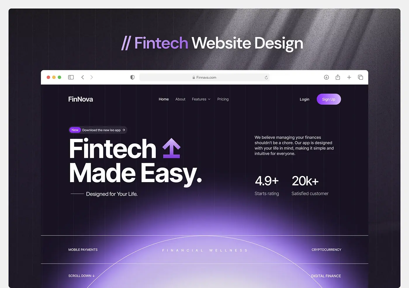
Website design · Fintech
A dark, product-led website for a fintech SaaS, designed for Webflow.
View case study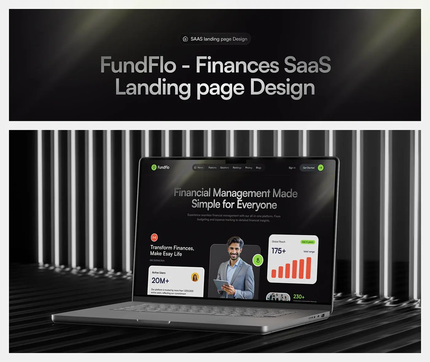
Landing page · Fintech
A finance management SaaS landing page, from the layout grid to the final page.
View case studyIs your transfer screen the one people read three times before they tap? Let's fix it.
Start a projectSix kinds of money product, each with its own hard screens. The case studies above show the first five.
Top up, send, request and withdraw, with the balance first and the two or three actions people open the app for one tap away. The review screen, the PIN or biometric step and the receipt follow one order in every flow, as on ZenPay.
Portfolios across stocks, crypto and other assets in one view, watchlists, goals and forecasts that never look like history. On Nexfolio, an AI-powered investment dashboard, my team set a 12 column grid so figures line up from page to page.
Applications, affordability questions, the repayment schedule and the total cost of credit on one screen before anyone signs. There is no lending case study on this site yet; the patterns come from the wallet and dashboard work, and from where Tamara and Tabby sit in a Saudi checkout.
Sites that explain what the product does in one line and answer security, fees and devices before sign-up. My team designed Fintus, a website for a banking and saving platform, on desktop, tablet and mobile.
Cash flow, spending, budgets and goals, with each insight phrased as a plain next step rather than another chart. WealthWise runs to more than 40 screens, with a mobile layout of the home view.
Finance tools for businesses: invoicing, payouts, approvals with roles, and the product website that sells them. My team designed a product website for a fintech SaaS covering payments, banking services and analytics.
Each card names the rule, what it means for your screens and where I read it. This is design guidance, not legal advice: your compliance team or counsel confirms what applies to you. For the Gulf, my pages on product design in Riyadh and Dubai cover local sign-in and payment systems.
The EU technical standard asks for two or more elements out of knowledge, possession and inherence, and for dynamic linking: the payer "is made aware of the amount of the payment transaction and of the payee". It caps consecutive failed attempts at five before a block, and online sessions at 5 minutes without activity. So the approve screen shows the amount and payee, an error never says which factor was wrong, and people are warned before a lockout or a timeout.
The PCI Security Standards Council describes PCI DSS as "a baseline of technical and operational requirements designed to protect payment account data", for every business that stores, processes or transmits cardholder data. The cheapest design decision is to keep card numbers off your servers: card entry sits in your payment provider's hosted fields, saved cards show only the last four digits, and no screen, log or support tool ever displays a full number.
The FATF Recommendations set the international standard behind every country's customer due diligence rules. Its Guidance on Digital ID (March 2020) helps firms decide whether a digital ID is reliable enough for those checks, and notes it can give people without traditional identification a way into financial services. In design terms: ask only what your provider and regulator need, offer national digital IDs such as UAE Pass where they exist, and never end a failed check in a dead end.
PRIN 2A.5.3 says a firm's communications must be "likely to be understood by retail customers" and must equip them to make decisions that are effective, timely and properly informed. PRIN 2A.5.10 adds testing before release, where appropriate, and monitoring afterwards. So the fee screen, the risk warning and the cancel flow get tested for understanding, and the evidence is kept. I do this for teams who hire a fintech product designer in London.
The Directive covers consumer banking services provided after 28 June 2025. Its annex asks that identification, electronic signatures, security and payment services be "perceivable, operable, understandable and robust", and that information not exceed level B2 of the Common European Framework of Reference for Languages. Microenterprises providing services are exempt. I design to WCAG 2.2 AA and write money copy in plain words. My guide to the European Accessibility Act goes further.
MAS's E-Payments User Protection Guidelines, last revised on 25 October 2024, ask for an onscreen chance to confirm the account debited, the amount and the recipient's credentials, with a warning to check, before any payment runs. They also ask for real-time alerts on outgoing payments, a prominent "kill switch" in the app to block access, and a cooling off period of at least 12 hours for high-risk actions on a new device. More on my Singapore product design page.
The same four steps as every project, with the checkpoints money products need.
Bring your busiest money screen, your fee table and your identity provider's flow. We talk through the product, the markets you serve and the part that hurts most, and I give you an honest view of whether I can help.
You get a written scope, flow by flow, with a list of the rules that likely touch your screens in each market for your counsel to confirm, and one fixed quote for the whole project. No retainer and no hourly billing.
Weekly sprints in Figma, a written update in Slack every 48 hours and a review call each week. Every money flow and every state is drawn as a greyscale wireframe before any visual design, because that is where amounts, fees and mistakes show up.
Before handoff, your compliance owner reads the copy and flows against the rule list from the scope. Then a documented design system and a walkthrough with your engineers, or my team builds it in React and Next.js, React Native or Flutter.
Everything a fintech team needs to ship money screens with confidence, in one engagement.
From the first screen to a verified account, with the pending, retry and failed routes designed, plus sign-in with passkeys or biometrics and a recovery path that doesn't undo the security.
Review, confirm, processing, needs action, succeeded, failed and refunded, with receipts that carry the amount, recipient, date and transaction ID.
Every charge on its own line before the button, the exchange rate and mark-up shown, and the same figures in the app, the email and the PDF.
Balances, portfolios and cash flow with axes that start where they should, periods that suit the decision and forecasts marked as forecasts.
Amount and Change components, status tokens with a word and an icon each, and review and receipt templates, in light and dark, named the same in Figma and in code.
Contrast pairs in the tokens, focus and reading order on every screen, and layouts checked at 200% text, where long balances break first.
A short document that links each screen to the rule it was designed around, so your compliance review starts from a list rather than a blank page.
The same team builds the web app in React and Next.js or the mobile app in React Native or Flutter, connected to your payment and identity providers. See development.
Most fintech projects use two or three of these together.
Figures from the World Bank, the European Central Bank and the US Federal Trade Commission, quoted as published.
An honest comparison, row by row, including where the other two win. You get the senior people an agency would bill for, without the layers.
| What you get | My team | Large agency | Freelancer |
|---|---|---|---|
| Senior designers on your product from week one | Yes | Sometimes | Yes |
| Wallet, investing and finance website work to show | Yes | Often | Sometimes |
| Design and front-end build by one team | Yes | Yes | No |
| Each screen mapped to the rule behind it | Yes | Sometimes | Sometimes |
| One fixed quote for the full scope | Yes | Sometimes | Sometimes |
| Cover when someone is ill or leaves | Yes | Yes | No |
| In-house legal and compliance specialists | No | Sometimes | No |
| An office in your city | No | Often | Sometimes |
Working with Jubayer and the team has been a blast. Their creativity has honestly taken our platform to new heights. Incredibly professional and so proud to work with, we’re over the moon with their results, and we can’t wait to team up with them again.

I highly recommend Jubayer for any design project. He quickly grasps complex concepts, excels in standard design practices, and responds promptly.

Long reads on money screens, the Consumer Duty, accessibility, sign-in and checkout, written from my team's own projects.
Fintech app design best practices from 7 projects: money screens, numbers, honest charts, KYC, fees up front, undo, failure states and a design system.
Consumer Duty UX for fintech: how I design and test fee screens, risk warnings, cancelling and support so UK customers understand, and keep the evidence.
ADA website accessibility in New York for fintech apps: why lawsuits cluster here, what audits find, and the WCAG 2.2 AA fixes I make first.
Straight answers before you book a call.
It depends on the number of money flows, the platforms, the identity and payment providers involved, the markets and languages, how much research the product needs, and whether my team also builds it. After a free 30 minute intro call I write a scope, flow by flow, and give you one fixed quote for the whole project, so you know the cost before you commit. For market rates, see my guide to how much app design costs.
Both. My team builds web apps and dashboards in React and Next.js, and mobile apps in React Native or Flutter, connected to your APIs and to your payment, card and identity providers. If you have your own engineers, we hand over a documented design system and annotated flows instead, and I stay available to answer their questions while they build.
No designer can make you compliant; that is your firm's job, with your counsel. What I do is design each screen around the rules that apply, such as strong customer authentication or clear fee disclosure, keep card data in your provider's hosted fields, and give your compliance owner a map of which screen answers which rule. None of it is legal advice.
Not one I can show here yet. The seven fintech projects on this site are a mobile wallet, two AI finance dashboards, and four websites and landing pages. The hard parts of lending are close to what those taught me: the total cost before the button, a clear schedule, plain consent and an honest decline. I design those screens to the same standard.
It depends on how many money flows the first version needs. A focused MVP is usually a matter of weeks, not months. Identity checks, payment states and a design system for amounts add time, because every state needs a screen. The written scope after our intro call sets out the timeline flow by flow, so you can plan a launch on a real schedule.
Yes. I sign your NDA before you share anything, and my team works under the same confidentiality. Files live in your workspace or one you control, we design and test with sample data rather than real customer records, and access ends when the project does. If your security team has a vendor checklist, send it with the brief.
Yes. I design right to left Arabic interfaces with Arabic amounts and digits, national sign-in such as Nafath and UAE Pass, and checkouts with local methods like mada and STC Pay. Native speakers on your side approve the words. My guide to Saudi checkout UX shows the level of detail.
Yes. I work remotely from Dhaka, on UTC+6 all year. Europe shares the morning or more of my day, the Gulf and Asia most of it, and for the US I keep evening calls in Dhaka, which is your morning. Everything else runs in writing, with an update every 48 hours. See how I work.