Consumer Duty UX: designing fintech screens UK customers can understand
Consumer Duty UX for fintech: how I design and test fee screens, risk warnings, cancelling and support so UK customers understand, and keep the evidence.


Consumer Duty UX is the design of the screens where customers decide something about their money: fees, key facts, risk warnings, cancelling and getting help. The FCA's consumer understanding rules in PRIN 2A.5 say those communications must be likely to be understood and must equip customers to make effective, timely and properly informed decisions, with testing where appropriate.
So a tidy screen isn't enough. You need one your customers understand, and evidence that they did. The FCA's March 2026 review found testing that was often "superficial, one-off or poorly documented".
This guide is for founders, product leads and compliance owners at UK payments, savings, lending and investing apps. If you want a fintech UX designer in London to do this with you, I work remotely from Dhaka with my team, and this is my method.
What the consumer understanding outcome asks of a screen
The Consumer Duty came in through PS22/9, the FCA's policy statement, and has applied since 31 July 2023 to products open to sale and since 31 July 2024 to closed products. Its four outcomes are products and services, price and value, consumer understanding, and consumer support. Screens get judged mostly on the last two.
For designers, PRIN 2A.5 comes down to this: meet the customer's information needs, be understood by your target market, help them decide at the right time, give them a fair chance to review it, test before release where appropriate, and keep watching after launch. The FCA's own summary of the Consumer Duty pairs clear information with testing.
The FCA's finalised guidance, FG22/5, asks for communications that are layered, engaging, relevant, simple and well timed. It cites Behavioural Insights Team research in which a question-and-answer layout for key terms improved understanding by 36%, and summarising terms with explanatory icons improved it by 34%. Those are layout decisions, so they sit with design, not only with legal.
The guidance also says that if you test messages to maximise sales, you should test understanding to an equivalent standard. Most fintech teams A/B test sign-up. Few test whether anyone understood it.
Where Consumer Duty UX bites: the screens I start with
I start where a misunderstanding costs the customer most. FG22/5 points the same way: testing matters most for decisions that matter, messages that reach many people, customers with lower financial capability, and a real chance of harm.
| Screen | What the customer must take away | What I check first |
|---|---|---|
| Fee, price and rate | What it costs in pounds, and when | Is the total on the same screen as the button? |
| Key information before a decision | What they agree to, and what happens if they do nothing | Is anything decisive only in the terms? |
| Risk warning | What could go wrong, in plain words | Is it as prominent as the benefit? |
| Cancelling, switching, withdrawing | How to leave, how long it takes, what it costs | Is it as easy as signing up? |
| Telling you about their circumstances | That they can say it once and get help | Where can someone say "I'm struggling"? |
| Chat, bot and help | How to reach a person | Does every bot path end in a human option? |
Fee and price screens: the total in pounds, before the button
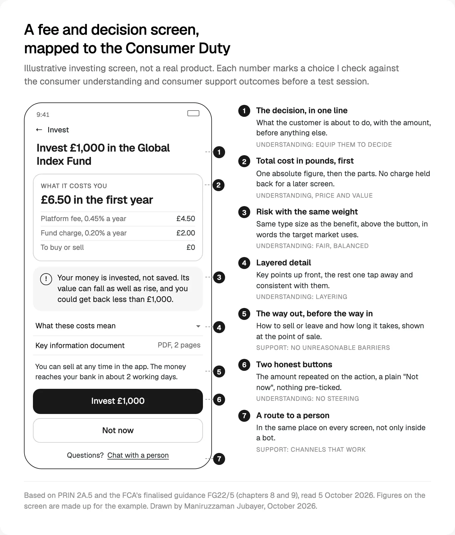
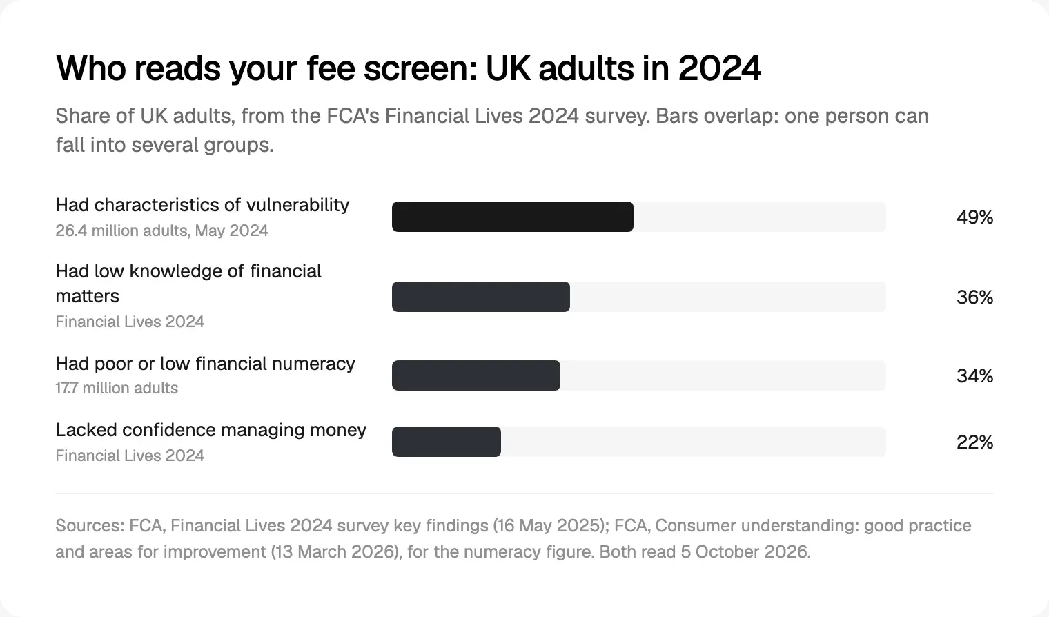
FG22/5 says absolute costs help people understand and compare. So I lead with one number in pounds, for the period the customer thinks in, and break it down underneath. A percentage alone asks the customer to do the sum, and many can't: the FCA's 2026 review notes that 17.7 million UK adults (34%) have poor or low financial numeracy.
The guidance's poor practice example spreads the introductory cost, the later cost and the cost of cancelling across three documents. On a screen, that is a fee that first appears at confirmation, or an exchange rate markup behind an info icon. The CMA's paper on online choice architecture names drip pricing and partitioned pricing among 21 practices that can harm consumers. I treat both as defects, not growth tactics.
On every price screen I check for:
- One total, in pounds, beside the action button.
- Every charge that can apply in the first year, including exit and transfer fees.
- What changes later, such as the rate after an offer ends, with the date.
- Tabular figures, so amounts line up.
- The same numbers in the app, the email and the PDF.
Key information and layering at the moment of decision
Layering means key points first, detail one tap away, all of it consistent. FG22/5 says key information usually includes any action the customer must take, what happens if they don't, and the features, benefits, risks and costs of a choice. It also notes that people rely heavily on the first thing they read.
My rule: if a fact would change the decision, it belongs on the decision screen, not in the terms. The guidance's e-money example fits many fintechs: a firm states in its terms that FSCS protection doesn't apply but never draws attention to it. If your product holds e-money, say so plainly where people put money in.
Timing matters too. The guidance asks firms to communicate at the right points, such as contractual breakpoints. In an app, that is the day a fixed rate ends, a renewal, a price change or a missed payment, so I map those moments before designing the messages. Long documents stay as the bottom layer, under a short summary. The FCA's 2026 review praised a smaller firm that tested a renewal letter with customers, including two with sight impairments, then added a 100-word summary and large print.
Risk warnings people read, not tick
A risk warning works when the customer can tell you what could go wrong. For high-risk investments, the FCA's PS22/10 rules prescribe the warning, a link to a short risk summary, a personalised warning, and a 24-hour cooling-off period for first-time investors with a firm.
In behavioural tests reported in the PS22/10 policy statement, the personalised warning led 69% of consumers to open the risk summary. A tick box confirming they understood they could lose all their money got 37%. A tick box records a click, not understanding.
So on risk I do three things:
- Same weight as the benefit: same type size, same screen, above the button. The FCA's 2026 review lists equal prominence for risks as good practice.
- Customers' words: the risk written in the language people use in research sessions, then checked with compliance.
- Friction with a purpose: FG22/5 counts a short educational video before a high-risk purchase, and Confirmation of Payee warnings, as good friction.
Cancelling, switching and the sludge I remove
FG22/5 says firms should make it at least as easy to switch, leave or make a change as it was to buy. It calls friction that stops people acting in their own interests sludge. Its poor practice examples read like a design review: switching only by phone, with a long retention script; a better savings rate that customers had to claim through a discreet radio button, because the firm knew many wouldn't find it.
Sludge I take out of fintech products:
- Sign up in the app, but cancel by phone, email or post.
- Cancel buried four menus deep.
- Retention offers that must be declined more than once.
- Opt-in steps to get a better rate or a refund the customer is owed.
- Exit copy that guilt-trips people for leaving.
- Pre-ticked add-ons and defaults that favour the firm.
- Withdrawal times revealed only after someone asks to withdraw.
Not all friction is sludge: a fraud check or a clear summary of what cancelling loses can protect people. FG22/5 expects firms to justify each extra step, so I write the reason beside it in the Figma file.
Designing for customers in vulnerable circumstances
FG21/1, the FCA's guidance on vulnerable customers, describes four drivers: poor health, life events, low resilience and low capability. The FCA's Financial Lives 2024 key findings found 26.4 million UK adults, 49%, had characteristics of vulnerability in May 2024; 36% had low knowledge of financial matters and 22% lacked confidence managing money.
When the FCA reviewed firms' treatment of vulnerable customers in March 2025, it kept FG21/1 unchanged alongside the Duty. Its 2026 review adds research finding that 1 in 7 adults have literacy skills at or below those expected of a 9 to 11 year old.
On screen, that means:
- Plain words by default. Experts don't mind plain English.
- Tell us once. One place to record needs, such as large print or a preferred channel, that every later screen and letter respects. The 2026 review calls this good practice.
- A safe place to say it. A visible "I'm finding things difficult" route on payment and arrears screens.
- Accessibility as the floor. WCAG 2.2 AA: reflow at 320 CSS pixels wide, targets of at least 24 by 24 CSS pixels, help in a consistent place, and a check or undo step before financial submissions.
Chatbots, live chat and the route to a person
FG22/5 allows digital-only support for a target market it suits, if you say so before the sale, the channel works, and non-standard issues can reach a real-time human where needed. Its poor practice examples include a payments firm whose chat, the only channel when accounts were frozen, left questions unanswered while each new adviser asked them again.
The FCA's July 2026 review of outcomes monitoring, which surveyed 56 firms, shows the better version: in-app chat, with AI routing people to the right team and flagging possible vulnerability for priority handling. It criticised a firm that kept passing customers between agents.
My rules for bots in regulated products:
- The bot says it is a bot, and what it can help with.
- Every path offers "talk to a person", with an honest wait time.
- The conversation travels to the human, so nobody repeats themselves.
- Signs of distress, bereavement or money trouble go to a person instead of looping.
- Answers about fees, rates or risk come from approved content.
My notes on designing AI features people trust cover the rest: show sources, admit limits, hand over cleanly.
How I test understanding and keep evidence for the Duty
The FCA's consumer understanding review of March 2026, based on a survey of 38 firms in September 2025, praised testing before and after changes and recording what changed, why, and with what effect. It also found firms treating sales data or a lack of complaints as proof of understanding, which it says gives no reliable assurance.
My steps, inside weekly design sprints:
- Pick two or three decision screens, ranked by the harm if someone misreads them.
- Write objective questions. FG22/5's example: if the screen explains cost, ask what it costs. For options, ask people to choose and explain why.
- Recruit people like your customers, including some with characteristics of vulnerability or lower digital confidence.
- Test a clickable Figma prototype. People read the screen, then answer without scrolling back.
- Set a pass mark first. One firm in the review targeted at least 80% correct recall of key points and retested until it got there.
- Fix the cause and retest. The review criticised cosmetic changes, like new icons or colours, that left customers misreading core points.
- Keep testing after launch. A/B test understanding alongside conversion, and read drop-off, chat transcripts and complaints.
- Keep the log: screen, version, date, questions, results, change and reason. That log is your evidence.
You don't need a big panel. The review describes a smaller firm testing its two highest-impact communications every fortnight with 3 to 5 recent customers by phone. Small, repeated and written down is how I design Consumer Duty screens for London teams: tests inside the sprint, not bolted on at the end.
The July 2026 review also describes a firm piloting AI-based synthetic testing that largely matched its human tests. I'd use that as a pre-check, never instead of people. For watching outcomes, the thinking behind dashboards founders actually open applies: a few measures per stage, each with an owner.
Where I would start
In the intro call, I'd ask to see your busiest decision screen, your cancel flow, and whatever worries your compliance lead most. Then I'd map each to its outcome, sketch the fix and test it with people like your customers before anyone writes code.
My take: the Duty rewards habits good product teams should have anyway. A screen that states the cost, the risk and the way out in plain words keeps customers for the right reasons; sludge wins a month and loses them. I'm a designer, not a lawyer, so your compliance lead signs off the wording. The rest of a money product, from numbers to fees and undo, is in what my team learned across seven fintech projects.
That is the core of my product design work for London fintechs: a free 30 minute intro call, a written scope and one fixed quote, weekly Figma sprints and a documented design system. My team can also build the front end in React and Next.js, or the app in React Native or Flutter. Read how I work, or see my wider product design for fintech and SaaS teams.
Frequently asked questions
What is Consumer Duty UX?
It is designing the screens where customers make money decisions so they meet the FCA's consumer understanding and consumer support outcomes. That means fees in pounds before the button, risks as prominent as benefits, key facts on the decision screen, leaving as easy as joining, and a route to a person. It also means testing that customers understood, and keeping the evidence.
Does the Consumer Duty require firms to test their screens?
PRIN 2A.5 requires firms to test communications before sending them where appropriate, and to monitor their impact afterwards. FG22/5 says testing matters most for key information that prompts a decision, messages reaching many customers, customers with lower financial capability, and cases where a misunderstanding could cause harm. Most fintech fee, sign-up and risk screens meet that test.
What is sludge under the Consumer Duty?
Sludge is friction that stops customers acting in their own interests, such as switching, cancelling, claiming or getting a better rate. FG22/5's examples include phone-only switching with a long retention script, and a radio button customers had to find to get a higher savings rate. Leaving should be at least as easy as buying, and every extra step needs a customer reason.
How do you test consumer understanding?
Show a group like your customers the screen, then ask objective questions about it, such as what it will cost them, or which option suits them and why. Avoid "was this clear?". Set a pass mark in advance, fix the layout or wording when people miss key points, retest and record each round. After launch, A/B test understanding and read drop-off and chat logs.
Can a fintech offer support only through a chatbot?
FG22/5 allows digital-only support for a target market it suits, if you make that clear before the sale and the channel works. Non-standard issues such as fraud, frozen accounts or vulnerability may need a real-time human, according to the guidance. A bot with no route to a person, or chats that go unanswered, falls short of the consumer support outcome.
Does the Consumer Duty apply to fintech startups and e-money firms?
The Duty applies to FCA-regulated firms serving retail customers, and the FCA expects firms of all sizes to meet it, proportionately. Its March 2026 consumer understanding review covered payments firms alongside banks, insurers, lenders and CFD providers. If you are unsure whether your activities are in scope, ask your compliance adviser before you design around the answer.
Sources and method
I read every source on 5 October 2026. Every number comes from the FCA, the CMA or W3C, not client work; the diagram's figures are invented for the example.
- FCA, PS22/9 A new Consumer Duty (27 July 2022), date read 5 October 2026: fca.org.uk
- FCA, FG22/5 finalised guidance on the Consumer Duty (July 2022), date read 5 October 2026: fca.org.uk
- FCA Handbook, PRIN 2A.5 consumer understanding, date read 5 October 2026: handbook.fca.org.uk
- FCA, About the Consumer Duty (24 February 2026), date read 5 October 2026: fca.org.uk
- FCA, Consumer understanding: good practice and areas for improvement (13 March 2026), date read 5 October 2026: fca.org.uk
- FCA, Outcomes monitoring: good practice and areas for improvement (27 July 2026), date read 5 October 2026: fca.org.uk
- FCA, FG21/1 fair treatment of vulnerable customers (23 February 2021), date read 5 October 2026: fca.org.uk
- FCA, review of firms' treatment of customers in vulnerable circumstances (7 March 2025), date read 5 October 2026: fca.org.uk
- FCA, Financial Lives 2024 survey key findings (16 May 2025), date read 5 October 2026: fca.org.uk
- FCA, PS22/10 financial promotion rules for high-risk investments (August 2022), page and policy statement, date read 5 October 2026: fca.org.uk, fca.org.uk
- CMA, Online choice architecture: how digital design can harm competition and consumers (5 April 2022), date read 5 October 2026: gov.uk
- W3C, WCAG 2.2 Recommendation (12 December 2024), date read 5 October 2026: w3.org