Fintech app design best practices, from the money screens my team designed
Fintech app design best practices from 7 projects: money screens, numbers, honest charts, KYC, fees up front, undo, failure states and a design system.

Fintech app design best practices come down to one promise: before anyone taps a button that moves money, they know who it goes to, what it costs in total, when it lands and how to take it back. In finance, much of that is rules, not taste.
My team has designed seven fintech projects: a mobile wallet, two AI finance dashboards, and four websites and landing pages for finance products. The lessons below come from those screens, checked against regulators' rules and official standards.
It's for founders and product leads building a wallet, a payments app or an investing tool. If you're about to hire a product designer for SaaS and fintech, it's the list I'd hold any designer to, me included. I'm not a lawyer, so have counsel confirm what applies to you.
Fintech app design best practices from seven projects
All seven were designed by my team. The products taught me the rules for money screens; the websites taught me what people ask before they trust anyone with money.
| Project | What we designed | The lesson I carry |
|---|---|---|
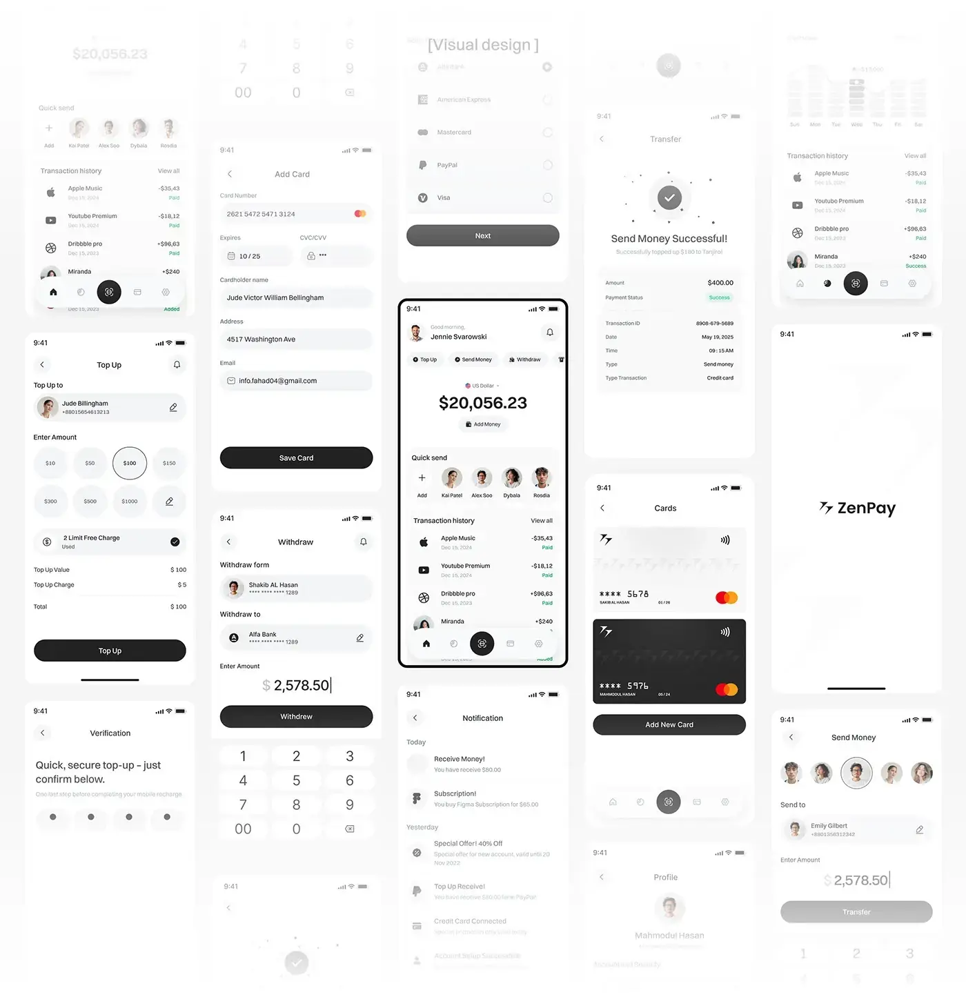
| ZenPay | A mobile wallet, 50+ screens across 20 flows | One order on every money screen: who, how much, cost, confirm |
| Nexfolio | An AI-powered investment dashboard | Put the AI beside the numbers it explains |
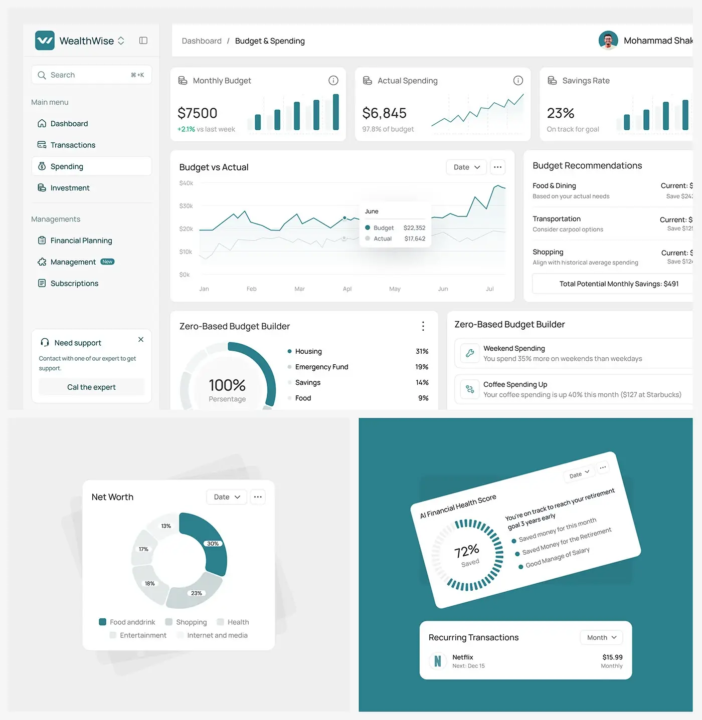
| WealthWise | An AI personal finance dashboard, 40+ screens | Phrase each insight as a plain next step |
| Fintus | A website for a banking and saving platform | Answer security, fees and devices before sign-up |
| Fintech SaaS website | A homepage for payments, banking and analytics | Show the product, don't describe it |
| FundFlo | A landing page for a small business finance SaaS | Promise, proof and next step on the first screen |
| FinFuse | A landing page for a fintech partner | Answer doubts on the page itself |
Security, fees and devices came up on every website, and those worries don't end at sign-up.
Trust and clarity on money screens
People open a money app to check or do one thing. On ZenPay, the home screen leads with the balance, with Top Up, Send Money and Withdraw one tap away.
Trust comes from predictability more than polish. When every money screen uses the same order and words, people stop rereading. So the design system carries a short glossary: "Send" everywhere, never "Transfer" here and "Pay" there. NIST's identity proofing guideline, SP 800-63A-4, gives the same advice for sign-up: use one word consistently rather than synonyms.
Colour stays quiet. ZenPay is monochrome, and Nexfolio is mostly graphite, light grey and white, so one lime accent marks what matters. On both dashboards, AI insights sit beside the figure they come from, so people can check them. My notes on designing AI features people trust go further.
Numbers, currencies and rounding
Most number bugs start as design decisions nobody wrote down.
Use each currency's own decimals. The ISO 4217 currency list published on 17 September 2026 gives 17 currency codes no minor unit, including the yen and the won, and 7 codes three, including the Kuwaiti and Bahraini dinars and the Omani rial. A hard-coded ".00" is wrong in Tokyo and Kuwait City.
Store whole numbers, format at the edge. Stripe's currency documentation takes amounts in the smallest unit: 1099 for 10.99 USD, 10 for 10 JPY. In my Node.js test, (1.005).toFixed(2) returned "1.00" while Intl.NumberFormat showed £1.01, so rounding lives in one shared function.
Pin the formatting options. MDN's Intl.NumberFormat reference says currency formatting defaults to the ISO 4217 minor units and rounds ties away from zero unless told otherwise. Locale changes the symbol too: in my test, the same dollars showed as $1,234.50 in en-US and US$1,234.50 in en-CA.
| Case | Rule in the design system |
|---|---|
| An amount being moved | Exact, never shortened to "1.2k" |
| Change over time | Sign always shown, plus an arrow or a word |
| Shares of a whole | Rounded so they add up to 100% |
| Two currencies on one screen | Symbol plus code |
| Columns of figures | Tabular figures |
The shares rule catches teams out: thirds stored as 33.333%, 33.333% and 33.334% each round to 33%, which adds up to 99%. Use a largest remainder rule. Tabular figures, OpenType's tnum feature, give every digit the same width, so columns line up and a live balance doesn't jiggle.
Charts that do not mislead
A finance chart can be accurate and still mislead, through the axis, the period or the forecast.
The axis. The UK Government Analysis Function's guidance on charts says not to break the axis on a bar chart, because a break distorts bar lengths. On a line chart a break is acceptable but can exaggerate small differences, and it warns that two y-axes are easily misread. A 2% dip shouldn't look like a cliff.
The period. In the UK, COBS 4.6 in the FCA Handbook says past performance in a communication must not be its most prominent feature, must cover five years (or since launch) in complete 12-month periods, and must warn that past performance is not a reliable indicator of future results. Ask compliance which screens count. My rule anyway: the period that suits the decision, never the flattering one.
The forecast. Nexfolio's AI insight screen shows forecasts with a confidence score. Under the same chapter, a promotion's forecast must rest on reasonable assumptions and show negative and positive scenarios. In design terms: a dashed line or a range, labelled "forecast", with the downside as visible as the upside.
For chart types, see my guide to choosing charts for dashboards people open.
Onboarding and identity checks (KYC)
Know your customer (KYC) checks are where onboarding loses people, and much of that is design, not law. In the US, the Customer Identification Program rule, 31 CFR 1020.220, asks banks for a name, date of birth, address and ID number before opening an account, verified "within a reasonable time" afterwards. Customers must be told, before opening, that the bank is asking to verify their identity, and the rule expects a route for people without an unexpired photo ID.
The customer experience section of NIST SP 800-63A-4 is the checklist I use: explain the whole process, how long it takes, why it's needed, which documents count and what's optional, then ask for as little as possible.
The order I design it in:
- Before you start: what you'll need, how long it takes, and why.
- Basic details, autofilled, with nothing asked twice.
- Document capture with a frame, automatic capture and an easy retake.
- A face check, only if your provider requires one.
- A pending screen with honest timing.
- A failure route: a manual review or a person, never a dead end.
I write the "we couldn't verify you" copy before the happy path.
Fees and exchange rates before commitment
On ZenPay, send, top up and withdraw show the charge and the total before the button, so there are no surprise fees.
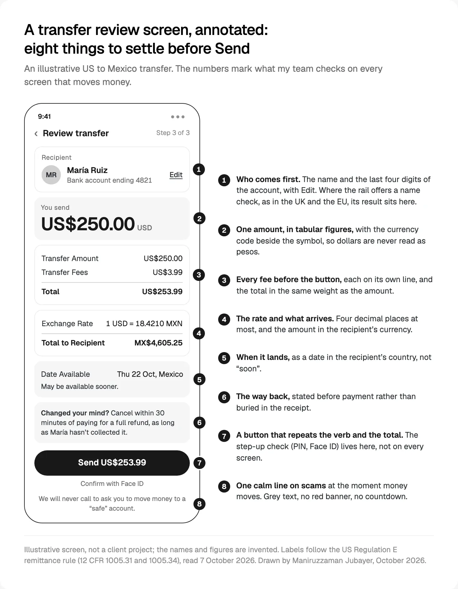
For US remittances, Regulation E's pre-payment disclosure rule, 12 CFR 1005.31, names what the sender sees before paying: Transfer Amount, Transfer Fees, Total, Exchange Rate (rounded to between two and four decimal places) and Total to Recipient. The receipt adds Date Available. I use those labels even where the rule doesn't apply.
In the EU, Regulation (EU) 2019/518 makes providers state currency conversion charges on card payments as a percentage mark-up over the latest European Central Bank reference rate, before the payment starts. So "no fees" with a padded rate isn't free. Show the mark-up.
My fee rules: every charge on its own line before the button, never in a tooltip; the total in the same weight as the amount; and the same figures on the receipt and the email.
Confirmation, undo and payment states
For most transfers, the review screen is the only undo, because many bank payments can't be pulled back once sent.
Check the payee. Pay.UK's Confirmation of Payee checks account names on UK payments; Pay.UK says over 300 organisations use it, with more than 2 million checks a day. In the EU, Regulation (EU) 2024/886 requires a payee check before the payer authorises: a warning on no match, and the real name on an almost match. Euro area providers had to comply by 9 October 2025. So design four states: match, close match, no match and couldn't check.
Show the way back. Under Regulation E's cancellation rule, 12 CFR 1005.34, a US remittance can be cancelled within 30 minutes of paying, if not yet collected, with a full refund within three business days. WCAG 2.2 criterion 3.3.4 asks financial submissions to be reversible, checked or confirmed.
Stop double payments. Stripe's guide to idempotent requests shows how a key makes a retry safe. The design half is a button that shows progress and can't be pressed twice.
Name every state honestly. Stripe's payment lifecycle documentation notes bank debits can take several days to confirm, so "processing" is a real state.
| State | What people see | What I never show |
|---|---|---|
| Processing | "Sending", with the expected date | A success tick |
| Needs action | Exactly what to do next | A generic error |
| Succeeded | A receipt: amount, recipient, date, transaction ID | A celebration before the money moves |
| Failed | A plain reason, whether money left, a retry | An error code on its own |
Security cues without fear
For many users the threat is a scam, not a hacked app. In its testimony of 25 March 2026, the FTC said consumers filed 3 million fraud reports in 2025 and reported $15.9 billion in losses, $7.9 billion of it to investment scams.
So the cue that matters is one calm, specific line where money moves, like callout 8. I add friction only when something looks off, such as a new payee, and say why. Red banners on every transfer teach people to ignore warnings.
Reassurance belongs where people decide: on Fintus and FinFuse, my team answered security, fees and devices in an FAQ on the page itself.
For sign-in, NIST SP 800-63B-4 says verifiers shall allow password managers and autofill and should permit paste, with no composition rules or forced changes. It accepts syncable authenticators, the kind behind passkeys. My default: a passkey or biometrics first, a pasteable code as the fallback, and a step-up check only for risky actions.
Dark patterns regulators name in finance
The FTC's report Bringing Dark Patterns to Light (September 2022) describes its complaint against LendingClub, which alleged the lender promised "no hidden fees" while burying fees behind tooltips applicants were unlikely to click. It also cites a complaint that Credit Karma A/B tested an allegedly false "pre-approved" claim and kept it because it won more clicks.
Directive (EU) 2023/2673, applying from 19 June 2026, bars manipulative interfaces in financial services sold at a distance. Each member state must tackle at least one of three practices: undue prominence for one choice, asking again after a choice is made, or termination harder than sign-up. It also adds a "withdraw from contract here" function for contracts made online.
What I won't design:
- Fees or rate mark-ups behind an info icon.
- "Pre-approved" unless it is.
- Pre-ticked add-ons.
- A cancel flow longer than sign-up.
- Asking again after a no.
Test understanding as well as clicks: in the Credit Karma case, clicks picked the misleading version.
A fintech app design system for money
A finance design system needs a few components most don't have:
- Amount: takes minor units and a currency, then handles decimals, sign, symbol and size.
- Change: sign, arrow and value together.
- Status tokens for processing, failed and refunded, each with an icon and a word.
- Review and receipt templates, so every money flow ends the same way.
Colour never carries meaning alone. WCAG 2.2 criterion 1.4.1 rules out colour as the only signal, so a red figure needs a minus sign or "down". At 200% text (1.4.4) and the 320 CSS pixel reflow width (1.4.10), a seven-figure balance must wrap, never cut off. My guide to WCAG 2.2 fixes for fintech apps goes deeper.
Nexfolio runs on a 12 column grid with a fixed spacing scale, so numbers line up from page to page; ZenPay uses a 4 column grid. Name every token and component the same in Figma and in code, which is easiest with one team from Figma to production code. Every product design project for fintech apps I run starts there.
Where I would start
In a first call I'd ask for your busiest money screen, your fee table and your identity provider's flow. Then I'd fix them in order: the review screen, the payment states, the Amount component and onboarding.
My take: in finance, the plain screens are the product. People forgive a quiet home screen, not a fee they didn't see or a payment marked "sent" that wasn't.
That's my product design service for fintech teams: a free 30 minute intro call, a written scope and one fixed quote, weekly Figma sprints with a written update every 48 hours, and a documented design system. My team can also build the front end in React and Next.js, or the app in React Native or Flutter. Read how I work.
Frequently asked questions
What are the best practices for fintech app design?
Make every money screen answer who, how much in total, when it lands and how to undo it, before the button. Use each currency's own decimals and tabular figures, keep charts honest, explain identity checks, show fees up front and design every payment state, then build it all into the design system.
How do you design a fintech app people trust?
Be predictable and plain. Use the same order and words on every money screen, show the total and every fee before the button, and give each payment a receipt with a transaction ID. Answer worries about security, fees and devices where people decide, and keep warnings calm.
What should a fintech app design system include?
Beyond the usual tokens, an Amount component that formats minor units for each currency, a Change component with sign and arrow, status tokens for processing, failed and refunded payments, and review and receipt templates. Pair every colour with a word or icon, and name tokens the same in Figma and in code.
How should a fintech app show fees?
Show every fee as its own line before the person commits, with the total in the same weight as the amount, and repeat the total on the button. If you convert currency, show the rate, the mark-up and what arrives. US remittance rules require these disclosures before payment, and EU card rules require the mark-up.
How do you design KYC onboarding people finish?
Tell people what they'll need, how long it takes and why, before the first field. Ask for the minimum, autofill from the scanned document, make retakes easy and show honest pending times. Design the failure path first: a manual review or a person, never a dead end.
What makes a good fintech mobile app design?
A home screen led by the balance and the two or three actions people open the app for, large amounts in tabular figures, a review screen before every payment, and sign-in with a passkey or biometrics. Test it on a small phone at 200% text size, where long amounts break first.
Sources and method
I read every source on 7 October 2026. Number tests ran in Node.js 24.14.1 (ICU 78.2, CLDR 48). Project details come from my team's case studies; the diagram is illustrative, with invented names and figures. None of this is legal advice.
- SIX, ISO 4217 currency list one (17 September 2026), read 7 October 2026: six-group.com
- Stripe, supported currencies, read 7 October 2026: docs.stripe.com
- MDN, Intl.NumberFormat() constructor, read 7 October 2026: developer.mozilla.org
- Microsoft, OpenType 'tnum' feature, read 7 October 2026: learn.microsoft.com
- UK Government Analysis Function, charts guidance, read 7 October 2026: analysisfunction.civilservice.gov.uk
- FCA Handbook, COBS 4.6 past and future performance, read 7 October 2026: handbook.fca.org.uk
- eCFR, 31 CFR 1020.220 Customer Identification Program, read 7 October 2026: ecfr.gov
- NIST, SP 800-63A-4 identity proofing (July 2025), read 7 October 2026: pages.nist.gov
- NIST, SP 800-63B-4 authentication (July 2025), read 7 October 2026: pages.nist.gov
- eCFR, 12 CFR 1005.31 remittance disclosures, read 7 October 2026: ecfr.gov
- eCFR, 12 CFR 1005.34 remittance cancellation, read 7 October 2026: ecfr.gov
- EUR-Lex, Regulation (EU) 2019/518 (19 March 2019), read 7 October 2026: eur-lex.europa.eu
- Pay.UK, Confirmation of Payee, read 7 October 2026: wearepay.uk
- EUR-Lex, Regulation (EU) 2024/886 on instant payments (13 March 2024), read 7 October 2026: eur-lex.europa.eu
- Stripe, idempotent requests, read 7 October 2026: docs.stripe.com
- Stripe, Payment Intents lifecycle, read 7 October 2026: docs.stripe.com
- FTC, testimony on fraud to the Joint Economic Committee (25 March 2026), read 7 October 2026: ftc.gov
- FTC, Bringing Dark Patterns to Light (September 2022), read 7 October 2026: ftc.gov
- EUR-Lex, Directive (EU) 2023/2673 (22 November 2023), read 7 October 2026: eur-lex.europa.eu
- W3C, WCAG 2.2 (12 December 2024), read 7 October 2026: w3.org