


Product design · Healthcare
CareUp
A mobile healthcare app, from user research and wireframes to the final UI.
View case studyHealthcare product design and build, from Dhaka
I'm Maniruzzaman Jubayer, and with the senior team of designers and developers I lead, I design and build healthcare products: patient apps, hospital and clinic dashboards, health SaaS and the websites that sell them. I work remotely from Dhaka with founders and product teams in Europe, the US, the Gulf and Asia, and design every screen for the person opening it, who is often worried, busy or both.
Five healthcare case studies on this site · Built in React, Next.js, React Native and Flutter







Design engineer and product design lead, with a senior team behind me
04 problems
Four problems I hear from health founders again and again, each with what I do about it.
Staff screens grow one request at a time until every number is urgent and every task takes six clicks. When everything warns, people stop reacting and miss the alert that matters. I cut alerts to three levels named in words, make each one say what to do next and who owns it, and put key numbers on top with the working list below. My team designed Mediso, a hospital management dashboard.
A patient opens your app a few times a year, often on a phone, often on a bad day. Clinical words, grey helper text and tiny time slots lose them. I write patient words first and the clinical term second, ask one question at a time, keep targets large and test the booking flow at 200% text. My lessons from five health products go deeper.
Teams either lock everything down until the front desk shares one login, or leave the analytics pixel on the patient portal. I agree who sees what with your compliance lead before the first wireframe, then design it in: everyone signs in as themselves, quick switching on a shared tablet, a session warning that keeps the draft, and an analytics plan that keeps marketing tags off logged-in screens.
A slot that looks free but isn't, a form that clears when a call interrupts, an upload that stalls without a word. I define a slot once with the clinic and draw the staff calendar and the patient picker from that one model, hold the slot while the patient finishes, and make staff forms save as you go. My team designed VitalHealth, a healthcare SaaS for finding and booking doctors.
A patient app, a hospital dashboard, a health SaaS, a medical software website and a mental wellbeing platform.
Product design · Healthcare
A mobile healthcare app, from user research and wireframes to the final UI.
View case study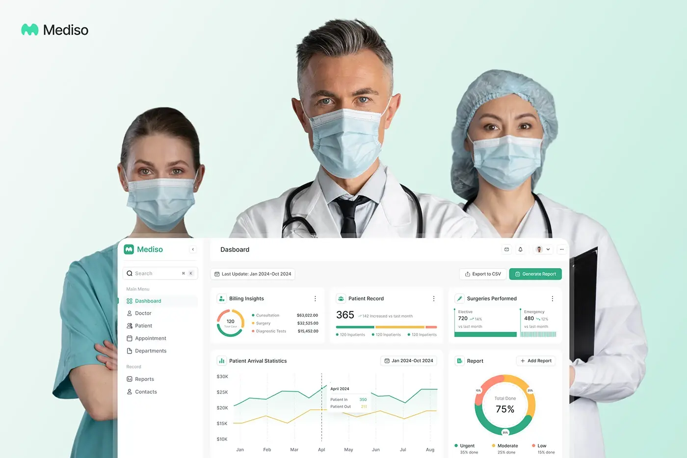
Product design · Healthcare
Patients, appointments, staff and departments managed from one healthcare admin platform.
View case study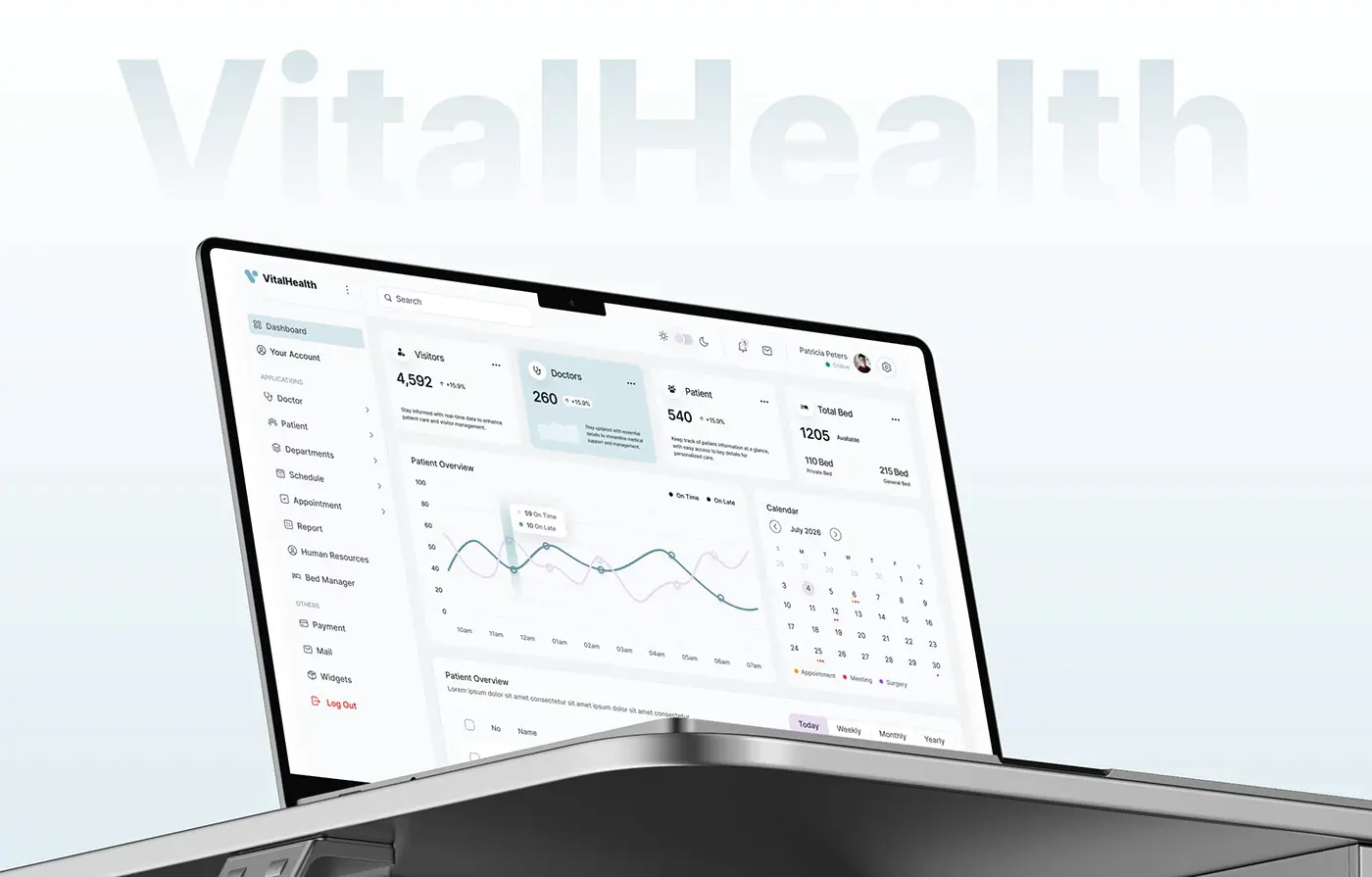
Product design · Healthcare
A healthcare platform with more than 50 screens, from the design process to the final dashboard.
View case studyPlanning a patient app or a clinic dashboard? Let's talk it through before the first wireframe.
Start a projectSix kinds of health product, most of them with a patient side and a staff side on one data model.
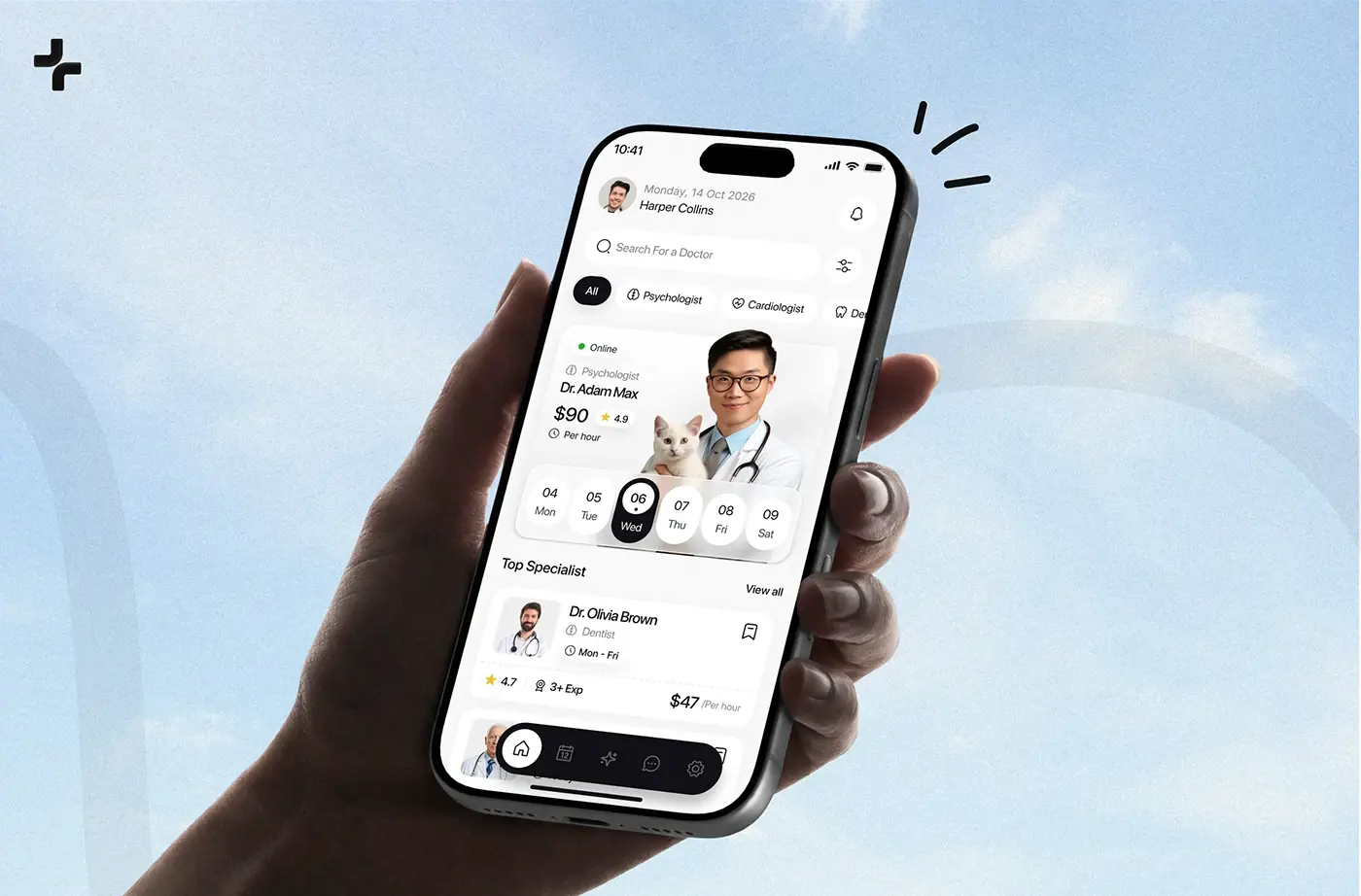
Find a doctor, see credentials and real availability, book in a few taps, reschedule as easily, and keep appointments and records in one place. My team designed CareUp, an AI healthcare app for finding a doctor and booking.
Patients, doctors, shifts, departments and urgent reports on screens an admin can read at a glance under time pressure, with a profile for each patient and each doctor.
Multi-clinic platforms with roles, calendars, payments and records, held together by one design system so staff learn the layout once, however many screens the product grows to.
The states around the call, not just the call: how to join, what happens if it drops, a location check, a callback number and a consent step the clinic can switch on.
Calm screens for people who arrive ashamed or afraid: privacy shown at the first step, a small private start, and progress people can see. My team designed Sovia, website and app screens for a mental wellbeing platform.
Sites that earn a healthcare buyer's trust before they read the details: each product module easy to find, proof and answers in one place, designed for Webflow or built in Next.js.
These are the rules that shape screens most often in health products. This is design guidance, not legal advice: your counsel and your regulatory lead decide what applies to you.
HHS's summary of the Security Rule lists technical safeguards that become screens: access control so only authorised people reach ePHI, audit controls that record activity, and authentication that checks a person is who they say. HHS adds that an addressable specification does not mean optional. I turn these into a role matrix, a readable access history on each record and sign-in that never forces shared accounts.
FHIR is HL7's standard for health care data exchange, and R5 is the current published version. Its resources include Patient, Practitioner, Appointment, Schedule, Observation, Consent and AuditEvent. When your API speaks FHIR, I name screens, fields and states the way those resources do, so a booking on screen maps to one appointment in the data and nothing gets lost between the design and the integration.
IEC 62366-1:2015 specifies a process for a manufacturer to analyse, specify, develop and evaluate the usability of a medical device as it relates to safety, including risks from use errors. If your software is a device, the screens are part of that file. I work with your regulatory lead on use scenarios and testing, alongside the FDA's human factors guidance.
The FDA uses the IMDRF definition: software intended to be used for one or more medical purposes that performs them without being part of a hardware medical device. A symptom checker or an AI assistant can drift into that territory through its wording alone. So I ask early what each feature is for, keep screen copy within what your regulatory lead has agreed, and design AI answers that explain themselves and point to a person.
The Digital Technology Assessment Criteria cover five core areas: clinical safety, data protection, technical assurance, interoperability, and usability and accessibility. NHS adopters review a supplier's completed DTAC during procurement, and NHS England refreshed the form in 2026. I design so the usability and accessibility answers have evidence behind them. For UK teams, see product design for London.
The W3C Recommendation of 12 December 2024 is my baseline for every patient screen: text that resizes to 200% without loss (1.4.4), targets of at least 24 by 24 CSS pixels (2.5.8), time limits people can extend (2.2.1) and sign-in without a memory test (3.3.8). The last two matter most in health, where sessions time out and patients forget passwords. My WCAG 2.2 checklist for React covers the code.
The same four steps as every project, with the checkpoints a health product needs built in.
We talk through the product, the users and the part that hurts most. I also ask three health questions: who owns compliance, whether any feature could count as medical device software, and whose developer account the app will ship from.
The scope lists every role, every core flow, the access matrix and the analytics plan to agree, so nothing about privacy turns up as a surprise later. You get one fixed quote for the whole project before any work starts. No retainer.
Weekly sprints in Figma, a written update in Slack every 48 hours and a review call each week in your time zone. Before handoff, your compliance or clinical safety lead reviews the consent, access and alert flows and the words on them.
A documented design system, a walkthrough with your engineers, and the web front end in React and Next.js or the app in React Native or Flutter, built by my team if you want it. A person who knows the design reviews every change.
Everything a health product team needs to build with confidence, and to answer a buyer's or an assessor's questions about the design.
Every role, what each one needs to see and do, and the emergency route, agreed with your compliance lead before the wireframes.
Booking, records, messages and payments mapped for both sides from one definition of a slot, an appointment and a record.
Test booking and sign-in with people like your patients and your staff before a line of code is written.
Empty, loading, error, held slot, session warning and dropped call, for phone, tablet and desktop, in light and dark.
Slot picker, status chip that always carries text, vital sign tile with unit and date, consent row and access history row, in Figma and in code.
Contrast, 200% text, target sizes, focus order and sign-in checked on the key flows, with the fixes made, not just listed.
Specs, tokens and annotated flows, plus a walkthrough with your engineers and quick answers while they build.
Built by the same team that designed it, so the session warning you approved is the one patients see.
Most health products need more than one of these. Each line says what the service means in this sector.
Each figure is quoted as its publisher states it, with its year. None is a market-size estimate.
An honest comparison, including where the others win. With me you get the senior people a healthcare UX design agency would bill for, without the layers between you and them.
| What you get | My team | Large agency | Freelancer |
|---|---|---|---|
| Senior people on your product from the first week | Yes | Sometimes | Yes |
| You talk to the people doing the work | Yes | Varies | Yes |
| Design and front-end build in one team | Yes | Sometimes | No |
| Patient apps and clinic dashboards in the portfolio | Five health projects | Varies | Varies |
| Regulatory or clinical safety staff in-house | No | Sometimes | No |
| Cover when someone is ill or away | Yes | Yes | No |
| Room to staff several large products at once | No | Yes | No |
| One fixed quote for the full scope | Yes | Sometimes | Sometimes |
Working with Jubayer and the team has been a blast. Their creativity has honestly taken our platform to new heights. Incredibly professional and so proud to work with, we’re over the moon with their results, and we can’t wait to team up with them again.

I highly recommend Jubayer for any design project. He quickly grasps complex concepts, excels in standard design practices, and responds promptly.

What I have written on health products, accessibility, dashboards and AI features people trust.
Healthcare app design lessons from five health products my team designed: patients and staff, booking, records, consent, accessibility and alerts.
A WCAG 2.2 React checklist for level AA: what changed in 2.2, the components that fail most, short TypeScript fixes and the tests that keep them fixed.
App Store rejection reasons I design around: account deletion, Sign in with Apple, permission prompts, in-app purchase, privacy labels and demo accounts.
Straight answers to what health founders ask before they start.
It depends on the number of user roles, the core flows, the platforms, how much research the product needs, the compliance and clinical safety reviews, and whether my team builds it too. A patient app with a clinic dashboard is two products on one data model, and the scope says so. After a free 30 minute intro call I write a scope and give you one fixed quote for the whole project. No retainer and no hourly billing.
There is no HIPAA certification for a design or a designer. HIPAA binds covered entities and their business associates. What I do is design the parts of the rule that show on screen: access control, audit history, sign-in for each person and session warnings that keep the draft. Your counsel decides how the rule applies to you, and I make sure the design can follow that decision.
An agency suits you if you need many people across several large products at once, or in-house regulatory staff. If you want senior people on one product, a fixed quote and the same team designing and building, my team fits better. You work with me directly, and in reviews with the designers and developers doing the work. Book a free intro call and I will tell you honestly which fits your project.
Yes. When your API exposes FHIR resources such as Patient, Appointment, Schedule and Observation, I name the screens, fields and states the way those resources do, so the design and the integration agree. My team builds front ends in React and Next.js that connect to your APIs. The integration with a specific EHR is planned with your engineers, because each vendor's access and limits differ.
It might be. The FDA uses the IMDRF definition of software as a medical device: software intended for one or more medical purposes that performs them without being part of a hardware device. Intended use is the key, and screen copy can change it. Ask a regulatory specialist early. If the answer is yes, I design with IEC 62366-1 usability engineering in mind and work with your regulatory lead on use scenarios and testing.
It depends on the number of roles and screens, how much research the product needs and how many review rounds your clinical and compliance leads want. A focused dashboard is usually a matter of weeks, not months. Your written scope after the intro call sets out the timeline flow by flow, with the review checkpoints marked, so you can plan a launch on a real schedule rather than a guess.
Always. WHO estimates that 1 in 6 people experience significant disability, and many patients are older or unwell when they use the product. Every patient screen meets WCAG 2.2 level AA: text that resizes to 200%, targets of at least 24 by 24 CSS pixels, time limits people can extend and sign-in without a memory test. I write patient words first and test the booking flow at 200% text.
Yes. For the NHS, I design with the DTAC in mind, especially its usability and accessibility area, so your answers have evidence behind them. For Europe, the GDPR treats health data as a special category, so consent rows are separate, unticked and say who sees the data. I work remotely from Dhaka with teams in the UK and Europe, and native speakers on your side approve the words.