Overview
This mental health app and website design project is for Sovia, a digital health platform for people dealing with addiction and mental wellbeing problems. It's built on one belief: recovery works better when it feels human. I designed its website and app screens for mobile and desktop, plus the UI style guide behind them.
The challenge
People seeking addiction support often arrive ashamed or afraid, so every screen had to feel safe first.
- Many want help but fear what others think, so privacy had to show early.
- Fear-based messaging had to go, replaced by calm, clear guidance.
- The first step had to be small: a few private questions.
- People in recovery need to see they're moving forward.
The process
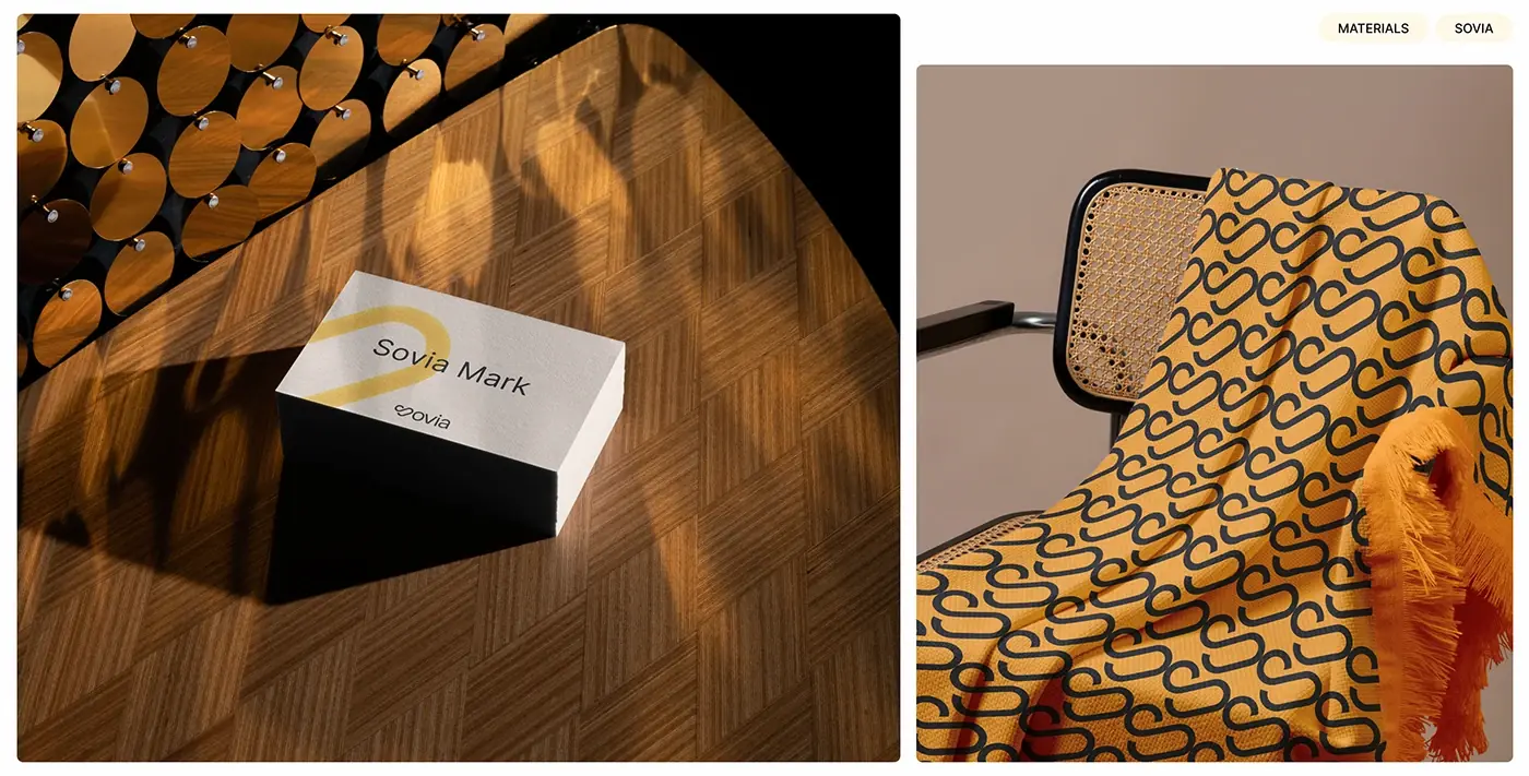
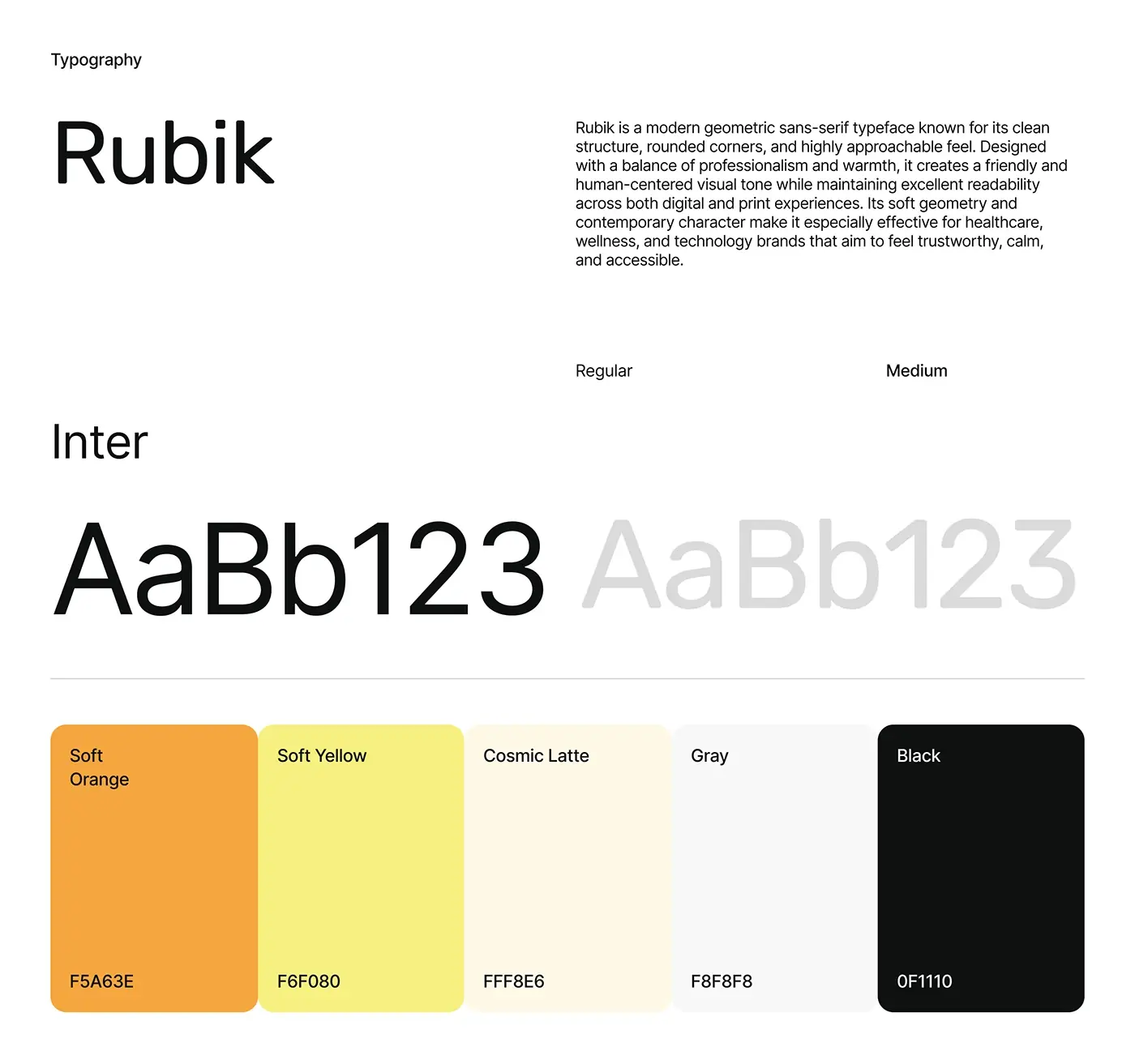
- Type and colour: Rubik and Inter in regular and medium, with a five colour palette of soft orange, soft yellow, a warm cream, light grey and near black.
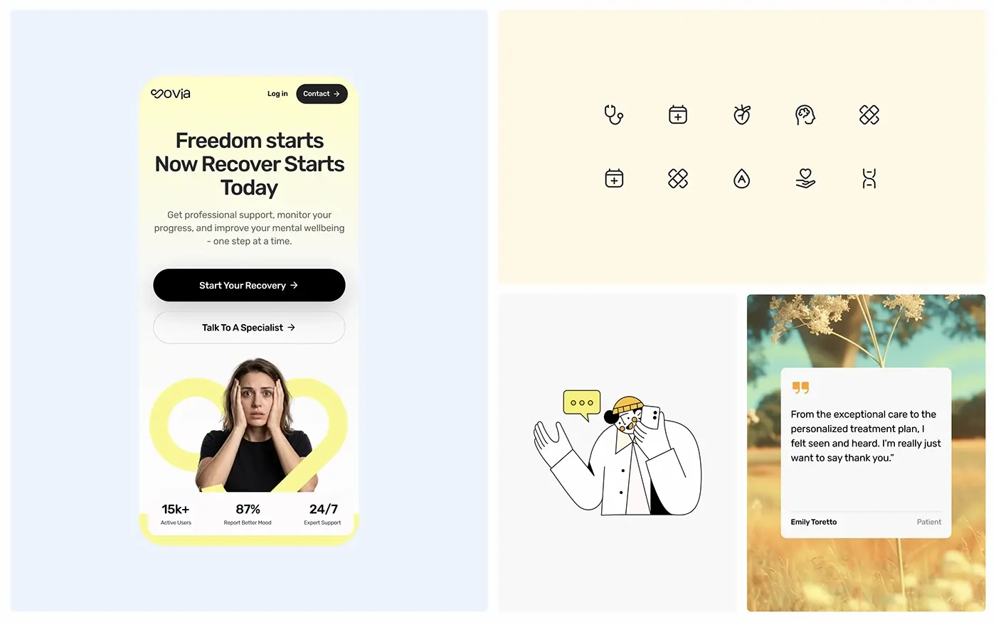
- A line icon set, from a stethoscope to a heart held in a hand, and a simple line illustration style.
- Mobile screens: home, treatments, the three step start and the trust section.
- Desktop versions of the same screens, checked across sizes.
The solution
I kept the screens soft and plain, with real photos of people outdoors instead of clinical imagery.
Home screen and first actions
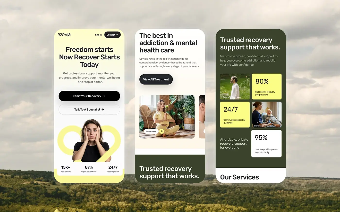
On the phone, "Freedom starts Now Recover Starts Today" sits on soft yellow above one line about support, progress and mental wellbeing. Two buttons follow: a black Start Your Recovery and an outlined Talk To A Specialist, so people can begin alone or with a person. Below them sit a photo framed by a yellow loop and a strip of three figures. The header keeps only Log in and Contact, so nothing competes with the first step.
Three step start
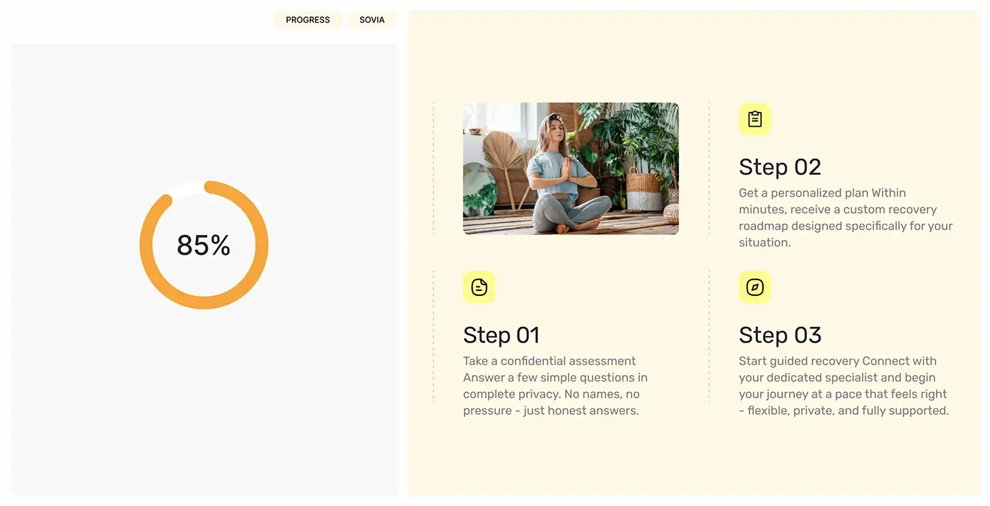
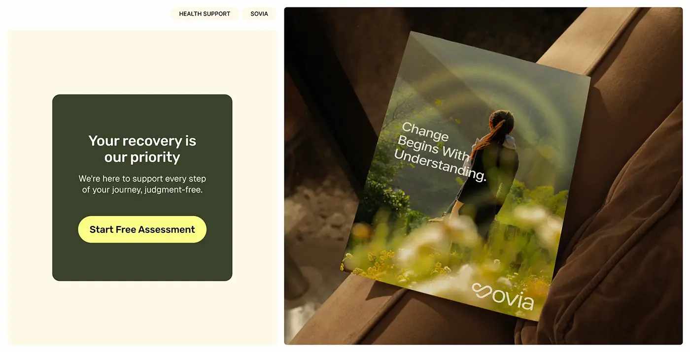
A confidential assessment, a personalised plan, then guided recovery with a specialist. Each step gets a number, a small icon on a yellow square and two lines of text, so the whole path is clear before anyone commits. A deep green card with Start Free Assessment repeats the first step, with a promise of support without judgement.
Privacy in plain sight
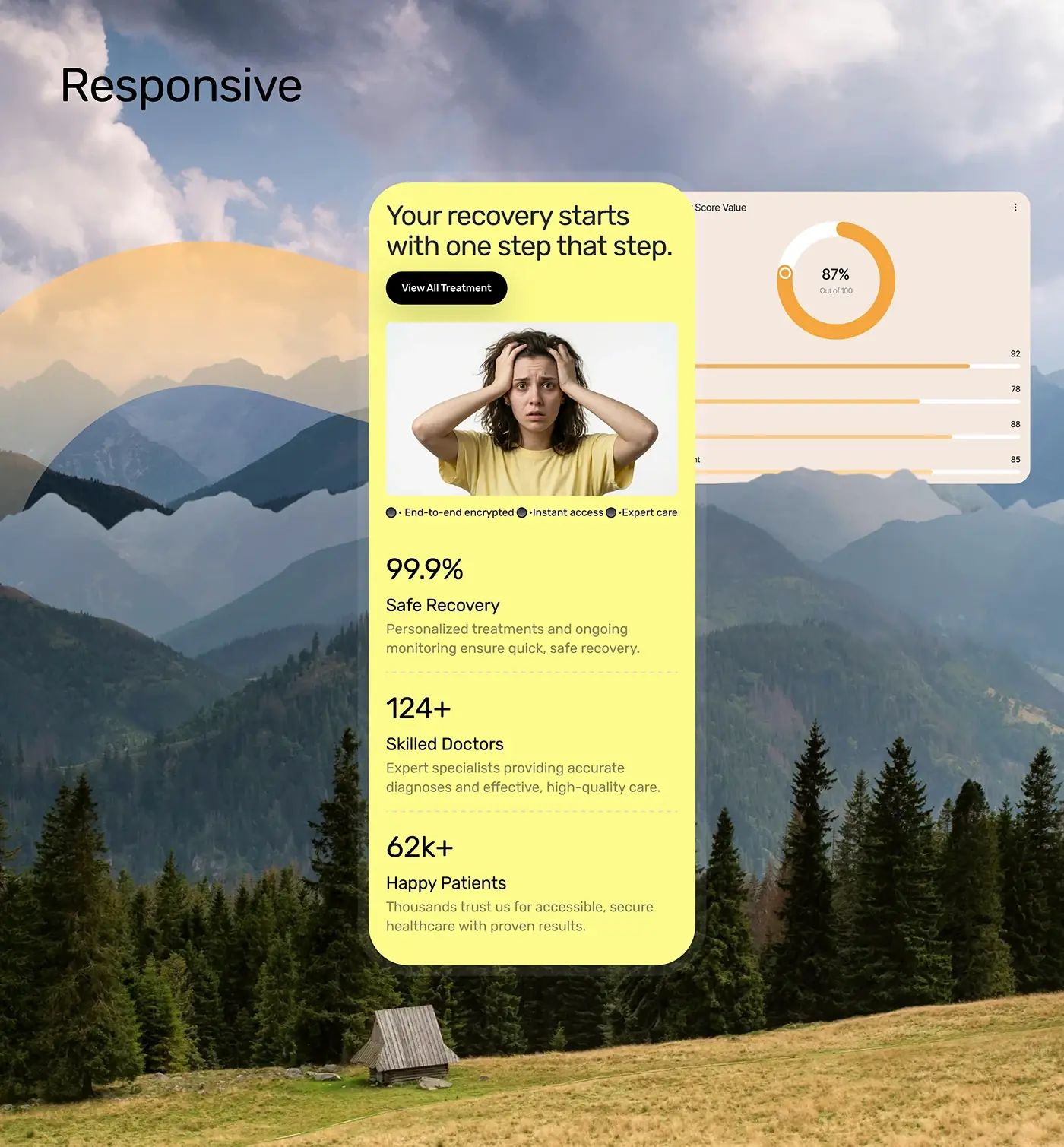
Step one says it outright: a few simple questions, in complete privacy, with no names and no pressure. On the responsive home, a single line under the first photo reads end-to-end encrypted, instant access and expert care. Both sit early on the page, close to the first step, where the worry is biggest, rather than in a policy page.
Treatments
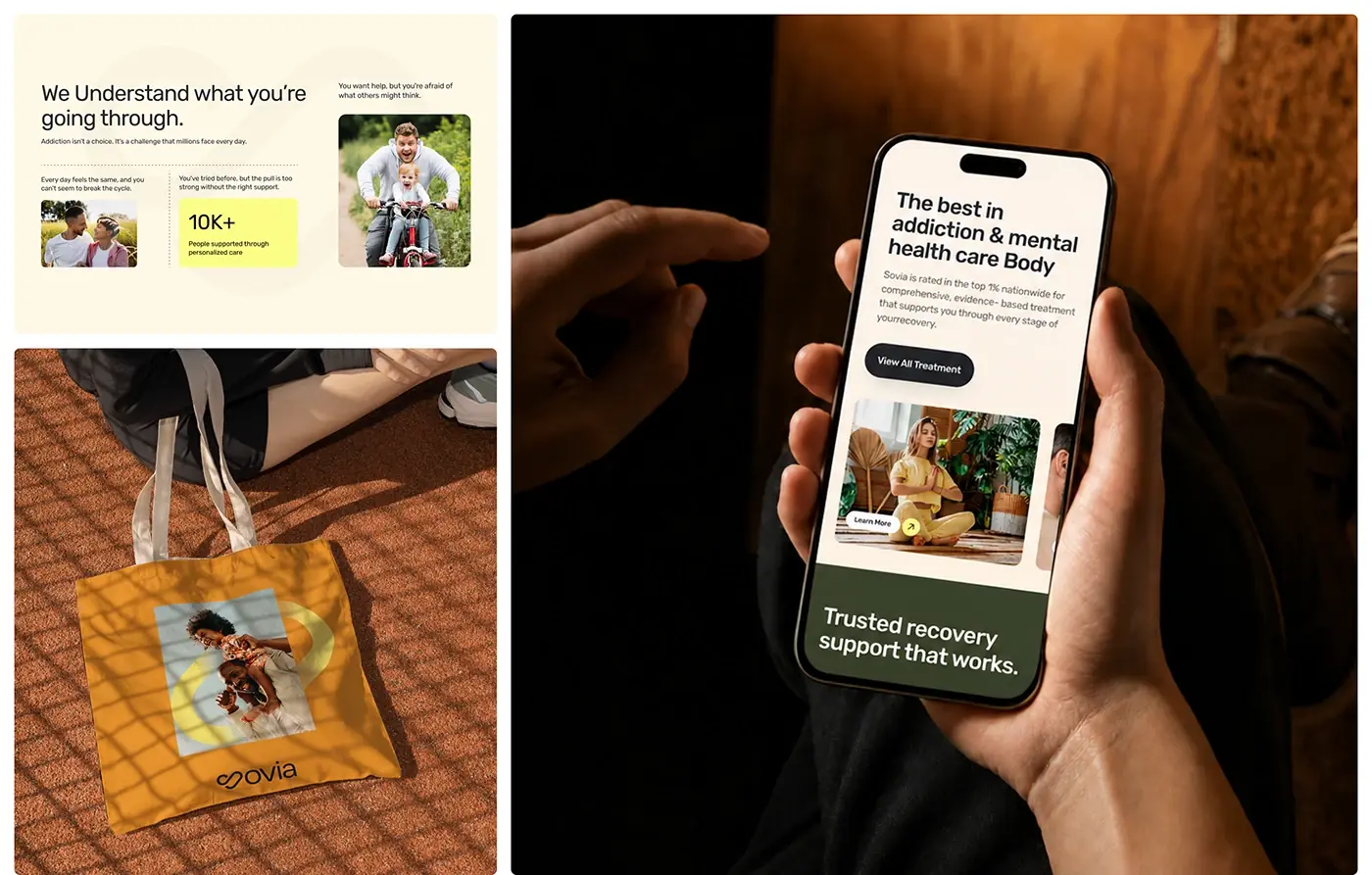
"The best in addiction & mental health care" heads a short intro and a View All Treatment button. Under it, a row of treatment cards runs off the edge of the screen, each with one photo and a Learn More link. One image and one action per card lets people browse at their own pace instead of reading a long list of therapies.
Trust section
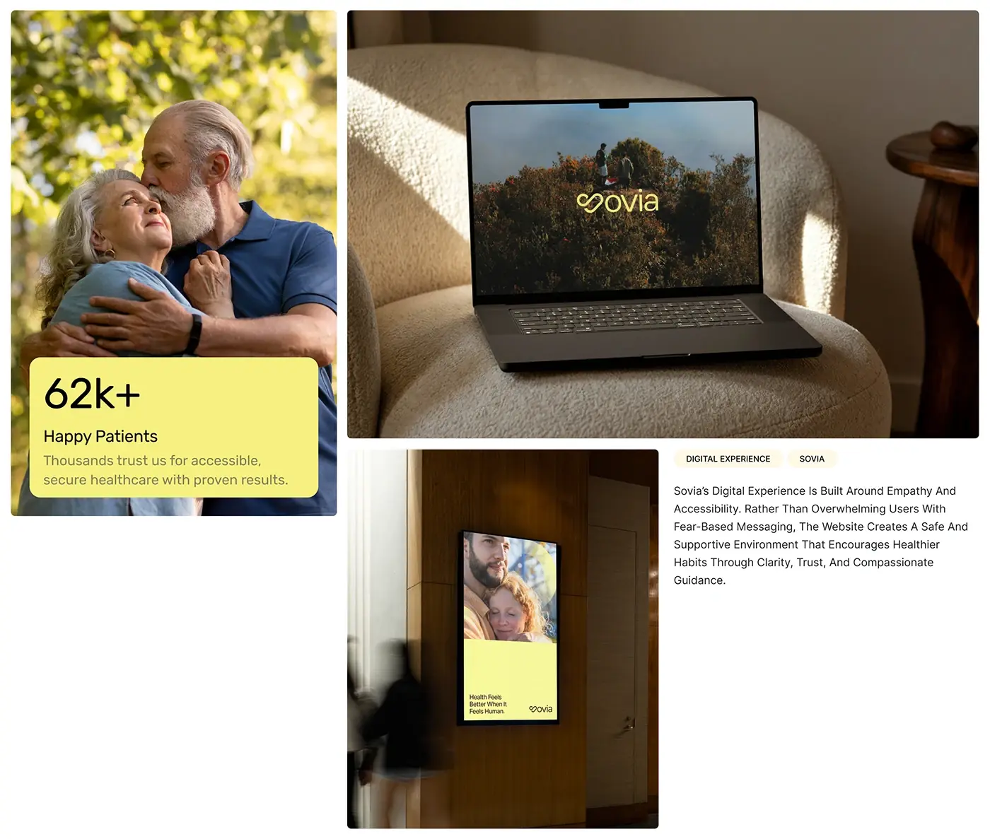
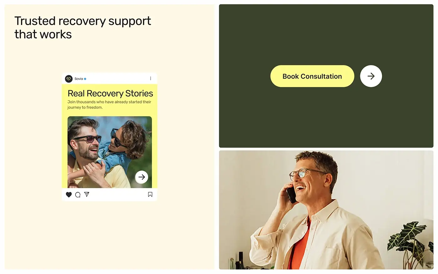
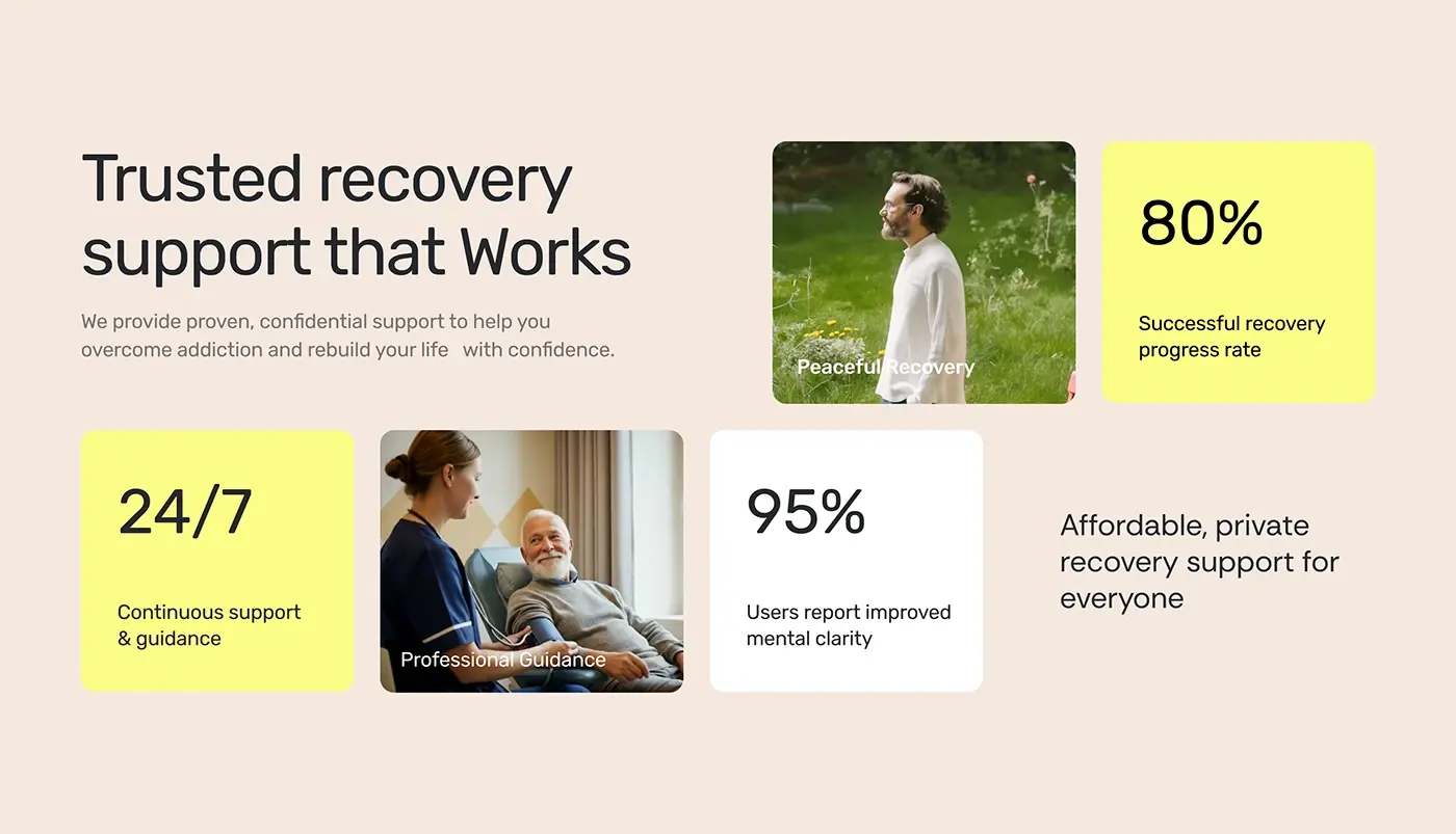
On the phone, "Trusted recovery support that works" sits on deep green above a grid that alternates photos and yellow cards: peaceful recovery, professional guidance, round-the-clock support and a line on affordable, private help for everyone. Mixing faces with short figures keeps the proof human. Elsewhere, a patient testimonial card and a yellow Book Consultation button give a clear next step.
Progress view
A progress ring shows one percentage in soft orange. A Score Value card pairs a larger ring, marked out of 100, with four bars for separate scores. People in recovery see where they stand in one glance, without reading a chart or a table.
Desktop home page
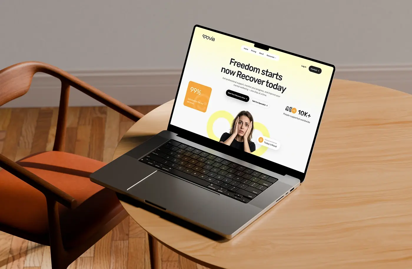
On a laptop the hero widens: Home, Pricing, About and Resources sit in a pill menu, with Log in and Contact on the right. The two first actions centre under the headline, and small cards float around the photo: a satisfaction figure, a count of people supported and a Today's Mood chip. The headline and the two first actions match the phone, so the first step looks the same on every device.
The result
- Mobile and desktop screens for home, treatments, the three step start and the trust section.
- A progress ring and a score card for tracking recovery.
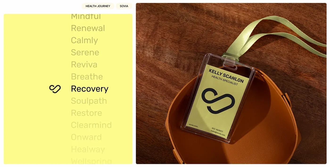
- A UI style guide: type, a five colour palette, line icons and an illustration style.
- Responsive mockups on phone and laptop, and the presentation.
How it helps the client
The screens let Sovia meet people at a hard moment without scaring them off: a visitor can take a private assessment, get a plan and reach a specialist from any device. That's my approach to website design for sensitive health products: plain words, one calm next step. More work in this space is in my healthcare case studies.