Overview
RoomMind AI is an iOS app that redesigns a room from one photo, and this AI interior design app case study shows how: pick a style and get an AI redesign in under 30 seconds. I designed the app end to end, from user flow to final UI.
The deck names Europe as the priority market: the UK, Germany, France and Sweden.
The challenge
Most people can't picture a new look in their own room, and the app had to close that gap.
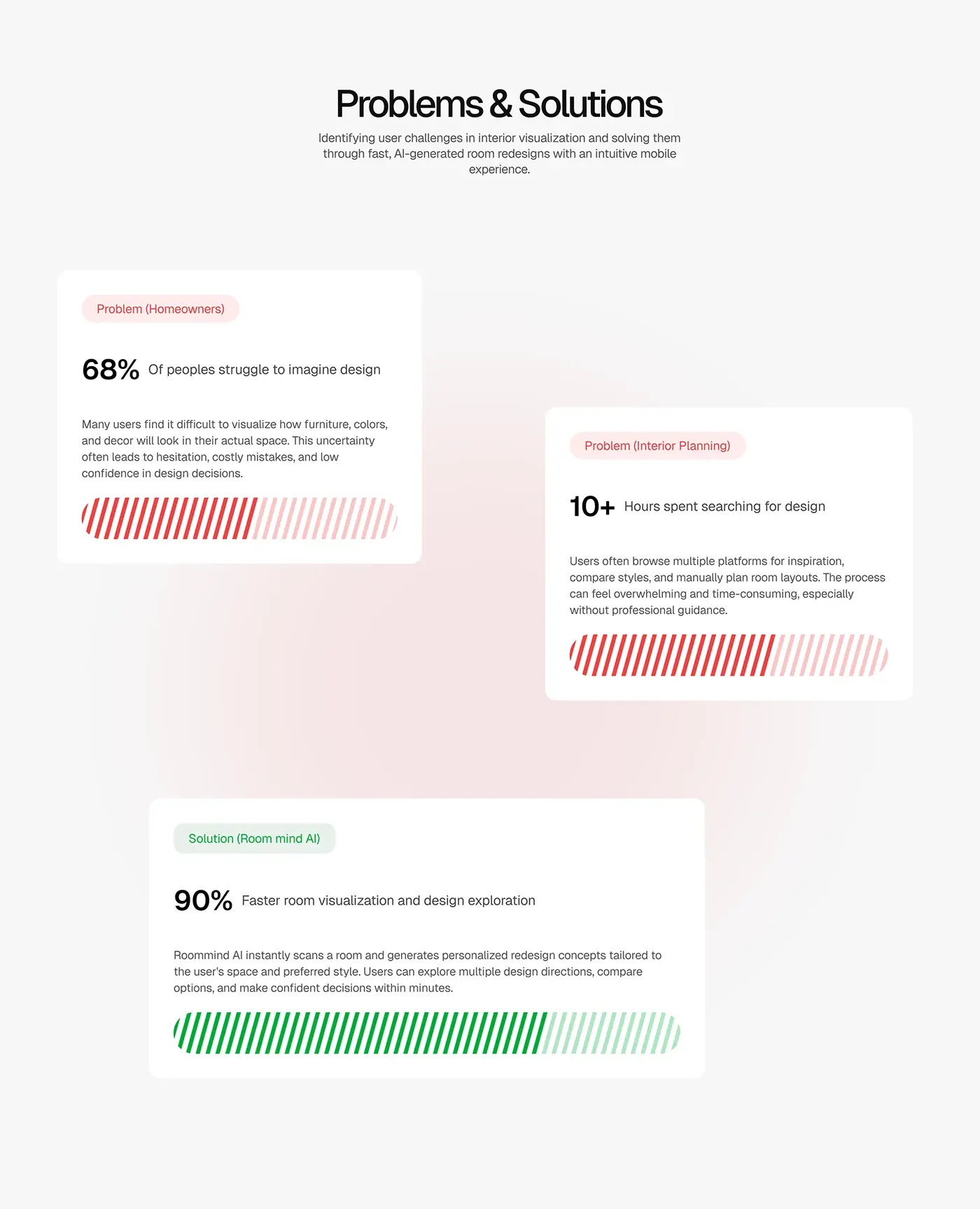
- People can't see how furniture, colour and decor will look in their space, so they hesitate or make costly mistakes.
- Inspiration is spread across several platforms, and planning by hand is slow.
- The wait while the AI works had to feel guided, not blank.
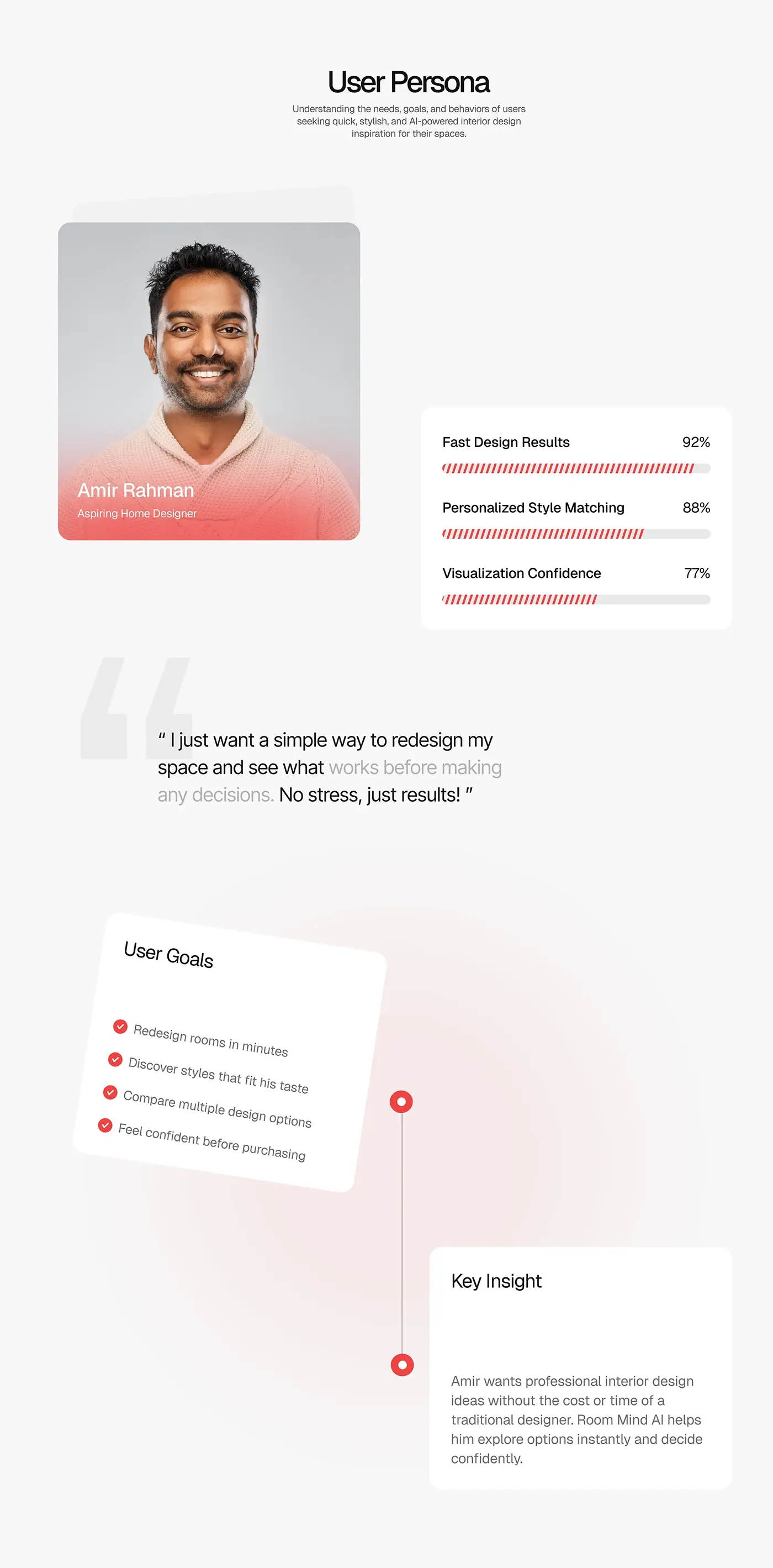
The persona, Amir Rahman, an aspiring home designer, wants professional ideas without a designer's cost or time, and confidence before buying anything.
The process
- Research and market analysis, a problem and solution map, and a persona.
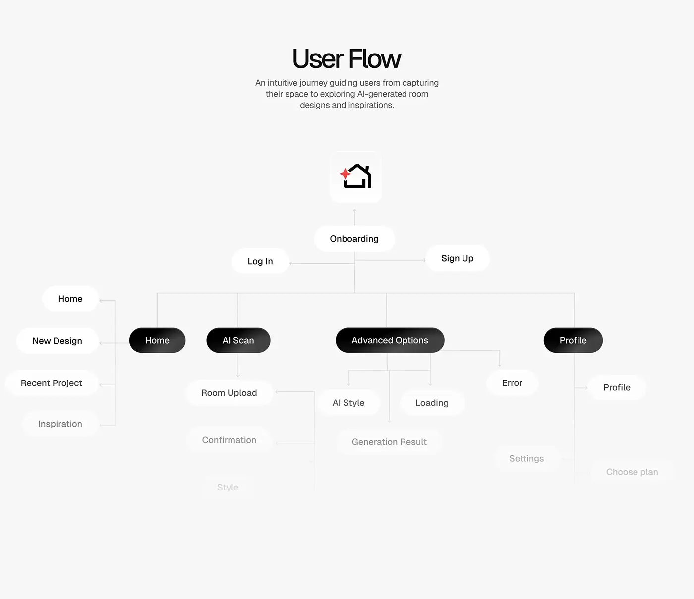
- A user flow from onboarding to the generated result, with branches for the AI scan, advanced options, errors and the profile.
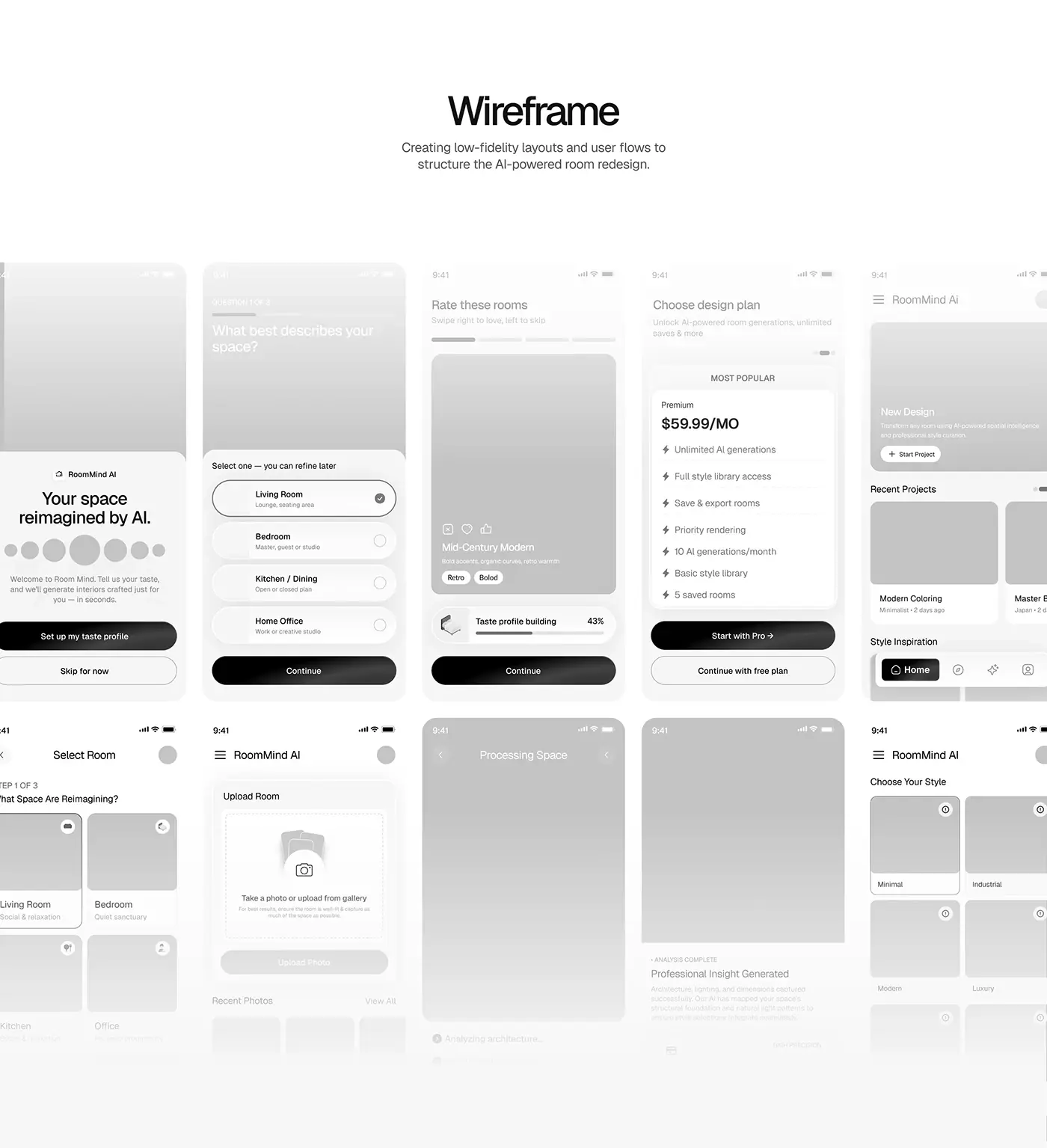
- Low fidelity wireframes for every key screen.
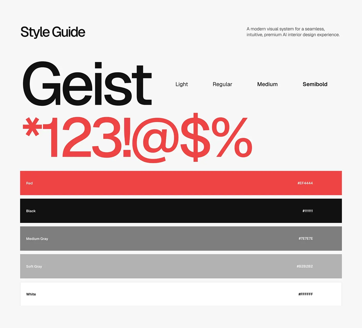
- A style guide: Geist in four weights, a red accent, black, two greys and white.
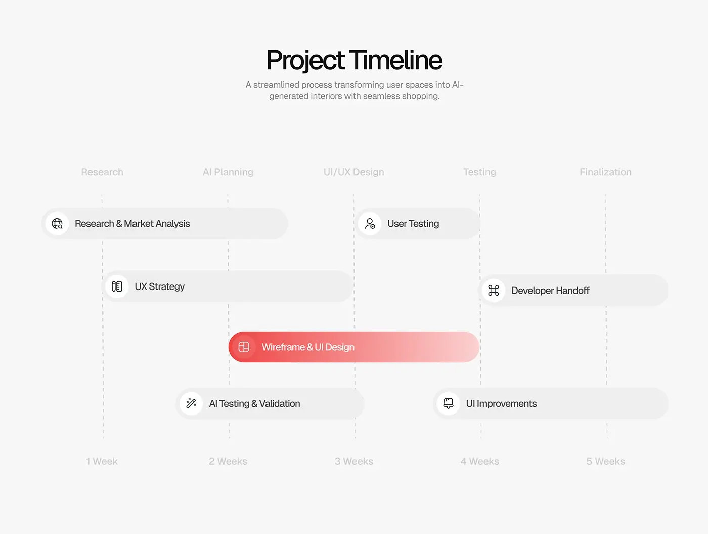
- High fidelity UI, AI testing and validation, user testing and handoff, over five weeks.
The solution
The flow keeps people oriented while the AI works and makes the before and after easy to compare.
Onboarding and taste profile
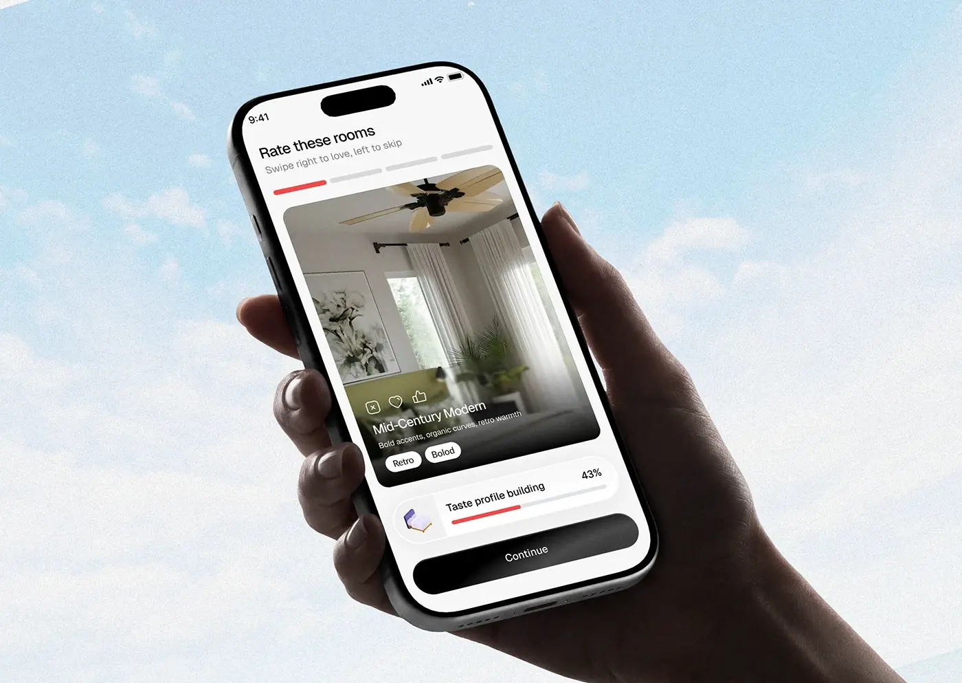
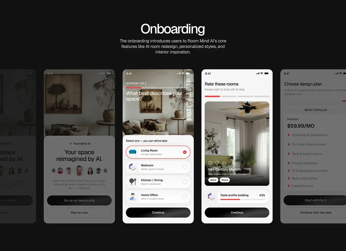
Three questions come first, starting with what best describes your space, each answer a large card. Then a swipe deck of styled rooms, right to love and left to skip, with style tags and a taste profile bar that fills as you go. A plan screen closes onboarding, with Continue with free plan as visible as Start with Pro. By the first redesign, the app already knows the person's taste.
Home
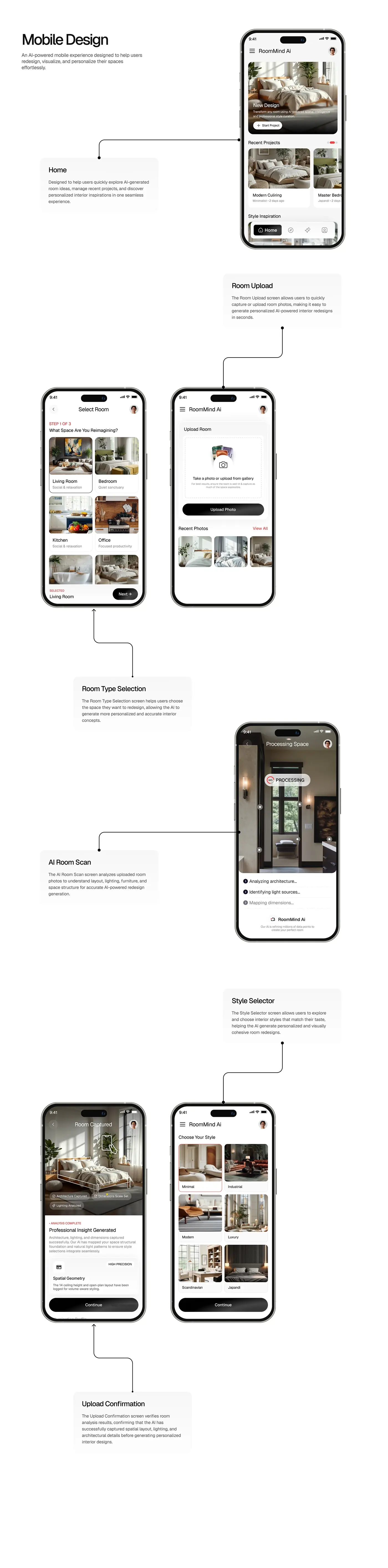
Home leads with a New Design card and a Start Project button, then recent projects with their style and date, then style inspiration. A floating four icon tab bar keeps the main areas one tap away. Starting something new is the biggest target on the screen, because that is why people open the app.
Room type and photo upload
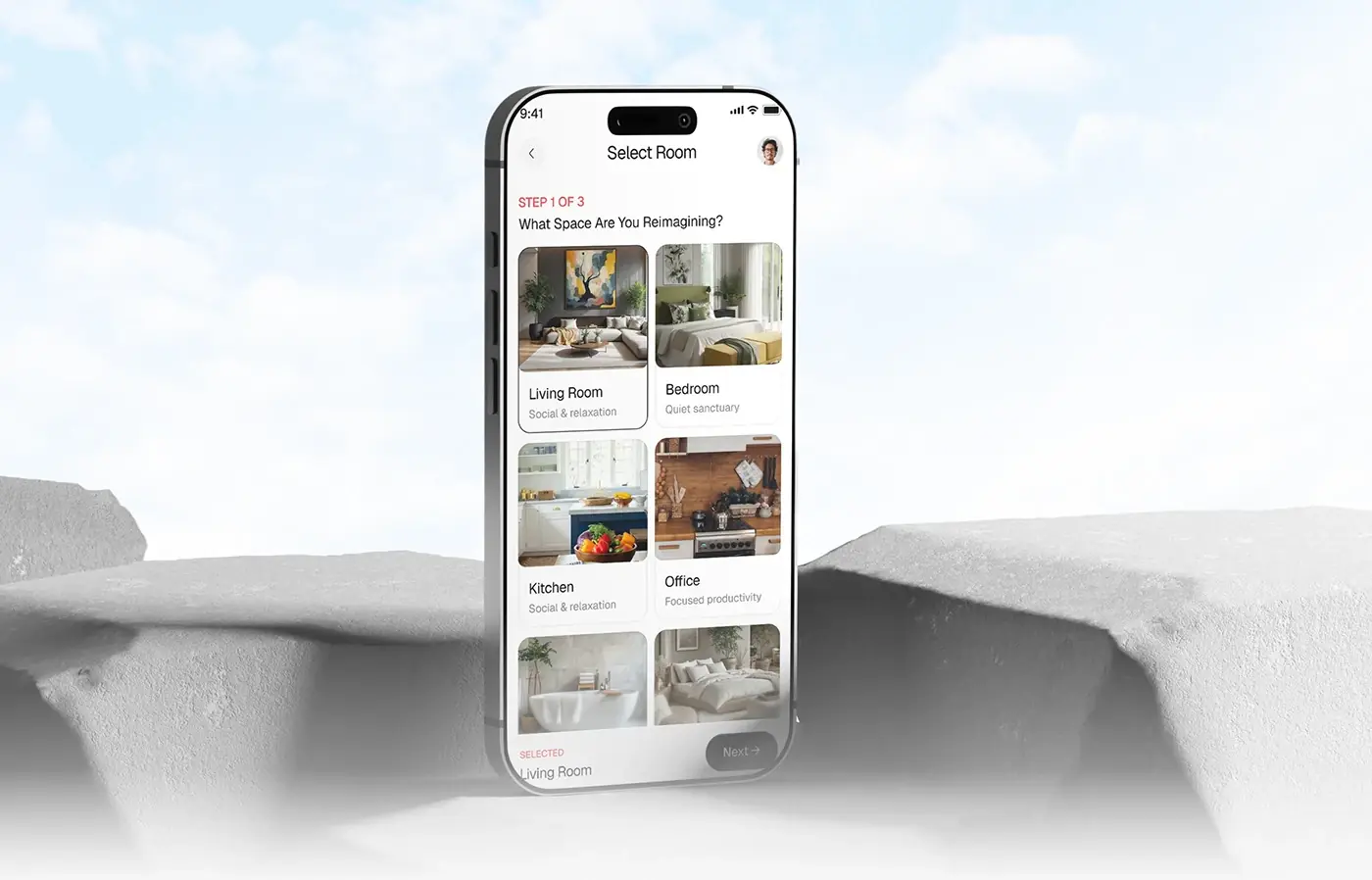
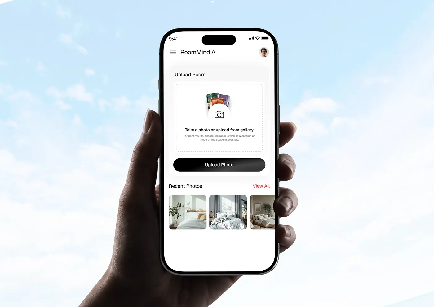
Step 1 of 3 asks what space you're reimagining, with photo cards for living room, bedroom, kitchen, office and more, each with a short line such as "Quiet sanctuary". The choice shows at the bottom beside Next. The upload screen takes a new photo or one from the gallery, with a tip to shoot a well-lit room and capture as much of it as possible, plus recent photos to reuse.
AI room scan and confirmation
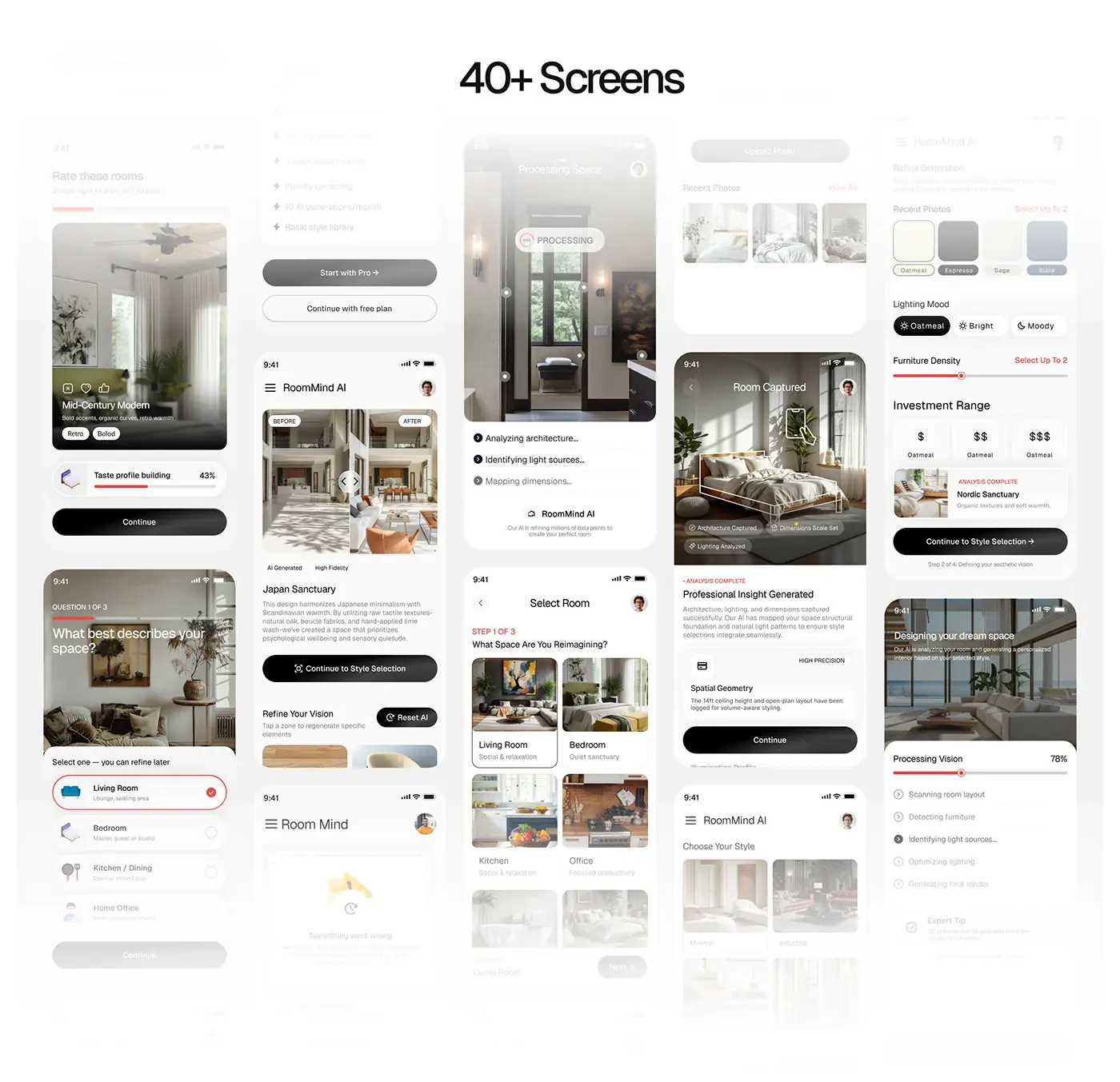
While processing, the photo stays on screen with scan points and a percentage, and a checklist names each step: analysing architecture, identifying light sources, mapping dimensions. The confirmation screen then tags what was captured (architecture, dimension scale, lighting) and notes the room geometry it logged. The wait reads as work being done, and people see the AI understood the room before choosing a style.
Style selector and refinement
Six styles (Minimal, Industrial, Modern, Luxury, Scandinavian, Japandi) are photo cards, not a list of names, because people recognise a style faster than they can name it. The refine screen sets a colour palette, a lighting mood such as bright or moody, furniture density on a slider and a budget range from one to three dollar signs, with a step counter.
Result and regeneration
The result is a before and after slider over the room, tagged AI generated and high fidelity, with the style name and a short description. Below it, Refine Your Vision lets people tap a zone to regenerate just that part, and Reset AI starts over. An error screen handles the moment something goes wrong, and an alert tells people when a redesign is ready.
The result
- The iOS app UI, more than 40 screens: onboarding, home, upload, AI scan, styles, results, plans and error states.
- The user flow, wireframes, persona and a UI style guide.
How it helps the client
The design takes someone from a photo to a redesign they shaped themselves, so the result feels directed, not random. The client gets onboarding that learns each person's taste first. That's the aim of my product design for AI apps, and there are more examples in my AI case studies.