Overview
This AI SaaS landing page design is for a product that helps businesses analyse and optimise how they run, from marketing and sales to daily workflow. I designed the full desktop page and its mobile views, with the design process and a style guide.
The challenge
AI products are easy to oversell, so the page had to show the product early and explain it in plain words.
- Six services had to read at a glance, not as a wall of claims.
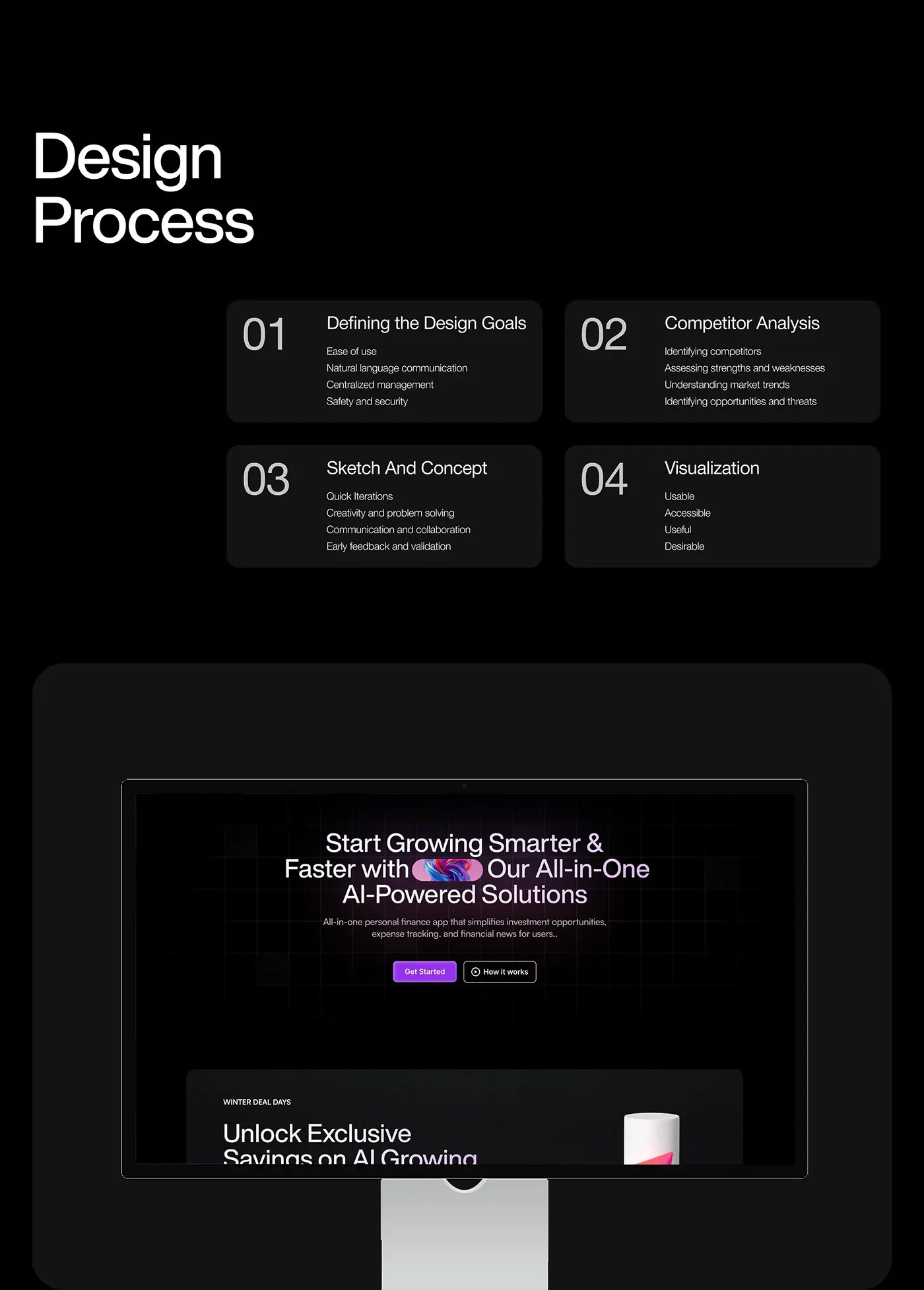
- The design goals: ease of use, natural language, centralised management, and safety.
- It had to stand apart from competing AI tools.
- It had to work on a phone too.
The process
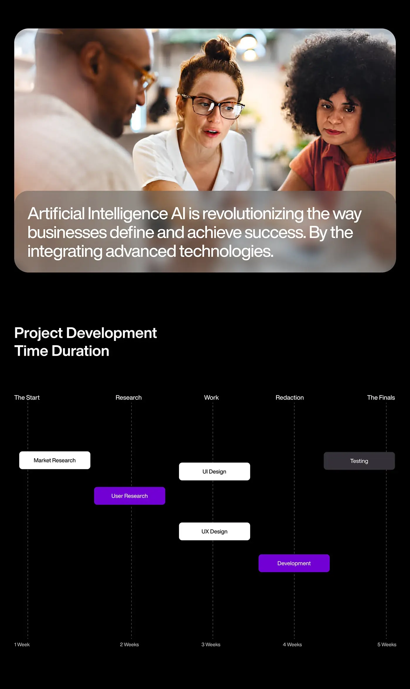
- Market research in week one, user research in week two.
- Design goals, then a competitor analysis: strengths and weaknesses, market trends, opportunities and threats.
- Sketches and concepts, with quick iterations and early feedback.
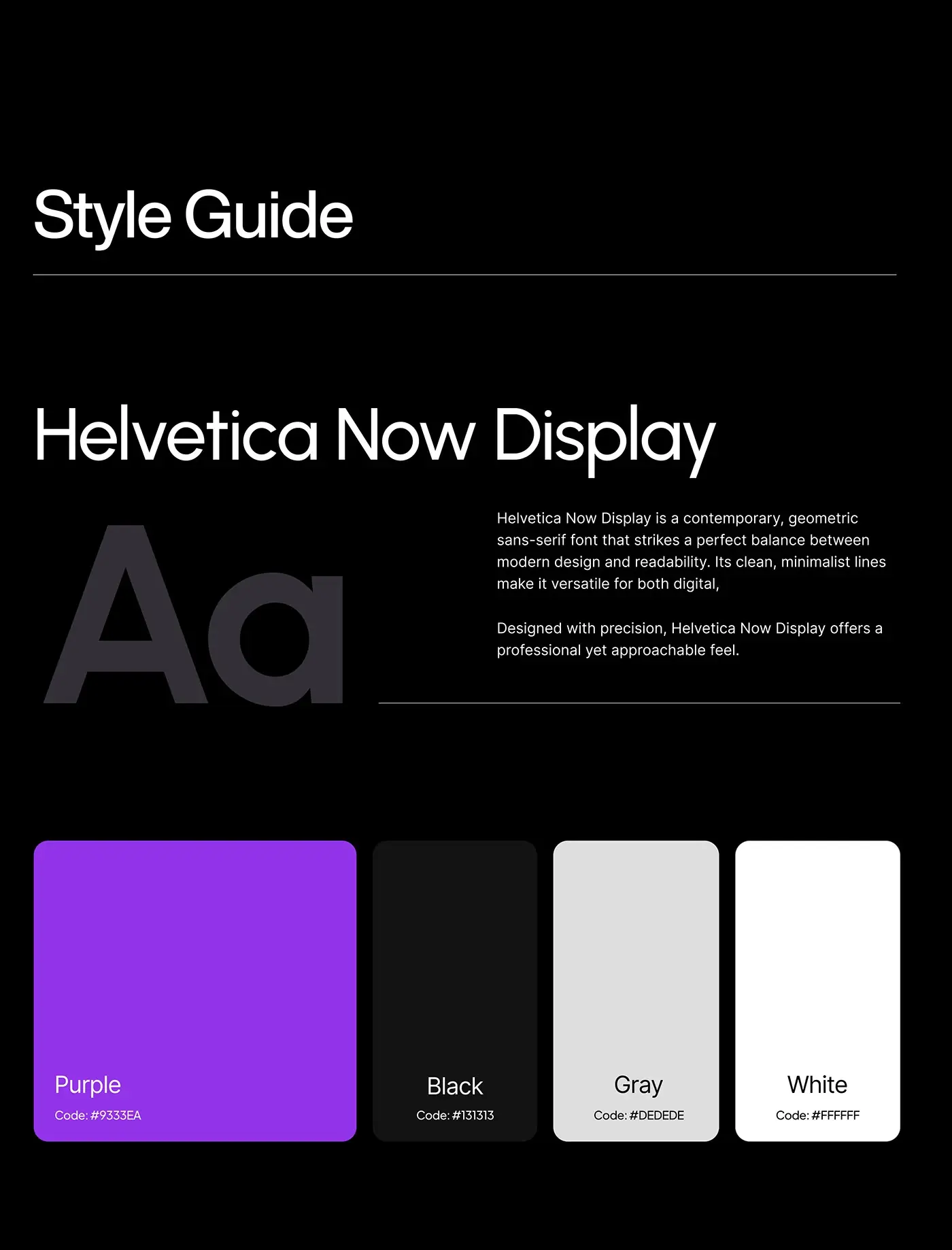
- Page design in week three, aiming for screens that are usable, accessible, useful and desirable, with a Helvetica Now Display and violet style guide.
- Development in week four and testing in week five.
The solution
I designed one dark, product-led page with a single violet accent.
Product-first hero
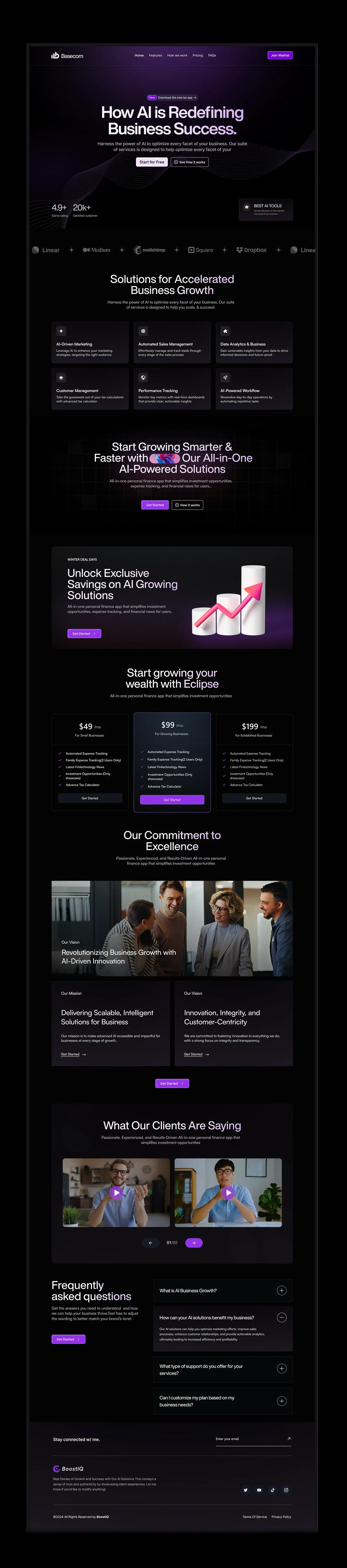
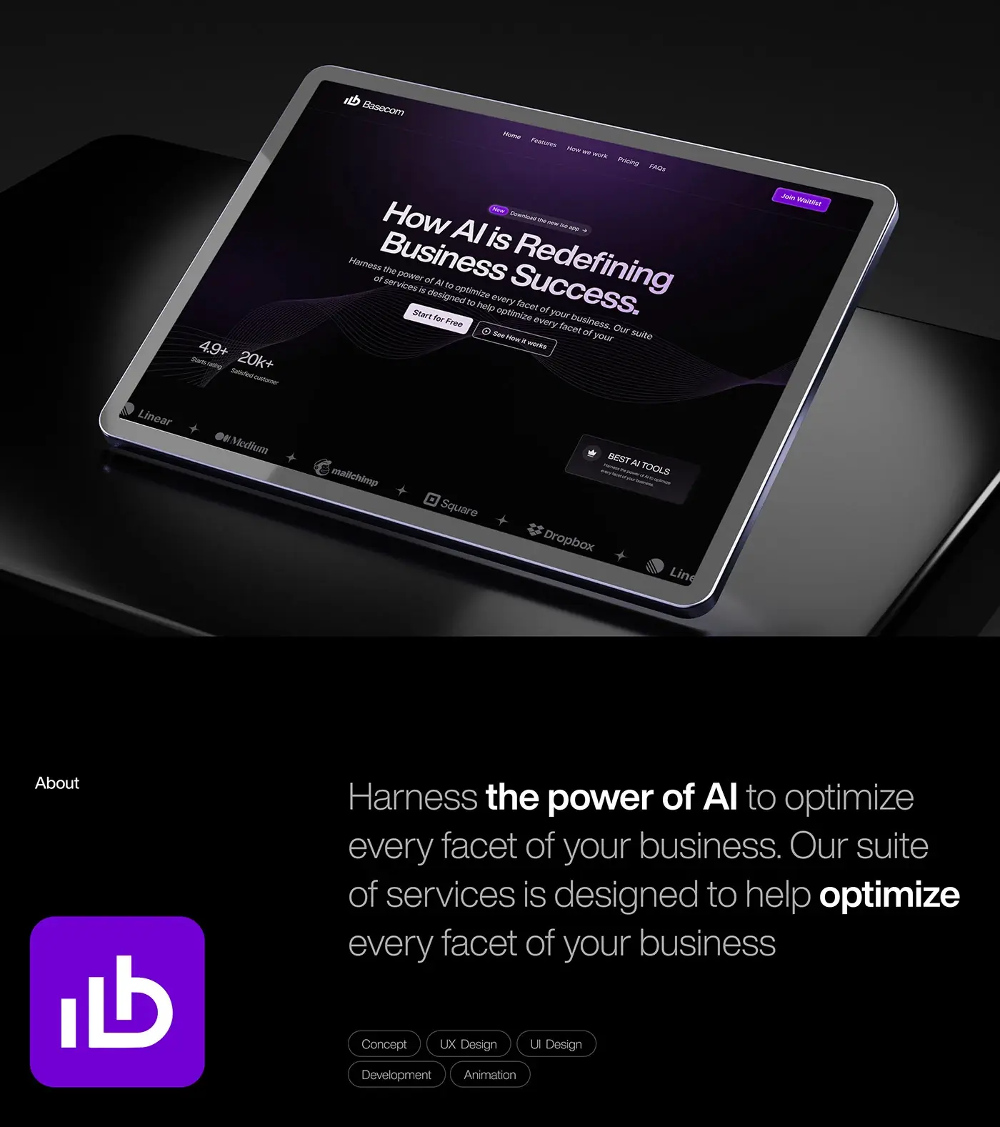
"How AI is Redefining Business Success" sits centred on near black, with a violet glow behind it and fine flowing lines below. A small New pill above the headline points to the iOS app. Start for Free is the filled button and See How it works the outlined one, so the promise and the next step sit above the fold. The menu keeps Home, Features, a process link, Pricing and FAQs, with Join Waitlist in violet on the right.
Proof under the hero
A star rating and a customer count sit at the bottom left of the hero, and a small Best AI Tools card sits at the bottom right. A strip of partner logos runs across the page just below. Putting this proof before any long copy answers the first doubt a visitor has about a new AI tool.
Six service cards
"Solutions for Accelerated Business Growth" leads a three by two grid of dark cards: AI-driven marketing, automated sales management, data analytics, customer management, performance tracking with real-time dashboards, and AI-powered workflow. Each card has one white icon, a title and one plain line. Equal cards keep the six services side by side, so no single feature reads as the whole product.
Call to action and offer
A second headline, about growing smarter and faster with one AI-powered toolset, sits on a faint grid with an inline gradient image between the words and Get Started and How it works buttons below. Under it, a seasonal offer banner pairs a short pitch with a 3D bar chart and a rising pink arrow.
Plans
Three plan cards sit side by side for small, growing and established businesses. The middle plan has a violet outline and the only violet Get Started button, so the recommended choice is clear without a badge. Each card uses the same checklist in the same order, so the plans compare line by line.
Vision, mission and client videos
Under a heading about commitment to excellence, a wide team photo carries the vision line, and two dark cards hold the mission and the principles behind it, each with a Get Started link. A client section follows as a video carousel: two framed clips with violet play buttons, arrows and a 01/05 counter. Video keeps the proof personal without long quotes.
FAQ, newsletter and footer
The FAQ is an accordion beside a short intro and a Get Started button, shown with one answer open. Below it, a newsletter row asks for an email in one field, and the footer holds social icons, terms and privacy links.
Mobile view
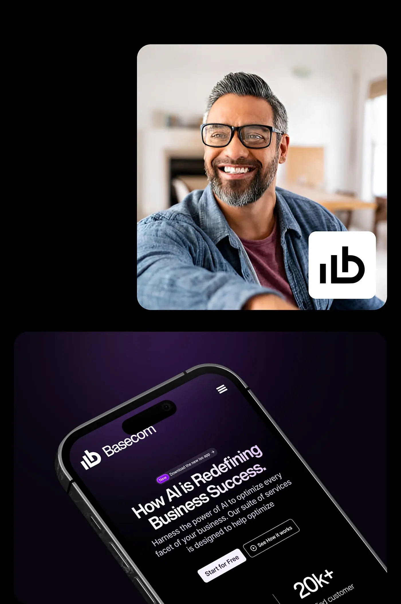
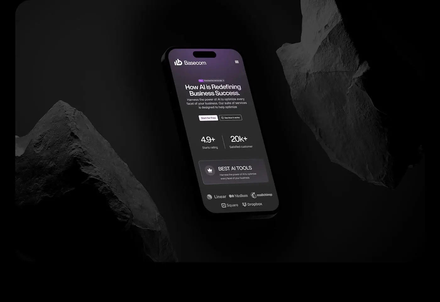
On a phone the hero stacks: the product name and menu icon, the New pill, the headline, the two buttons, then the rating and customer count side by side. The Best AI Tools card and the partner logos follow, wrapped onto two lines, so the proof still sits on the first scroll.
The result
- The full desktop landing page, from hero to footer, plus mobile views.
- A style guide: Helvetica Now Display with violet, black, grey and white.
- The design process and a five week timeline, in the presentation.
How it helps the client
The page lets a business owner see what the product does in a few seconds, then start for free or join the waitlist. Plain words and one accent colour keep attention on the product, not on AI buzzwords. That's the core of how I approach landing page design for AI products, and there are more examples in my AI case studies.