Overview
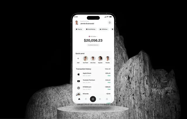
This delivery app design case study covers Shipora, a parcel delivery app: customers book a shipment, follow it live and pay, while admins run orders, pricing, support and refunds. I designed the mobile app, customer side and admin side, in 5 weeks.
Both sides run on a phone, so an admin can act on a failed order or a refund request away from a desk.
The challenge
Late parcels were costing Shipora trust, so every delivery had to be easy to book and to follow.
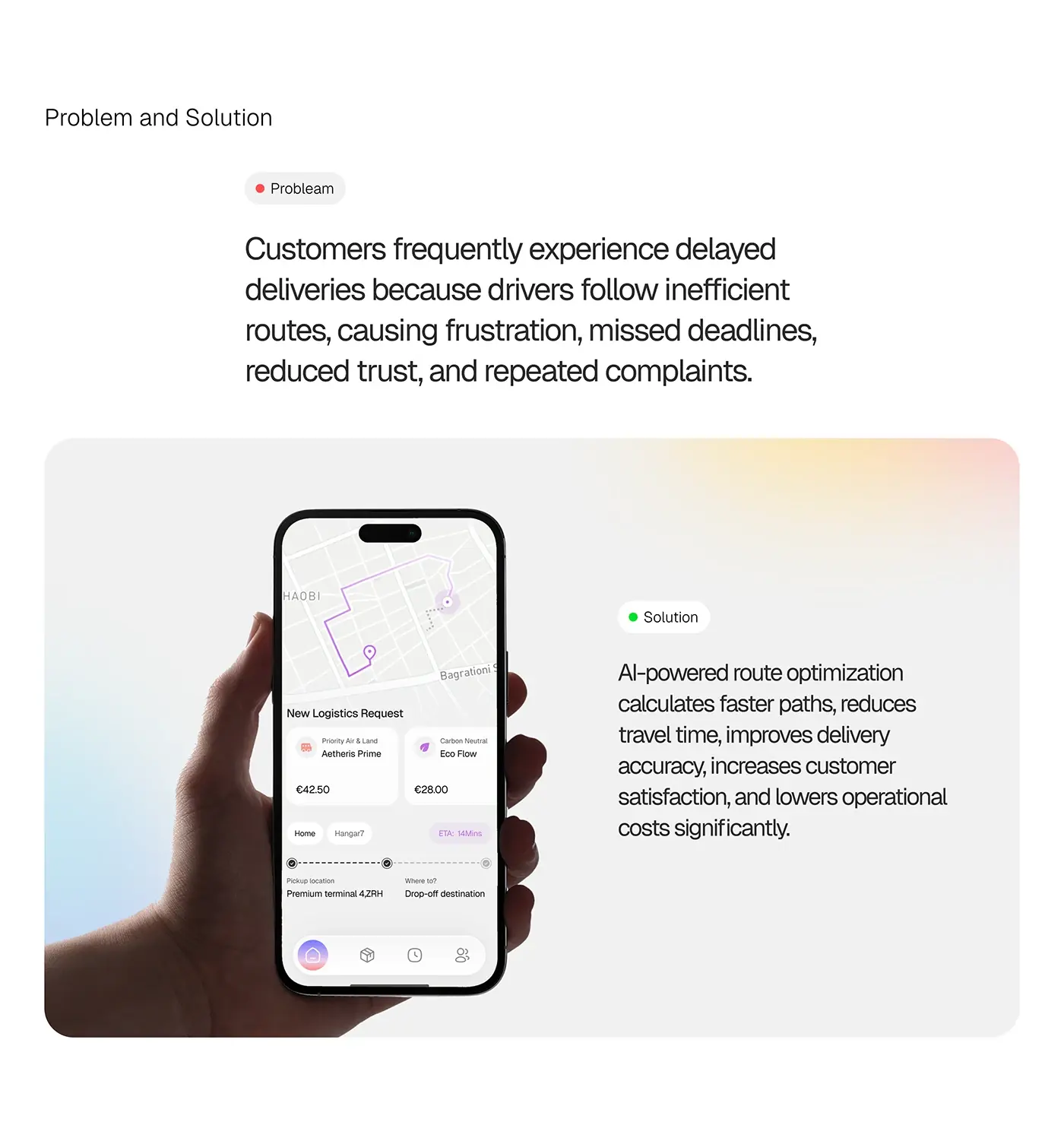
- Drivers on inefficient routes meant delayed deliveries, missed deadlines and repeated complaints.
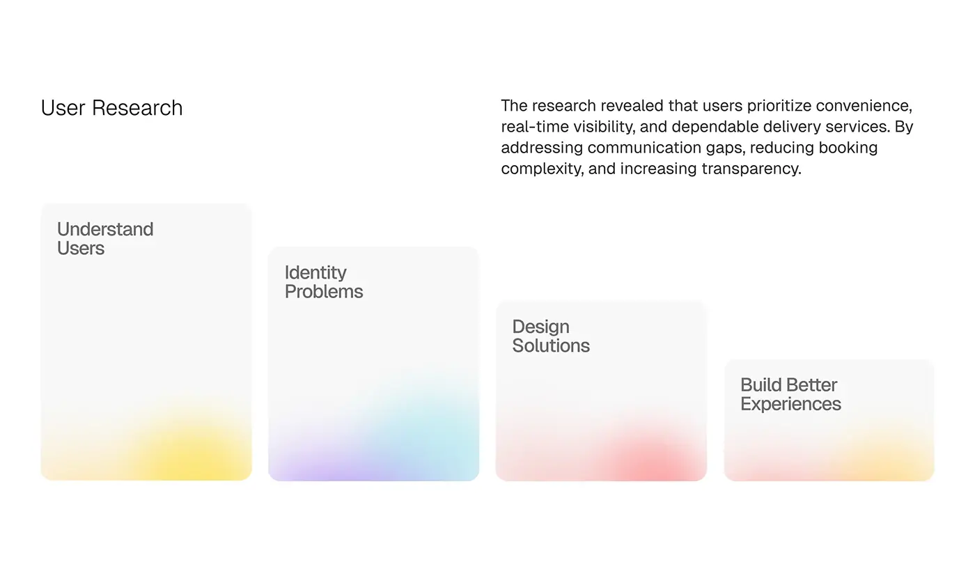
- Research showed customers want convenience, real-time visibility and dependable service.
- Complex booking and communication gaps left people guessing.
- Admins needed orders, drivers, pricing and refunds in one place.
The process
- User research into what customers value.
- Problem and solution: late deliveries from inefficient routes, answered with AI route optimisation.
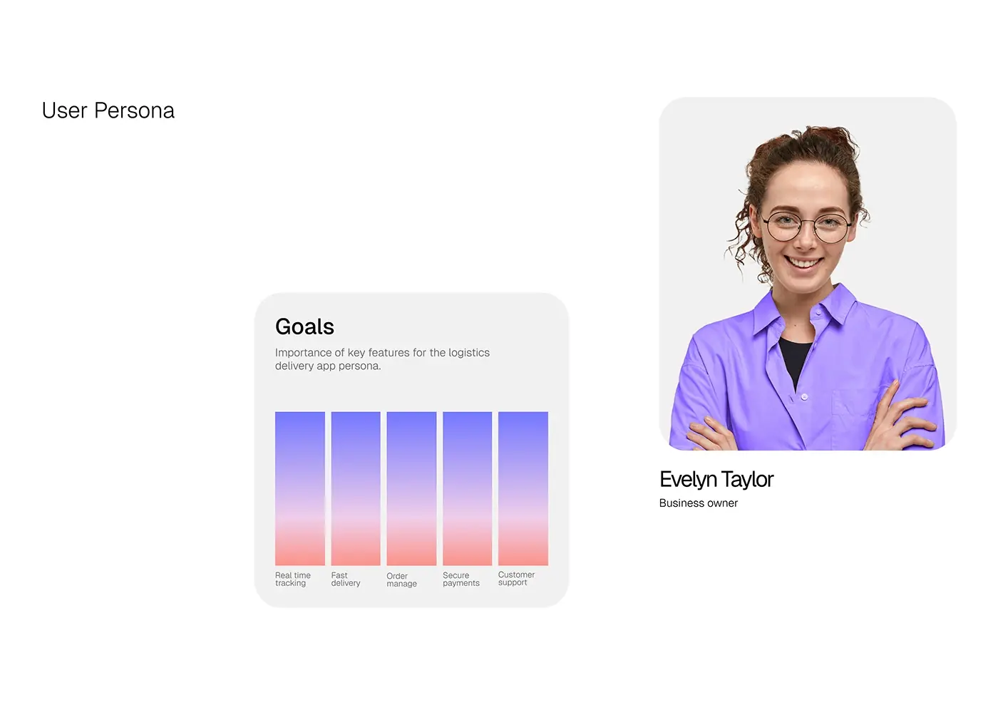
- A persona: Evelyn Taylor, a business owner, and her five goals.
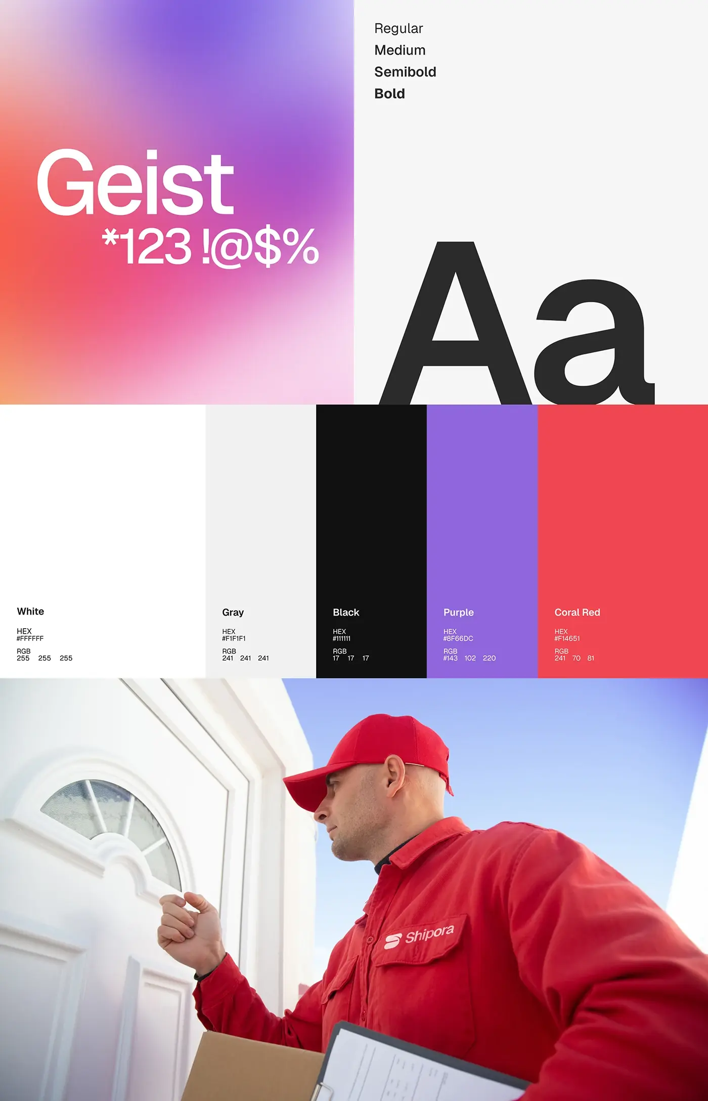
- Style guide: Geist in four weights, purple and coral red on white, grey and black.
- High fidelity customer, payment and admin screens.
The solution
The app puts the parcel's status first, wherever a customer might wonder where it is.
Onboarding
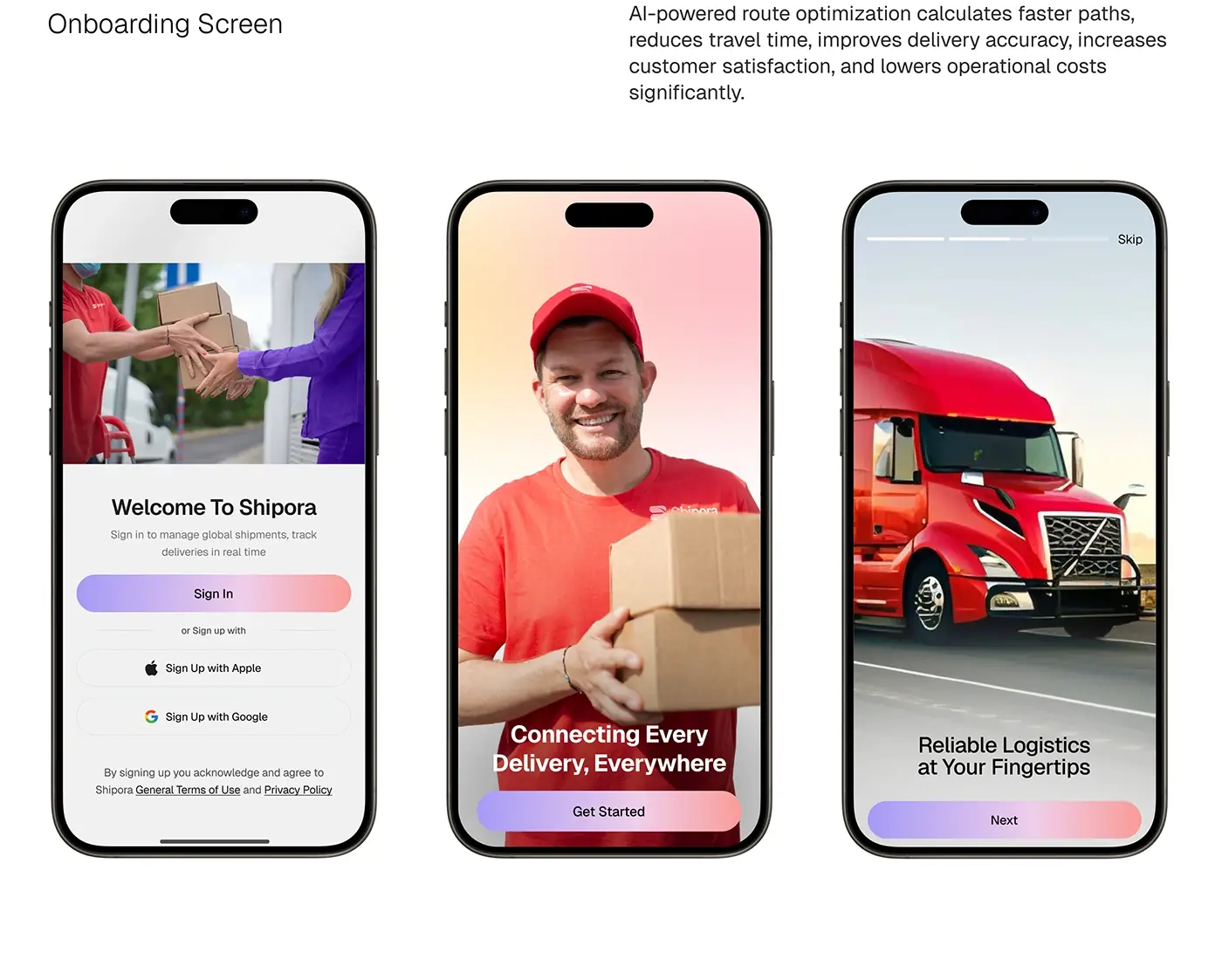
Two full photo intro screens, with a progress bar and a Skip link, lead to the welcome screen. Sign In comes first, with Apple and Google sign-up below. A returning customer is one tap from their parcels, and nobody fills in a long form before seeing the app.
Home and active shipments
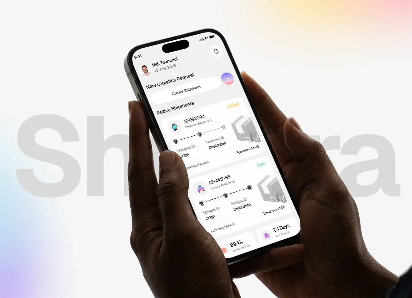
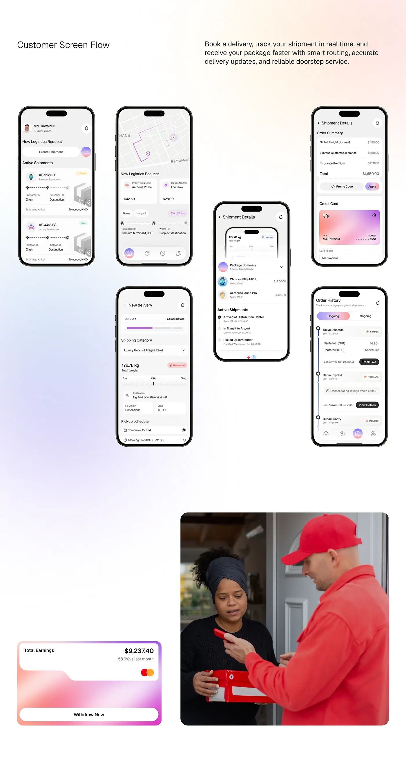
Home opens on a Create Shipment button, then one card per active parcel: shipment ID, item type, origin and destination on a dotted route line, a status tag such as In Transit or Done, and the estimated arrival. The question "where is my parcel?" is answered without a tap.
Booking in steps
A new request starts on a map with the route, pickup and drop-off fields and an ETA. Two service cards sit side by side, priority air and land or carbon neutral, each with its price, so choosing is a straight comparison. Package details is step 2 of 4: shipping category, a weight slider that flags a heavy load, dimensions, declared value, and a pickup date and slot.
Shipment details and checkout
Shipment details lists each item with its value, then a timeline of stops from courier pickup to the distribution centre, each with place and time. Checkout itemises freight, customs clearance and insurance above the total, with a promo code field and the saved card below, so people see what they pay for first.
Order history and live tracking
Order history stacks orders on a vertical line, each with a status tag (In Transit, Processing, Delivered), the route legs and an estimated arrival. Ongoing orders carry a Track Live button, the rest View Details, so the next action always matches the order's state.
Earnings and payouts
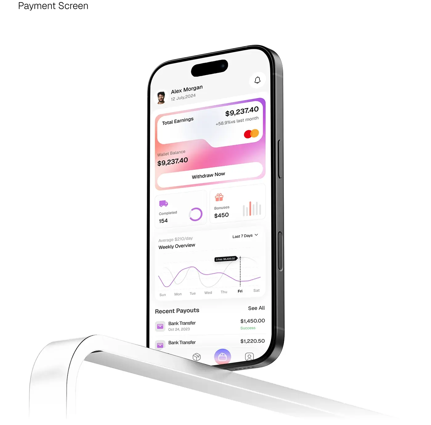
The payment screen puts total earnings and wallet balance on one card, with Withdraw Now right under them. Completed deliveries, bonuses, a weekly overview chart with a daily average and a list of recent bank transfer payouts with their status follow.
Admin: orders and live status
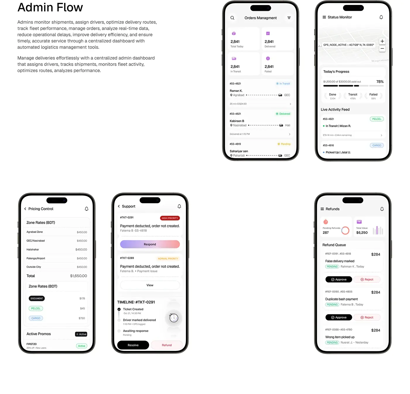
Orders management opens on four count cards: total today, delivered, in transit and failed. The order list below shows ID, customer, route and status. The status monitor pairs a live map with today's progress and a live activity feed tagged by parcel type.
Admin: pricing, support and refunds
Pricing control lists zone rates, rates by parcel type (document, parcel and cargo) and active promo codes. Each support ticket carries a priority tag, a timeline from ticket created to driver marked delivered, and Resolve or Refund buttons. The refund queue lists each request with its reason and Approve or Reject side by side.
The result
- The customer app: onboarding, home, booking in steps, shipment details, checkout and order history.
- The admin flow: orders, status monitor, pricing control, support and refunds, plus a payment screen with earnings, wallet balance and payouts.
- A UI style guide for type and colour, and the full presentation.
How it helps the client
The design lets a customer book a parcel in a few steps and check where it is without calling anyone. Admins see failed orders, open tickets and pending refunds in one app, so a problem reaches someone who can fix it. That's the thinking behind my product design for delivery apps. See more in my mobile app case studies.