Overview
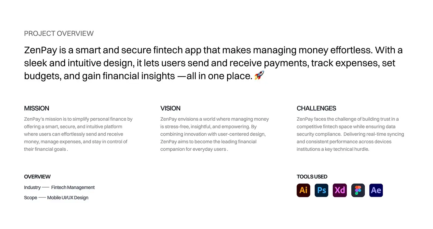
This fintech app design case study covers ZenPay, a mobile wallet for sending and receiving payments, tracking expenses and setting budgets in one place. I designed the mobile app, from personas and user flow to the final screens, and a landing page that sells it.
The challenge
Money apps run on trust, and the deck set out what that meant.
- Earn trust in a crowded fintech market while meeting data security rules.
- Keep balances and activity consistent across devices.
- Let a busy user send money and check spending quickly.
- Give a freelancer paid by several clients one clean record.
The process
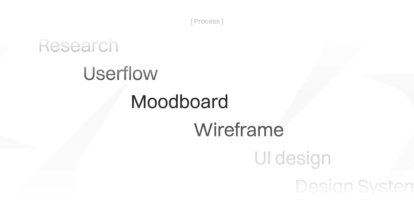
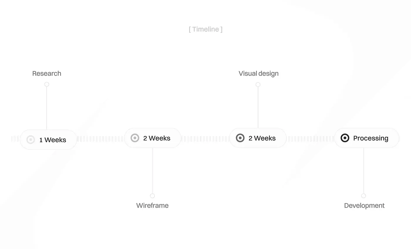
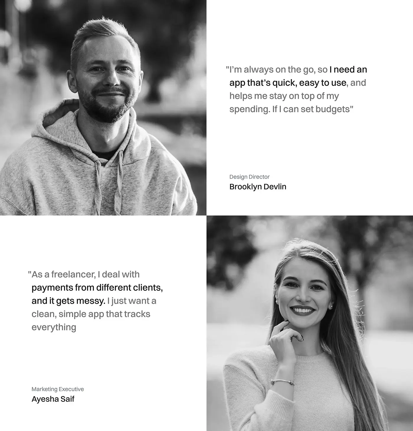
- Research, 1 week: personas for a busy professional and a freelancer.
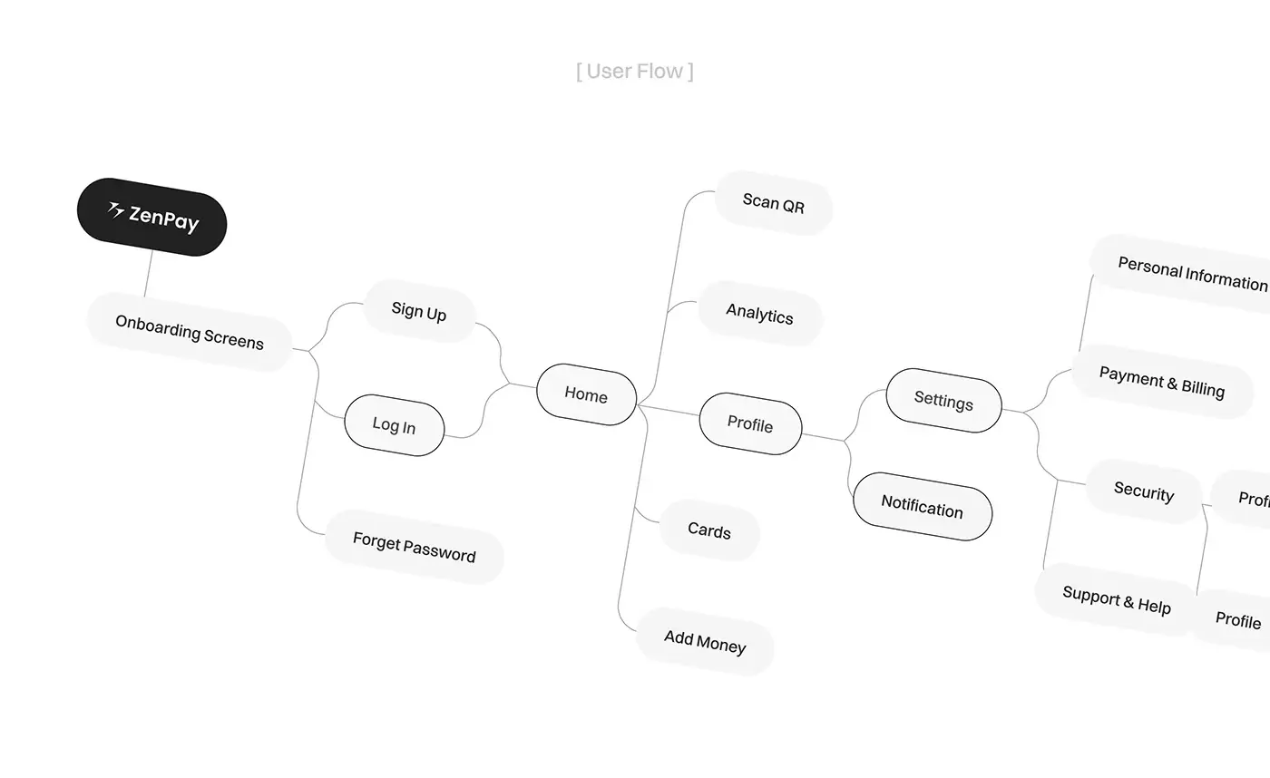
- User flow: from onboarding and log in to home, then out to scan QR, analytics, cards, add money and a profile with its settings.
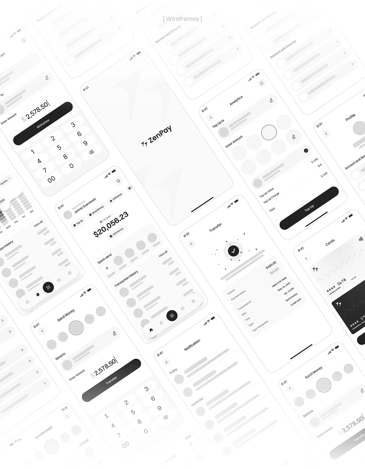
- A moodboard, then wireframes, 2 weeks: greyscale layouts for withdraw, send money, transfer receipt, cards, notifications, analytics and profile.
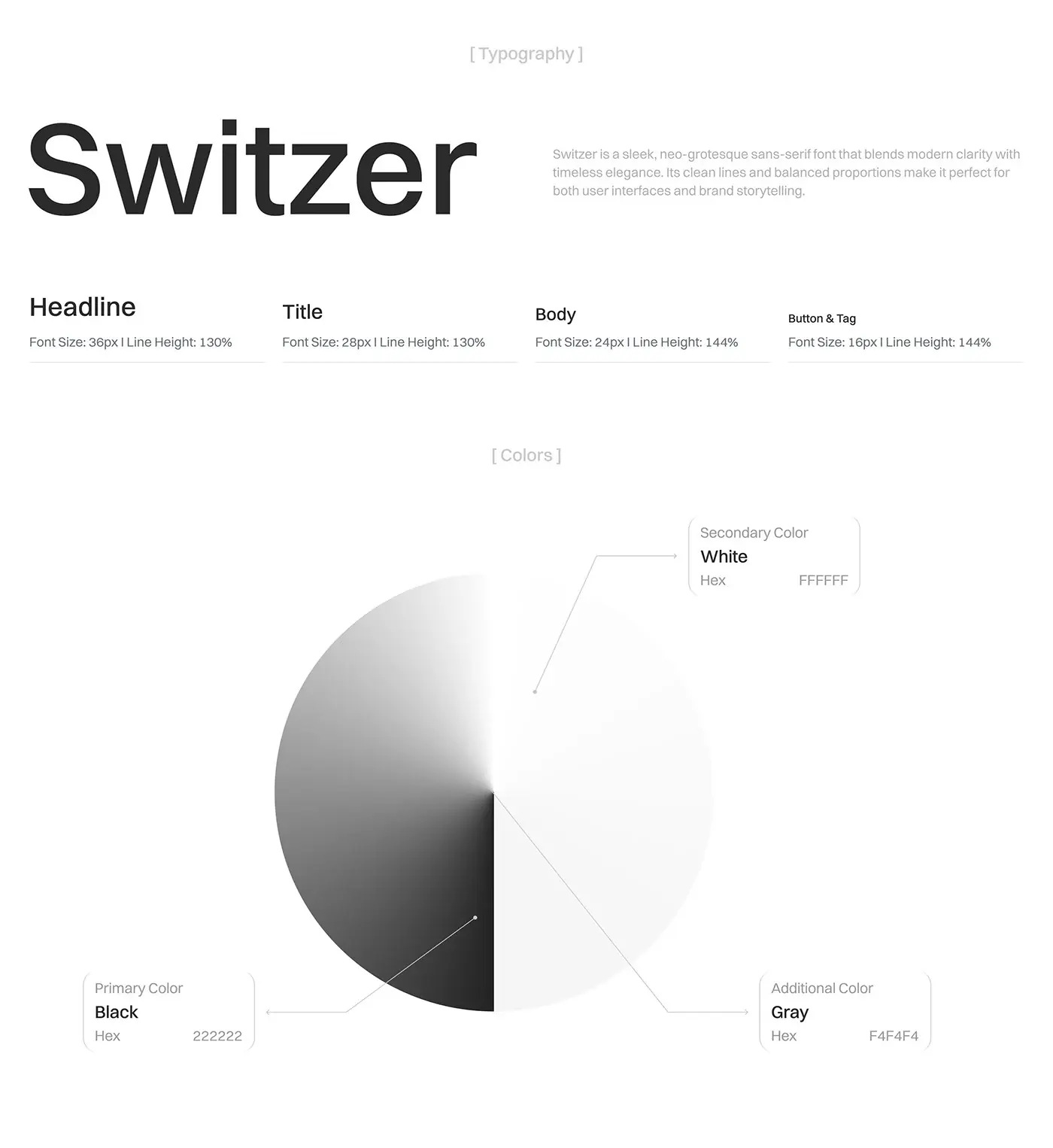
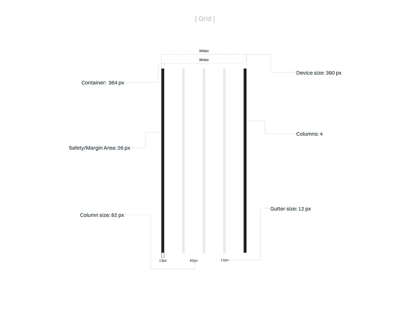
- Visual design, 2 weeks: Switzer type from a 36 px headline down to 16 px buttons and tags, a monochrome palette of near black, white and light grey, and a 4 column grid on a 390 px screen with 12 px gutters.
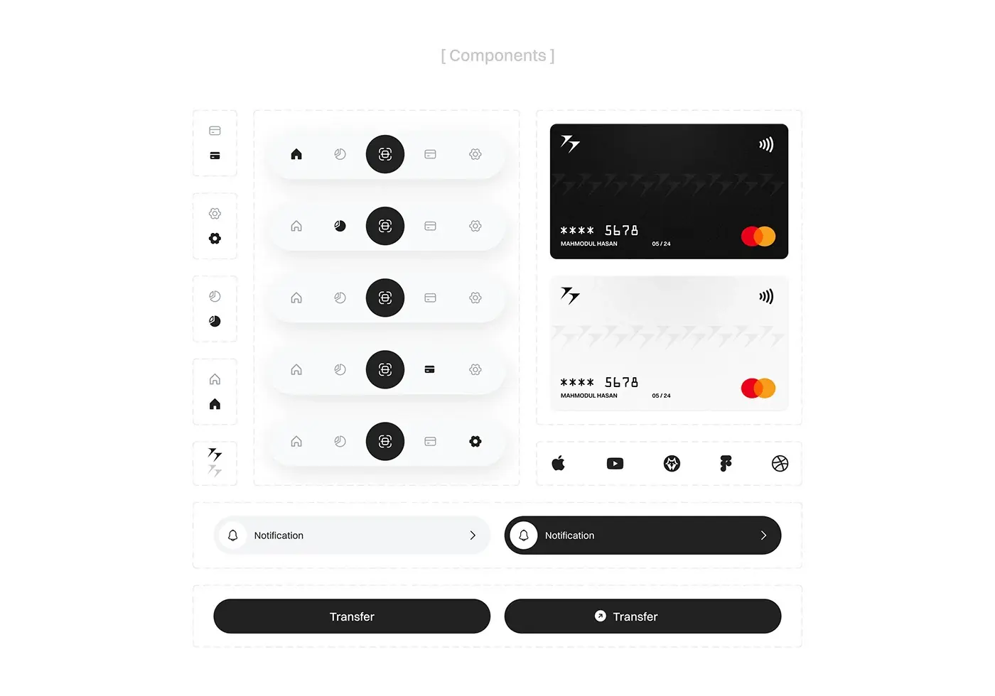
- A design system of reusable components: the bottom bar in each active state, card faces, notification rows and buttons.
The solution
Every screen that moves money follows the same order: who, how much, what it costs, then confirm.
Home and balance
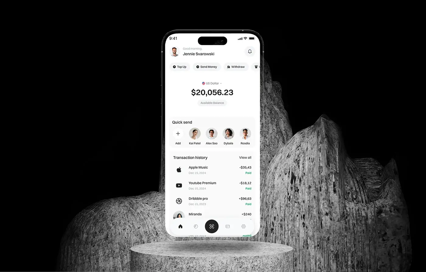
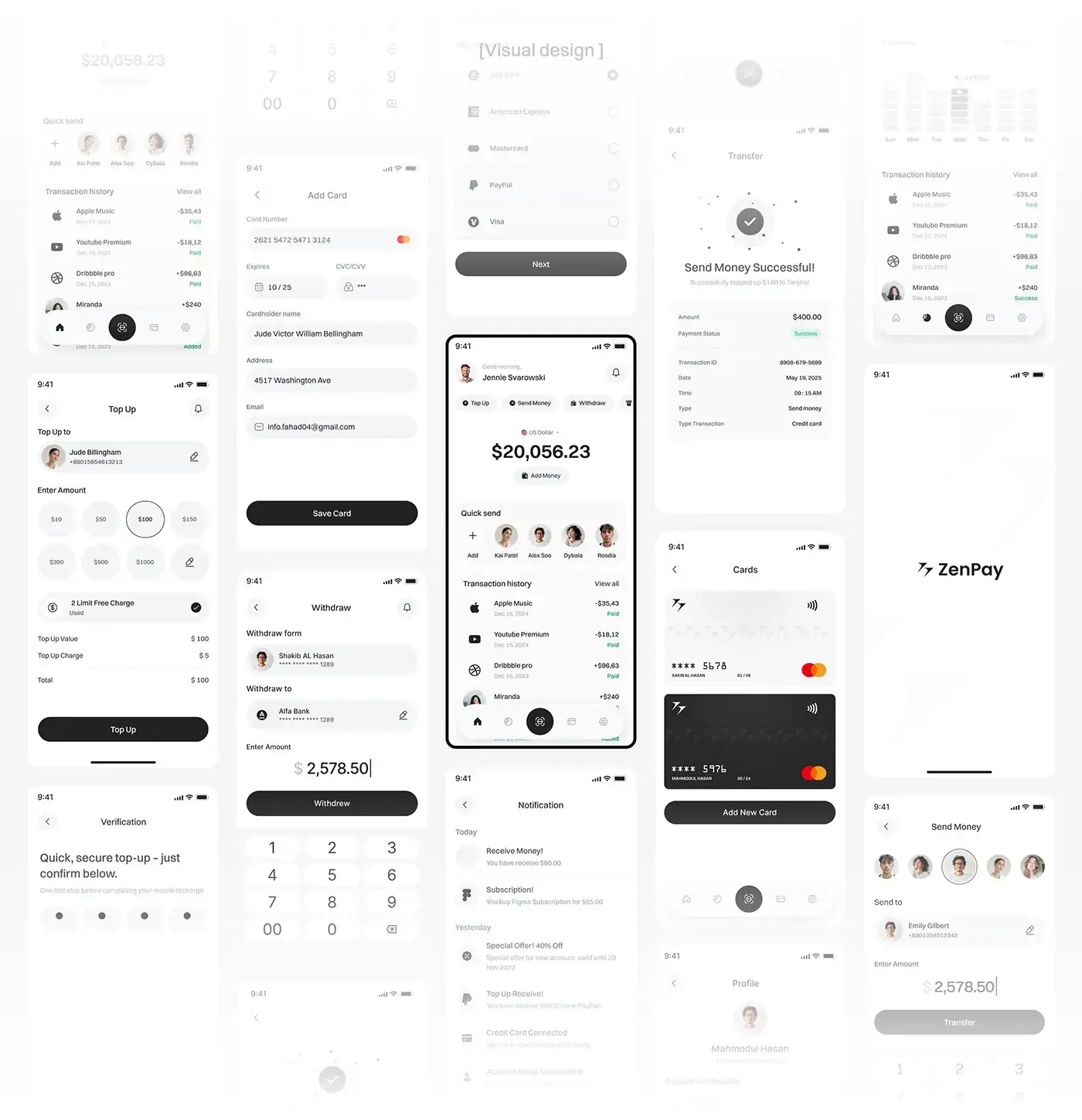
Home opens with a greeting, then Top Up, Send Money and Withdraw as chips across the top, because that's why people open the app. The available balance sits in the centre in large type. Below come a quick send row of recent contacts and the transaction history, each line marked Paid or Added. The bottom bar puts a round scan button in the middle, within reach of the thumb.
Send money, top up and withdraw
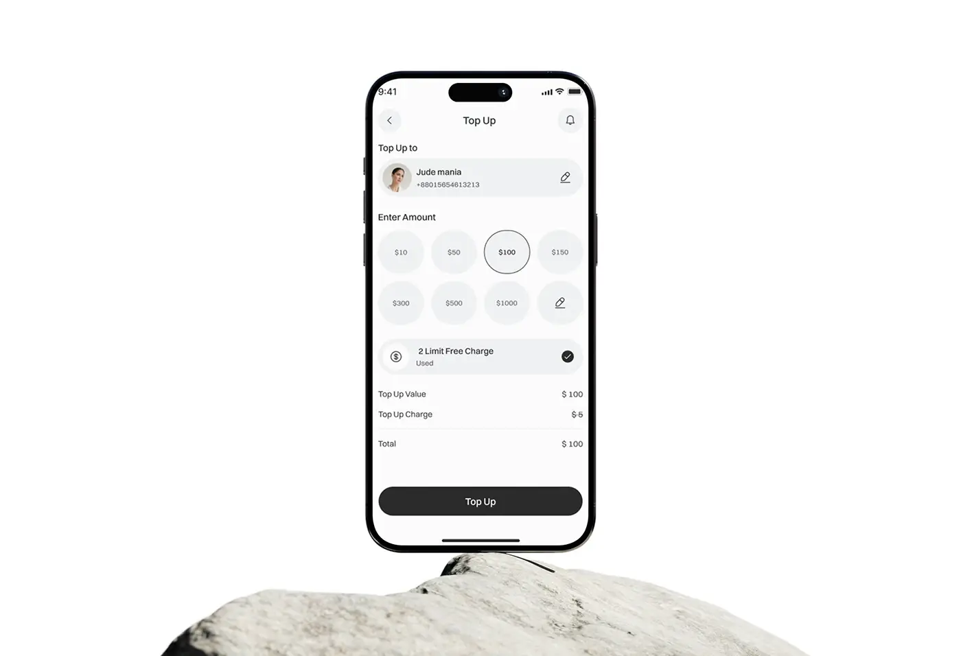
Each flow starts with the person or account, shown as a card you can edit. Top up offers a grid of preset amounts plus a custom option; send and withdraw use a large keypad. Before the button, the screen lists the value, the charge and the total, and top up strikes through the fee when a free charge applies. Nobody meets a surprise fee after tapping.
Verification and receipts
Paying needs a PIN on a calm verification screen with one line of reassurance and four dots. After it, a success screen shows the amount and a receipt with payment status, transaction ID, date, time and type. Every payment leaves a record the freelancer persona can find later.
Cards and payment methods
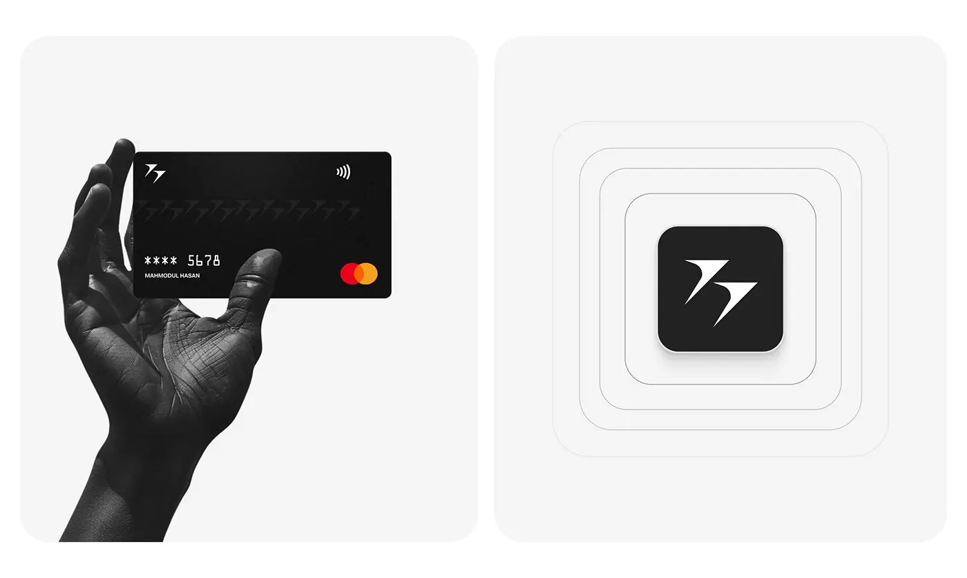
The cards screen stacks a light and a black card with the last four digits and expiry, and an Add New Card button underneath. Adding a card is one form: number, expiry, CVC, cardholder name, address and email, then Save Card. A separate screen lists the payment methods, each with a radio button, before Next.
Analytics and notifications
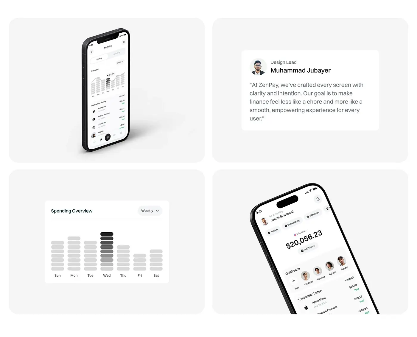
Analytics splits earning and spending into two tabs, with a weekly filter and a bar chart that darkens the selected day. The transaction history repeats underneath, so a spike in the chart can be checked against the payments behind it. Notifications are grouped into Today and Yesterday: money received, subscriptions, offers, top ups and newly connected cards.
Landing page
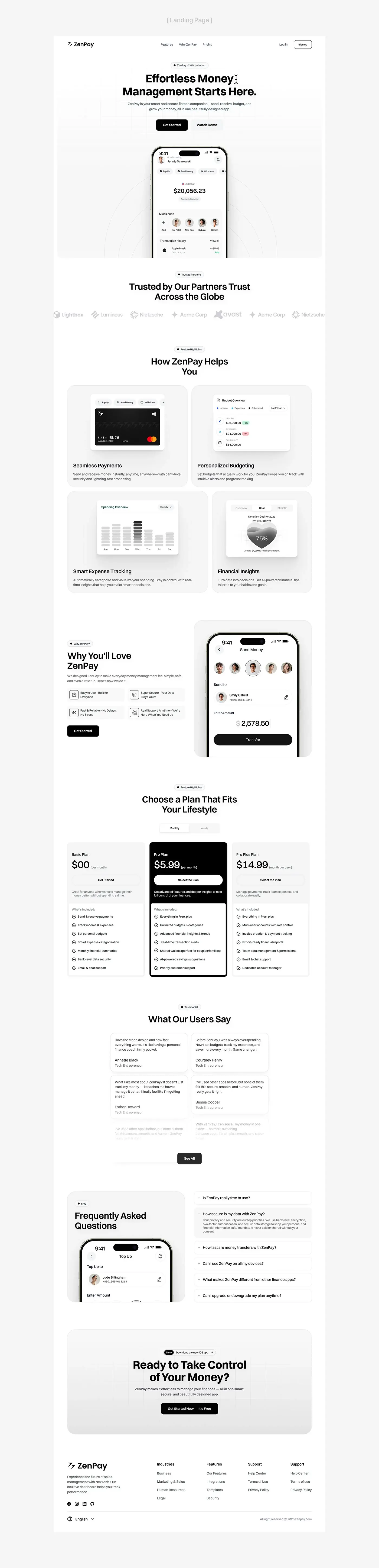
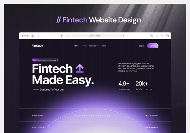
The landing page leads with one promise, Get Started and Watch Demo buttons, and the home screen in a phone. Four feature cards follow (payments, budgeting, expense tracking and insights), each illustrated with a piece of the app's interface, then four reasons to choose ZenPay beside the send money screen. A plan section with a monthly and yearly toggle, user quotes, an FAQ and a closing call to action finish it.
The result
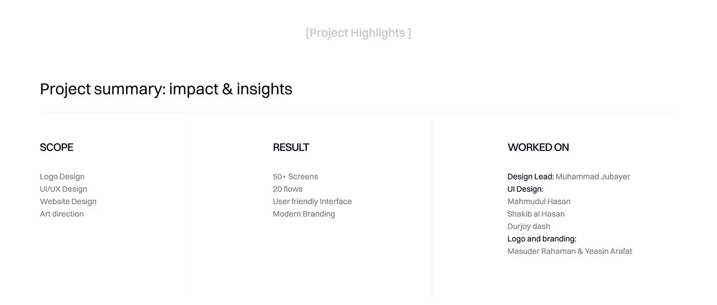
- The mobile app, listed in the project summary as 50+ screens across 20 flows.
- A design system: Switzer type scale, monochrome palette, grid and components.
- A landing page with feature cards, an FAQ and a closing call to action.
How it helps the client
ZenPay can ask for trust one step at a time: users see the charge before they pay, confirm with a PIN and get a receipt after. Busy users and freelancers get balance, history and spending in one place, and the shared grid and components mean new flows can be added without the app drifting. For more work like this, see my fintech case studies. Building something similar? See how I approach product design for fintech apps.