Overview
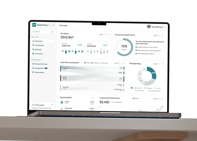
This fintech SaaS website design case study covers a product site for a fintech SaaS that offers payments, banking services, personal finance and data analytics, with an app for iOS and Android. I designed the homepage for desktop and mobile in a dark, product-led style, ready for a Webflow build.
The challenge
A fintech homepage has seconds to earn trust, so the design had four jobs.
- Land one promise, "Fintech made easy", before anything else.
- Make four services read as one product, not a list.
- Show the analytics product instead of describing it.
- Keep a dark, glowing look readable on a phone.
The process
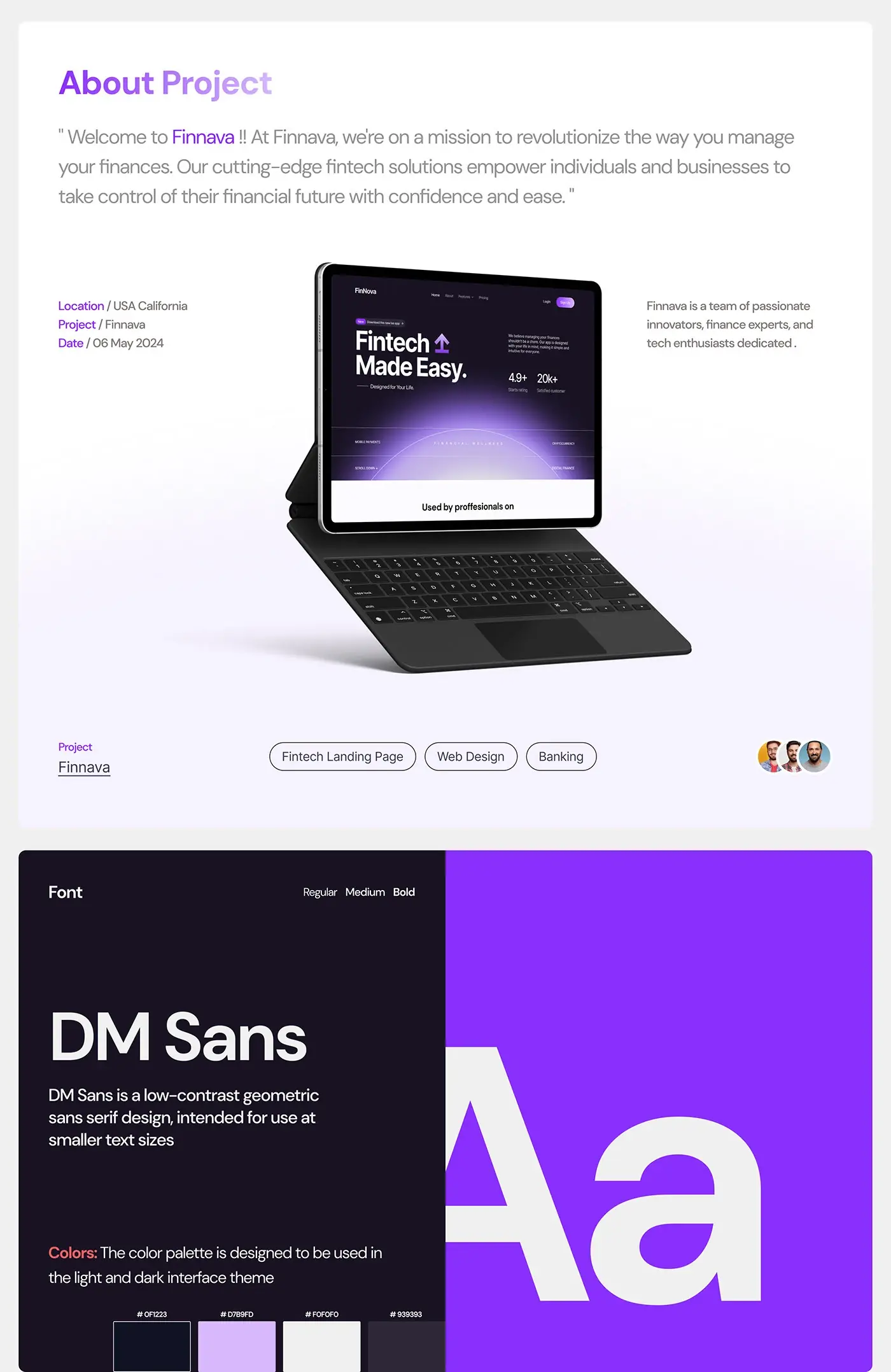
- A style guide: DM Sans in three weights and a palette for light and dark themes, built from a deep navy, a soft lavender, an off white and a mid grey, with a strong purple for actions.
- The homepage in high fidelity on desktop, from hero to footer.
- Mobile layouts for every section, planned for a Webflow build.
The solution
The page answers a buyer's questions in the order they tend to ask them: what is it, who uses it, what does it do, what does it cost, and how do I start.
Hero
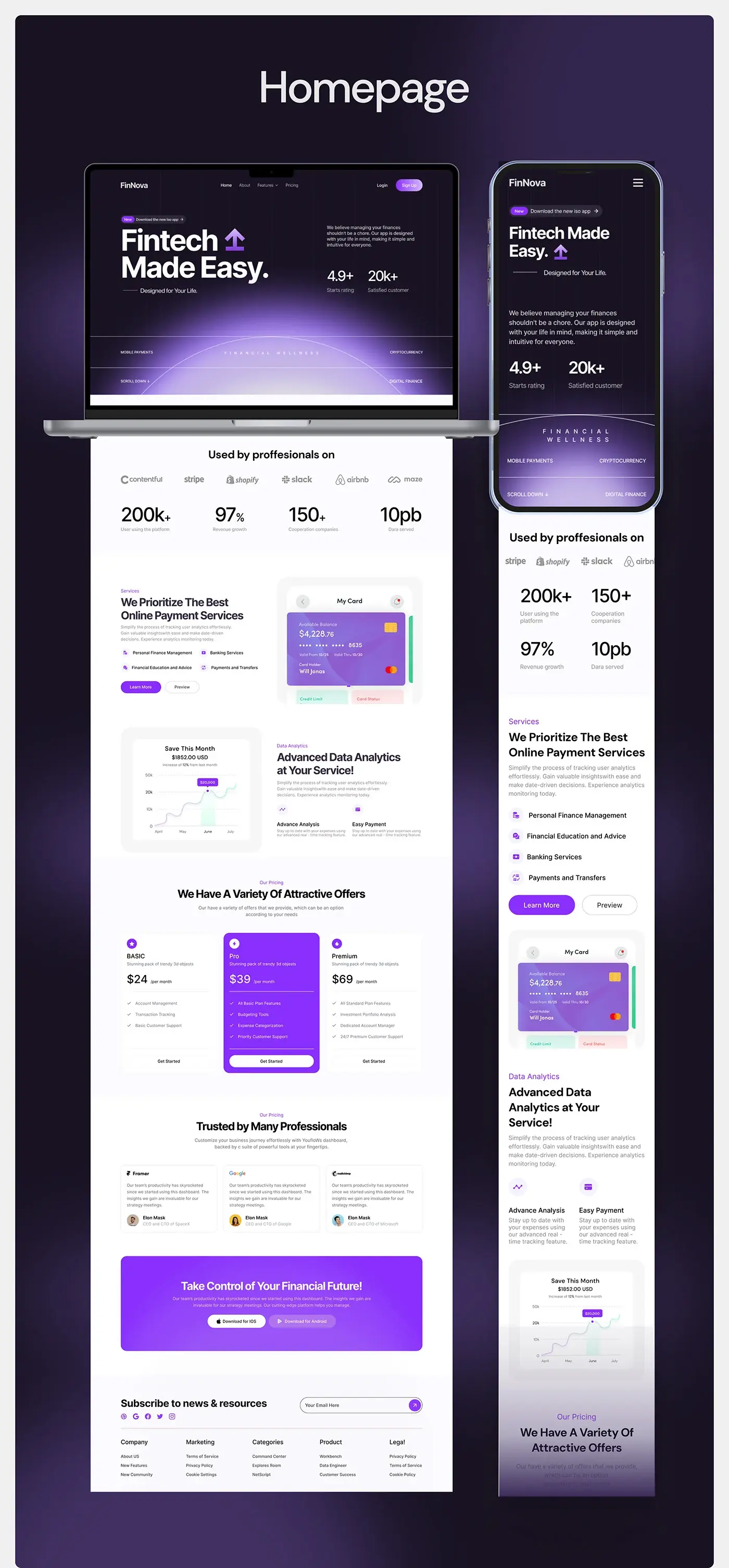
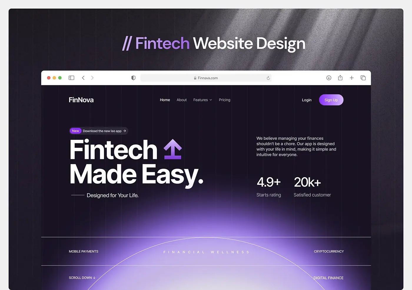
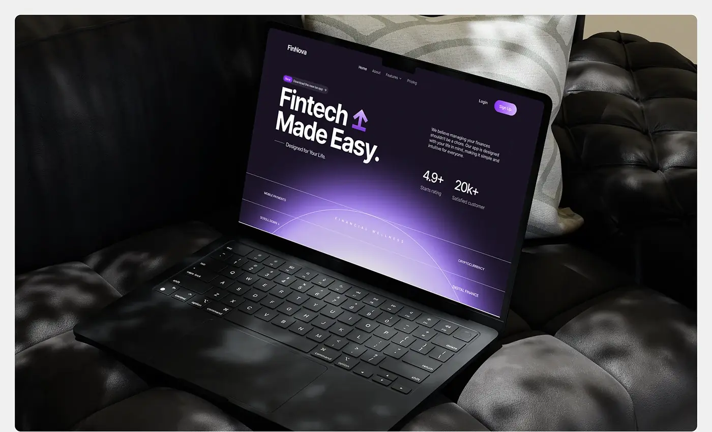
"Fintech Made Easy." sits in heavy white type with a purple arrow, over a deep navy background with faint vertical lines and a purple glow rising from the bottom. A pill above it points to the new iOS app. On the right, two sentences of promise and two large figures give the eye somewhere to go next. A band of four labels, mobile payments, cryptocurrency, digital finance and financial wellness, names the scope before the first scroll.
Logo row and figures
Straight under the hero, the page turns white for a "used by professionals" logo row and four large figures with short captions. Placing them here means trust comes before the pitch, and the switch from dark to light marks the move from promise to proof.
Services and card interface
The services section, pitched on online payments, lists the four services with small purple icons: personal finance management, banking services, financial education and advice, and payments and transfers. Learn More and Preview buttons sit underneath. Beside them, a card interface shows the available balance, the masked card number, and tabs for credit limit and card status, so the list of services is backed by a screen from the product.
Data analytics
The analytics section flips the layout: a savings chart card on the left with the month's total, its change from last month and a highlighted peak, and the heading "Advanced Data Analytics at Your Service!" on the right. Two short points, advance analysis and easy payment, explain what the chart is for. The product is shown at work rather than described.
Pricing and testimonials
Three plan cards sit side by side with a feature list and a Get Started button on each. The middle plan is filled purple so it reads as the default choice without hiding the other two. Below, "Trusted by Many Professionals" carries three quote cards, each with a company mark, the quote, a photo and a name.
Download band and footer
The page closes on a purple panel, "Take Control of Your Financial Future!", with Download for iOS and Download for Android buttons, so app installs get their own call to action. A newsletter sign-up with social icons and a five column footer for company, marketing, categories, product and legal links finish it.
Mobile layout
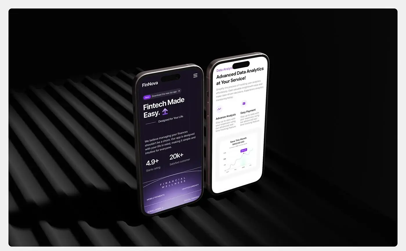
On a phone the hero stacks in reading order: the pill, the headline, the tagline, the promise, the two figures and the label band, with a menu button in place of the links. The figures become a two by two grid, the services list comes before the card interface, and the analytics copy comes before its chart, so each section still leads with words.
The result
- The homepage for desktop and mobile.
- A style guide: DM Sans in three weights and a palette for light and dark themes.
- Layouts ready for a Webflow build.
How it helps the client
The client gets a homepage that makes one promise, backs it with product screens and sends visitors to sign up or download the app. Because the palette works in both themes, the light sections sit inside the dark page without breaking it. For similar projects, see my fintech case studies. Need a site like this? Here's how I approach website design for fintech companies.