Overview
FinFuse is a fintech company that presents itself as a secure, trusted financial partner. For this fintech landing page design I worked from the visual direction to the full page, on desktop and mobile, with the typography and colour palette behind it.
The page runs from a hero with a real face to an FAQ that answers the usual worries about security, fees and devices. I made it in Figma and Photoshop.
The challenge
Trust is the product in fintech, so the page had to earn it before asking anyone to sign up.
- Visitors need a clear promise and a real person in the first screen.
- The main offers (secure savings, instant access, fraud protection) have to read in seconds.
- Common worries about security, fees and devices need answers on the page itself.
- The look had to be modern and clean, never gimmicky.
The process
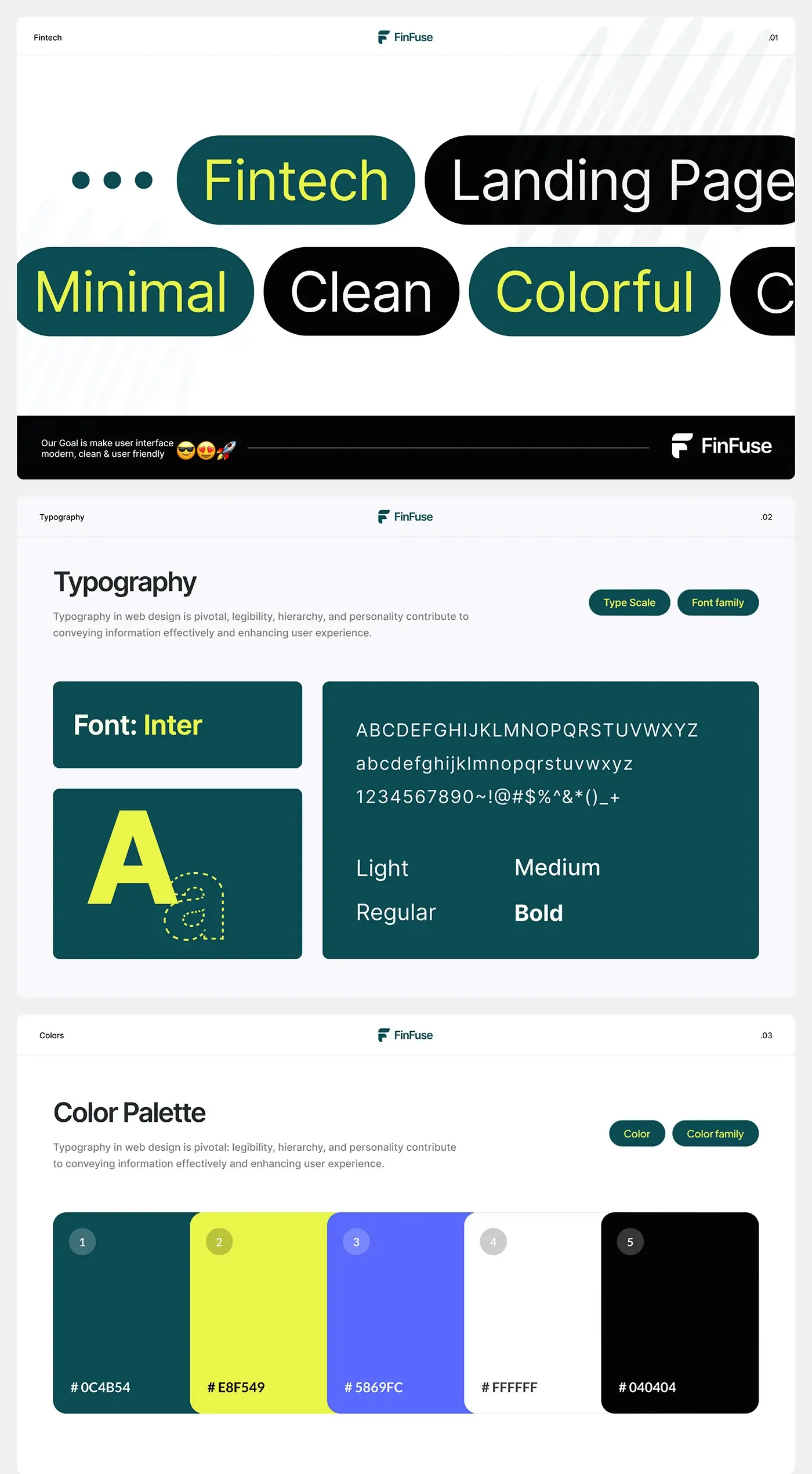
- Visual direction: minimal, clean and colourful, for an interface that feels modern and user friendly.
- Typography: Inter in light, regular, medium and bold, with a type scale.
- Colour: deep teal (#0C4B54), lime (#E8F549), a bright blue (#5869FC), white and near-black (#040404).
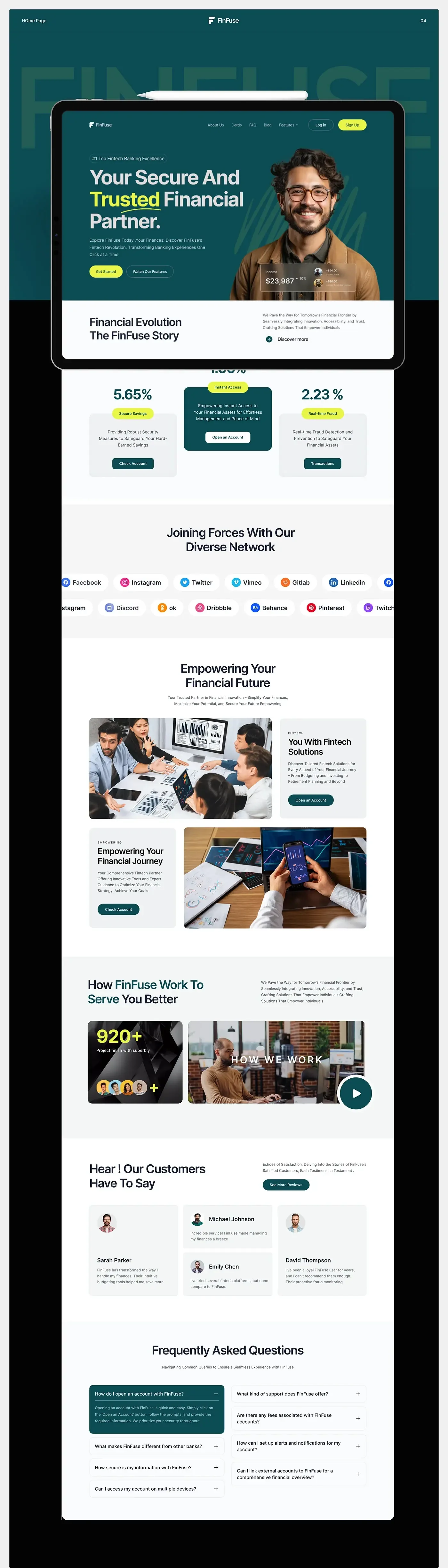
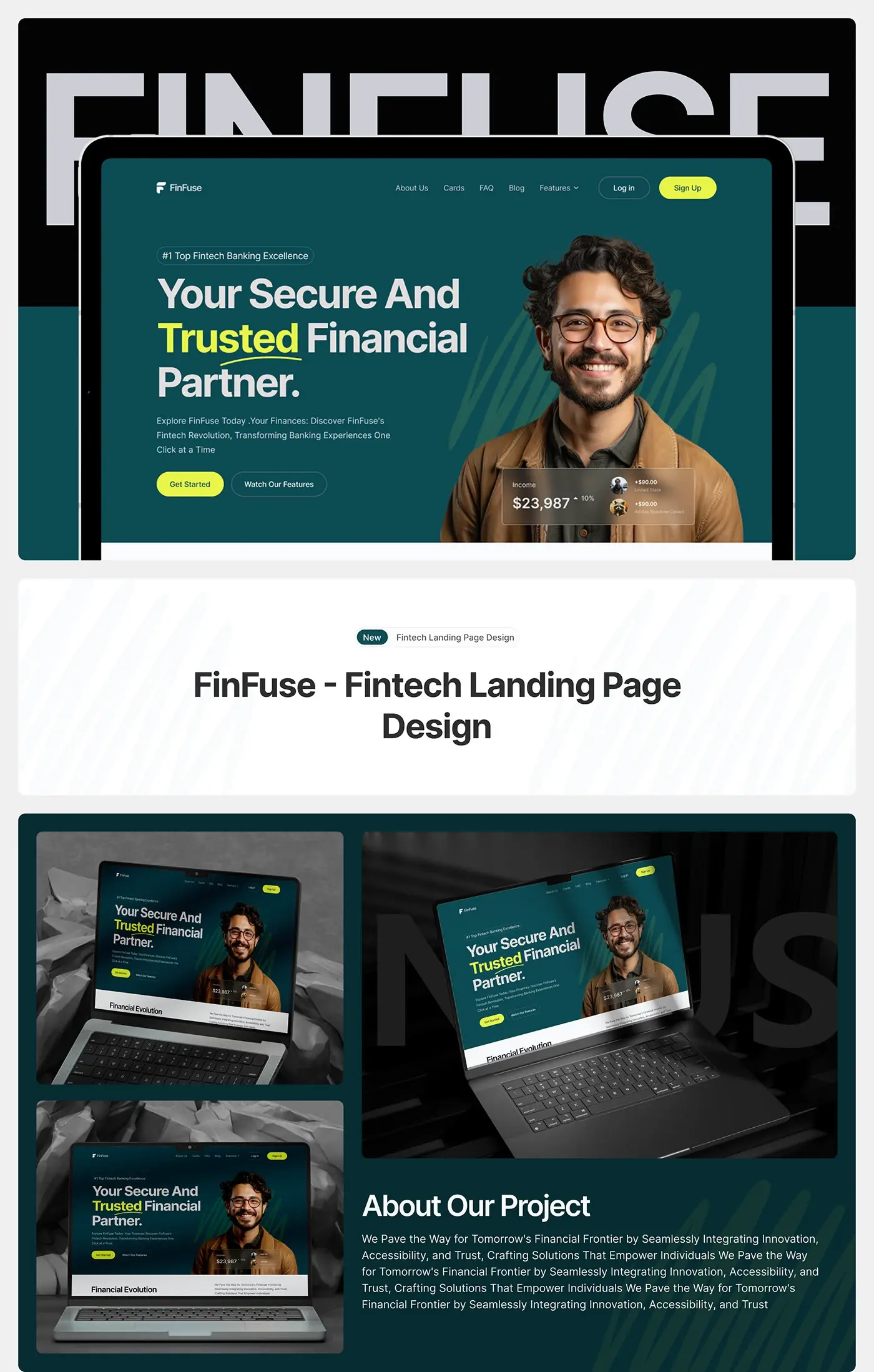
- The full landing page, section by section, presented in a tablet frame.
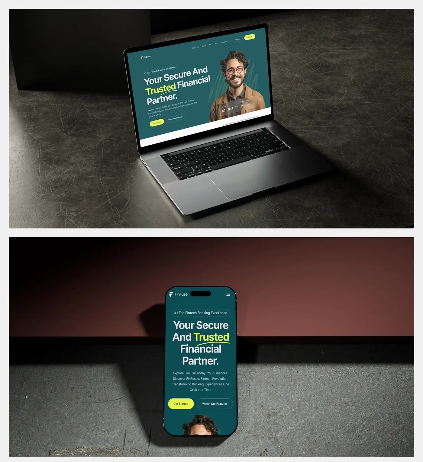
- A mobile hero, then laptop and phone mockups.
The solution
The page sits on deep teal with lime for actions and highlights, and every section says one thing.
Hero with a real face
"Your Secure And Trusted Financial Partner." sits on the left, with "Trusted" picked out in lime and underlined. A smiling portrait fills the right, with a translucent income card over it showing a balance, its change and two recent payments. Under the copy, Get Started is a lime button and the features video a quieter outlined one. A real face and a live-looking number show the product in use before the copy has to explain it.
Offer cards
Under a short strip for the FinFuse story, with a Discover more link, three cards present the core offers: Secure Savings, Instant Access and Real-time Fraud detection. Each has a lime label, one line of explanation and its own button: Check Account, Open an Account or Transactions. The middle card is filled teal so opening an account leads, while the side cards stay light grey.
Network and solution cards
A network section runs two offset rows of platform pills, from Facebook and LinkedIn to Discord and Behance. Then "Empowering Your Financial Future" pairs two photos with two solution cards in a checkerboard: one for tailored fintech solutions with Open an Account, one for the wider financial journey with Check Account. The alternating layout keeps a text-heavy section easy to scan.
How it works and reviews
The how it works section sets a short paragraph beside a dark count card and a video thumbnail with a large teal play button. Customer reviews follow in a staggered grid of four cards, each with a face, a name and a short quote, plus a See More Reviews button. The staggered heights stop the grid reading like a table and give longer quotes room.
FAQ on the page
Eight questions sit in two columns of accordions, with the first one open and filled teal: how to open an account. The rest cover what makes FinFuse different from other banks, security, multiple devices, support, fees, alerts and notifications, and linking external accounts. These are the doubts that stop a sign up, so I answered them on the page instead of in a help centre.
Mobile hero
On a phone the headline stacks into four short, centred lines, with "Trusted" still in lime. The badge line stays above it, the intro text and both buttons sit below, then the portrait, and the menu folds into a single icon. The order matches desktop, so the promise and the first action still lead.
The result
- A full landing page: hero, story, offer cards, network section, solution cards, video, reviews and FAQ.
- A mobile version of the hero.
- A style sheet: direction, Inter type and the colour palette.
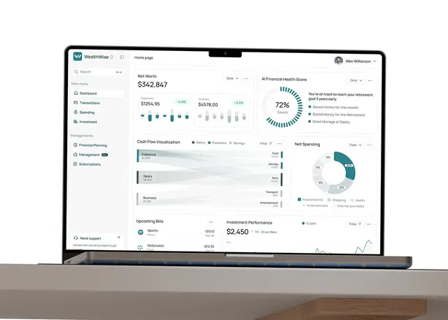
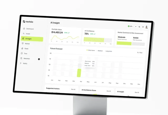
- Laptop, tablet and phone mockups, and the presentation.
How it helps the client
The page lets FinFuse answer a visitor's main questions (is it secure, are there fees, does it work on my phone) before it asks them to open an account. Each offer card leads to its own action, so someone who came for savings and someone who came for fraud protection both find a next step. That's the core of landing page design for fintech: one promise, real faces and doubts answered in place. More money products that faced the same trust problem are in my fintech case studies.