Overview
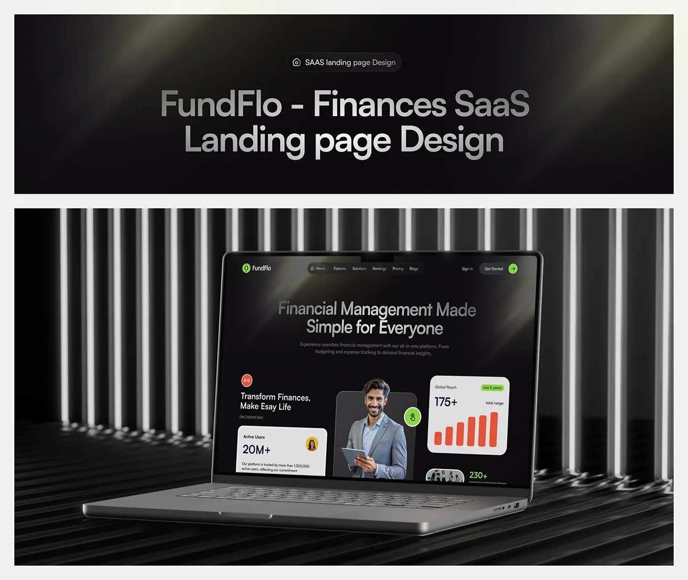
FundFlo is a finance management SaaS for small businesses, covering budgeting, expense tracking and financial insights. This case study covers my finance SaaS landing page design for FundFlo, on desktop and mobile, from the layout grid to the final page.
The page runs from a one-line promise to a 14 day free trial offer, with how it works, reviews, events and a blog in between. I made it in Figma and Photoshop.
The challenge
A finance tool has to look simple to feel simple, and the page had to prove that in the first screen.
- Visitors need to see what the product does before they scroll.
- A finance product has to earn trust before anyone signs up.
- A long page has to scan quickly on desktop and on a phone.
The process
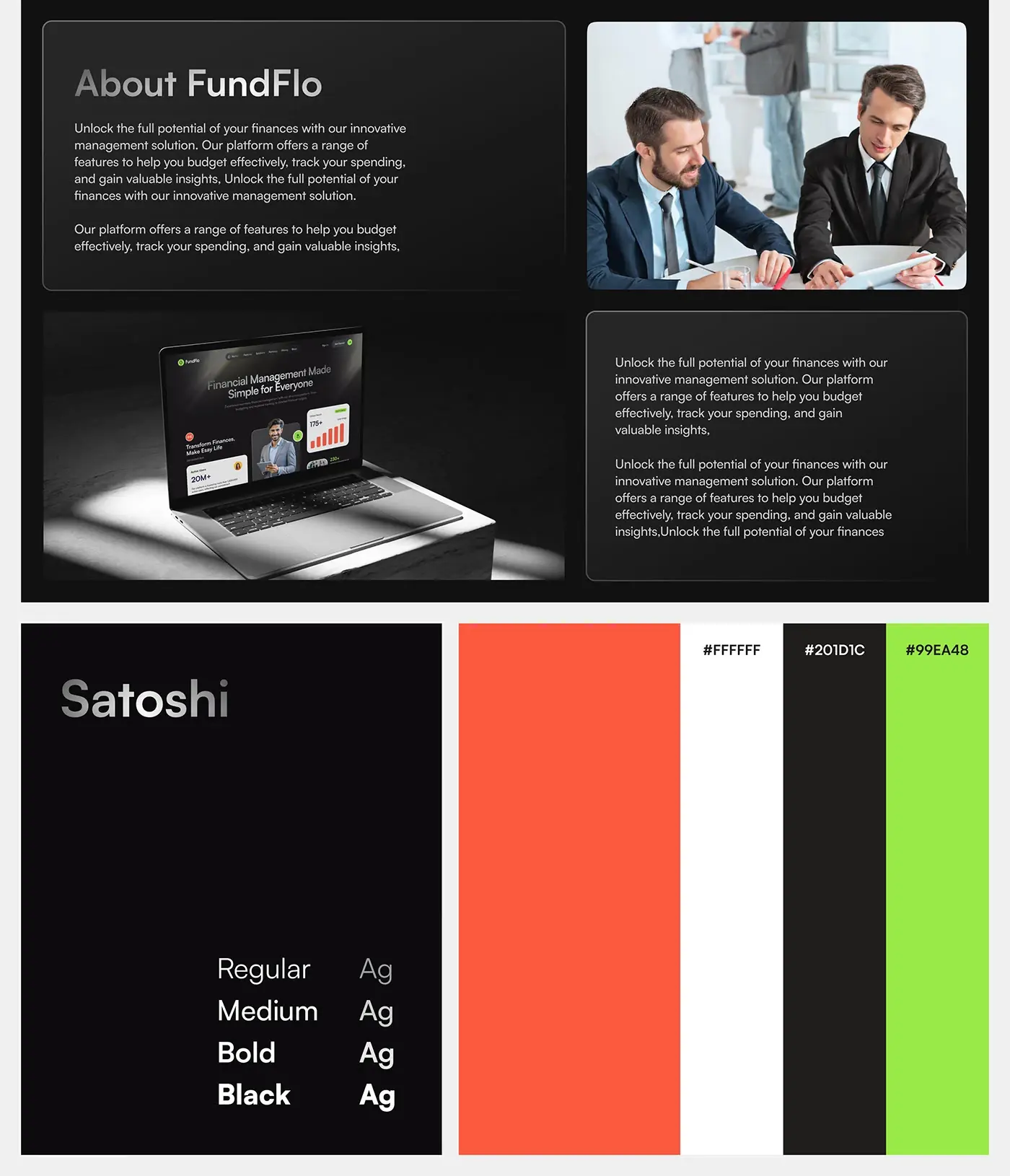
- About the product and its audience: a short summary of what FundFlo does.
- Type and colour: Satoshi in Regular, Medium, Bold and Black, with orange, near black (#201D1C), white and lime green (#99EA48).
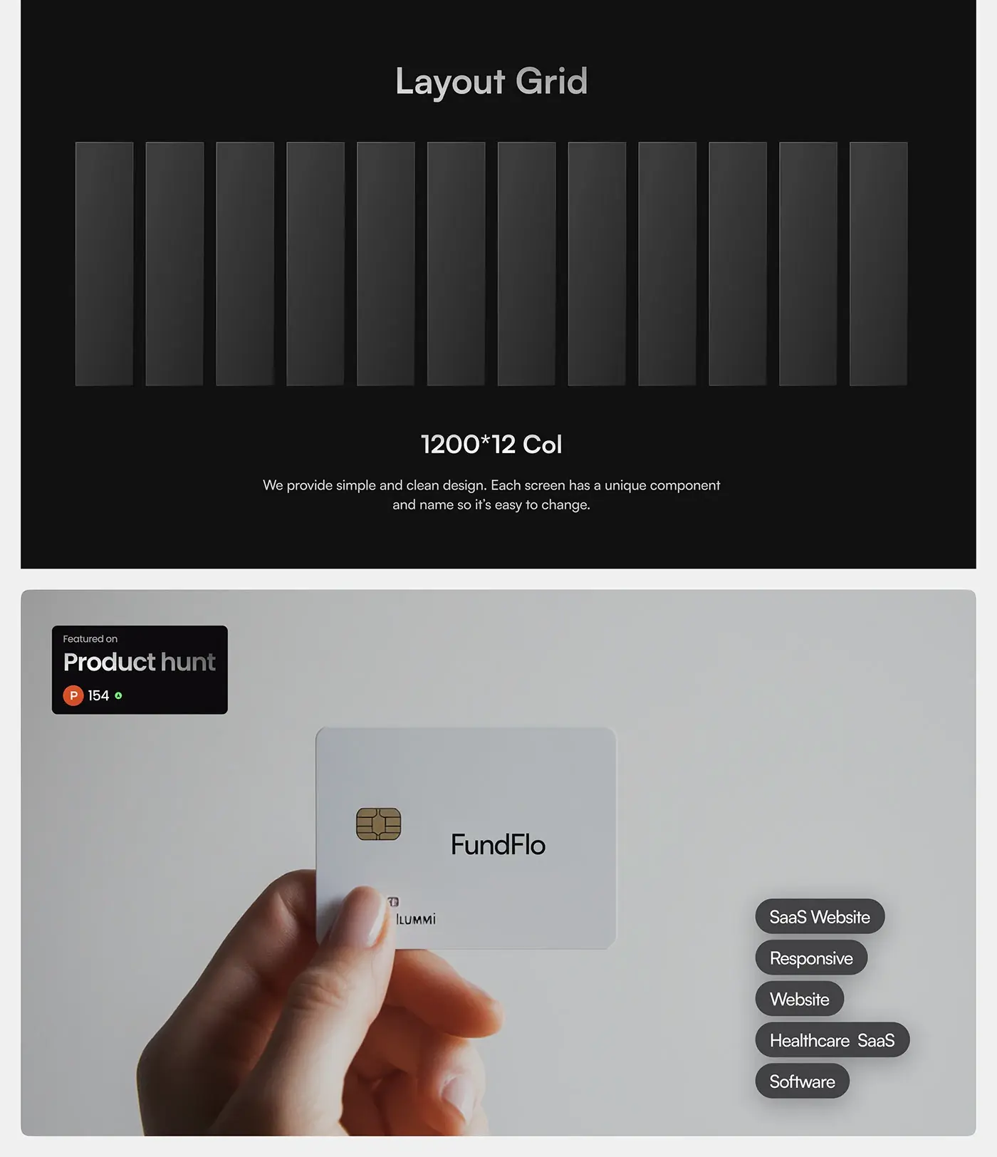
- A 1200 px, 12 column layout grid, with every component uniquely named so sections are easy to change.
- The full landing page on desktop, then the mobile layout and the laptop and phone mockups.
The solution
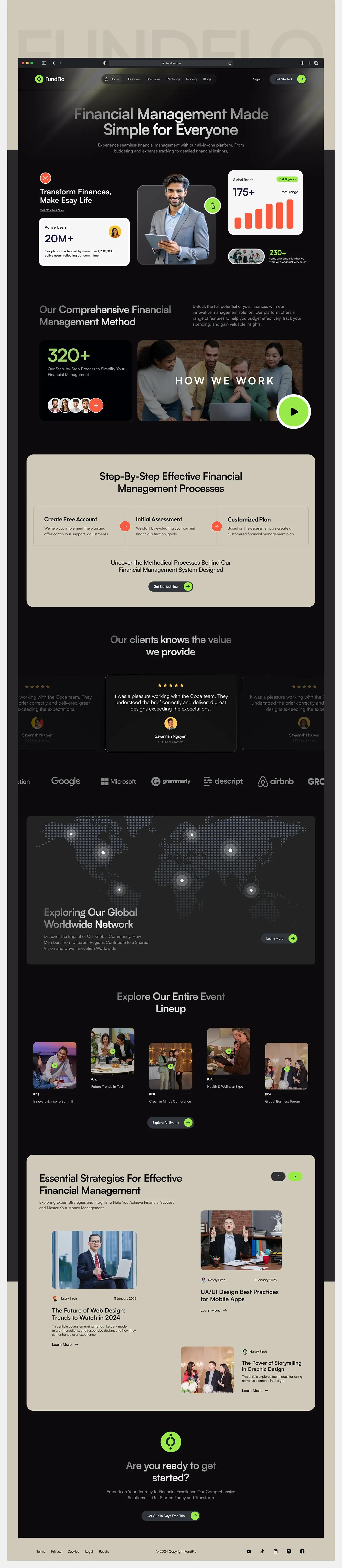
Each section carries one message, on a dark page broken up by warm beige bands.
Hero and proof cards
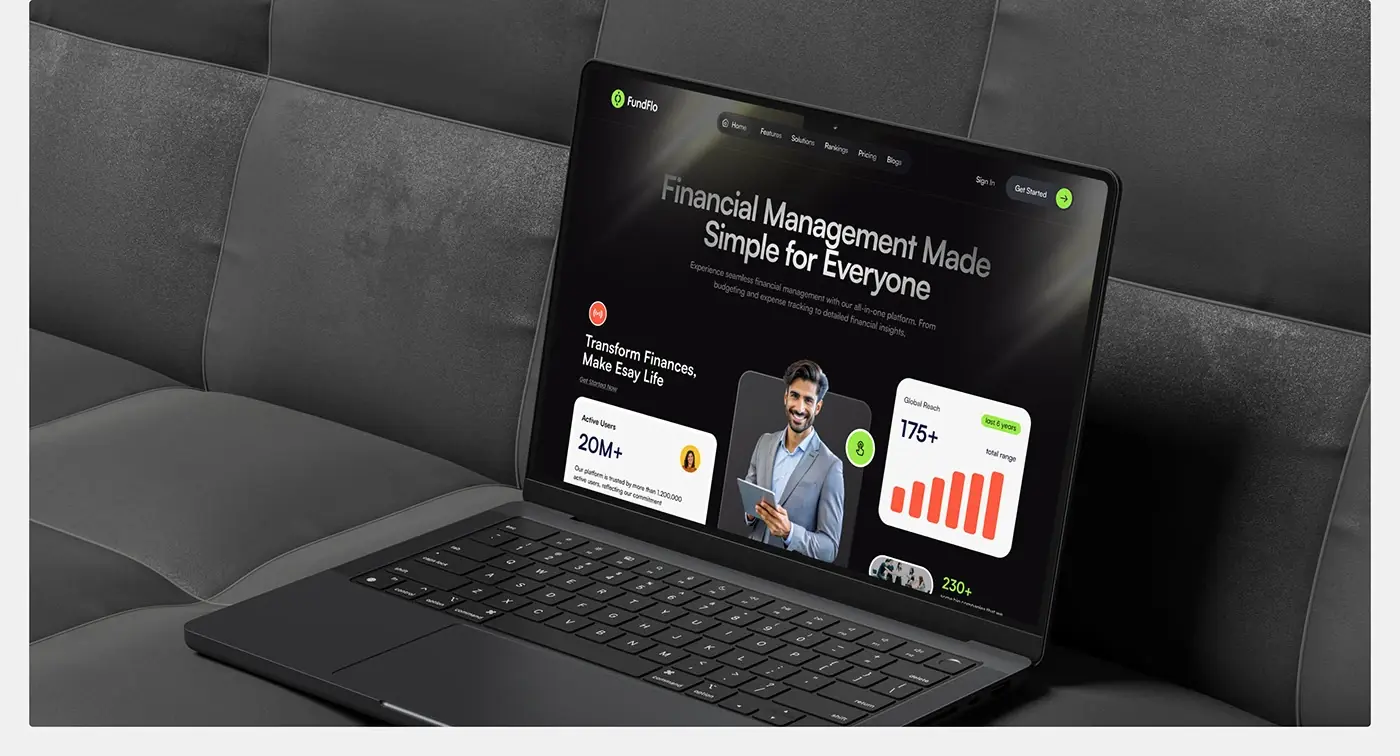
The headline "Financial Management Made Simple for Everyone" sits centred under a pill-shaped menu, with one line naming budgeting, expense tracking and insights. Below it, a smiling portrait is flanked by proof cards: active users with a Get Started Now link on the left, a global reach bar chart and a companies card on the right. With Get Started also in the menu, the promise, the proof and the next step all land before the first scroll.
Method and three steps
A short method section pairs a process card with a how it works video thumbnail and a large lime play button. Then the first beige band lays out three steps in a row: Create Free Account, Initial Assessment and Customized Plan, joined by orange arrows. A Get Started Now button closes the band, so the next action sits right after the explanation.
Reviews and trusted-by strip
Star-rated review cards run in a carousel, with the centre card in focus and the side cards faded, followed by a trusted-by strip of company names. I kept both grey and quiet on the dark base, so they back up the message instead of competing with the calls to action.
Global network and events
A dotted world map with glowing location points introduces the community behind the product, with a Learn More button. Below it, five event cards, from Innovate & Inspire Summit to Global Business Forum, sit at staggered heights, each with a play icon and a numbered label, then an Explore All Events button. The staggered heights break the even rhythm of the sections above.
Blog and closing offer
A second beige band, "Essential Strategies For Effective Financial Management", holds article cards with author, date, title and a Learn More link, with arrow buttons to page through them. The page then returns to black for the close: the FundFlo icon, "Are you ready to get started?" and a single 14 day free trial button. The footer keeps legal links, the copyright line and social icons.
Mobile layout
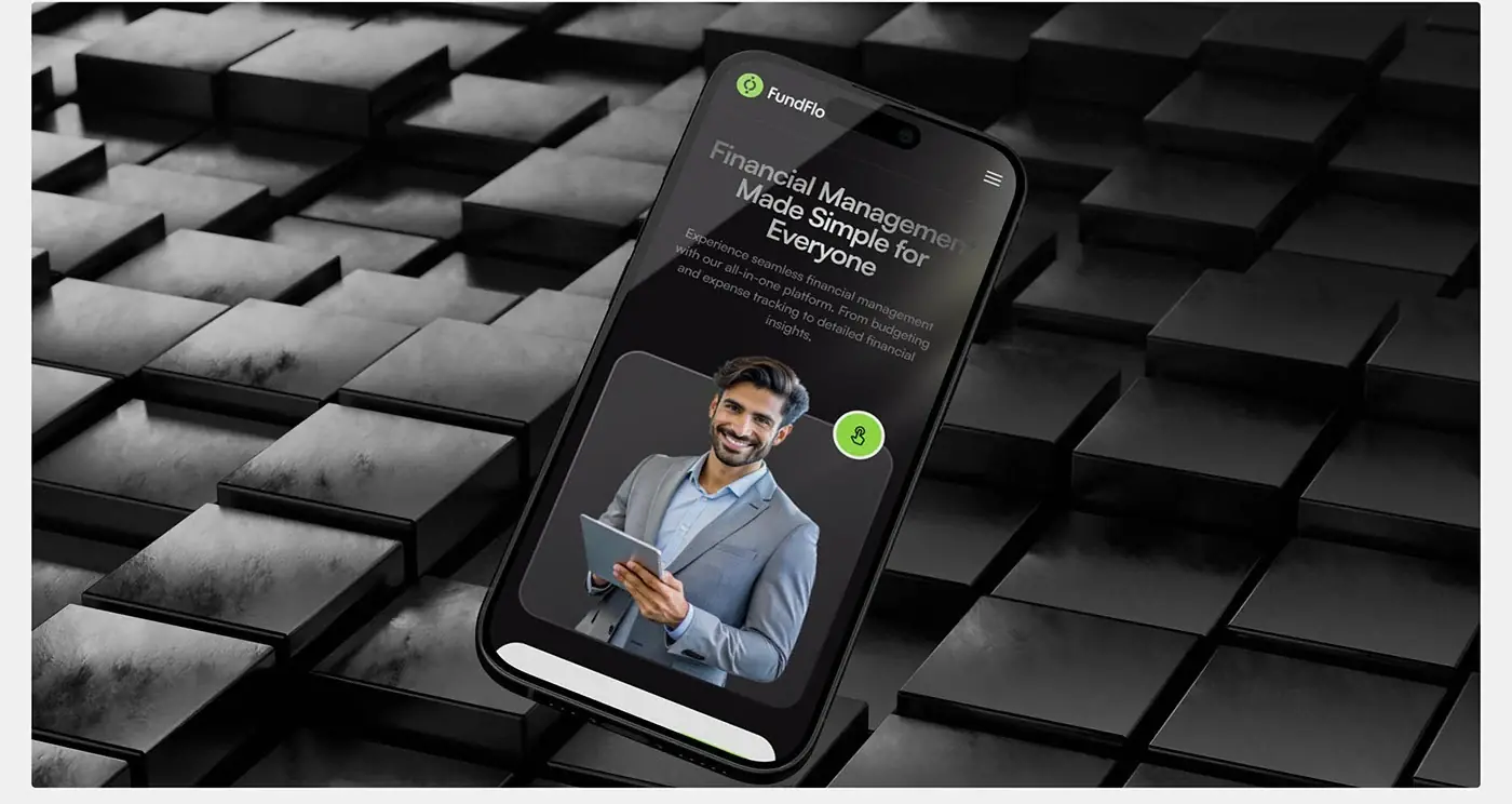
On a phone the hero stacks the headline, the short description and the portrait in one column, and the menu folds into a single button in the top right. The FundFlo name stays top left, so the page is still recognisable, and the headline keeps its weight, so the promise reads first on a small screen.
The result
- The landing page from hero to footer, on desktop and mobile.
- A UI style guide: Satoshi and a four colour palette.
- A 12 column layout grid with uniquely named components, so sections are easy to change.
- Laptop and phone mockups for the presentation.
How it helps the client
A small business owner sees the promise, the proof and the next step on the first screen, and reads on only for detail. Whenever a visitor is convinced, a Get Started button is within reach. Named components on one grid let the client update sections later without breaking the layout. That's the goal of my landing page design for SaaS, and you can compare it with my other landing page case studies.