Overview
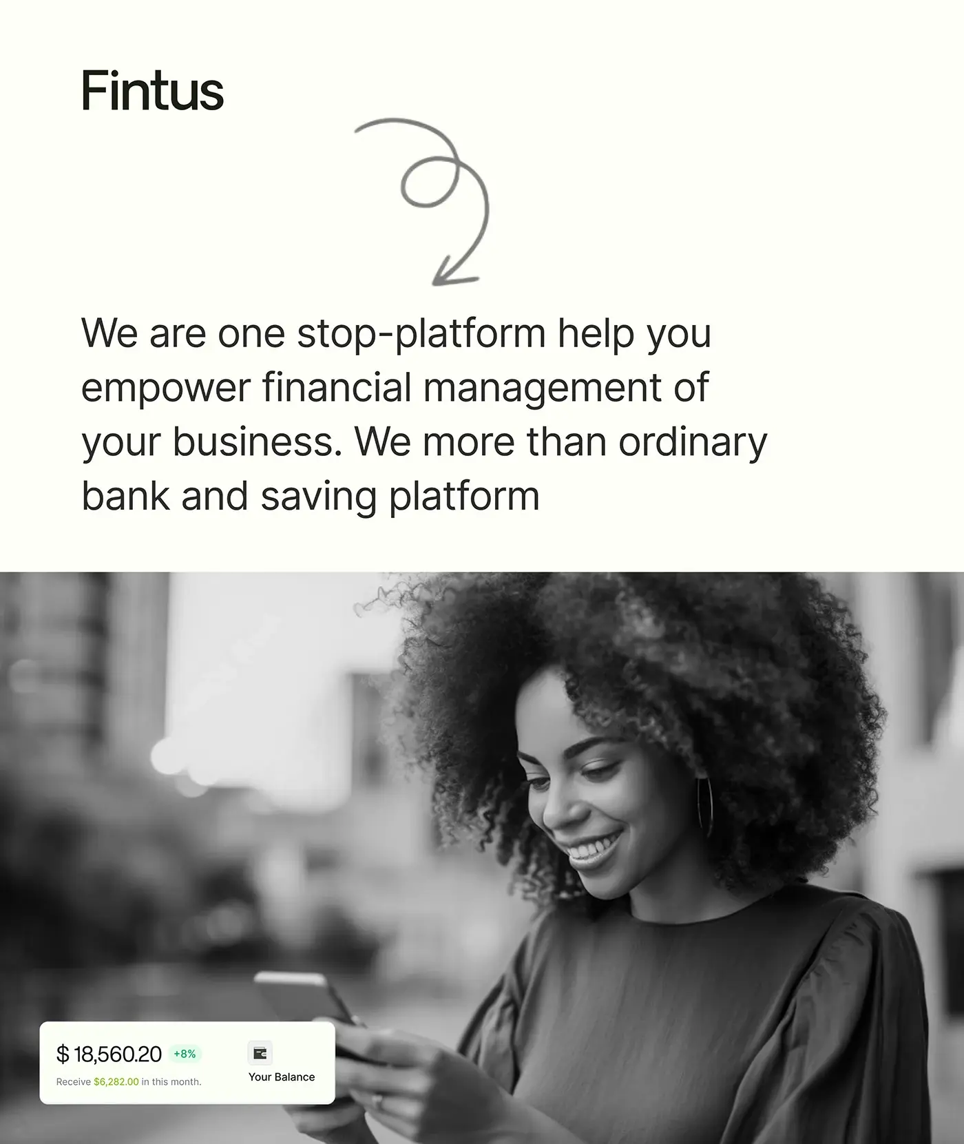
This banking website design case study covers Fintus, a banking and saving platform that brings a business's money management into one place. I designed its marketing website: home, features, about, blog, blog article and FAQ pages, on desktop, tablet and mobile.
The challenge
A money platform has to look simple and safe before anyone signs up, so the site had to explain a lot without feeling heavy.
- Visitors need to get what Fintus does from one line.
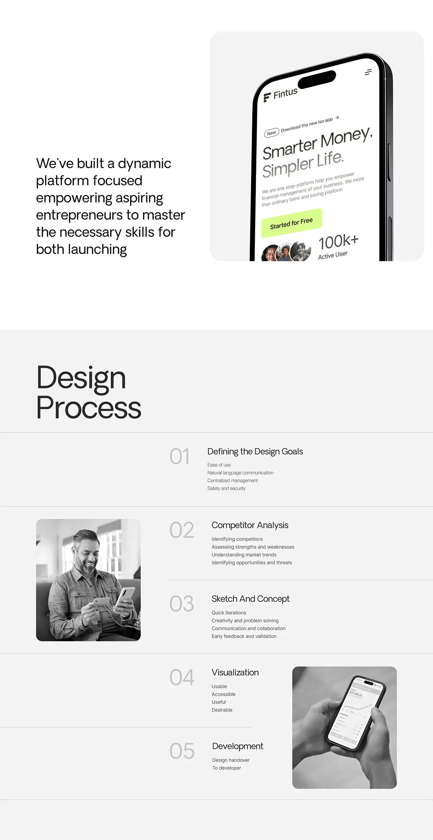
- The design goals were ease of use, natural language, centralised management, and safety and security.
- Three services (finance tools, AI-powered features and virtual assets) had to read as one offer.
- Questions on security, fees and devices needed a clear home.
The process
- Design goals, set before any layout.
- Competitor analysis: strengths and weaknesses, market trends, and the opportunities and threats in the market.
- Sketches and concepts, with quick iterations and early feedback and validation.
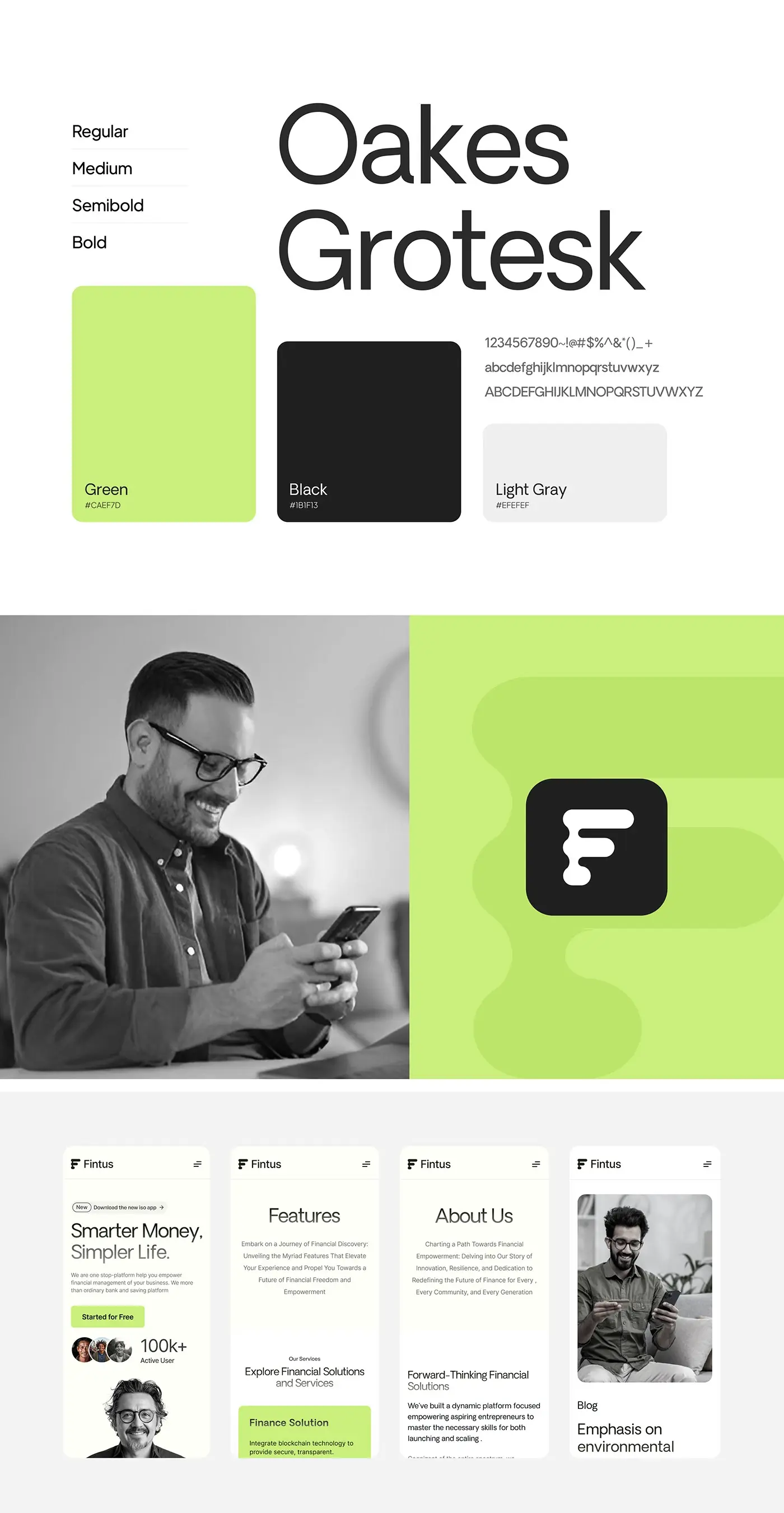
- Visual design: a style guide in Oakes Grotesk, lime green, near black and light grey, with desktop, tablet and mobile layouts. The visual stage aimed for four qualities: usable, accessible, useful and desirable.
- Design handover to developers.
The solution
Black and white photos and a quiet palette let the lime green buttons carry the next step on every page.
Homepage hero
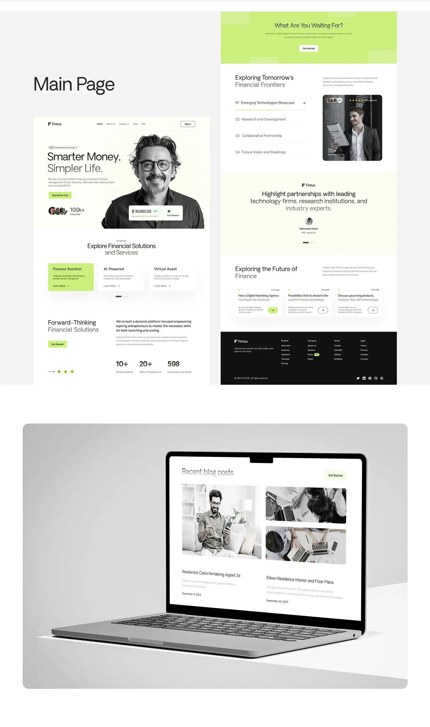
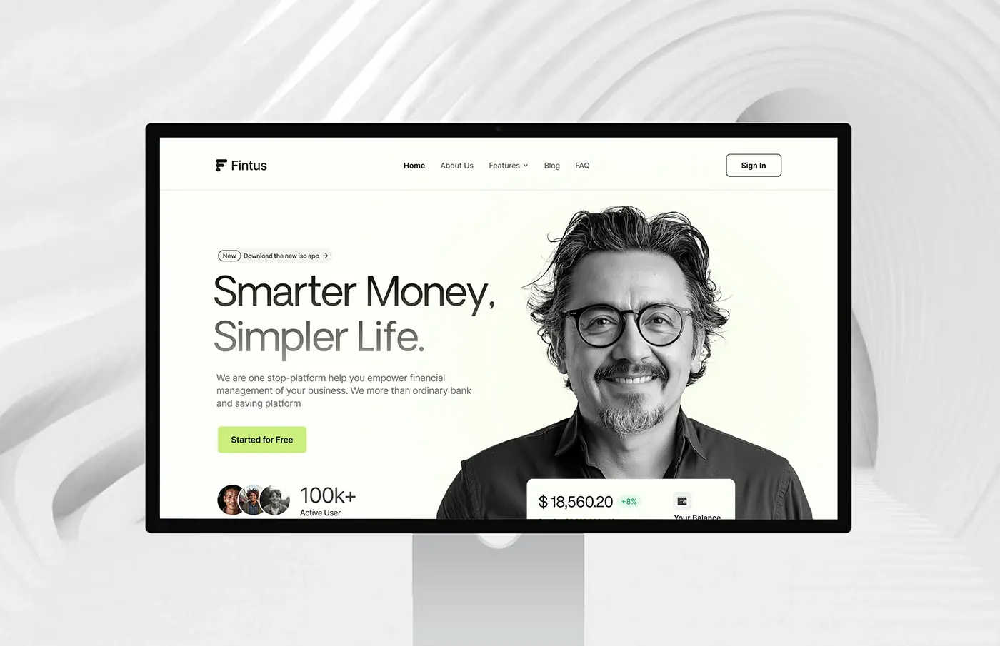
The hero runs left to right: a small "new app" pill, "Smarter Money, Simpler Life." in two tones of grey, one line on what Fintus does, and a lime Started for Free button with a row of user avatars under it. On the right, a black and white portrait carries a floating balance card with the monthly change. The navigation keeps five links and one outlined Sign In.
Services
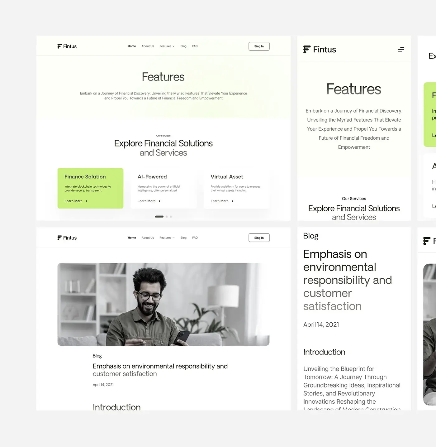
"Explore Financial Solutions and Services" puts the three services side by side as cards: a finance solution built on blockchain technology, AI-powered features, and virtual assets. The first card is filled lime and the others stay white, with Learn More on each and carousel dots below. The same carousel leads the features page.
Home page sections
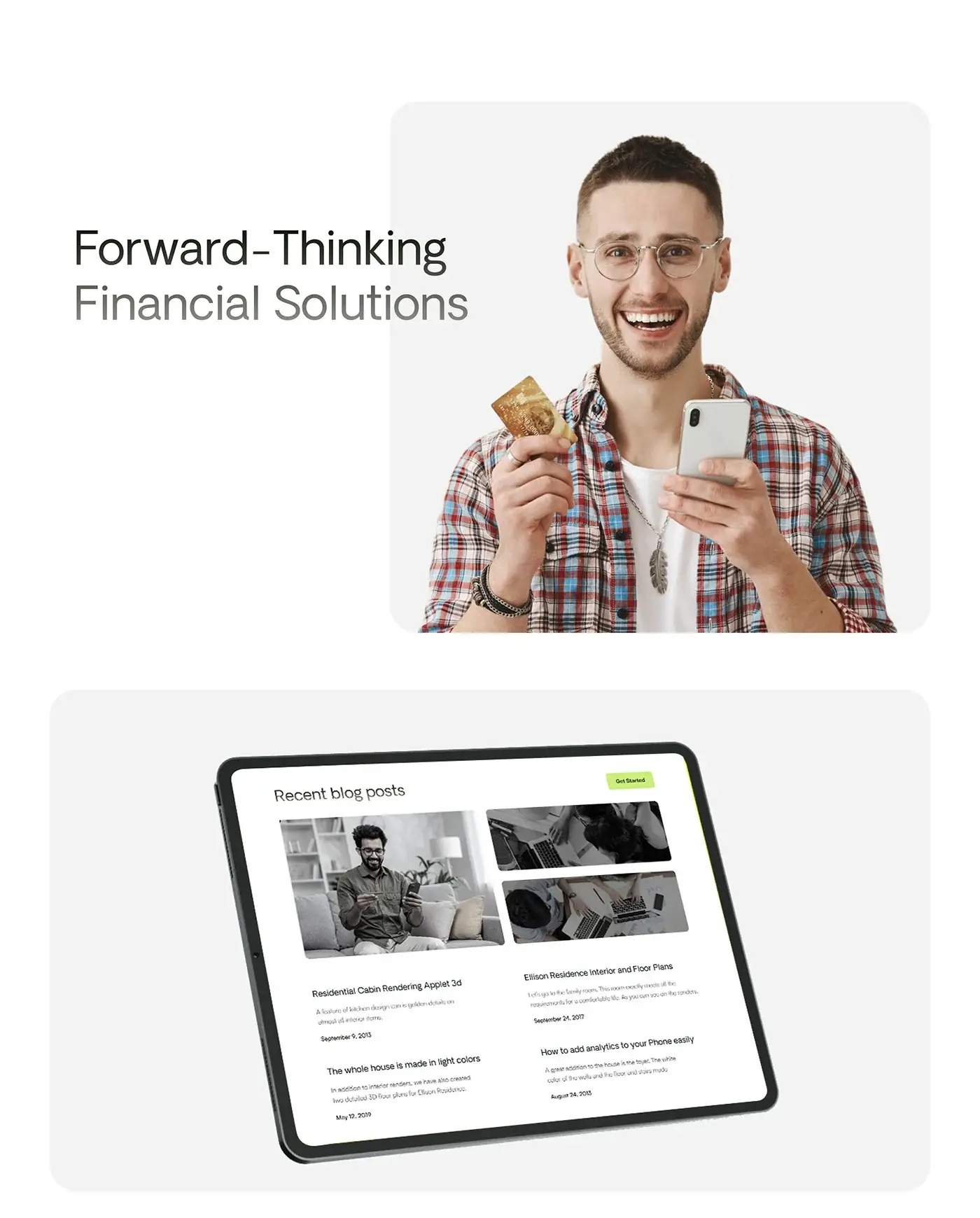
Below the services, the homepage moves from proof to a nudge. A forward-thinking section pairs a short statement with three figures and Get Started. A lime band asks "What Are You Waiting For?", then a numbered list of four topics sits beside a photo card. A testimonial carousel, three article cards with read times and a dark footer with product, company, social and legal links close the page.
Features and about pages
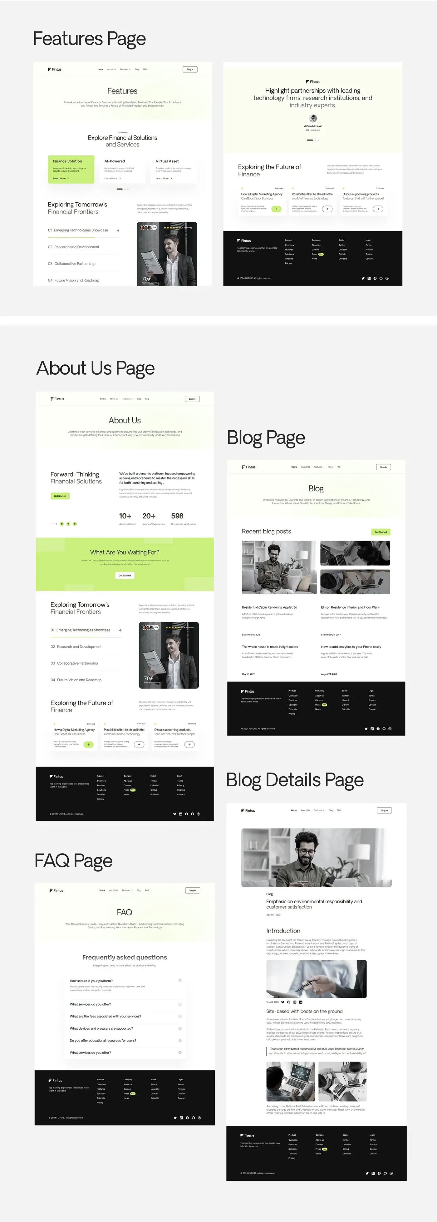
Both open with a title and one line on a pale lime wash, so every inner page starts the same way. The features page then runs the services carousel, the numbered topics list, the testimonial and the article cards. The about page leads with the forward-thinking statement and its figures, then repeats the lime call to action. Reusing sections keeps the build small and the site consistent.
Blog and article
The blog page shows recent posts as one large image beside two small ones, each with a title, an excerpt and a date, plus a Get Started button. The article layout keeps a narrow text column under a wide hero image: title, date, introduction, inline images, share icons, subheads, a pull quote and an image pair. Long reads stay comfortable at any width.
FAQ page
The FAQ page opens with the same title band, then a single accordion under "Frequently asked questions". The first answer, on platform security, is shown open; the rest cover services, fees, supported devices and browsers, and learning resources. One question open at a time keeps a long list short, and security comes first, since it is the question a banking visitor is most likely to have.
Responsive layouts
On mobile every page collapses to one column with a menu button in place of the links. The hero keeps the headline, the line of copy and the green button above the portrait, so the call to action is on screen without scrolling.
The result
- Six page designs: home, features, about, blog, blog details and FAQ.
- Mobile layouts for home, features, about and blog, and a tablet blog view.
- A UI style guide: Oakes Grotesk in four weights, lime green, near black and light grey.
How it helps the client
The design lets Fintus explain a broad platform in a few calm sections, with one clear next step on every page. Visitors who want more can read the features, the blog or the FAQ before they sign up. You can find more of this work in my fintech case studies. It's what I aim for in website design for fintech companies.