Overview
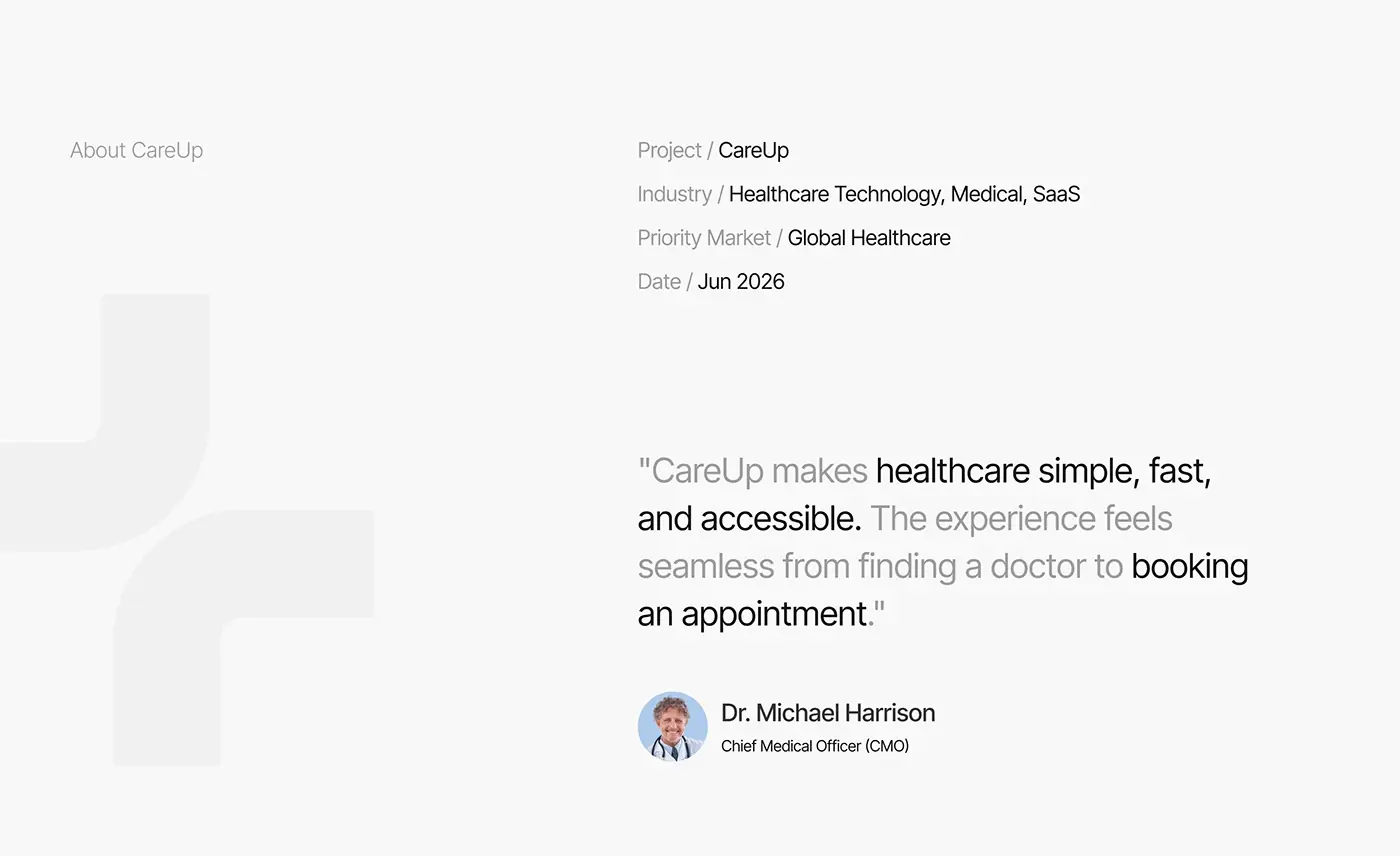
CareUp is an AI healthcare app for finding a doctor and booking an appointment, and this healthcare app design case study follows it from research to the final screens. I designed the iOS app, from user research and wireframes to the final UI, including an AI health assistant.
The project overview places it in healthcare technology, medical and SaaS, for a global market. I worked in Figma, XD, Illustrator and Photoshop.
The challenge
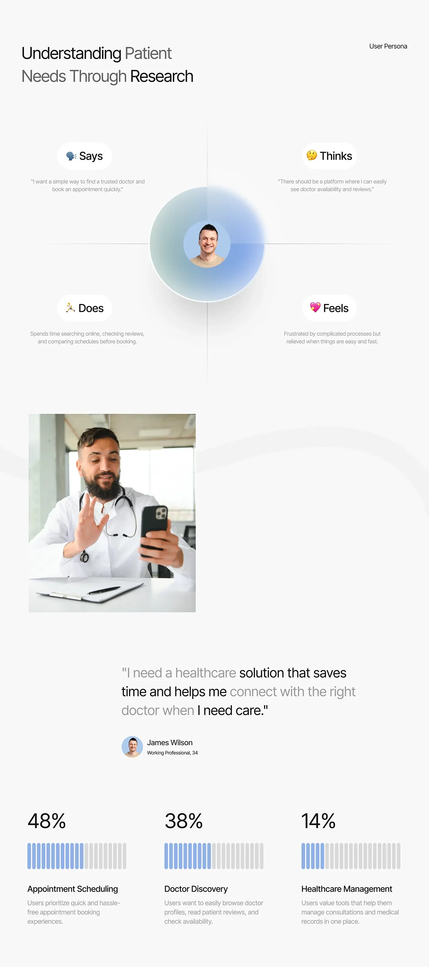
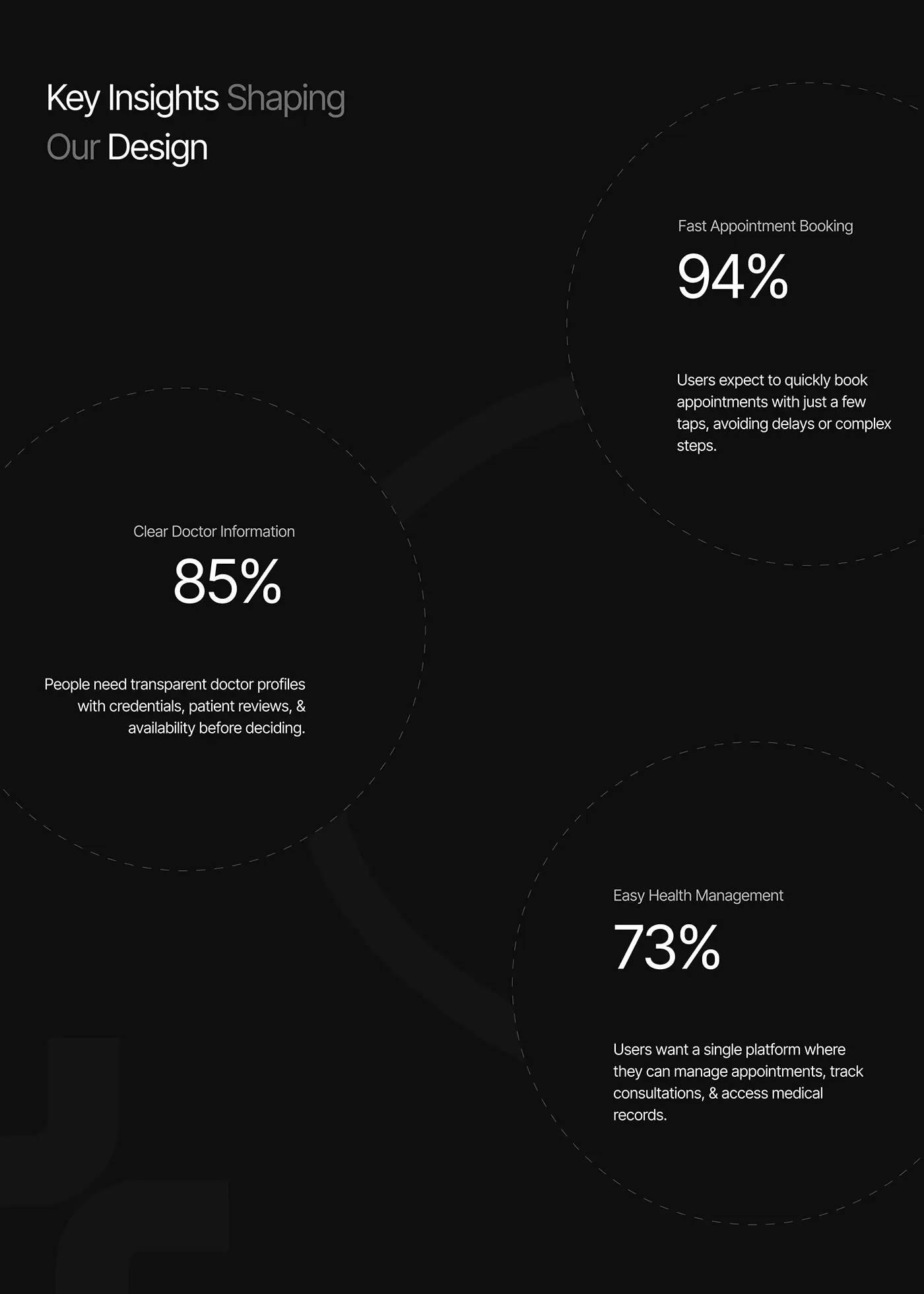
My persona and research insights pointed to three needs the app had to meet together.
- Booking had to take a few taps, with no delays or complex steps.
- Doctor profiles had to show credentials, ratings and availability before anyone decides.
- Appointments, consultations and medical records belonged in one place.
The persona, a 34 year old working professional, wanted to save time and reach the right doctor when he needs care.
The process
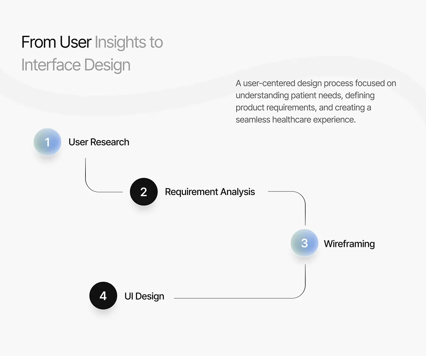
- User research: an empathy map of what the persona says, thinks, does and feels, and a persona for a busy working professional.
- Requirement analysis: the key insights behind the design.
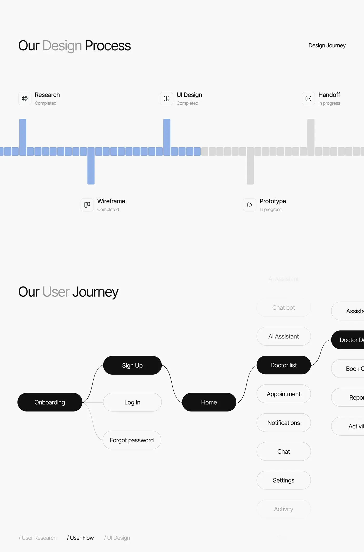
- User flow: onboarding, sign up and log in, then home, doctors, appointments, notifications, chat, settings and the AI assistant.
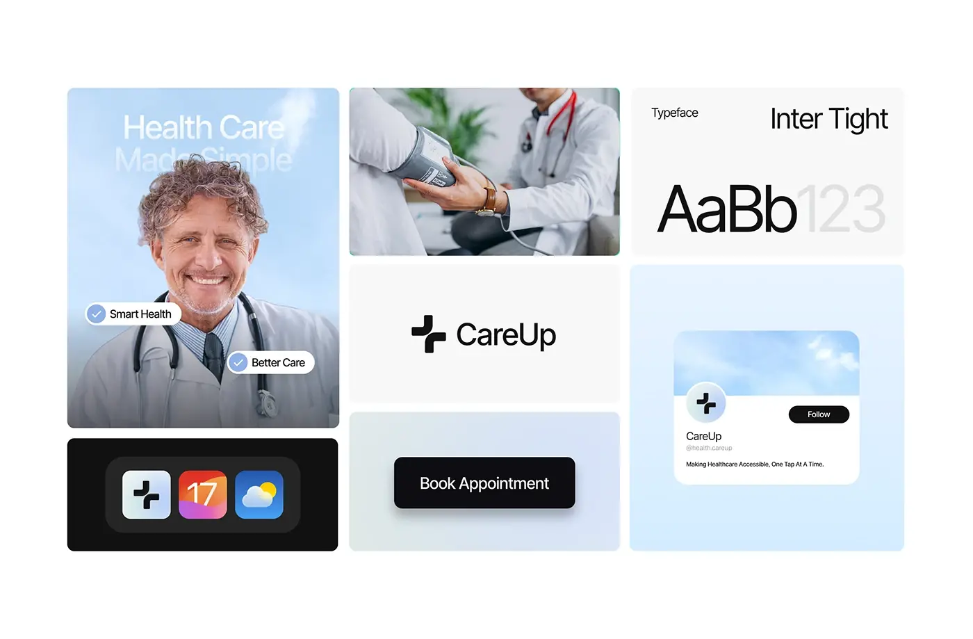
- Wireframing, then UI design in Inter Tight with soft blue and black.
The solution
The app keeps the path from symptom to appointment short.
Onboarding
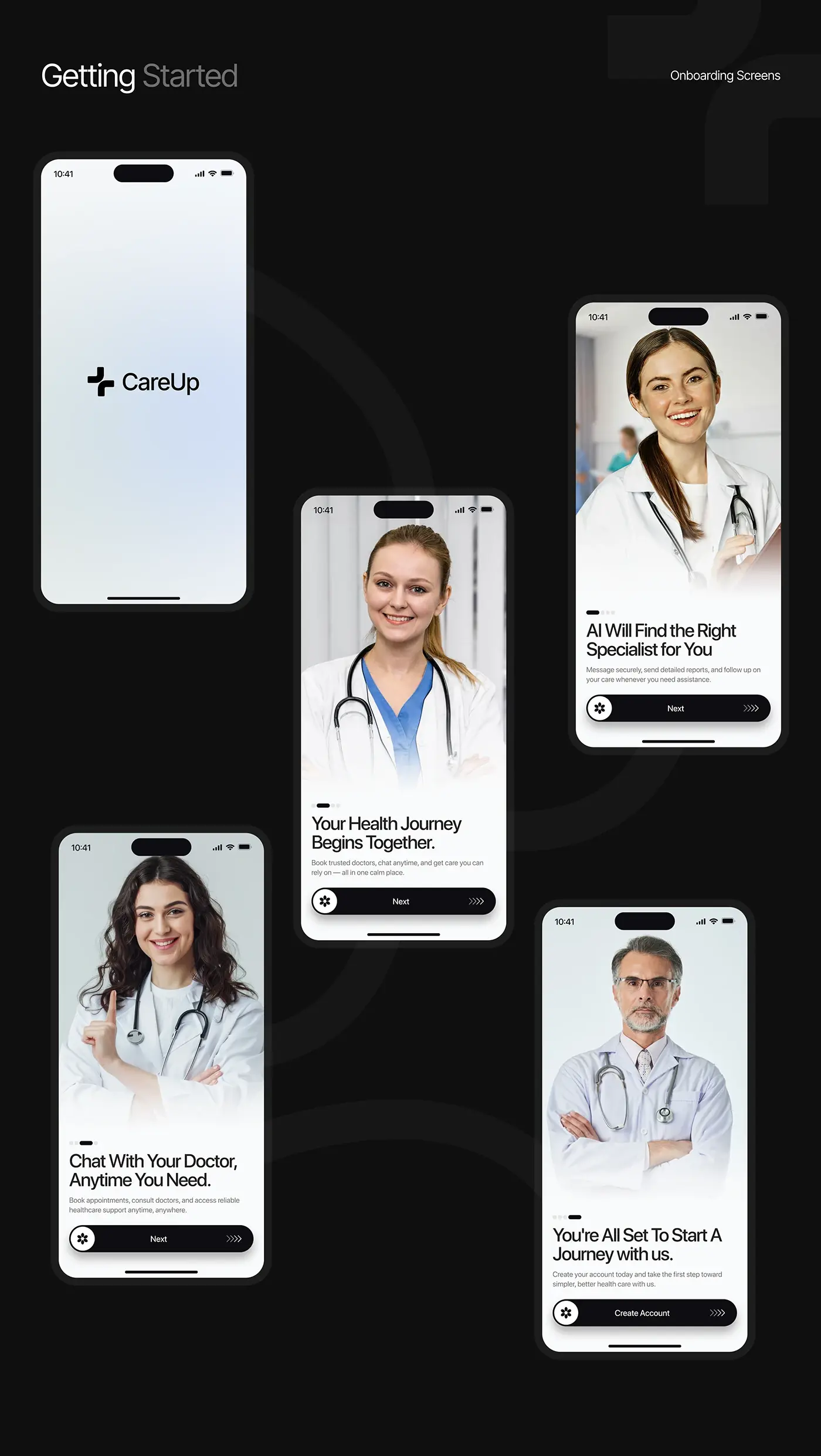
A splash screen with the CareUp name opens onto four onboarding screens, each led by a doctor's portrait: the health journey, AI that finds the right specialist, chat with your doctor at any time, and a final screen with Create Account. Each screen has one headline, one line of support, a progress indicator and a full-width button, so new patients learn the three main features before they sign up.
Home
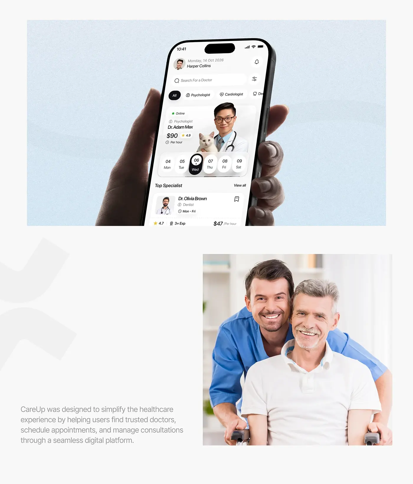
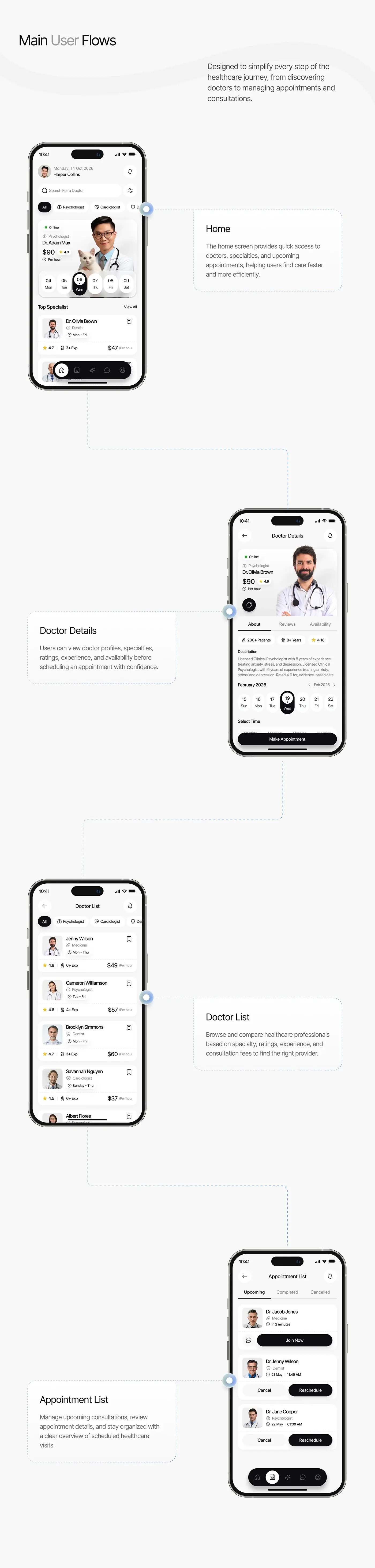
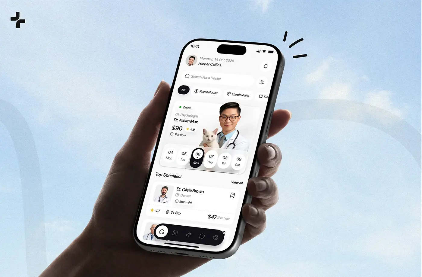
Home greets the patient by name, with a doctor search and a filter button at the top and specialty chips (psychologist, cardiologist, dentist and more) below. A featured doctor card shows online status, specialty, fee per hour and rating above a date strip, so booking can start on the first screen. Top Specialist cards follow, and a floating dark tab bar holds home, appointments, the AI assistant, chat and settings.
Doctor list
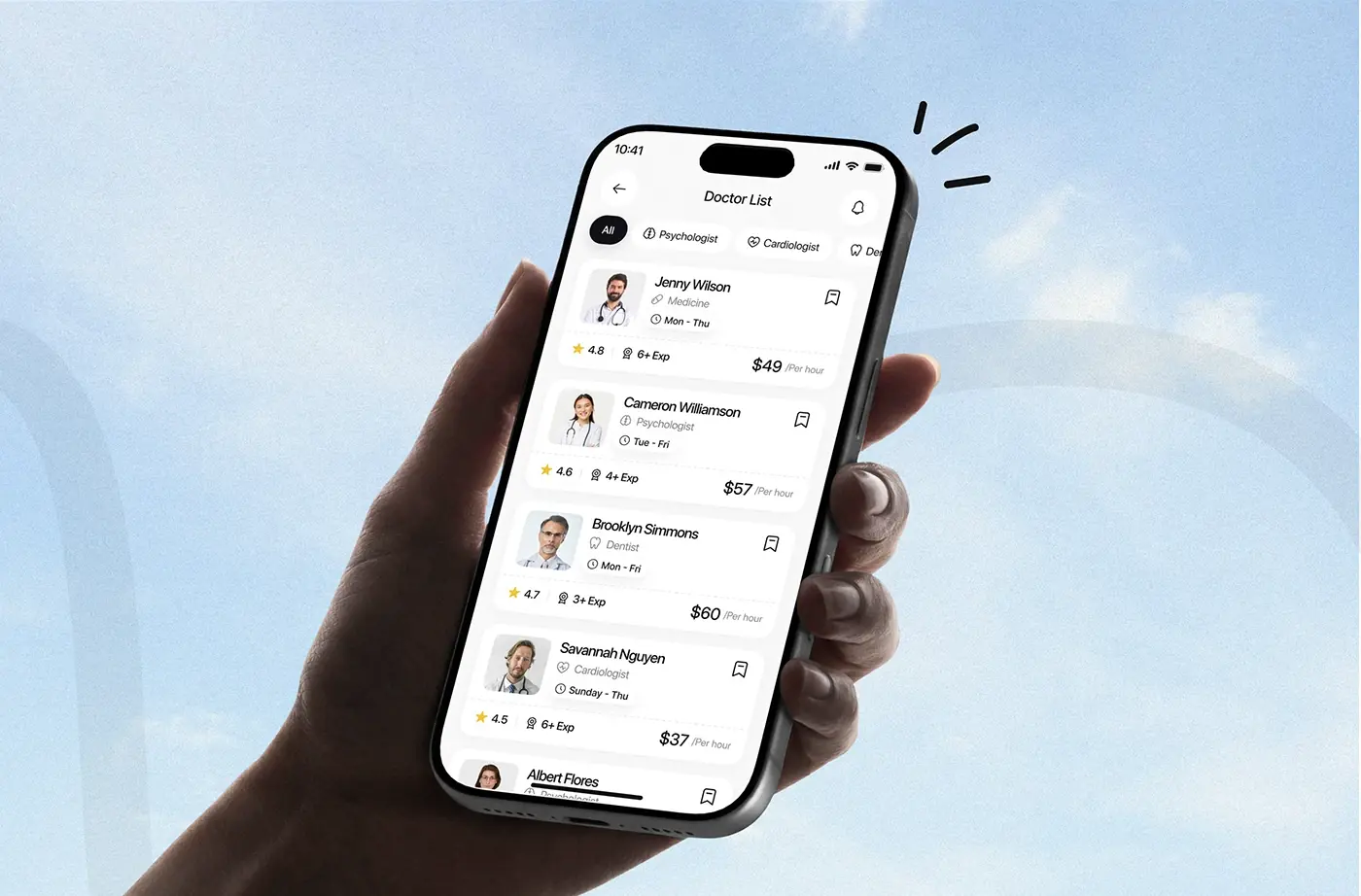
The doctor list keeps the specialty chips at the top and stacks one card per doctor: photo, name, specialty, working days, rating, years of experience and fee per hour, with a bookmark to save them. Every card uses the same layout, so patients can compare doctors without opening each profile.
Doctor details and booking
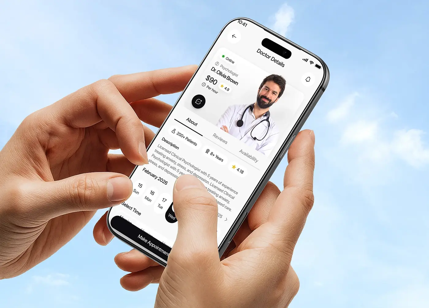
The details screen leads with a large portrait card: online status, specialty, fee per hour, rating and a chat button. Tabs split About, Reviews and Availability. Under About, three chips show patients treated, years of experience and rating, then a short description, a date strip for the month and time slots. Make Appointment stays pinned to the bottom, so the action is always in reach while the patient reads.
Appointment list
Appointments split into Upcoming, Completed and Cancelled tabs. The next visit sits on top with a countdown, a chat icon and a full-width Join Now button; later visits show the date and time with Cancel and Reschedule. Putting the most urgent action first saves a search when a consultation is about to start.
AI health assistant
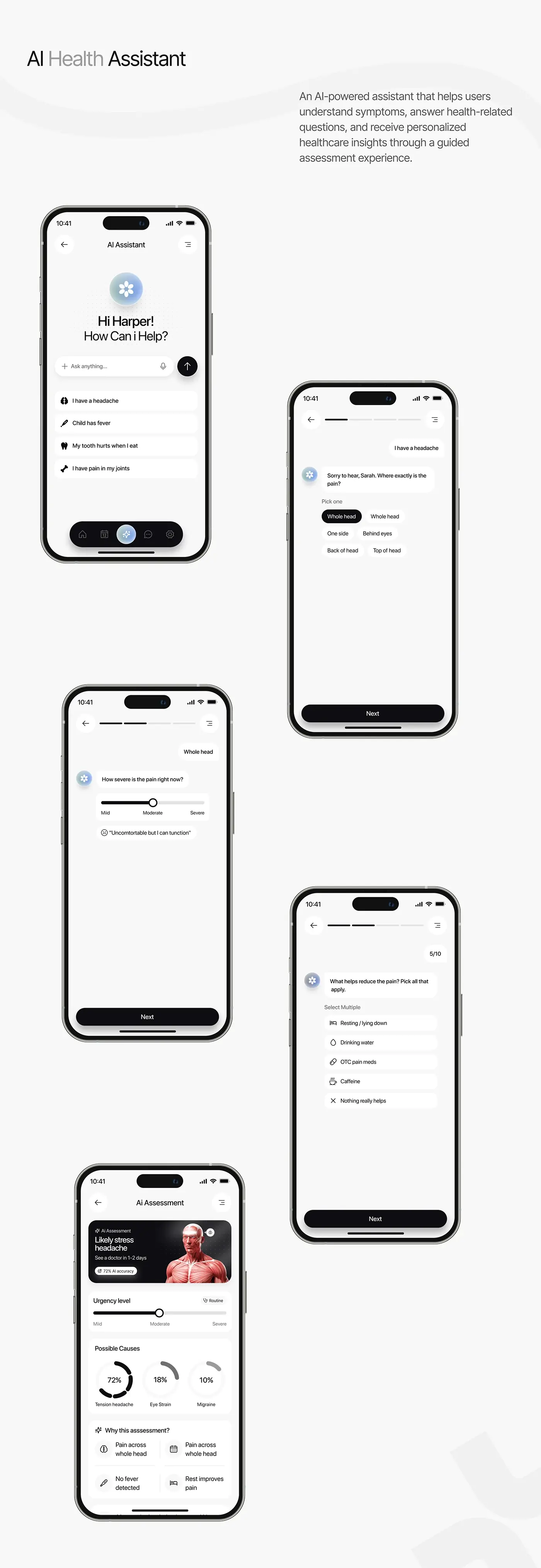
The assistant opens with a greeting, an Ask anything field with voice input and quick prompts such as "I have a headache" or "Child has fever". A guided chat then asks one question per screen, with a progress bar: where the pain is, how severe it is on a mild to severe slider, and what helps. The assessment shows a likely cause, when to see a doctor, an urgency level, possible causes as percentages and a "Why this assessment?" panel.
The result
- The iOS app UI: onboarding, home, doctor list, doctor details, appointments and the AI assistant.
- A persona, research insights and a user flow for every main screen.
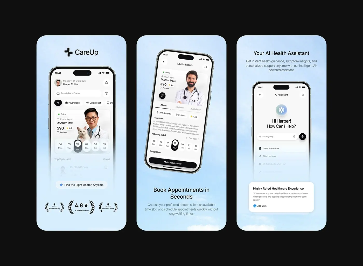
- A UI style guide with type, colour, line icons, buttons and the app icon, plus App Store screenshots.
How it helps the client
A patient can go from "I have a headache" to a booked visit in a few screens. The client gets an app that puts each doctor's availability and credentials up front, so people book instead of calling around. The assistant explains its reasoning and points to a doctor, so it guides people towards a visit rather than replacing one. That's the aim of my product design for healthcare apps, and there's more in my healthcare case studies.