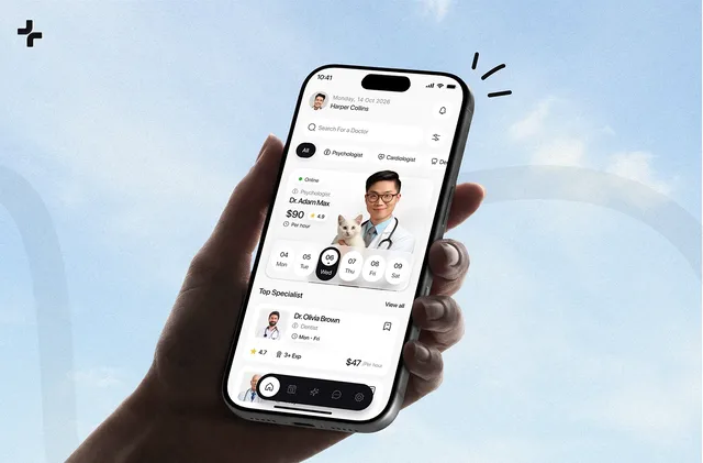
Overview
Wave is a medical software SaaS covering electronic health, telehealth, billing and invoicing, and analytics and reporting. I designed its marketing website for Webflow, and this medical SaaS website design covers the homepage, the inner pages and a style guide, responsive from laptop to phone.
The site is built around trust: a healthcare buyer should know what Wave does, who it serves and what the plans include before talking to sales.
The challenge
Healthcare buyers need to trust a vendor before they read the details, so the site had to earn trust fast.
- Four product areas had to fit on one homepage without crowding it.
- Proof, plans and answers had to be easy to find.
- Inner pages had to stay consistent, so the Webflow CMS stays easy to extend.
- Every page had to work on laptop, tablet and phone.
The process
- Research into the product and its market.
- A moodboard to set the visual direction.
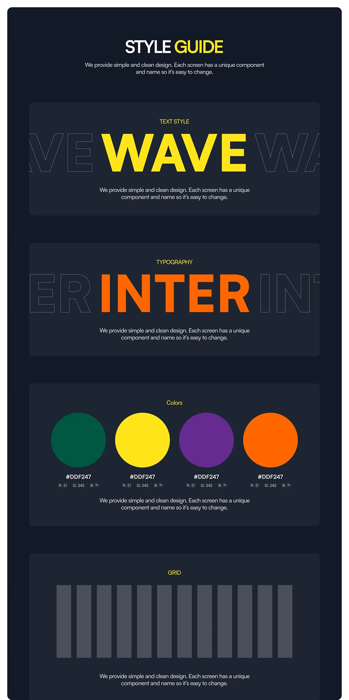
- A style guide: Inter, deep green with yellow, purple and orange, and a 12 column grid, with a named component for every section so each one is easy to change.
- The homepage, then the inner pages from the same components.
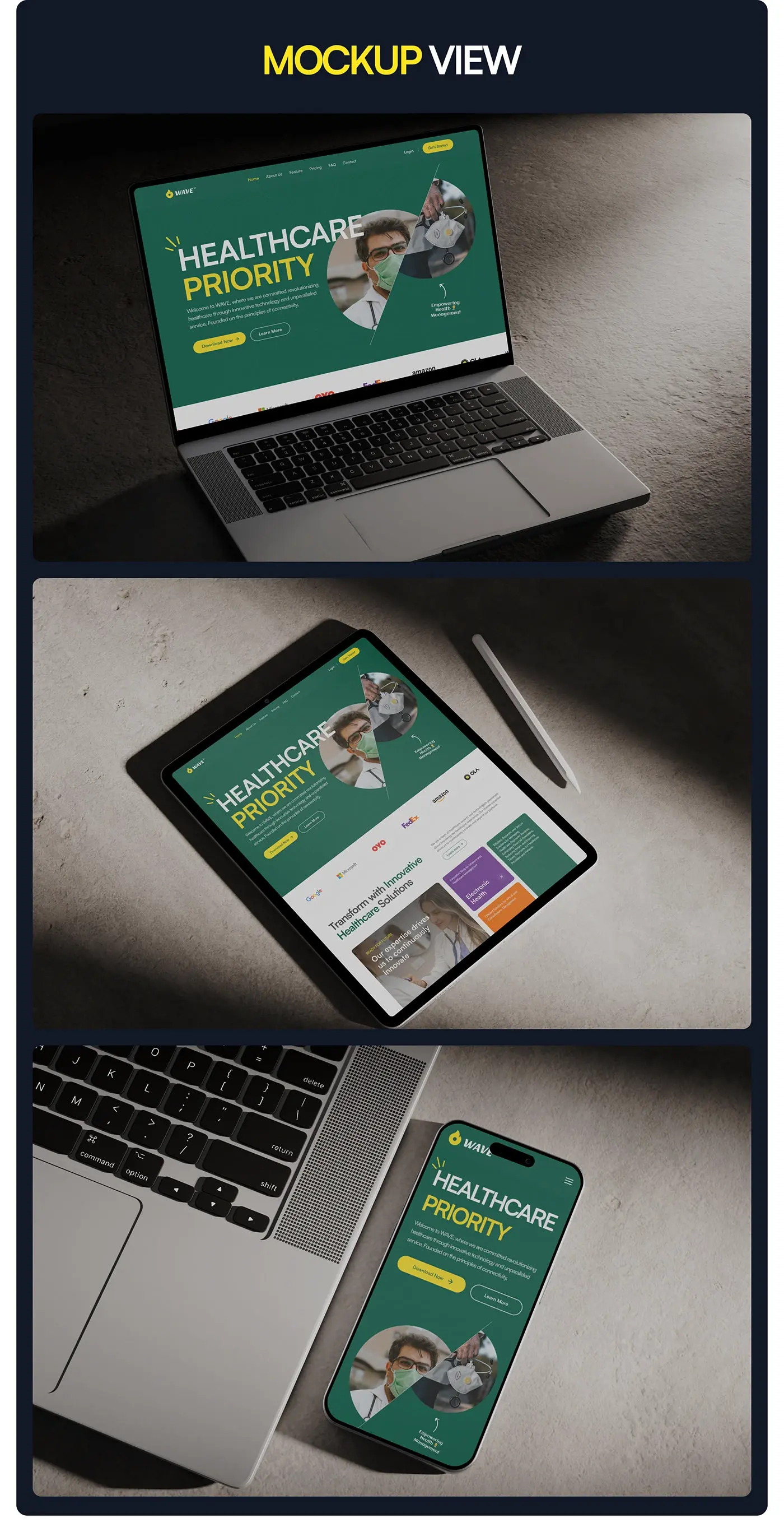
- Mockups on laptop, tablet and phone.
Deep green sets the base and yellow marks every main action, from Download Now to Choose Plan, so buttons are easy to find on any page.
The solution
I gave Wave a bold site that still reads clearly.
Hero and navigation
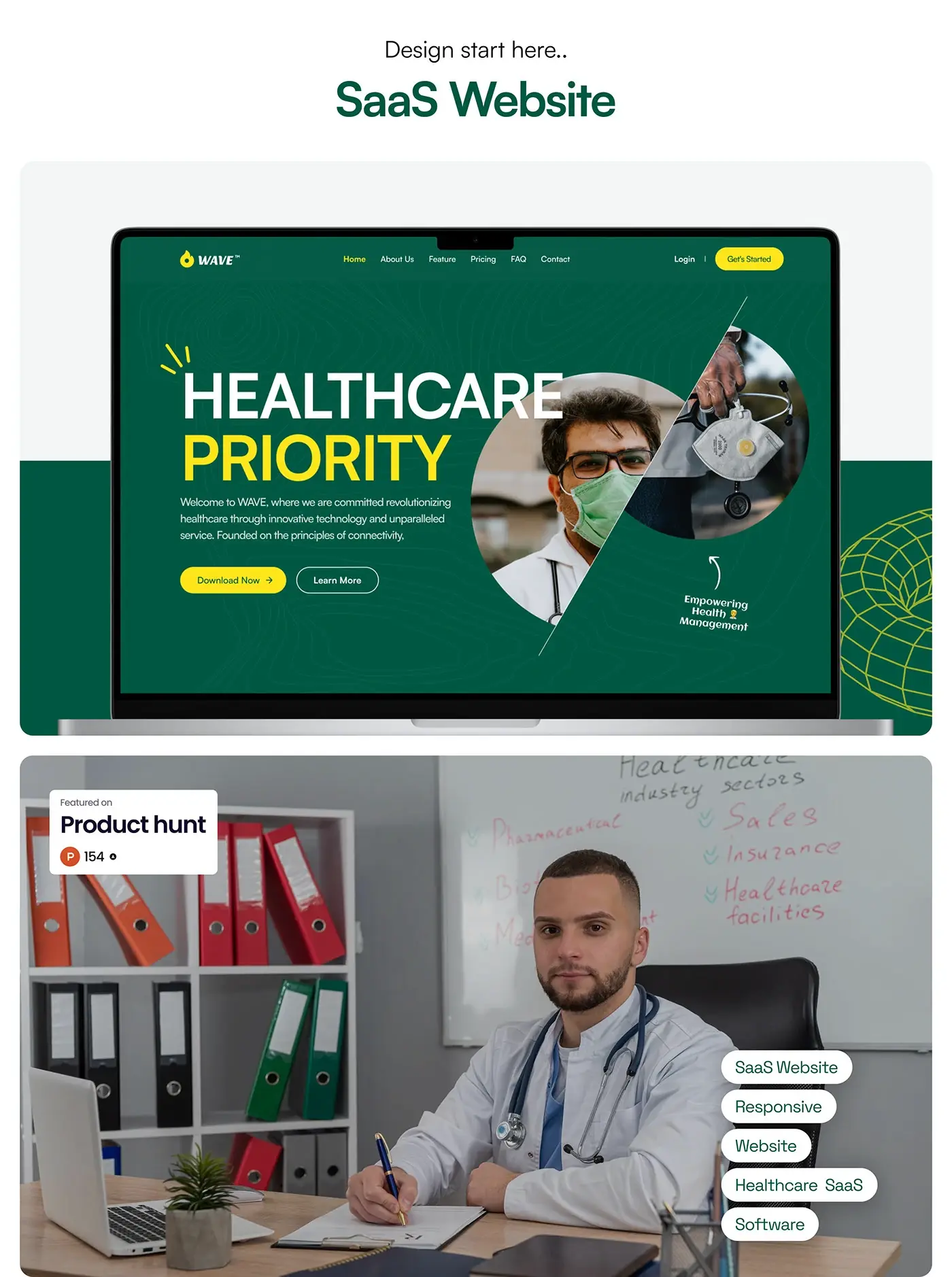
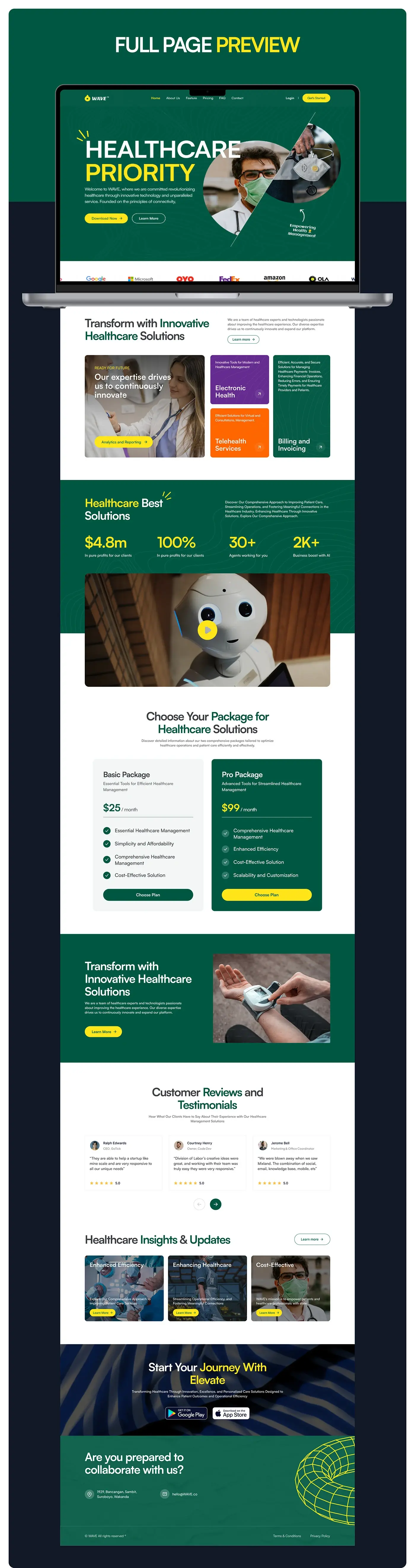
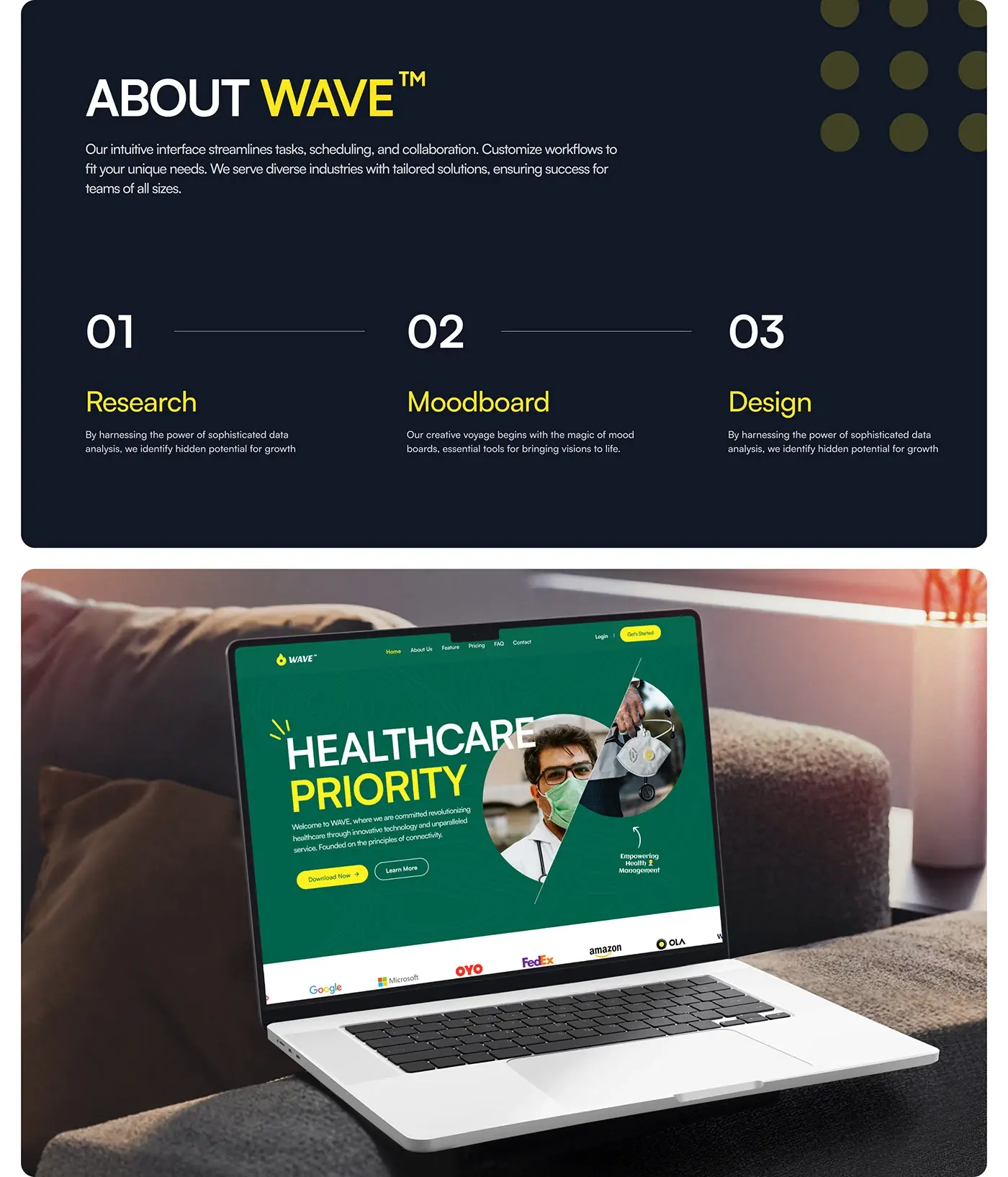
"Healthcare Priority" sits in large white and yellow type on deep green with a faint contour pattern, beside a round clinician photo split by a diagonal line. Download Now and Learn More give two clear paths, and a handwritten "Empowering Health Management" note adds a human touch. The top bar keeps six short links, from Home to Contact, plus Login and a yellow Get Started button. A logo strip sits directly under the hero, so proof comes before the first scroll ends.
Module cards
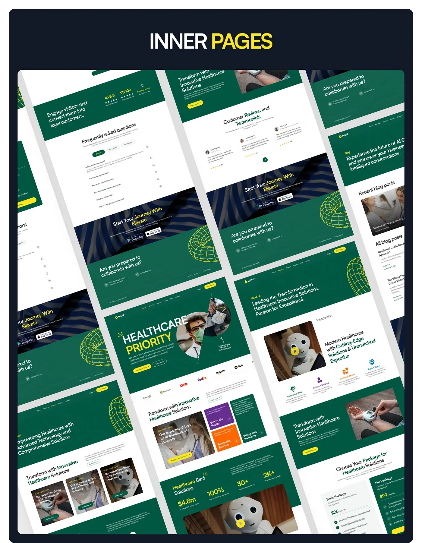
Under the heading "Transform with Innovative Healthcare Solutions", a large photo card links to analytics and reporting, and three cards cover the other modules: Electronic Health in purple, Telehealth Services in orange, and Billing and Invoicing in green. Each card has a one line description and an arrow. Giving every module its own colour lets a buyer spot their area in a second, without reading the cards they don't need.
Figures, video and plans
A green "Healthcare Best Solutions" band shows four figures in large yellow type above a video block with a yellow play button, keeping proof close to the calls to action. Two plans follow side by side: a light Basic Package and a green Pro Package, each with a checklist and a Choose Plan button. The Pro card is filled in green with a yellow button, so the fuller plan stands out without needing a badge.
Reviews, articles and app download
Customer reviews sit in three cards with a name, role, short quote and star rating. "Healthcare Insights & Updates" shows three article cards with photo backgrounds and Learn More buttons. A dark band then offers Google Play and App Store badges for the mobile app, and the green footer closes the page with an address, an email, and terms and privacy links.
Inner pages
The inner pages reuse the same header, green hero bands and footer, so the site reads as one piece:
- About: an introduction with a video and four values: Innovation Core, Patient-Centered, Comprehensive and Expert Team.
- Features: three photo cards under the same "Transform" heading as the homepage.
- Pricing and FAQ: a ratings band, the two plans, and questions split into General, For Clients and For Experts tabs.
- Blog: a featured recent post above a list of all posts.
Responsive layouts
The homepage is shown on laptop, tablet and phone. On the phone the hero stacks the headline, the intro line and both buttons above the split clinician photo, and the navigation folds into a menu icon. On the tablet the logo strip and module cards keep the laptop's order under the hero.
The result
- A marketing website designed for Webflow: the homepage plus about, features, pricing, FAQ and blog pages.
- A style guide with type, colour, a 12 column grid and named components.
- Responsive mockups on laptop, tablet and phone, and the presentation.
How it helps the client
The site lets Wave show a healthcare buyer what the software does, who it's for and what the plans include, before a sales call. With named components, Wave's team can add pages in Webflow without redrawing the layout. That's my aim in SaaS website design for healthcare, and you can see similar work in my healthcare case studies.