WCAG 2.2 React checklist: each component, and the code my team uses for AA
A WCAG 2.2 React checklist for level AA: what changed in 2.2, the components that fail most, short TypeScript fixes and the tests that keep them fixed.

To meet WCAG 2.2 at level AA in a React app, fix the components, not the pages. Six criteria are new at levels A and AA: Focus Not Obscured (Minimum) 2.4.11, Dragging Movements 2.5.7, Target Size (Minimum) 2.5.8, Consistent Help 3.2.6, Redundant Entry 3.3.7 and Accessible Authentication (Minimum) 3.3.8. One old criterion, 4.1.1 Parsing, is gone.
Most failures I find sit in a few components: a div pretending to be a button, a field whose error nobody hears, a modal that loses focus, a hand-built menu, a route change that strands keyboard users. Each has a short fix and a test. None of them can be fixed by a widget, as the record on accessibility overlays shows.
This is the checklist the team I lead works through as a design engineer for startups. It's for founders, product leads and React developers. For the law, see what the European Accessibility Act asks of Dutch shops.
WCAG 2.2 React checklist: what is new at A and AA
W3C's summary of what's new in WCAG 2.2 lists nine added criteria. Three are AAA, so a level AA checklist covers six, plus a removal:
| Criterion | Level | What usually fails in React | The fix |
|---|---|---|---|
| 2.4.11 Focus Not Obscured (Minimum) | AA | A sticky header or cookie banner covers the focused field | scroll-padding, or move the layer |
| 2.5.7 Dragging Movements | AA | A sortable list that only drags | A click or tap alternative |
| 2.5.8 Target Size (Minimum) | AA | 16 px icon buttons packed into table rows | 24 by 24 CSS pixels, or spacing |
| 3.2.6 Consistent Help | A | The help link moves between pages | Put it in the shared layout |
| 3.3.7 Redundant Entry | A | A checkout asks for the address twice | Prefill it, or let people pick it |
| 3.3.8 Accessible Authentication (Minimum) | AA | Blocked paste, six-box codes, puzzles | Autofill, paste, passkeys |
| 4.1.1 Parsing | Removed | Duplicate ids still break labels | useId; now judged under 1.3.1 and 4.1.2 |
W3C published WCAG 2.2 on 5 October 2023 and updated it on 12 December 2024. Its WCAG overview says the 2023 text is also ISO/IEC 40500:2025, and content meeting 2.2 also meets 2.1.
Focus, target size and dragging
The Understanding page for 2.4.11 names sticky headers, sticky footers and non-modal dialogs as the usual cause, and says a cookie banner fails if it entirely covers the focused component. W3C's technique C43 uses scroll padding:
/* 2.4.11: focused fields scroll clear of a 64px header and an 88px bottom bar */
html { scroll-padding-block: 72px 96px; }

/* 2.5.8: icon buttons never drop below 24 by 24 CSS pixels */
.icon-button { min-inline-size: 24px; min-block-size: 24px; }
Target Size (Minimum) allows five exceptions, but a minimum size on the component is the simplest pass.
The Understanding page for 2.5.7 says a keyboard equivalent doesn't meet it unless it also gives controls people can click or tap. So a sortable list keeps its drag and gains buttons:
<li>
  {task.title}
  <button type="button" aria-label={`Move ${task.title} up`} onClick={() => move(i, -1)}>↑</button>
  <button type="button" aria-label={`Move ${task.title} down`} onClick={() => move(i, 1)}>↓</button>
</li>Forms, errors and sign-in under WCAG 2.2
Every field in our library goes through one component:
import { useId, type ComponentProps } from 'react'

type FieldProps = ComponentProps<'input'> & { label: string; error?: string }

export function Field({ label, error, ...input }: FieldProps) {
  const id = useId()
  const errorId = `${id}-error`
  return (
    <div>
      <label htmlFor={id}>{label}</label>
      <input id={id} aria-invalid={error ? true : undefined}
        aria-describedby={error ? errorId : undefined} {...input} />
      {error && <p id={errorId}>{error}</p>}
    </div>
  )
}
That useId is where 4.1.1's removal still matters. The Understanding page for Parsing says many issues it covered now fail 1.3.1 or 4.1.2. Hard-code id="email" in a field used on a page and in a dialog, and the dialog's label points at the page's input. React's `useId` prevents that.
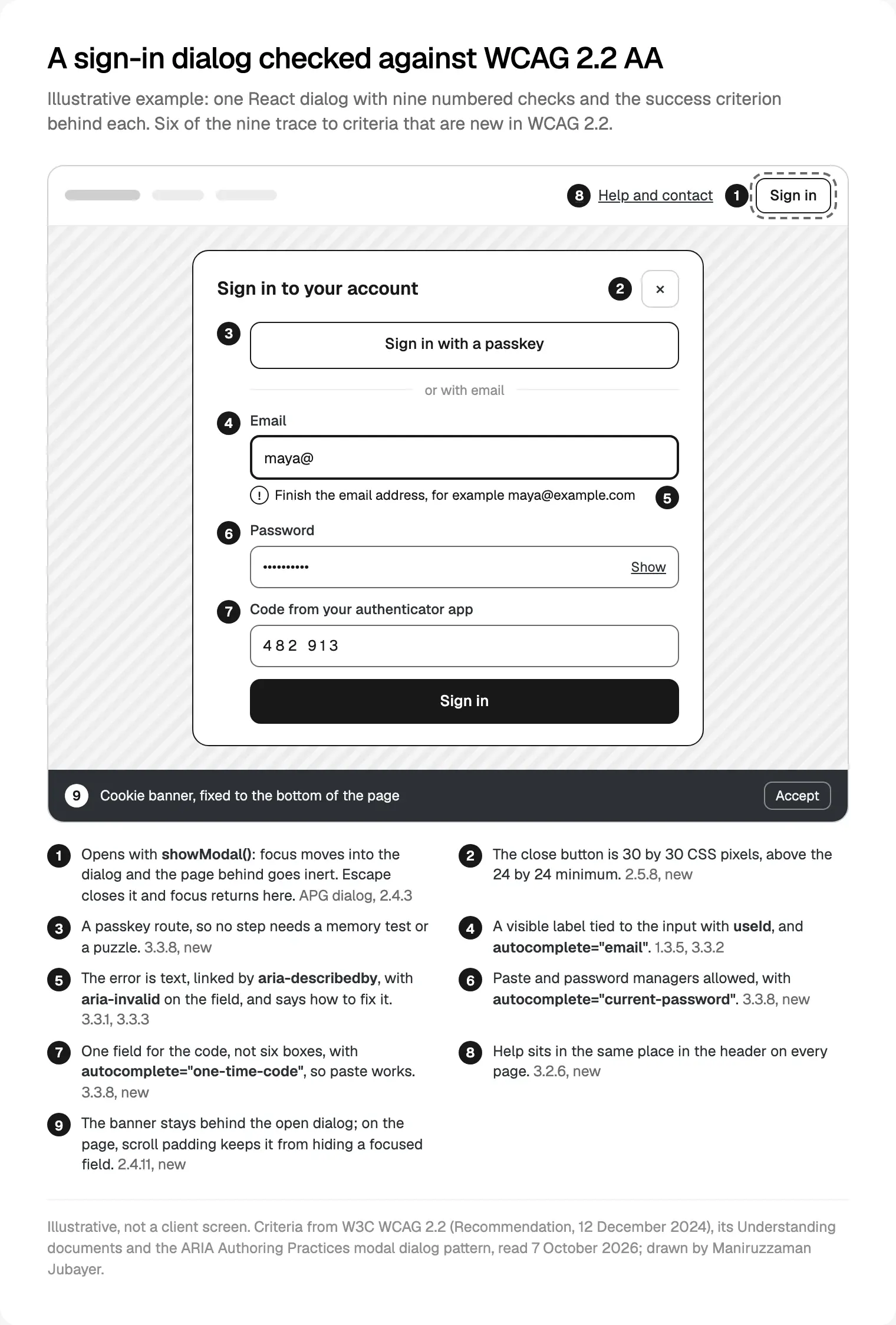
Sign-in is where 2.2 bites hardest. The Understanding page for 3.3.8 counts remembering a password or transcribing a code as a cognitive function test. Unless another route exists, password managers and paste must work, at every step of multi-factor sign-in. W3C's technique H100 shows the markup, and MDN's autocomplete reference defines one-time-code:
<Field label="Email" name="email" type="email" autoComplete="email" />
<Field label="Password" name="password" type="password" autoComplete="current-password" />
{/* Step two: one field, so paste and autofill work. Never block onPaste. */}
<Field label="Code from your authenticator app" name="code"
  inputMode="numeric" autoComplete="one-time-code" />
The 3.3.8 page lists WebAuthn, signing in with your device, as passing, so I design the passkey route first. For Redundant Entry, the Understanding page for 3.3.7 says browser autocomplete doesn't count: the product must offer what it already has, so keep multi-step form state in a parent component.
Modals: focus in, Escape out, focus back
The ARIA Authoring Practices modal dialog pattern asks for four things: focus moves inside on open, Tab stays inside, Escape closes, and focus returns to the element that opened it. The native dialog with showModal() gives you all four. MDN's dialog page says a modal dialog makes the rest of the page inert and closes on Esc, and the HTML standard's dialog steps restore focus to the previously focused element on close.
'use client'
import { useEffect, useId, useRef, type ReactNode } from 'react'

type ModalProps = { open: boolean; onClose: () => void; title: string; children: ReactNode }

export function Modal({ open, onClose, title, children }: ModalProps) {
  const ref = useRef<HTMLDialogElement>(null)
  const titleId = useId()

  useEffect(() => {
    const dialog = ref.current
    if (open && !dialog?.open) dialog?.showModal() // focus in, page behind inert
    if (!open && dialog?.open) dialog.close() // focus back to the opener
  }, [open])

  return (
    <dialog ref={ref} aria-labelledby={titleId} onClose={onClose}>
      <h2 id={titleId}>{title}</h2>
      {children}
      <button type="button" onClick={onClose}>Close</button>
    </dialog>
  )
}
I ran this in Chrome with Playwright: focus landed on the first field, and went back to the opener after Escape and after Close. React's `onClose` event keeps state in step.
Two traps. jsdom, the DOM most Jest and Vitest setups use, has no showModal() (I checked version 30.1.2), so test dialogs in a real browser. And Next.js 16.4 turns Cache Components on for new create-next-app projects; its guide to preserving UI state explains that pages are then hidden, not unmounted, so a dialog left open is still open when someone returns. The guide resets transient UI in a useLayoutEffect cleanup.
Route changes and live regions in the Next.js App Router
The Next.js accessibility docs say the route announcer reads document.title, then the h1, then the URL. The 16.4.0 source adds two details: it announces only when the title changes, and the router leaves focus untouched. So give every route a unique title, and move focus yourself:
'use client'
import { usePathname } from 'next/navigation'
import { useEffect, useRef } from 'react'

// In app/layout.tsx. Each page's <h1> has tabIndex={-1}.
export function RouteFocus() {
  const pathname = usePathname()
  const firstLoad = useRef(true)

  useEffect(() => {
    if (firstLoad.current) { firstLoad.current = false; return }
    // Hidden pages stay in the DOM, so focus the visible h1
    const headings = document.querySelectorAll<HTMLElement>('main h1')
    ;[...headings].find((h) => h.checkVisibility())?.focus()
  }, [pathname])

  return null
}
In my 16.4.0 test app, two h1 elements sat in main after navigating back, hence the visibility check. Headings suit screen reader users too: 67.8% in WebAIM's 2026 survey start with them on a long page.
Toasts and "Saved" messages are status messages (4.1.3). MDN's live regions guide says the region must exist before its content changes:
// Rendered with the page and never unmounted; only its text changes
export function StatusMessage({ text }: { text: string }) {
  return <p role="status" aria-live="polite" className="sr-only">{text}</p>
}
I never put the only Undo in a toast that vanishes: I treat that as a time limit under 2.2.1 Timing Adjustable.
Contrast tokens and reduced motion
WCAG 2.2 asks for 4.5:1 for text (1.4.3) and 3:1 for the parts of controls people need to see (1.4.11). I check pairs once, in the tokens: a unit test runs each pair through WCAG's luminance formula. #8f8f8f on white is 3.23:1: fine for an icon or border, too light for body text. #cfcfcf is 1.56:1, too pale even for the border that shows where a field is.
Motion depends on level. Animation from Interactions (2.3.3) is AAA; at level A, Pause, Stop, Hide (2.2.2) covers movement that starts automatically, lasts more than five seconds and runs beside other content. I honour `prefers-reduced-motion` anyway, because it costs one media query:
@media (prefers-reduced-motion: no-preference) {
  .drawer { transition: transform 240ms ease-out; }
}How to test: lint, Testing Library, Playwright with axe, then people
There's no single React accessibility checker, only layers. Lint comes first, and the jsx-a11y README says to pair it with tests of the rendered DOM.
Testing Library's query priority puts getByRole first. With jest-dom, a test checks what a screen reader will hear:
test('an empty email gets an error a screen reader hears', async () => {
  const user = userEvent.setup()
  render(<SignInForm />)
  await user.click(screen.getByRole('button', { name: 'Sign in' }))
  const email = screen.getByRole('textbox', { name: 'Email' })
  expect(email).toHaveAttribute('aria-invalid', 'true')
  expect(email).toHaveAccessibleDescription('Enter your email address')
})
Then axe in a browser, per Playwright's accessibility testing guide. Ask for 2.2 on purpose: axe-core's rule list has one WCAG 2.2 rule, target-size, disabled by default. On a test page with two 16 px links side by side, a default scan reported nothing; with wcag22aa it reported target-size.
import { test, expect } from '@playwright/test'
import AxeBuilder from '@axe-core/playwright'

test('sign-in has no detectable WCAG 2.2 AA violations', async ({ page }) => {
  await page.goto('/sign-in')
  const results = await new AxeBuilder({ page })
    .withTags(['wcag2a', 'wcag2aa', 'wcag21a', 'wcag21aa', 'wcag22aa'])
    .analyze()
  expect(results.violations).toEqual([])
})
Skip @axe-core/react: its README says it doesn't support React 18 and above. And axe-core marks some results "incomplete", for a person to review.
Last, people. WebAIM's Screen Reader User Survey #11 shows why one screen reader isn't enough:
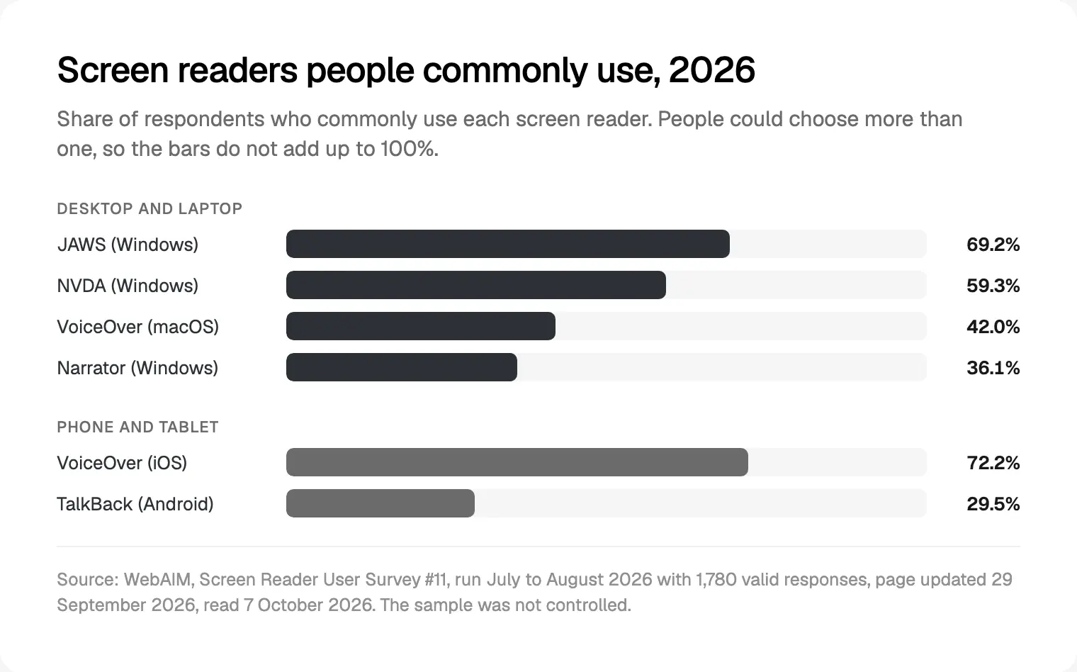
On desktop, 69.2% commonly use JAWS, 59.3% NVDA, 42.0% VoiceOver and 36.1% Narrator; on phones, 72.2% use VoiceOver and 29.5% TalkBack. My release pass covers NVDA, VoiceOver on a Mac and an iPhone, and TalkBack, plus JAWS for North American users. No tool tells you:
- whether focus lands somewhere sensible after a dialog, a route change or a deleted row;
- whether an error helps anyone fix the problem, or an announcement fires once, on time;
- whether 3.3.8, 3.2.6, 3.3.7 and 2.5.7 pass, since none has an axe rule.
Where these checks sit in the build: taking a Figma file to Next.js and how I review AI-generated UI code.
Where I would start
I'd start with one flow, not the whole app:
- Pick sign-in, or the form that makes you money.
- Tab through it, then run it with VoiceOver or NVDA.
- Fix what you find in the shared components, not on the page.
- Add the lint rules and the Playwright scan so the fixes hold.
If you'd rather one person owned the design and the code, that's my design engineering work for startups, with my team building the React and Next.js front end. It starts with a free 30 minute intro call, then a written scope and one fixed quote.
Frequently asked questions
When was WCAG 2.2 released?
W3C published WCAG 2.2 on 5 October 2023 and an updated version on 12 December 2024. The October 2023 text is also ISO/IEC 40500:2025, and W3C expects the December 2024 version to become ISO/IEC 40500:2026 by late 2026. Content that meets 2.2 also meets 2.1.
What is new in WCAG 2.2?
Nine success criteria, six of them at level A or AA: Focus Not Obscured (Minimum), Dragging Movements, Target Size (Minimum), Consistent Help, Redundant Entry and Accessible Authentication (Minimum). The other three are AAA. Criterion 4.1.1 Parsing was removed, because assistive technology no longer parses HTML itself.
What is the best React accessibility checker?
No single tool covers it. Use eslint-plugin-jsx-a11y's recommended rules for the code, Testing Library queries by role for components, and axe-core through Playwright, with the wcag22aa tag on, for rendered pages. Then test by keyboard and screen reader, because tools miss focus order and unclear errors.
Does @axe-core/react work with React 19?
No. Its README says the package doesn't support React 18 and above, and Deque points those users to its axe Developer Hub. For a React 19 or Next.js app, run axe-core in a real browser instead, through @axe-core/playwright in your end-to-end tests or a browser extension during development.
Does Next.js handle focus after a route change?
Partly. Its route announcer reads the new page title, then the h1, then the URL, and in the 16.4.0 source it speaks only when the title changes. The router doesn't move keyboard focus. Give every route a unique title, and move focus to the new heading yourself.
Do duplicate ids still matter now that 4.1.1 Parsing is removed?
Yes. W3C removed the criterion, but says many issues it covered now fail Info and Relationships (1.3.1) or Name, Role, Value (4.1.2). In React, a duplicate id usually means a label or aria-describedby pointing at the wrong element. Generate ids with useId in every reusable field.
Sources and method
I read every source on 7 October 2026 and rechecked links on 9 October. I ran the code: lint with eslint-config-next 16.4.0 and eslint-plugin-jsx-a11y 6.10.2, the form test in Vitest 5.0.3, and the dialog, route and axe tests with Playwright 1.63.0, @axe-core/playwright 4.13.0 and Chrome 154 on a Next.js 16.4.0 test app. I tested no client product.
- W3C, WCAG 2.2, Recommendation of 12 December 2024, date read 7 October 2026: w3.org
- W3C WAI, What's New in WCAG 2.2, and the WCAG 2 Overview (updated 17 September 2026), date read 7 October 2026: w3.org, w3.org
- W3C WAI, Understanding 2.4.11, 2.5.7, 2.5.8, 3.3.7, 3.3.8 and 4.1.1, with techniques C43 and H100, date read 7 October 2026: w3.org, w3.org, w3.org, w3.org, w3.org, w3.org, w3.org, w3.org
- W3C WAI, ARIA Authoring Practices: Read Me First, modal dialog, disclosure, menu button and combobox, date read 7 October 2026: w3.org, w3.org, w3.org, w3.org, w3.org
- WHATWG, HTML Living Standard, the dialog element, date read 7 October 2026: html.spec.whatwg.org
- MDN, dialog, ARIA live regions, autocomplete and prefers-reduced-motion, date read 7 October 2026: developer.mozilla.org, developer.mozilla.org, developer.mozilla.org, developer.mozilla.org
- React, useId and common components, date read 7 October 2026: react.dev, react.dev
- Vercel, Next.js 16.4 docs: accessibility, Image and preserving UI state, date read 7 October 2026: nextjs.org, nextjs.org, nextjs.org
- jsx-eslint, eslint-plugin-jsx-a11y README, and Deque, axe-core README, rule descriptions (4.14) and @axe-core/react README, date read 7 October 2026: github.com, github.com, github.com, github.com
- Microsoft, Playwright accessibility testing, and Testing Library, query priority and jest-dom, date read 7 October 2026: playwright.dev, testing-library.com, github.com
- WebAIM, The WebAIM Million 2026 and Screen Reader User Survey #11 (July to August 2026, updated 29 September 2026), date read 7 October 2026: webaim.org, webaim.org
- Radix Primitives, DropdownMenu, and Adobe, React Aria ComboBox, date read 7 October 2026: radix-ui.com, react-aria.adobe.com