From Figma to Next.js: the path my team follows to a production app
Figma to Next.js the way my team does it: audit the file, turn variables into tokens, build components, then routes, states, checks and preview links.

Going from Figma to Next.js well is less about converting a file than about translating a design system. My team audits the Figma file for missing states first, turns its variables into design tokens and a Tailwind theme, and builds the components before any page. Then we assemble App Router routes and layouts with every loading, empty and error state, images through next/image and fonts through next/font.
Plugins and AI tools help with first drafts; Figma's own MCP server returns React and Tailwind code by default. None of them knows your data, your undrawn states or your component names, so a person still decides the structure. That judgement is what you are really paying for when you hire a Next.js developer for startups.
This is for founders and product leads holding a finished Figma file, and for designers who want to know what developers need. It is the order the team I lead follows, with the check we use at each step.
The Figma to Next.js pipeline my team follows
Nine stages, always in this order. Order matters more than any tool: a gap found in Figma costs one frame, while the same gap found in a pull request costs design, code and review again.
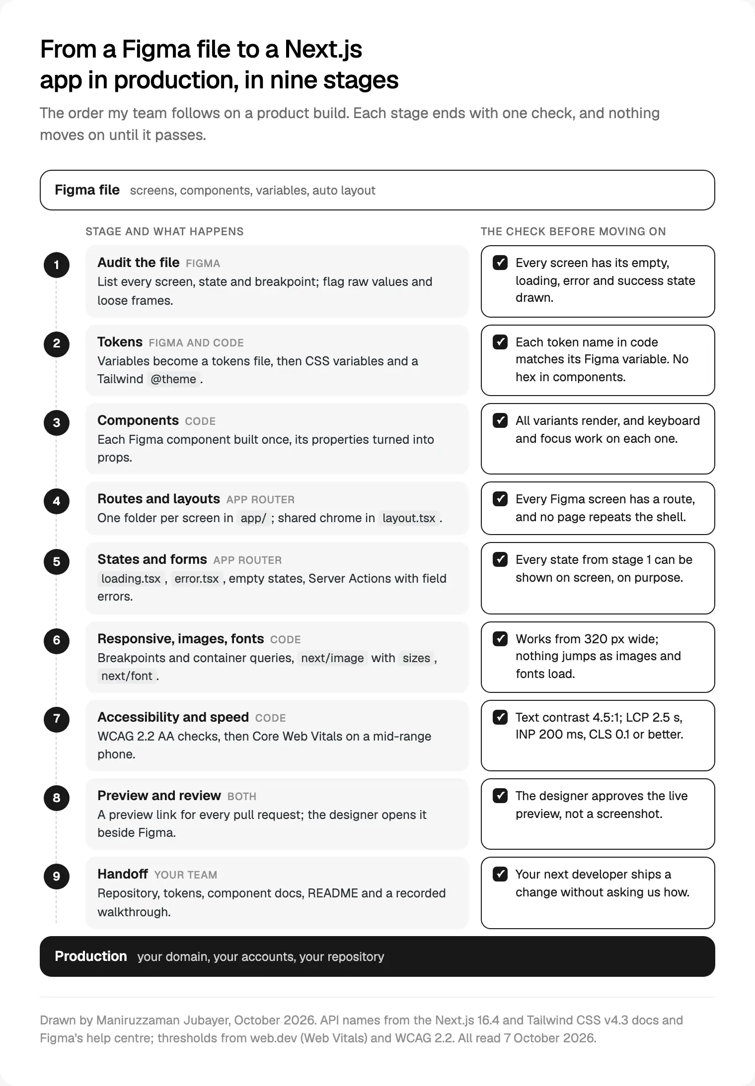
Stages 1 to 3 happen once per product, then stay current. Stages 4 to 8 repeat for every feature in weekly sprints. Stage 9 comes at the end.
Audit the Figma file before anyone writes code
A Figma file shows the product when everything goes right. Code has to handle everything else, so I read every file, ours or a client's, as a developer would and list what is missing:
- States. Every screen needs empty, loading, error and success versions; data screens also need "no permission" and "too much data". I look for long names, zero items and a thousand items.
- Variables. Colour, spacing, radius and type applied as variables, not raw values. Figma variables hold colours, numbers, strings and booleans in collections with modes such as light and dark, per Figma's overview of variables, collections and modes.
- Auto layout. The hug, fill and fixed settings and min and max widths in Figma's guide to auto layout show how things stretch, and translate almost directly into flex and grid.
- Breakpoints. Which widths were drawn, and what happens between them.
- Components and names. Anything repeated is a component, and layers are named for what they are.
Figma's guide to structuring a file for code gives its MCP server the same list, down to renaming Frame1268 to CardContainer.
The audit ends in a written list of gaps, which my designers fill in Figma before development reaches those screens. It also tests scope: a screen with no clear job is a candidate to cut, as in how I scope an MVP.
Figma variables to design tokens, CSS variables and a Tailwind theme
Design tokens are named values, such as surface or action-primary, that the design and the code share. Getting them out of Figma depends on your plan: Figma's Variables REST API needs a full seat in an Enterprise organisation; otherwise we use a plugin export or the MCP server's get_variable_defs tool.
The tokens file follows the Design Tokens Community Group's 2025.10 format, a Final Community Group Report of 28 October 2025: each token has a $value and $type, and aliases go in curly braces. It is stable, though not a W3C Standard, and Style Dictionary supports it from version 4.
I keep two layers. Primitives hold raw values (grey-900); semantic tokens alias them (text points to grey-900). Components use only semantic tokens, so dark mode changes one file.
In Tailwind v4.3, anything in @theme creates utility classes and is exposed as a CSS variable, and --color-*: initial removes the default palette, as Tailwind's theme variables docs explain. That is my favourite guardrail: nobody can reach for an off-system blue that does not exist.
@import "tailwindcss";

/* Figma variable values, one block per mode */
:root { --surface: #ffffff; --text: #191919; }
[data-theme="dark"] { --surface: #191919; --text: #f6f6f6; }

/* Figma names, so bg-surface means one thing */
@theme inline {
  --color-surface: var(--surface);
  --color-text: var(--text);
  --font-sans: var(--font-geist);
}
The check: every token name in code matches its Figma variable, and a search for hex values in the components folder finds nothing.
Build components before pages
With tokens in place, we build every component the screens need, then assemble pages. A dashboard repeats the same table, filter and chart on every screen, so building each once keeps the product consistent.
Radix Primitives ship unstyled and follow WAI-ARIA design patterns, handling roles, focus and keyboard navigation. shadcn/ui calls itself not a component library but a way to build yours: its code, built on Radix UI or Base UI, is copied into your project to edit. Both work if the result uses your tokens and Figma names.
My default is our own code for simple pieces (button, input, card) and primitives for dialogs, menus, comboboxes and tabs, because focus traps and screen reader announcements are where hand-rolled code usually breaks.
Each Figma component becomes a React component whose props mirror its properties. Figma's five property types (variant, boolean, instance swap, text and slot), listed in Figma's guide to component properties, each have a natural home in code:
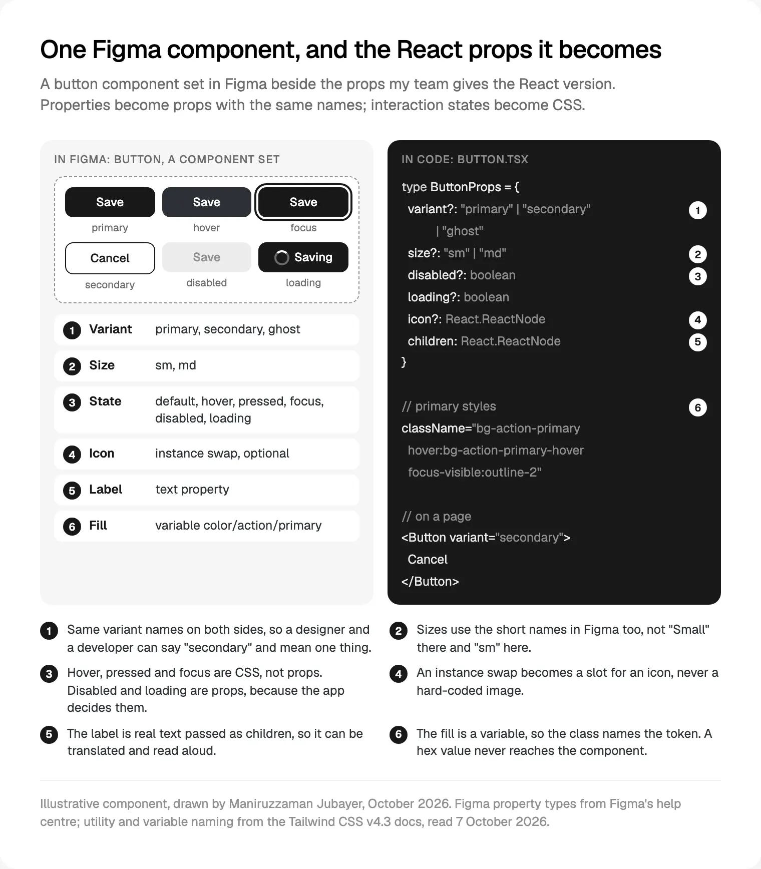
Layouts and pages are Server Components by default; anything with state or event handlers must be a Client Component, per the Next.js guide to Server and Client Components. We keep that boundary small: a card that only shows data stays on the server, and only its button runs in the browser.
The check: every variant renders on one test page, and each interactive component works by keyboard alone.
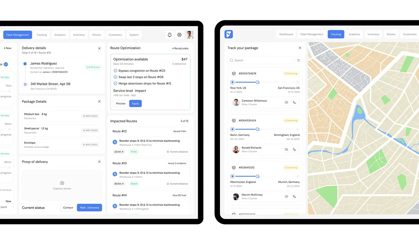
App Router: layouts, routes and every state
Now the Figma screens map onto folders in app/. A layout is UI shared between pages that keeps its state and does not rerender on navigation. A typical product file maps like this:
| In the Figma file | In the Next.js app |
|---|---|
| Sidebar and top bar on every screen | app/(app)/layout.tsx |
| Dashboard screen | app/(app)/dashboard/page.tsx |
| Skeleton version of the dashboard | app/(app)/dashboard/loading.tsx |
| "Something went wrong" frame | app/(app)/dashboard/error.tsx |
| Detail screen for one record | app/(app)/projects/[id]/page.tsx |
| "No projects yet" empty state | A branch inside the page, not a file |
`loading.js` shows an instant loading state while the segment streams in, so the designer's skeleton is what people see first. `error.js` must be a Client Component, and since Next.js 16.3 it receives retry(), which re-fetches and re-renders the segment, while reset() clears the error without re-fetching.
Next.js 16.4, released on 6 October 2026, turns Cache Components on by default for new apps from create-next-app: the static shell streams first and uncached content fills in behind Suspense boundaries. Knowing which parts of each screen wait for data tells us where skeletons go.
Forms
Forms drift furthest from the design, because their states are rarely all drawn. The Next.js forms guide has a form call a Server Action, validate on the server with a library such as Zod or Valibot, show errors and a pending flag through React's useActionState, and check authentication inside every action.
So the audit asks for each field's error message, the pending submit button and the screen after success. It is the part of how my team builds MVPs from a Figma file that founders rarely see in a demo, and that users meet first.
Responsive behaviour, images and fonts
Figma frames have fixed widths; browsers have every width between. Tailwind is mobile first, with default breakpoints, per Tailwind's responsive design docs, of sm 40rem (640px), md 48rem (768px), lg 64rem (1024px), xl 80rem (1280px) and 2xl 96rem (1536px). We set --breakpoint-* to the widths the designer drew.
Components need more than viewport breakpoints. A card in a narrow sidebar and in the main column needs two layouts at one screen width, so we use container queries (@container, then @md: variants). Then we drag the browser through every width, not just the drawn ones.
The Next.js Image component serves correctly sized files in formats such as WebP, lazy loads by default and prevents layout shift. Two details matter:
- `sizes`: without it, the browser assumes the image fills the viewport and may download a far larger file than needed.
- The hero image: since Next.js 16,
priorityis deprecated in favour ofpreload, and the docs sayloading="eager"orfetchPriority="high"is usually the better choice.
`next/font` downloads Google Fonts at build time and self-hosts them, so the browser sends no requests to Google, and an adjusted fallback font reduces layout shift. Its variable option gives the --font-geist in the theme above. For a paid typeface, check that its licence covers web use before self-hosting it.
Accessibility and Core Web Vitals checks
Accessibility starts in Figma, where contrast is cheap to fix, and finishes in code. We check against WCAG 2.2 level AA, a W3C Recommendation last updated on 12 December 2024:
| Check | WCAG 2.2 | Where we catch it |
|---|---|---|
| Text contrast of at least 4.5:1 | 1.4.3 | Figma, in token values |
| Controls and icons at 3:1 | 1.4.11 | Figma, then focus rings in code |
| Targets of at least 24 by 24 CSS pixels | 2.5.8 | Figma, then spacing in code |
| A visible focus indicator | 2.4.7 | Code, tabbing through each flow |
| Focus never fully hidden, say by a sticky header | 2.4.11 | Code |
| No sideways scrolling at 320 CSS pixels wide | 1.4.10 | Code, in the responsive pass |
For speed, Google's Web Vitals article on web.dev counts a page as good when Largest Contentful Paint (LCP) is within 2.5 seconds, Interaction to Next Paint (INP) is 200 milliseconds or less and Cumulative Layout Shift (CLS) is 0.1 or less, at the 75th percentile of page loads, mobile and desktop separately.
Each metric traces back to design: LCP is usually the hero image or headline, CLS comes from images without dimensions and late fonts, and INP suffers when a click runs heavy JavaScript. We test on a mid-range phone, and after launch we use the `useReportWebVitals` hook to send real users' numbers to your analytics.
Figma to Next.js plugins and AI tools: where they help
Many people want to convert Figma to Next.js in one click. The tools are useful, but each stops at the same line: it sees what was drawn, not what the product does. By their own documentation:
| Tool | Where it helps | What your team still does |
|---|---|---|
| Figma's MCP server, with a coding agent in your repository | Reads variables, layout and a screenshot of a frame; returns React and Tailwind by default, or uses your components when told | Data, routing, undrawn states and review; View and Collab seats get up to 20 tool calls a month |
| Code Connect | Shows your real component code in Dev Mode and gives agents your component names | Needs an Organization or Enterprise plan, and someone to keep mappings current |
| Code-export plugins such as Locofy, Anima and Builder.io's Visual Copilot | A fast first pass of static screens as React or Next.js, with Tailwind as an option | Data fetching, sign-in, validation, states, accessibility and checking the fit with your library |
| v0, from a pasted Figma link | Reads frames, variables, layout and assets into a working app, on paid v0 plans | Moving the result into your routes, components and data |
| Figma Make | Turns prompts and frames into a React prototype you can download | Rebuilding it as App Router routes with real data and every state |
My team uses AI inside your product's repository, after the tokens and components exist: the agent reads a frame through the MCP server and is told to use our components, as in Figma's example prompt "generate my Figma selection using components from src/components/ui". A person who knows the design reviews every change, the loop I describe in my design-to-code workflow.
Preview deployments, review and handoff
Every pull request gets a preview link. On Vercel, a preview deployment is created by default for each push to a non-production branch and each pull request. Vercel Comments are on by default for previews on all plans, though everyone commenting needs a Vercel account. On other hosts we build the same habit into the pipeline.
The designer who drew the screen opens the preview beside the Figma file and approves the live version, not a screenshot. At the weekly review call you see working software, never slides.
Handoff is planned from day one: the repository, hosting and accounts are in your name from the start. At the end you get a README, the tokens file, a page of every component and variant, tests on the risky paths and a recorded walkthrough.
Where I would start
Start with the audit, not the build. Ask whoever builds your product to list the missing states and raw values before quoting; that list says more than a portfolio.
For a marketing site, you may not need Next.js at all; my comparison of Framer, Webflow and Next.js helps you decide. For a product with sign-in, data and real states, keep design and code in one team, the idea behind my design engineering work.
My team works from Dhaka, with evening calls for the Americas; more on how I work. A project starts with a free 30 minute intro call, then a written scope and one fixed quote, with no retainer. If that suits you, here is MVP development in Next.js with my team.
Frequently asked questions
Can you convert Figma to Next.js automatically?
Partly. Figma's MCP server, code-export plugins and v0 can turn frames into React or Next.js code with Tailwind. They cannot know your data, your sign-in, the states nobody drew or the components you already have. Treat the output as a draft that a developer restructures and tests like hand-written code.
What is the best Figma to Next.js plugin?
Judge plugins by their output, not rankings. Check whether the code uses your components and tokens, whether it writes App Router routes or only components, whether a changed design re-syncs without losing code, and who reviews it. For a product, the audit and component library matter more than the plugin.
Can AI turn a Figma design into a Next.js app?
It can produce a working first version: Figma Make builds a React prototype from prompts and frames, and v0 builds an app from a pasted Figma link on paid plans. For production, my team runs a coding agent in the real repository through Figma's MCP server, told to use our components, and a person reviews every change.
How do I go from Figma to Next.js with Tailwind?
Export your Figma variables as design tokens, map them to CSS variables and declare them in Tailwind v4's @theme, so bg-surface matches the surface variable in Figma. Load fonts with next/font and pass its CSS variable to --font-sans. Set --breakpoint-* to the drawn widths, then build components before pages.
How do I get React code from a Figma design?
Dev Mode and Figma's MCP server are the official routes. The MCP server's get_design_context tool returns React and Tailwind by default and can target other frameworks or your own components. Code Connect, on Organization and Enterprise plans, shows your real component code instead. Either way, name props after the Figma component properties.
Should we use shadcn/ui or build our own components?
Either works if the result carries your tokens and Figma names. shadcn/ui copies editable code, built on Radix UI or Base UI, into your project, which suits a fast start you fully own. Your own components suit a distinctive design system. My default is custom simple components plus accessible primitives for dialogs, menus and comboboxes. For public systems worth studying first, see nine design system examples and what to copy.
Sources and method
I read every source on 7 October 2026; the Next.js pages showed docs version 16.4.0 or 16.3.8. I did not test the plugins or AI tools: their rows describe their own documentation, and I found no neutral benchmark of their output. The illustrations are drawn for this post.
- Vercel, Next.js docs, versions 16.3.8 to 16.4.0: nextjs.org, nextjs.org, nextjs.org, nextjs.org, nextjs.org, nextjs.org, nextjs.org, nextjs.org
- Vercel, Next.js 16.4 release post, 6 October 2026: nextjs.org
- Tailwind Labs, Tailwind CSS v4.3 docs, theme variables and responsive design: tailwindcss.com, tailwindcss.com
- Figma Help Center, variables, auto layout, component properties, Figma Make code: help.figma.com, help.figma.com, help.figma.com, help.figma.com
- Figma developer docs, Variables REST API: developers.figma.com
- Figma developer docs, MCP server file structure, tools and rate limits: developers.figma.com, developers.figma.com, developers.figma.com
- Figma developer docs, Code Connect: developers.figma.com
- Design Tokens Community Group, Format Module 2025.10, 28 October 2025: designtokens.org
- Style Dictionary, DTCG support: styledictionary.com
- Radix UI, Primitives introduction: radix-ui.com
- shadcn/ui, introduction: ui.shadcn.com
- W3C, WCAG 2.2, Recommendation updated 12 December 2024: w3.org
- Google, Web Vitals on web.dev, updated 31 October 2024: web.dev
- Vercel docs, environments (updated 17 September 2026) and Comments (updated 19 August 2026): vercel.com, vercel.com
- Vercel, v0 Figma integration docs: v0.app
- Plugin makers' pages, Locofy, Builder.io and Anima: locofy.ai, builder.io, docs.animaapp.com