What five health products taught me about healthcare app design
Healthcare app design lessons from five health products my team designed: patients and staff, booking, records, consent, accessibility and alerts.

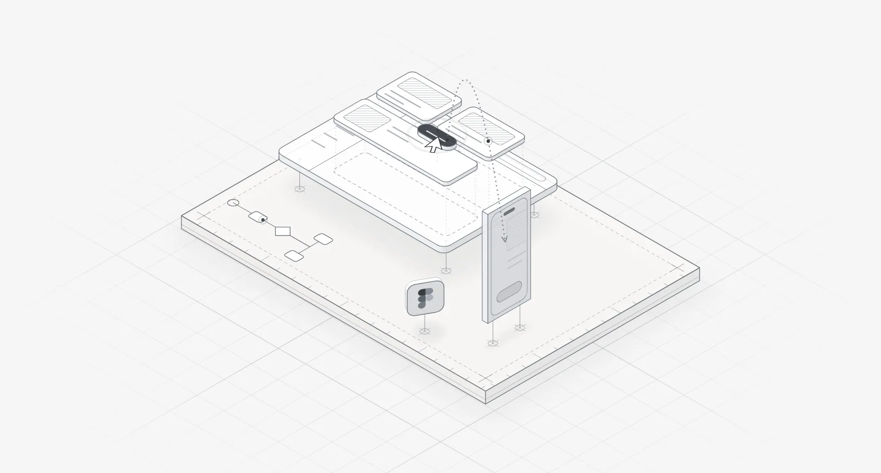
Healthcare app design differs from other product work in a few concrete ways. One product serves patients, who open it a few times a year and are often worried or unwell, and staff, who use it all day. Bookings must show only slots that exist. Records need rules for who sees what before anyone draws a screen. Privacy, consent and accessibility have to show on the screen, not hide in a policy.
These lessons come from five health products my team designed. This post is for founders and product leads planning a patient app, a clinic dashboard or a health SaaS, and for anyone deciding whether to hire a product designer for healthcare SaaS.
Each rule comes from a primary source, from HHS and the GDPR to WCAG 2.2 and the CDC. I'm a designer, not a lawyer, so treat the legal parts as questions for your counsel.
The five products, and why most have two audiences
| Product | What my team designed | Main users |
|---|---|---|
| Mediso | A hospital management dashboard, for the web | Hospital admin teams |
| VitalHealth | A healthcare SaaS for finding and booking doctors: its dashboard, more than 50 screens | Clinic staff |
| CareUp | An AI healthcare app for finding a doctor and booking, on iOS | Patients |
| Wave | A Webflow website for a medical software SaaS | Healthcare buyers |
| Sovia | Website and app screens for a mental wellbeing platform | People seeking support |
The patient side is opened now and then, usually on a phone, by someone who would rather be elsewhere. The staff side is open all day, with a queue waiting. To me, that is the real split between healthcare mobile app design and healthcare web app design: not screen size, but how often people come and in what state.
So I design the two sides as two products on one data model. A slot, an appointment and a record are defined once and shown in two vocabularies: a patient might see "Heart doctor (cardiology)" where the front desk sees "Cardiology". Agreeing that model first is where my product design for SaaS and health teams starts.
Booking and scheduling: only show slots that exist
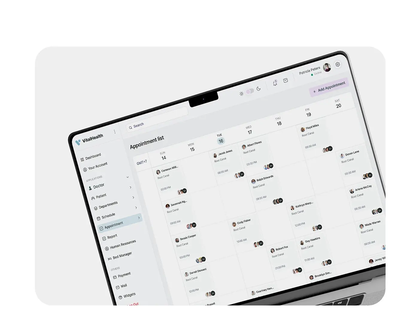
VitalHealth's brief named the failures: unavailable slots, no real-time updates, too little doctor information and missed reminders. CareUp's research asked for booking in a few taps, with credentials, ratings and availability shown before anyone decides. So CareUp's doctor details screen shows rating, experience, working days and fee above the date and time picker, and VitalHealth's week view shows staff the open slots at a glance.
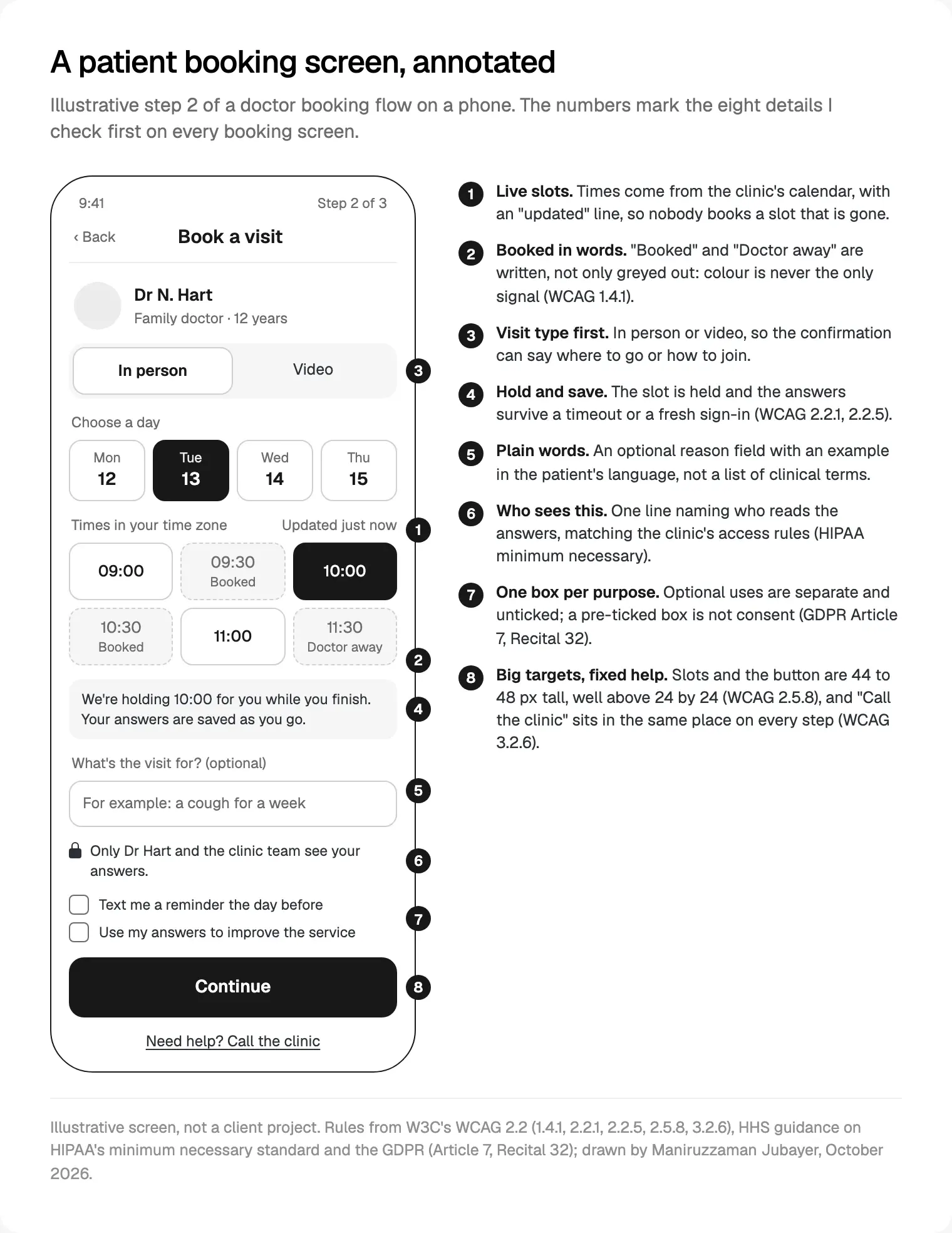
The order I design a booking flow in:
- Define a slot with the clinic: length, buffer, who may book it and what happens when a shift changes.
- Draw the staff calendar and the patient picker from that one slot, so neither can show what the other cannot.
- Label unavailable times in words, because WCAG 2.2 says colour must not be the only visual means of conveying information (1.4.1).
- Hold the slot while the patient finishes, and keep their answers if the session ends.
- Write the confirmation as instructions: date, time zone, place or video link, what to bring, how to cancel.
- Make rescheduling as short as booking. CareUp's appointment list puts Join Now on the next visit and reschedule on the rest.
Forms staff complete between patients
Mediso's brief starts from hospital admins working under time pressure, and its Add Doctor and Add Patient forms include document upload. Forms like these fail in familiar ways: a call interrupts, the session times out, an upload stalls, and the half-finished record is gone. So every staff form I design saves as you go, shows each upload's progress and puts errors beside the field without clearing anything. WCAG 2.2's Redundant Entry (3.3.7) adds one more: don't ask for the same information twice in one process.
Time is the hard part. The HIPAA Security Rule lists automatic logoff as an addressable specification in 45 CFR 164.312, and HHS's Security Rule summary says addressable does not mean optional. WCAG 2.2's Timing Adjustable (2.2.1) asks that people can turn off, adjust or extend a time limit, for example with a warning and at least 20 seconds to extend, unless an exception applies. My pattern respects both: a warning, one button to stay signed in, the draft kept, and sign-in that returns you to the same field. Your security team sets the timer; I design how it ends.
Records and permissions: decide who sees what first
Mediso puts a patient's vitals, ward, diagnosis and reports on one profile. HIPAA's minimum necessary standard asks covered entities to limit uses of protected health information to what the purpose needs, and HHS says their policies must identify the persons or classes of persons who need access, the categories of information and the conditions. Disclosures to a provider for treatment are exempt.
That is a role matrix in all but name, and I want it before the first wireframe. The Security Rule's technical safeguards then become screens:
| 45 CFR 164.312 | In the rule | On screen |
|---|---|---|
| Unique user identification | Required | Everyone signs in as themselves, with quick switching on a shared tablet |
| Emergency access procedure | Required | A designed emergency route, with a reason field, that is logged |
| Automatic logoff | Addressable | A warning, one action to extend, the draft kept |
| Audit controls | Standard | A readable access history on each record |
In December 2024, HHS proposed a Security Rule update that would, per its fact sheet, require multi-factor authentication with limited exceptions. On 7 October 2026, HHS still presented it as a proposal and said the current rule remains in effect, so I design sign-in where a second factor can be added later without a redesign.
Privacy and consent you can see on the screen
In the US, the screen decision HIPAA touches most is analytics. HHS's bulletin on online tracking technologies says tracking on a regulated entity's logged-in pages, such as a patient portal or telehealth platform, generally has access to protected health information, and that what its mobile app collects is generally PHI too. A court vacated the part about public, logged-out pages in June 2024. So the analytics plan belongs in the design scope, with marketing pixels kept off booking, portal and telehealth screens unless counsel clears them.
In the EU, the GDPR defines data concerning health in Article 4(15), and Recital 35 includes information collected when someone registers for care, so a booking form counts. Article 9 prohibits processing it unless an exception applies, such as explicit consent or the provision of health care. Where consent is the basis, Article 7 wants it distinguishable from other matters, in plain language and as easy to withdraw as to give, and Recital 32 says pre-ticked boxes are not consent. On screen: one box per purpose, unticked, each saying who sees the data.
Healthcare app design for older users and low vision
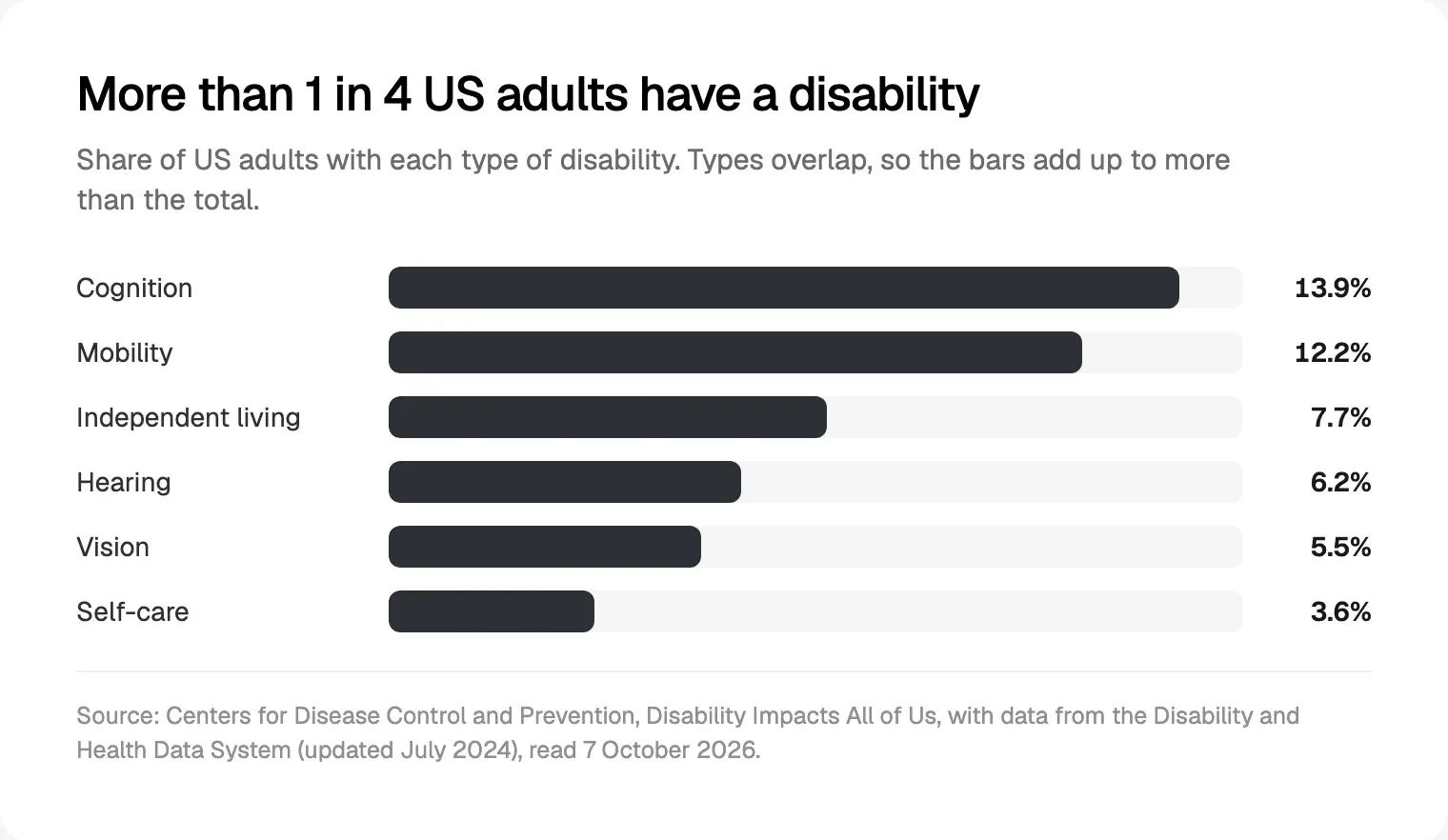
WHO's disability fact sheet estimates that 1.3 billion people, 1 in 6, experience significant disability. Its vision fact sheet counts at least 2.2 billion people with a near or distance vision impairment, most of them over 50. In the US, the CDC's Disability Impacts All of Us says more than 1 in 4 adults have a disability: 13.9% cognition, 12.2% mobility, 7.7% independent living, 6.2% hearing, 5.5% vision and 3.6% self-care.
So healthcare app UI design starts at WCAG 2.2 level AA. The checks I run first on patient screens:
| Check | WCAG 2.2 | Where it bites |
|---|---|---|
| Text contrast of 4.5:1, or 3:1 for large text | 1.4.3 | Grey helper text |
| Text resizes to 200% without loss | 1.4.4 | The whole booking flow |
| Targets of at least 24 by 24 CSS pixels | 2.5.8 | Time slots and date strips |
| Help in the same place on every page | 3.2.6 | "Call the clinic" |
| No memory test to sign in | 3.3.8 | Allow paste and password managers |
On phones I aim higher. Apple's accessibility guidelines give 44 by 44 points as the default control size on iOS, and Android's accessibility guide recommends targets of at least 48 by 48 dp. My WCAG 2.2 checklist for React teams covers the code side.
Plain language and health literacy
The CDC's plain language resources say plain language makes it easier for everyone to understand and use health information, and cite the Plain Writing Act of 2010; its Clear Communication Index gives 20 research-based items for checking materials. In England, the NHS digital service manual says more than 4 in 10 adults struggle with health content written for the public, and more than 6 in 10 with content that includes numbers and statistics. One of its examples: a man missed cancer tests because he did not know Radiology and the X-ray department were the same.
On screen, that means patient words first with the clinical term second ("X-ray (radiology)"), one main message per screen, a unit, a date and a plain explanation beside every number, and one question at a time, as CareUp's AI assistant asks where it hurts, how badly and what helps. Test the words with people too: the NHS manual does not recommend readability tools except to help prioritise content.
Alerts, urgency and safety
AHRQ's primer on alert fatigue cites a 2014 study in which the monitors in an academic hospital's 66 adult intensive care beds produced more than 2 million alerts in one month, 187 warnings per patient per day. People stop reacting, then miss the alert that matters. The primer's fixes are design choices: cut alerts that rarely matter, tier them by severity, make only severe ones interruptive, and apply human factors to format, legibility and colour.
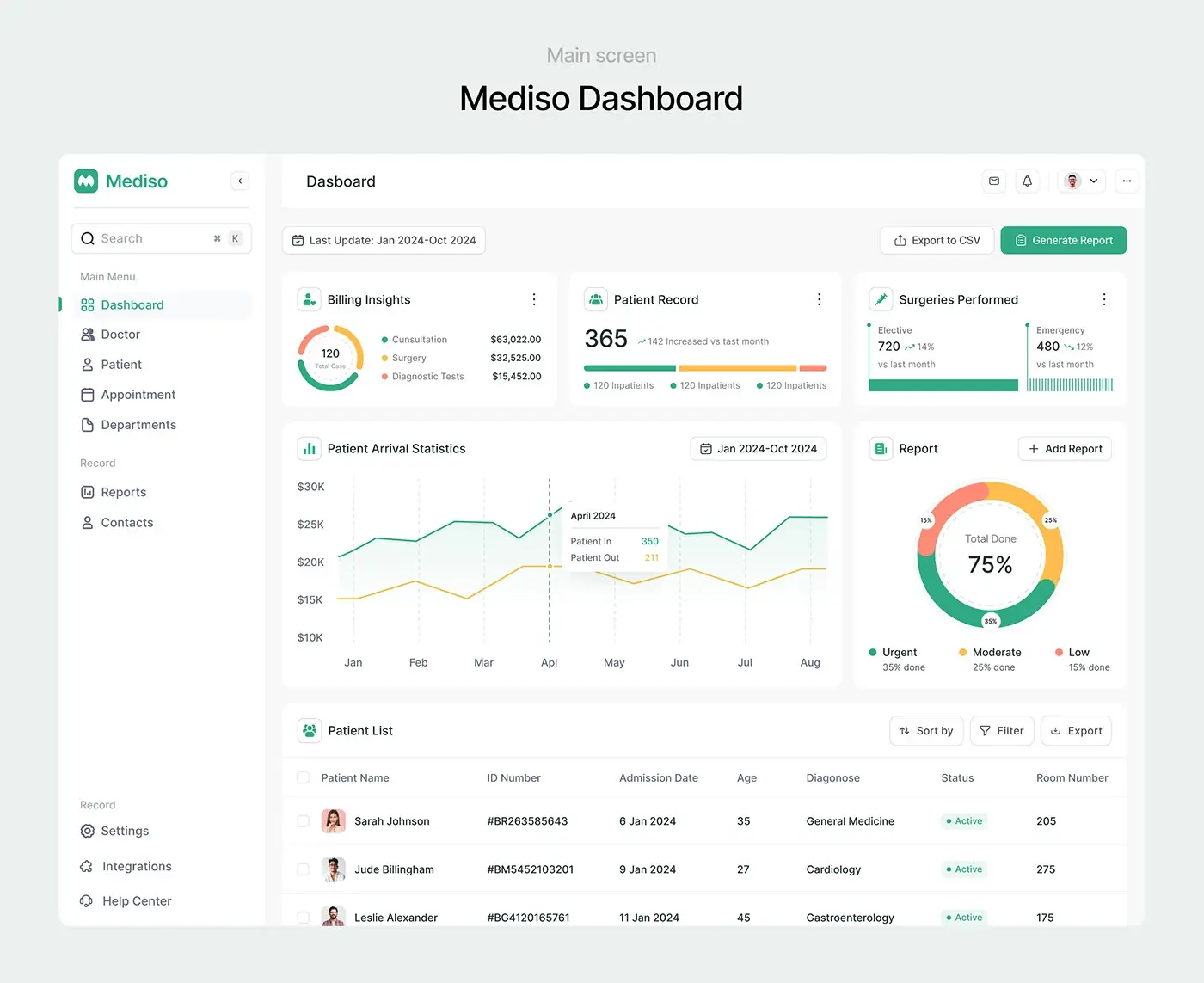
Mediso shows the calm version: reports grouped as urgent, moderate and low, and doctor attendance visible before a gap opens. My rules: three levels at most, each named in words; every alert says what to do next and who owns it; and on the patient side, urgency always leads to a person. CareUp's assistant explains its urgency level and nudges people to see a doctor.
If a feature diagnoses or treats, check early whether it is regulated: the FDA's Digital Health Policy Navigator explains that software intended for use in diagnosing, treating or preventing disease may meet the definition of a device. For alert thresholds on staff screens, see SaaS dashboard design best practices; for explaining AI output, how to ship AI features people trust.
Telehealth screens
CareUp puts Join Now on the next visit, and Wave's software covers telehealth beside electronic health and billing. HHS's guide to helping patients prepare for telehealth reads like a list of states to design: how the patient will connect (a call, an email link or a text), what to do if either side cannot connect, joining 15 minutes early to troubleshoot, what to expect in a virtual waiting room, finding a private place, and what an interpreter or caregiver may hear.
Its page on creating an emergency plan asks clinicians to confirm the patient's exact location at the start of each appointment and agree who calls whom if the call drops. I put both on the pre-call screen, as a location check and a callback number, beside a consent step the clinic can switch on, since HHS notes a provider may be required to get informed consent.
A design system for 50 screens and more
VitalHealth has more than 50 screens on desktop and tablet. They hold together through one sidebar, one header with search and notifications, Inter in four weights and one blue palette, with tables, cards and calendars repeating, so staff learn the layout once. Mediso uses one pattern everywhere: key numbers in cards on top, the working list below.
Health products also need components most systems lack: a slot picker with available, held and booked states; a status chip that always carries text; a vital sign tile with unit and date; a consent row; a session warning; an access history row. Each carries the same name and tokens in Figma and in code, which is why I believe in designing and building in one team: whoever drew the session warning checks it in the browser.
Where I would start
List the roles and each one's main job. Agree the access matrix and the analytics plan with whoever owns compliance, before wireframes. Define a slot with the clinic and design both sides of the booking together. Then test the booking flow at 200% text with people like your patients.
My projects run that way: a free 30 minute intro call, a written scope and one fixed quote, weekly sprints in Figma and a written update in Slack every 48 hours. If that suits you, see my product design work for health founders.
Frequently asked questions
What makes healthcare app design different?
One product usually serves patients and staff, who arrive with different needs and at different frequencies. The data is sensitive, so access, consent and analytics become design decisions. And many users have a disability, low vision or low health literacy, so WCAG 2.2 AA, large targets and plain words are the baseline.
Does a healthcare app need to be HIPAA compliant?
HIPAA binds covered entities, such as health plans and most health care providers, and their business associates. HHS says information a regulated entity's mobile app collects is generally protected health information. Apps not offered by or for a regulated entity fall outside HIPAA, though the FTC Act and the Health Breach Notification Rule may apply. Ask your counsel which applies to you.
How does the GDPR apply to health apps?
Health data is a special category under Article 9, and Recital 35 covers information collected when someone registers for care, so even a booking form counts. Processing is prohibited unless an exception applies, such as explicit consent or the provision of health care. Where consent is the basis, keep it separate, in plain language, unticked and as easy to withdraw as to give.
What accessibility standard should a healthcare app meet?
WCAG 2.2 level AA: text contrast of 4.5:1, text that resizes to 200%, targets of at least 24 by 24 CSS pixels, help in a consistent place and sign-in without a memory test. On phones, Apple's 44 by 44 point default and Android's 48 by 48 dp are a better floor for older or unsteady hands.
How long does it take to design a healthcare dashboard?
It depends on the roles, screens and research. Mediso, a hospital management dashboard, ran from 10 April to 29 May: 15 days of research, 5 of functional design, 20 of wireframing and prototyping and 10 of UI design. After a free 30 minute intro call, you get a written scope and one fixed quote for the whole project.
Can your team build the healthcare app too?
Yes. My team builds web apps and front ends in TypeScript, React and Next.js, and iOS and Android apps in React Native or Flutter, from the same documented design system. We use AI coding tools where they save time, and a person who knows the design reviews every change.
Sources and method
I read every source on 7 October 2026, the HHS pages in a browser because they refuse automated requests. NIH's plain language page sat behind a bot check, so that guidance comes from the CDC. Product details come only from my team's case study write-ups; the diagram is illustrative. The health literacy figures describe adults in England.
- U.S. Department of Health and Human Services, HIPAA guidance (minimum necessary, Security Rule, proposed update, tracking technologies), read 7 October 2026: hhs.gov, hhs.gov, hhs.gov, hhs.gov, hhs.gov
- eCFR, 45 CFR 164.312 Technical safeguards, read 7 October 2026: ecfr.gov
- EUR-Lex, Regulation (EU) 2016/679 (GDPR), Articles 4, 7 and 9, Recitals 32 and 35, read 7 October 2026: eur-lex.europa.eu
- W3C, WCAG 2.2, Recommendation of 12 December 2024, read 7 October 2026: w3.org
- World Health Organization, fact sheets on disability (7 March 2023) and blindness and vision impairment (10 February 2026), read 7 October 2026: who.int, who.int
- Centers for Disease Control and Prevention, Disability Impacts All of Us, plain language resources and the Clear Communication Index, read 7 October 2026: cdc.gov, cdc.gov, cdc.gov
- NHS England, digital service manual, health literacy, read 7 October 2026: service-manual.nhs.uk
- Apple, Human Interface Guidelines, accessibility, read 7 October 2026: developer.apple.com
- Android Developers, make apps more accessible, read 7 October 2026: developer.android.com
- Agency for Healthcare Research and Quality, PSNet primer on alert fatigue, read 7 October 2026: psnet.ahrq.gov
- U.S. Food and Drug Administration, Digital Health Policy Navigator, read 7 October 2026: fda.gov
- U.S. Department of Health and Human Services, Telehealth.HHS.gov guides on preparing patients and emergency plans, read 7 October 2026: telehealth.hhs.gov, telehealth.hhs.gov