ADA website accessibility for New York fintechs: the fixes that come first
ADA website accessibility in New York for fintech apps: why lawsuits cluster here, what audits find, and the WCAG 2.2 AA fixes I make first.

New York sees more ADA website and app accessibility lawsuits than any other state. Seyfarth Shaw counted 3,117 website accessibility suits in US federal courts in 2025, 1,021 of them in New York, and UsableNet, which also tracks state courts, says New York leads in both. You don't need an office in the state to be sued there.
Fintech is not the main target: UsableNet puts banking and financial firms under 1% of 2025 cases, against 70% for e-commerce. The fix is the same either way. Design to WCAG 2.2 AA from the first screen, and if your product is live, start where money moves: sign-in, transfers, balances and statements. For the sign-in rules New York's regulator adds, see NYDFS MFA requirements for fintech apps.
My work as a fintech product designer in New York runs remotely from Dhaka, in your morning, and this is the method I use. It's for founders and product leads whose product serves New Yorkers. I'm a designer, not a lawyer, so none of this is legal advice.
Why New York sees so many accessibility lawsuits
Seyfarth Shaw's count of federal website accessibility lawsuits for 2025 rose 27% to 3,117. New York's federal courts had 1,021, Florida's 961 and California's four. New York's federal peak was 2,560 in 2022, so filings there have fallen as state court cases grew.
Seyfarth's explanation is legal. Most New York district judges who have ruled on it treat online-only businesses as covered by the ADA; California's courts have said they are not, and the Second Circuit has not decided. New York federal judges have also become stricter about standing, pushing many plaintiffs into New York and New Jersey state courts. There, section 297(9) of New York's Human Rights Law lets a person sue for damages.
UsableNet's 2025 year-end lawsuit report counts both sides, and finds repeat claims common: 1,427 federal cases, 45%, named companies that had already been sued.
| Count | What it covers | 2025 figure |
|---|---|---|
| Seyfarth Shaw | Federal ADA Title III website suits | 3,117 in total, 1,021 in New York |
| UsableNet | Federal suits plus New York and California state courts; websites, apps and video, to 15 December | More than 5,000 reviewed: 3,195 federal, 1,919 state |
| UsableNet, by industry | Share of all cases | E-commerce 70%, food service 21%, healthcare 2%, banking and financial under 1% |
The counts differ because the methods differ. My reading for a fintech founder: you're less likely to be sued than a retailer, but serving New Yorkers puts you in the busiest court system for these claims.
What ADA website accessibility means for a New York fintech
Title III of the ADA covers businesses open to the public. The Justice Department's 2022 guidance on web accessibility and the ADA says they must make what they offer online accessible, and names the usual barriers: poor colour contrast, missing labels, mouse-only controls, videos without captions. It sets no technical standard for private companies, gives them flexibility and points to WCAG as helpful. One sample case is an agreement with H&R Block over a website that didn't work with assistive technology.
Governments have a firm rule. The Title II web and mobile app rule of 2024 names WCAG 2.1 AA for state and local governments, and an interim final rule of 20 April 2026 moved the deadlines to 26 April 2027 or 26 April 2028, by size. If you process payments for a city, it reaches you: the DOJ's own example is a parking payment app run by a private company.
So ADA compliance for a fintech app isn't a certificate you buy. It's a product people with disabilities can use, judged against a standard, and mine is WCAG 2.2. W3C says content that conforms to 2.2 also conforms to 2.0 and 2.1. The nine criteria new in 2.2 include several that money screens trip over: accessible sign-in, focus hidden behind sticky bars and small targets. For native apps, W3C's WCAG2ICT note explains how each criterion applies outside the browser.
The accessibility issues audits find most often
I start every audit with automated tests, then work by hand, because automation misses a lot. In February 2026, the WebAIM Million found detected WCAG failures on 95.9% of the top million home pages, 56.1 errors per page on average. Six error types made up 96% of them.
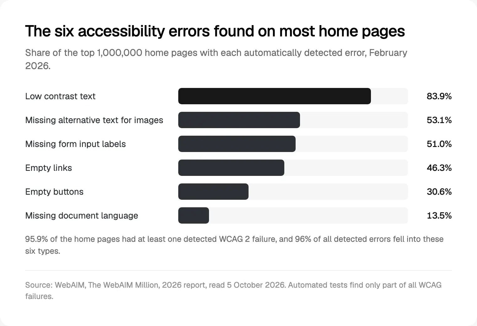
Two details matter for fintech. Personal finance sites averaged 45.4 errors, 19% fewer than the whole sample. And pages with ARIA had more errors, 59.1 against 42 without, which fits what usually goes wrong: ARIA added to patch a custom component often breaks it further. I use native HTML first.
Home pages are the easy part. The barriers in a finance product sit behind the login, where no crawl reaches.
How I build WCAG 2.2 AA into a fintech product from day one
Accessibility is cheapest in the design system, before any screen exists. On a new fintech product I set it up in this order:
- Colour tokens with contrast pairs. Text checked at 4.5:1, and borders, icons and chart lines at 3:1, before the first screen.
- Components with every state. Default, hover, focus, error, disabled and loading, so nobody invents a focus ring in sprint six.
- Notes on every screen. Focus order, reading order, headings, labels and what a screen reader says for each icon button.
- Text that grows. Layouts checked at 200% text, at 320 px wide (the reflow width WCAG uses) and with Dynamic Type on iOS.
- Tests with real tools. Keyboard only, VoiceOver and TalkBack on every key flow before release.
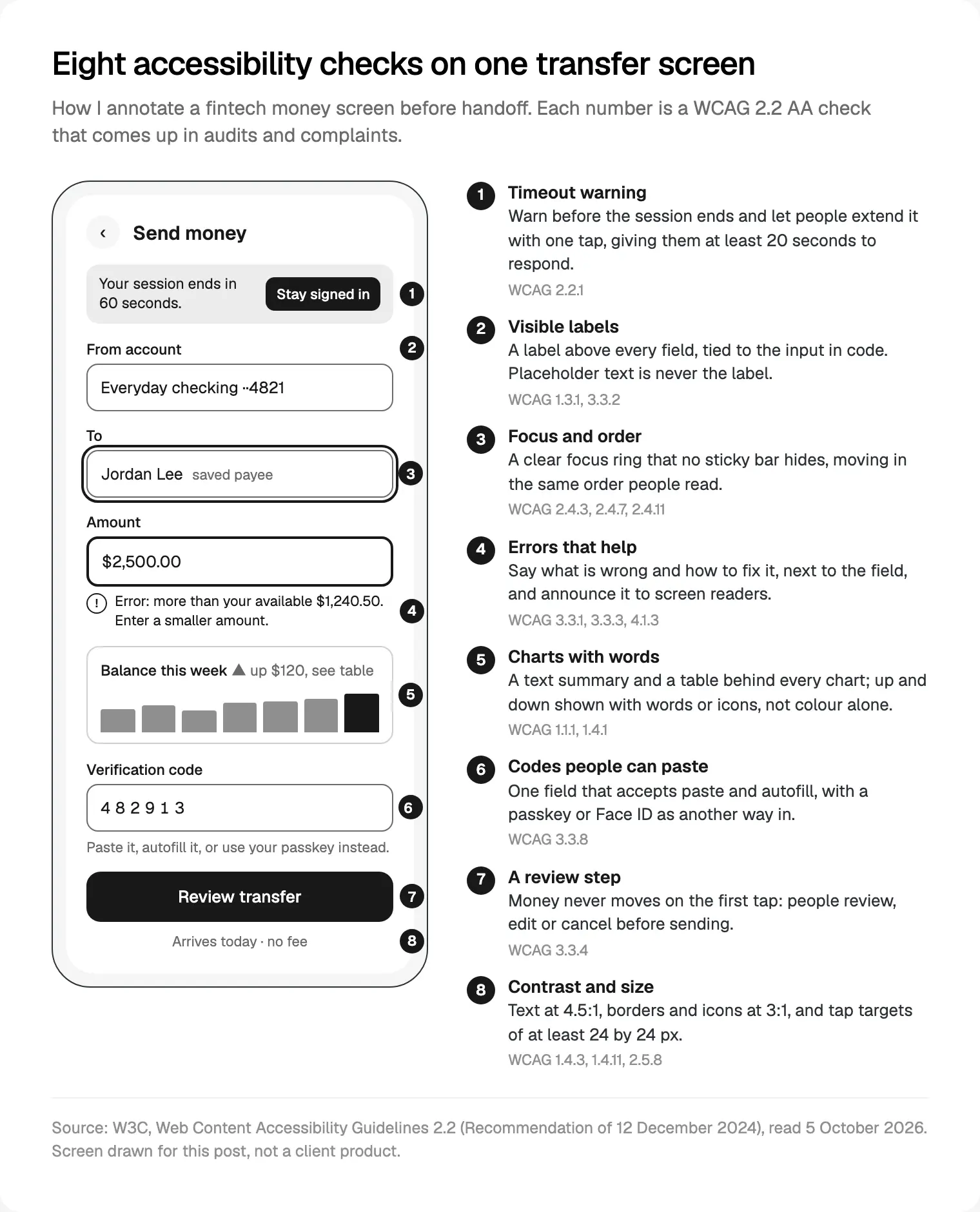
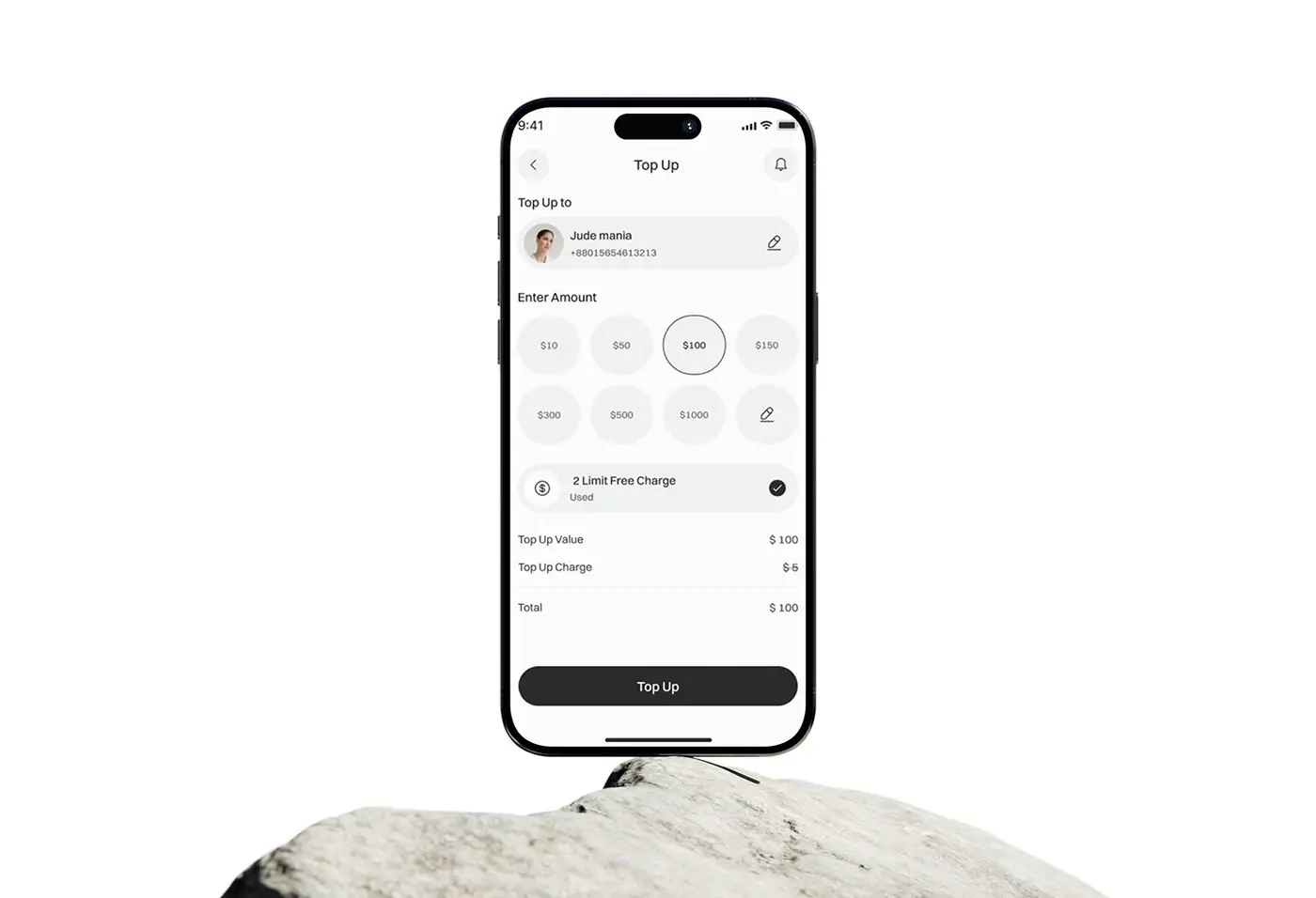
Here is that checklist on the screen that carries most of the risk in a money app. It's also the core of how I design accessible fintech screens for New York teams.
Contrast, focus and touch targets
Low contrast tops every list because finance brands love pale grey helper text and thin borders. WCAG 2.2 asks for 4.5:1 for normal text, 3:1 for large text, and 3:1 for the parts of controls and graphics people need to see, such as a field border or a chart line. I keep a short list of approved pairs in the tokens.
Colour can't carry meaning alone either (1.4.1). Red and green for losses and gains fail anyone who can't tell them apart, so I add a sign, an arrow or the word "down".
Every action must work from a keyboard, focus must be visible, and since 2.2 the focused element must not be entirely hidden by content you added, such as a sticky "Send" bar or a cookie banner (2.4.11). Targets need to be at least 24 by 24 CSS pixels, or spaced apart (2.5.8). On phones I go bigger: Apple's accessibility guidelines give 44 by 44 points as the default iOS control size, and Android's accessibility guidance asks for 48 by 48 dp.
Forms, errors and the transfer screen
Forms are where money moves, and WebAIM found a third of home page inputs (33.1%) without a proper label. My rules for a fintech form:
- A visible label for every field, linked in code; placeholders only show examples.
- Autocomplete attributes on name, email, phone and address, so browsers and password managers can fill them (1.3.5).
- Errors that say what happened and how to fix it, next to the field, announced as a status message without stealing focus (3.3.1, 3.3.3, 4.1.3).
- No asking twice: details entered earlier in the same flow are filled in or offered to pick (3.3.7).
For anything that moves money or makes a legal commitment, criterion 3.3.4 asks for at least one of three things: the submission can be reversed, the input is checked with a chance to correct it, or there's a review step before it's final. I design all three where the payment rail allows, starting with a review screen people can edit.
If you also sell in the UK, my Consumer Duty UX guide for fintech teams covers the FCA's side of the same screens.
Charts, statements and data tables
A chart is just an image to a screen reader unless you say otherwise. W3C's tutorial on complex images asks for a short description that identifies the chart and a long description with the data in text. So every chart I design gets a one-line summary written as a finding ("Spending is lower than last month, mostly travel") and a "View as table" option.
Tables need real table markup, with headers announced for each cell and the sign written out, not shown only in red. Statements need headings, so a screen reader user can jump to October. WCAG lets a data table scroll sideways on a narrow screen, but the rest of the page must reflow at 320 px.
Fewer widgets also means less to describe; my guide to dashboards founders actually open covers that trade-off.
Sign-in, verification codes and CAPTCHAs
This criterion is new in 2.2, so older products rarely meet it. Accessible Authentication (Minimum), 3.3.8, says no login step may require a cognitive function test, such as remembering a password, solving a puzzle or retyping a code, unless there's an alternative or a mechanism that helps. W3C's Understanding page for accessible authentication reads like a fintech audit:
- Login fields must let browsers and password managers fill them, and must accept paste.
- A one-time code split into six boxes that takes only one digit when pasted fails, and so does "enter the 1st, 3rd and 5th character of your password".
- Every step of multi-factor sign-in must pass, not only the first.
- Passkeys, hardware keys, an approve prompt in your app, and Face ID or Touch ID are not cognitive function tests.
- An audio CAPTCHA that people must transcribe doesn't count as the alternative.
Strong security and this rule fit together: a passkey is stronger and easier than a password plus a texted code. So I design the passkey or app-approval route first and keep the code route pasteable.
Timeouts and screen reader order
Banks time out sessions for good reasons, and WCAG accepts that. Criterion 2.2.1 asks that, for each time limit you set, people can turn it off, adjust it to at least ten times the default, or get a warning with at least 20 seconds to extend it with a simple action, up to ten times. W3C's Understanding page for timing adds that limits on time-based one-time codes can count as essential. My warning takes focus, says how long is left, and keeps the form data if the session ends.
Screen reader order is the quiet failure. The order in code must make sense (1.3.2), and focus must move in an order that keeps meaning (2.4.3). It breaks when a pop-up opens without moving focus into it, or when "Payment sent" appears and nobody hears it. AI assistants add a new case, streamed answers, which my notes on AI features people trust touch on.
The order I would fix an existing product in
I don't start with the home page. I start where a barrier stops someone using their own money, and I fix each issue in the shared component, so the fix spreads.
- Sign-in and recovery. Paste, autofill, a passkey route, readable errors.
- Moving money. Transfer, pay and top-up: labels, errors, focus and the review step.
- Seeing money. Balances, transactions and statements: contrast, table markup, chart summaries.
- Onboarding and identity checks. Forms, document capture and timeouts; ask your identity provider how its screens meet WCAG.
- Help. Contact options in the same place on every screen, as 2.2's Consistent Help asks.
- Everything else. The marketing site, settings and emails.
- Keep testing. Keyboard, VoiceOver and TalkBack on each flow, an accessibility statement, and a check every sprint.
What I would not do is install an overlay and call it done. The DOJ says automated checkers and overlays need careful use, and a clean report doesn't mean a site is accessible. UsableNet counted between 95 and 155 lawsuits a month in 2025 against companies using widgets. And in April 2025 the FTC finalised an order against an overlay vendor, requiring it to pay $1 million over claims that its plug-in could make any website WCAG compliant.
Where I would start
Before you buy any tool, take one honest pass through sign-in and your main money flow with a keyboard and a screen reader. It's slow and a little humbling, and it tells you more than any score. When you fix what it finds, the React code for each WCAG 2.2 criterion is a good place to start.
That's how I run my product design work for New York fintechs: a free 30 minute intro call in your morning, a written scope and one fixed quote, then weekly sprints in Figma with a WCAG review of every key flow before release. Read how I work, or see my wider product design service for fintech and SaaS teams.
Frequently asked questions
Does the ADA apply to fintech websites and apps in New York?
Most New York federal judges who have ruled on it say the ADA covers online-only businesses, according to Seyfarth Shaw's 2026 review, though the Second Circuit has not decided. The DOJ's 2022 guidance says businesses open to the public must make their online services accessible. Treat your website and app as covered, and ask counsel; this is not legal advice.
Is WCAG 2.2 AA legally required for private companies?
No federal rule names a WCAG version for private businesses. The DOJ's 2022 guidance gives them flexibility and points to WCAG as helpful. The 2024 Title II rule requires WCAG 2.1 AA, but only for state and local governments and services run for them. I design to 2.2 AA, which also meets 2.0 and 2.1.
Why are so many ADA website lawsuits filed in New York?
Two reasons show in the data. New York's federal judges have mostly treated online-only businesses as covered, unlike California's courts. And New York's Human Rights Law lets people sue for damages in state court, where many cases moved after federal judges tightened standing rules. Seyfarth counted 1,021 federal website suits in New York in 2025.
Can we be sued in New York without an office there?
Yes. UsableNet's 2025 year-end report says courts continue to accept cases against businesses whose websites are accessible to New York residents, even without a physical presence in the state. It also notes rising activity in Florida, Pennsylvania, Minnesota and Missouri, so plan for every market you serve, not one state.
Do accessibility overlays or widgets stop lawsuits?
The evidence says no. UsableNet counted between 95 and 155 lawsuits a month in 2025 against companies already using widgets. The DOJ warns that a clean automated report doesn't mean a site is accessible, and in 2025 the FTC made one overlay vendor pay $1 million over its compliance claims. Fixing the code is what works.
Does WCAG apply to mobile banking apps?
In practice, yes. W3C's WCAG2ICT note explains how each WCAG 2.2 criterion applies to native apps, and UsableNet's lawsuit count includes mobile apps. On iOS and Android I add the platform rules: Apple's 44 by 44 point controls, Android's 48 by 48 dp targets, Dynamic Type, and testing with VoiceOver and TalkBack.
Are one-time codes and CAPTCHAs allowed under WCAG 2.2?
Yes, with conditions. Criterion 3.3.8 allows a code if people can paste or autofill it rather than retype it, and every step of multi-factor sign-in must meet the rule. A CAPTCHA needs another route that isn't a puzzle or transcription, unless it only asks people to recognise objects. Passkeys and Face ID pass.
Sources and method
I read every source on 5 October 2026. Lawsuit counts differ by tracker: Seyfarth Shaw counts federal website cases only; UsableNet adds New York and California state courts, apps and video, to 15 December 2025. WebAIM's automated home page tests miss many failures, so real rates are higher.
- US Department of Justice, Guidance on Web Accessibility and the ADA (18 March 2022), read 5 October 2026: ada.gov
- US Department of Justice, fact sheet on the Title II web and mobile app rule (2024) and its interim final rule of 20 April 2026, read 5 October 2026: ada.gov
- W3C, Web Content Accessibility Guidelines 2.2, Recommendation of 12 December 2024, read 5 October 2026: w3.org
- W3C WAI, What's New in WCAG 2.2, read 5 October 2026: w3.org
- W3C WAI, Understanding Accessible Authentication (Minimum), read 5 October 2026: w3.org
- W3C WAI, Understanding Timing Adjustable, read 5 October 2026: w3.org
- W3C WAI, Complex Images tutorial, read 5 October 2026: w3.org
- W3C, WCAG2ICT Group Note (11 December 2025), read 5 October 2026: w3.org
- UsableNet, 2025 Year-End Digital Accessibility Lawsuit Report, read 5 October 2026: info.usablenet.com
- Seyfarth Shaw on JD Supra, Federal Court Website Accessibility Lawsuit Filings Bounce Back in 2025 (27 March 2026), read 5 October 2026: jdsupra.com
- WebAIM, The WebAIM Million, 2026 report, read 5 October 2026: webaim.org
- New York State Division of Human Rights, Human Rights Law, Executive Law article 15, read 5 October 2026: dhr.ny.gov
- Federal Trade Commission, final order against an overlay vendor (22 April 2025), read 5 October 2026: ftc.gov
- Apple, Human Interface Guidelines: Accessibility, read 5 October 2026: developer.apple.com
- Android Developers, Make apps more accessible, read 5 October 2026: developer.android.com