The best landing page examples in 2026, sorted by the job they do
Landing page examples from Linear, Wise, Ramp, Granola and more, sorted into 8 patterns: what each does, what to copy, what to avoid and how I build it.

The landing page examples worth studying aren't the prettiest ones. They're the pages where every section does one job: a promise you understand in seconds, one action, proof beside it, the real product, a clear price or first step, an FAQ for the doubts, a form that works on a phone, and a fast load.
These are the same eight patterns I work from when founders hire my landing page design services, so this is a pattern library, not a screenshot gallery. I opened every public page below on 10 October 2026; pages change, so check before you copy. I quote no conversion numbers for them, because none were published for these patterns.
It's for founders, marketers and product leads briefing a page. Each pattern gets its job, one or two live examples, what to copy, what to avoid and how my team builds it. For the words on the page, see landing page copywriting, section by section.
The eight landing page patterns at a glance
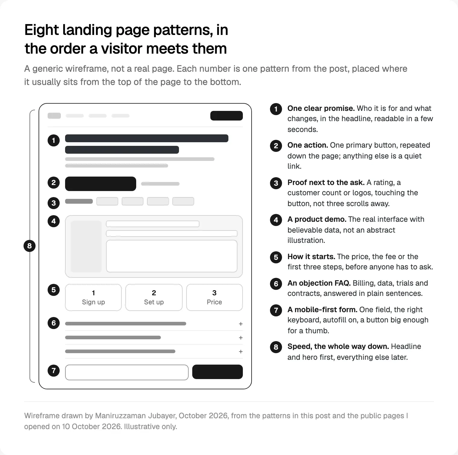
Each pattern does one job for a visitor with a few seconds to decide. The numbers follow the order a visitor meets them, top to bottom.
| # | Pattern | The job it does | Examples I opened |
|---|---|---|---|
| 1 | One clear promise | Tells a stranger what this is and who it's for | Granola, Cursor |
| 2 | One action | Removes the choice of what to do next | Monzo, Granola |
| 3 | Proof next to the ask | Answers "can I trust this?" at the moment of clicking | Ramp, Intercom |
| 4 | Product demo | Shows the product instead of describing it | Linear, Cursor |
| 5 | Pricing or how it starts | Removes the fear of a hidden cost or a long setup | Wise, Monzo |
| 6 | Objection FAQ | Answers the doubts a sales call would | Basecamp, Notion |
| 7 | Mobile-first form | Makes the action easy with a thumb | Mercury, Ramp, Wise |
| 8 | Speed | Makes sure the rest is seen at all | Stripe, Monzo |
1. One clear promise above the fold
The first screen still gets the most attention. In NN/g's 2018 scrolling and attention study (120 participants, over 130,000 eye fixations), people spent about 57% of their page viewing time above the fold and 74% in the first two screenfuls.
Examples. Granola's homepage names the user (people in back-to-back meetings) and the product (an AI notepad) in one headline, then answers the obvious worry right under it: it records your computer's audio, so no bot joins the call. Cursor's homepage says what it is, a coding agent, in a single sentence, with the download button beside it.
What to copy. Who it's for and what changes, in plain words, in the headline. Use the subhead for the first doubt, not a second slogan.
What to avoid. Clever lines that need the subhead to make sense. NN/g's F-pattern research shows people scanning the top and left of unformatted text, so lead with the most informative words.
How my team builds it. I write several headline options before anything is designed and read each one as a stranger arriving from the ad would. The one we keep goes into the wireframe as real text, because the layout depends on its length.
2. One action per page
A landing page has one job, so it gets one primary button. Everything else (sign in, docs, careers) becomes a quiet link.
Examples. Monzo's homepage repeats a single action, opening a free account, all the way down the page, with a short eligibility line under the first button. Granola does the same with one download button and lists the platforms it runs on right under it.
What to copy. The same words every time the button appears. A secondary action is fine when it's clearly smaller, such as a demo link.
What to avoid. Two buttons of equal weight in the hero ("Start free" and "Book a demo" in the same style). The visitor has to choose, and some choose neither.
How my team builds it. The button is one component in the design system, with the same name in Figma and in code, and its label is a single setting. Change it once and it changes everywhere, and every click fires the same tracking event.
3. Proof next to the ask
Proof belongs beside the button, not in a logo strip three scrolls down. In Baymard Institute's checkout research (page updated 22 September 2025), 19% of US shoppers who abandoned an order said they didn't trust the site with their card details. Checkout, not landing pages, but the same doubt.
Examples. Ramp's homepage shows a live counter just under the hero's email form, and the footer repeats that work email field with a customer count directly above it. Intercom's homepage sets a line about a free trial with no credit card right under its demo button, with a review count near the top of the page.
What to copy. One specific number or name you can stand behind, plus the honest small print that lowers the risk: free trial, no card, cancel any time, if those are true.
What to avoid. Logos you have no permission to show, and vague claims with no source.
4. A product demo instead of an illustration
For software, the product is the best picture you have. Abstract shapes say "technology"; a real screen says "this is what you'll use on Monday".
Examples. Linear's homepage opens on its actual interface, an issue thread with labels and an agent's draft pull request, built from live interface rather than a flat screenshot. Cursor does the same with an interactive demo of its desktop app and command line, with a written description of the demo for screen reader users.
What to copy. Believable data from your buyer's world, showing the moment the product saves time, not the settings page.
What to avoid. A demo that's hard to read on a phone. Crop to one panel on small screens instead of shrinking the whole app.
How my team builds it. We design the demo as a real product screen in Figma, then build it from the product's own components, with a light static version in the hero and the interactive one loaded later. If you're planning the build, Framer, Webflow or Next.js for the page decides how much interactivity you can afford.
5. Pricing, or how it starts
Visitors fear two things they can't see: the cost and the effort. Show at least one of them early. In Baymard's research, extra costs were the top reason shoppers abandoned an order, at 40%, and 12% couldn't see the total cost up front.

Examples. Wise's UK homepage puts a working transfer calculator near the top: type an amount and it shows the fee, the rate and when the money arrives, before you sign up. Monzo's homepage explains how it starts in three numbered steps: open the account, answer a few questions, add the card to your phone's wallet.
What to copy. A simple price, shown. A usage price, shown as a calculator. A sales-led price, replaced by the first three steps and how long they take.
What to avoid. "Contact us for pricing" as the only answer on a page for small teams. If you can't publish a price, say what decides it.
How my team builds it. Calculators are built as a real component with the pricing logic in one place, so a price change happens once, not in three hard-coded spots.
6. An FAQ that handles objections
A good FAQ isn't features restated as questions. It's the doubts a salesperson would hear on a call, answered plainly.
Examples. Basecamp's pricing page leads with flat prices and no per-user fees, then answers the questions people worry about: whether a trial needs a card, whether the trial ends in an automatic charge, and whether guests count as users. Notion's pricing page answers billing questions and one that matters for AI: how Notion AI uses your data, including that it's not used to train models unless you opt in.
What to copy. Questions in the visitor's own words, answers that start with yes or no, and the uncomfortable ones (data, contracts, cancelling) included.
What to avoid. Hiding the FAQ behind a link, or answers so long the accordion becomes a second page.
7. A mobile-first form
On most launch traffic, the form gets filled in on a phone. Baymard found 18% of shoppers abandoned because the site wanted an account and 17% because the checkout was too long or complicated. Fewer fields is the rule that travels.
Examples. Mercury's homepage asks for one thing in the hero: an email address, in a field marked as an email input with email autofill, beside an Open account button and a demo link. Ramp asks only for a work email, also as an email input with a proper accessible label. Wise marks its amount fields as decimal input, which brings up a number pad on phones.
What to copy. Small attributes. Per web.dev's sign-up form guidance, the right input type gives the right keyboard on mobile, and you should ask for as little as possible. MDN documents the inputmode attribute for number pads.
What to avoid. Placeholder text as the only label, and buttons too small for a thumb. WCAG 2.2's target size criterion sets 24 by 24 CSS pixels as the AA minimum; I design well above it.
How my team builds it. Every field gets its type, autocomplete value, visible label and error message in the component, tested on real iPhone and Android phones.
8. Speed you can see in the source
Speed runs the whole way down. Google's guidance on Largest Contentful Paint calls 2.5 seconds or less good, measured at the 75th percentile of page loads. In Vodafone's case study on web.dev (17 March 2021), an A/B test on a landing page found a 31% better LCP led to 8% more sales.
Examples. In the page source, Stripe's homepage preloads a static fallback image of its animated hero in desktop, tablet and mobile sizes, so something paints before the animation is ready. Monzo marks its hero image to load eagerly at high priority, with its size set, while the autoplay videos further down are muted and start in an offscreen state.
What to copy. Headline and hero image first, in the first HTML response; everything else waits.
What to avoid. A hero video as the largest element, lazy-loading the hero image, and a stack of chat and heatmap scripts that load before the button works.
How my team builds it. We set a speed budget in the written scope and check it before launch; the landing page checklist I run before launch lists every number I hold a page to.
Four landing page examples my team designed
Four pages from my own work show the same patterns in other industries, and how my team designs and builds a landing page from message to handoff.
- [Homelo, a landing page for a real estate company](/case-studies/homelo-real-estate-landing-page). One call to action in the hero, the consultants who help with paperwork, then featured homes with price, bedrooms, bathrooms and size. Patterns 1, 2 and 3.
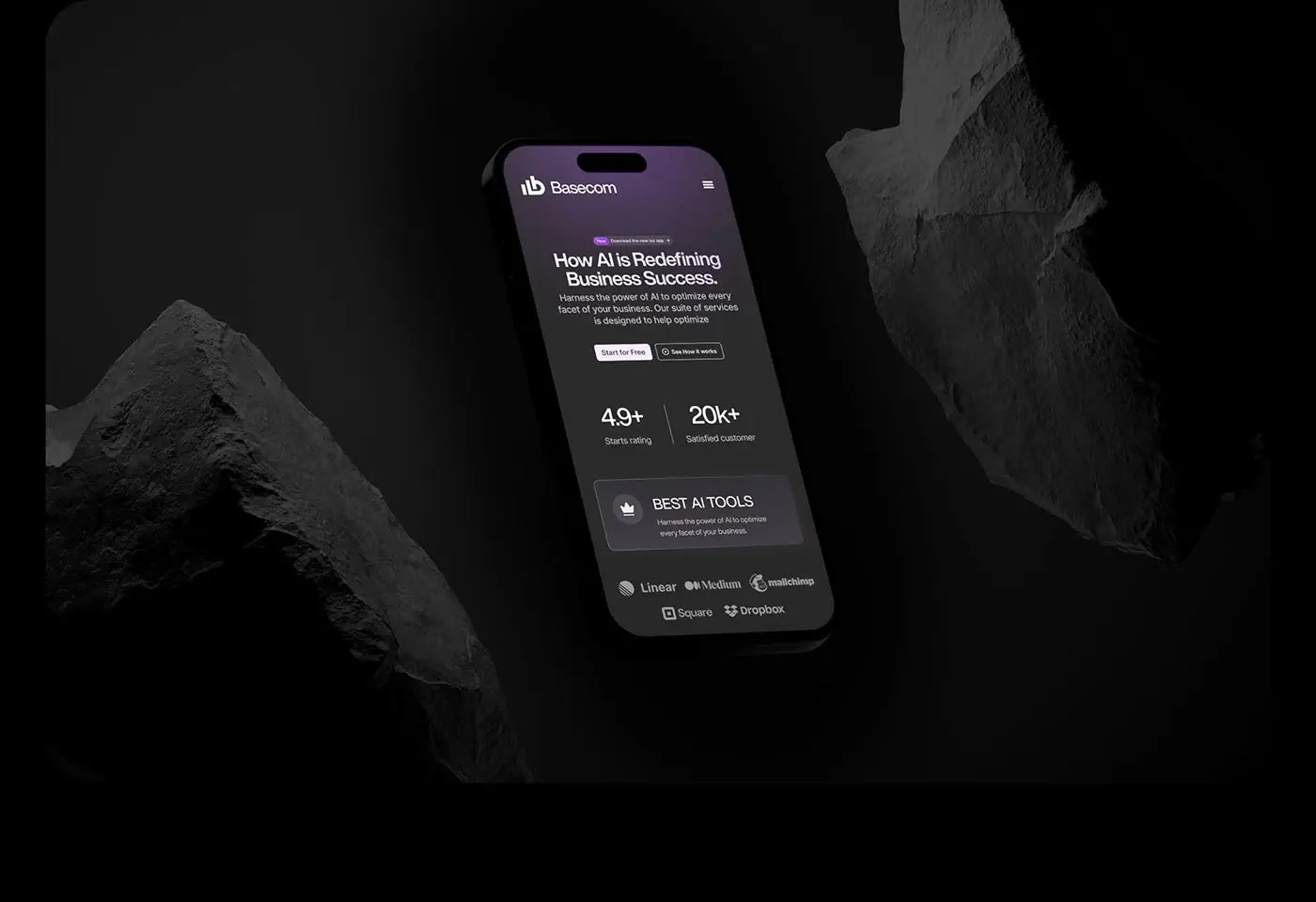
- [A landing page for an AI business analysis product](/case-studies/ai-analysis-landing-page). A promise and two actions above the fold, a rating and logo strip under the hero, six services in plain lines, then plans and an FAQ. Patterns 1, 3, 5 and 6.
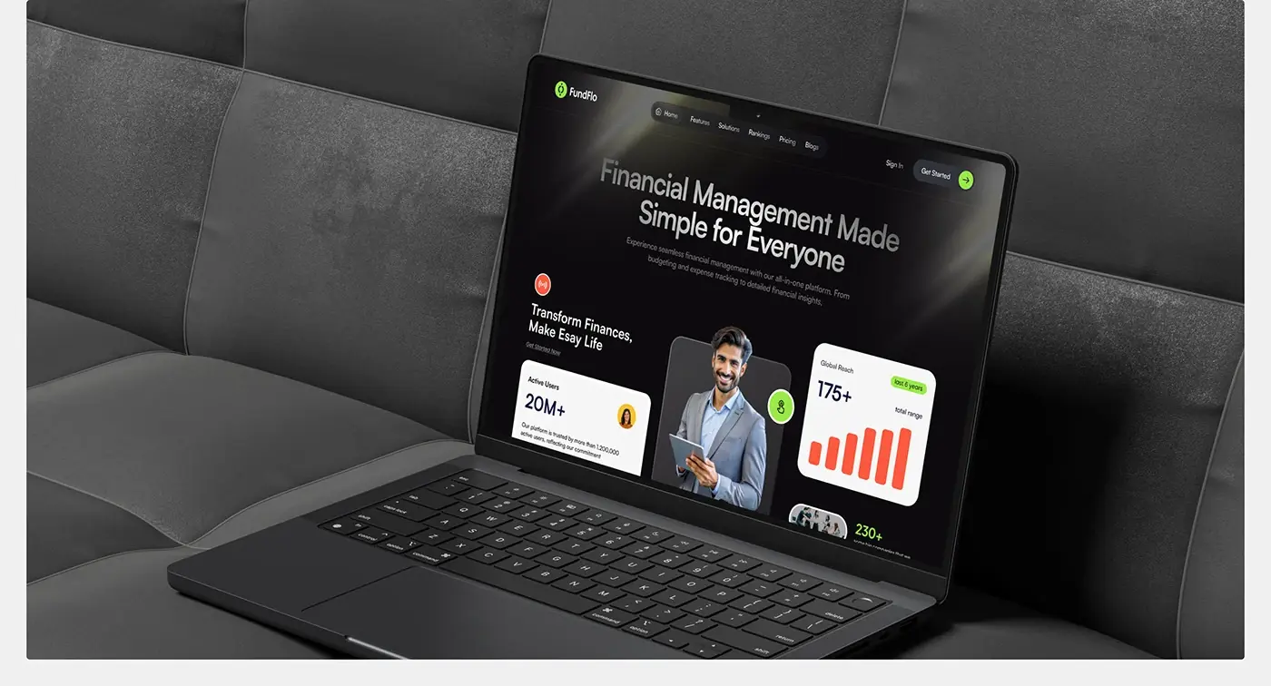
- FundFlo, a landing page for a finance SaaS. One promise with proof cards beside the button, a three step how it works, and a closing free trial offer. Patterns 3 and 5.
- FinFuse, a landing page for a fintech partner. A real face in the hero, three offer cards, a how it works video and an on-page FAQ about security, fees and devices. Patterns 1, 3 and 6.
None uses every pattern, deliberately: pick the ones that answer your visitor's real questions. When the design is done, how my team takes Figma to Next.js covers the build, with tokens and components named the same in both.
Where I would start
Open your current page on your phone and number its sections against the eight patterns. The gaps I check for first are proof beside the button and an answer to the first price question. Fix those two, then the form, then speed.
If you'd rather hand it over, a project starts with a free 30 minute intro call, then a written scope and one fixed quote for the whole page. My team works in weekly design sprints in Figma, with a written update in Slack every 48 hours and a review call each week. See my landing page design work for launches and campaigns.
Frequently asked questions
What makes a good landing page example?
A good landing page example does one job per section and one job overall: a clear promise above the fold, one main action, proof beside it, the real product, price or first steps, answered objections and a fast load on a phone. Judge examples by those jobs, not by how striking they look in a screenshot.
What are the best SaaS landing page examples to study?
Study each page for one pattern rather than copying it whole. On 10 October 2026, Linear showed its real interface in the hero, Cursor had an interactive demo, Basecamp's pricing page answered trial and billing objections, and Ramp and Intercom put proof beside the button. SaaS pages change often, so check again. For whole sites rather than single pages, see SaaS website examples grouped by pattern.
What should a product landing page include above the fold?
A headline that says who it's for and what changes, a subhead that answers the first doubt, one primary button, and a piece of proof beside it. A real product image helps if it's readable on a phone. NN/g's 2018 eyetracking found about 57% of viewing time above the fold, so the essentials can't wait.
Should a landing page show pricing?
If your price is simple, yes. Hidden costs drive people away: in Baymard's checkout research, 40% of US shoppers who abandoned an order blamed extra costs. If price depends on usage, show a calculator or a worked example. If it's sales-led, show the first steps and what decides the price instead of a bare contact form.
How many calls to action should a landing page have?
One primary action, repeated in the same words down the page. A smaller secondary option, such as a demo link next to the main button, is fine as long as it's clearly less prominent. Two buttons of equal weight force a choice the visitor didn't come to make, and the page loses focus.
What are good app landing page examples?
Look for one clear download action and the platforms listed beside it. On 10 October 2026, Granola's homepage did exactly that, with a single download button, the operating systems under it and a privacy answer in the hero. For mobile apps, show real app screens in device frames and link straight to the right store.
How long should a landing page be?
As long as the visitor's questions. A cheap, familiar product can work with a hero, proof and a form. A complex SaaS or fintech product needs a demo, how it starts and an FAQ. Keep each section to one job and repeat the main button.
Can I copy a landing page I like?
Copy the structure and the patterns, never the words, images or logos. A layout idea, such as proof beside the button or a calculator in the hero, is fair to reuse. The copy and brand assets belong to that company, and your page needs your own proof and voice to be believed.
Sources and method
I opened every example page on 10 October 2026 from Dhaka and read its visible text and, for speed and forms, its HTML source. I reproduce no screenshots, copy or logos. Google's older Think with Google speed pages now redirect, so speed data comes from web.dev. Baymard's figures are checkout research, and that page doesn't state its sample size.
- Nielsen Norman Group, Scrolling and Attention, Therese Fessenden, 15 April 2018, read 10 October 2026: nngroup.com
- Nielsen Norman Group, F-Shaped Pattern of Reading on the Web, Kara Pernice, 12 November 2017, read 10 October 2026: nngroup.com
- Baymard Institute, cart abandonment rate statistics, updated 22 September 2025, read 10 October 2026: baymard.com
- web.dev (Google), Largest Contentful Paint, read 10 October 2026: web.dev
- web.dev (Google), Vodafone case study, 17 March 2021, read 10 October 2026: web.dev
- web.dev (Google), sign-up form best practices, Sam Dutton, updated 9 December 2020, read 10 October 2026: web.dev
- MDN Web Docs, the inputmode global attribute, read 10 October 2026: developer.mozilla.org
- W3C, Understanding WCAG 2.2 success criterion 2.5.8, Target Size (Minimum), read 10 October 2026: w3.org
- Example pages, opened 10 October 2026: Granola granola.ai, Cursor cursor.com, Monzo monzo.com, Ramp ramp.com, Intercom intercom.com, Linear linear.app, Wise UK wise.com, Basecamp pricing basecamp.com, Notion pricing notion.com, Mercury mercury.com, Stripe stripe.com