The product design process for startups, week by week, in my first 30 days
The product design process for startups, week by week: what I do in the first 30 days, what you prepare, what you get and which decisions stay yours.

My product design process for startups fits the first 30 days into four weekly sprints, after a free intro call and a written scope. Week 1 is discovery and research. Week 2 is flows, wireframes and a clickable prototype. Week 3 tests that prototype with real users, then turns the tested flow into high-fidelity UI on a design system. Week 4 is handoff to your engineers, or to my team, who can build the front end.
You see the work throughout: a shared Figma file, a written Slack update every 48 hours and a weekly review call. You make the decisions that are yours, such as which problem comes first. What slows a first month down is rarely design. It's access, recruiting and late opinions.
This is for founders and product leads at SaaS, fintech and AI startups about to hire a product designer for SaaS who want to know what the first month looks like. It's how I run it, with the method sources behind each step.
The product design process for startups, week by week
Every first month I run has the same shape. The scope changes; the rhythm doesn't.
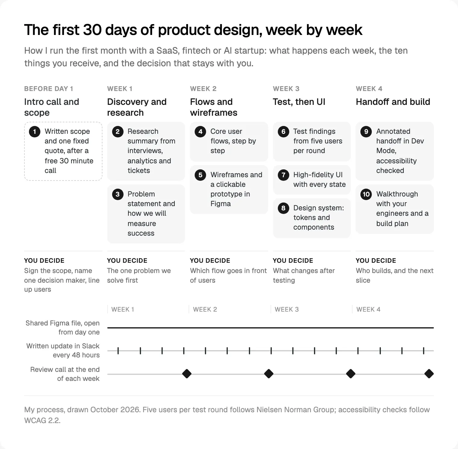
| Week | What happens | What you get | Your decision |
|---|---|---|---|
| Before day 1 | Intro call, then the written scope | 1. Scope and one fixed quote | Sign it; name one decision maker |
| 1 | Interviews, analytics, support tickets, a review of what exists | 2. Research summary; 3. Problem statement and success measures | The one problem we solve first |
| 2 | Flows, wireframes, a clickable prototype | 4. Core flows; 5. Wireframes and prototype | Which flow goes in front of users |
| 3 | Usability tests, fixes, then UI on a design system | 6. Test findings; 7. High-fidelity UI; 8. Tokens and components | What changes after testing |
| 4 | Accessibility checks, handoff, engineer walkthrough | 9. Annotated handoff; 10. Build plan | Who builds, and the next slice |
The Figma file is open to you from day one. Every 48 hours I post a written Slack update: what we did, what's next, what we need from you, and any decision waiting on you. Each week ends with a review call where we show the work and you decide.
I work from Dhaka (UTC+6, Sunday to Thursday) and keep evening calls, 7 to 10 pm my time, for teams in the Americas. The written updates mean nobody has to be awake at the same moment to know where things stand.
Before day one: the intro call, the scope and what to prepare
The free 30 minute intro call is mostly my questions. Who uses the product, and who pays? What has to be true by your next milestone? Where do people get stuck, and how do you know? For fintech I ask who signs off wording; for AI, what the model does when it's wrong.
After the call I write the scope: the flows, platforms and user roles, what's out, and the deliverables week by week, with one fixed quote for the whole project. I borrow one idea from Basecamp's Shape Up chapter on setting boundaries: fixed time, variable scope. If something new turns up mid-month, we trade it for something else rather than stretch the month.
What I ask you to prepare:
- Access: a staging account, your analytics, support tickets or sales call notes, and any research you already have.
- People to talk to: current or target users who'll talk to us in week 1 and try a prototype in week 3. Recruiting is the slowest step in the whole month.
- One decision maker: a named person who can say yes in a review call.
- Constraints: your tech stack, deadlines, and any legal or compliance review.
- Brand assets: I don't design logos or identities, so bring what you have. With none, I start from a calm, type-led interface.
Week 1: discovery and research
The UK government's service manual says a discovery phase typically takes around 4 to 8 weeks, with no building during it. I compress it into one week because the scope is already narrowed to one or two flows, and founders know a lot. That's a trade-off: for a new market or a regulated product with no users yet, I'd recommend a longer discovery.
I mix what people say with what they do. Nielsen Norman Group's guide to choosing UX research methods notes that qualitative methods answer why and how to fix, while quantitative ones answer how many. So week 1 is interviews for the why, analytics and support tickets for the how many, and, if a product exists, a review against Nielsen's 10 usability heuristics. I also walk through the tools your users rely on today.
By the end of the week you get a short research summary, a problem statement and a success measure. For the measure, I follow Google's HEART framework for user-centred metrics: start from a product goal, then pick the metric that shows it.
Your decision this week is the hardest of the month: which problem we solve first.
Week 2: flows, wireframes and a clickable prototype
I start with flows, not screens. Every step, every decision point, every way in and every error. Shape Up's breadboarding and fat marker sketches are a good model: places, the things you can do in each, and how they connect, before anyone argues about colour.
Then wireframes. Nielsen Norman Group describes prototype fidelity on three dimensions: interactivity, visuals and content. I keep visuals low in week 2 but push content fidelity high early. Real labels, real numbers and real error messages are what confuse people in tests, and placeholder text hides them. For data-heavy products, see my guide to designing dashboards founders open daily.
By the end of the week there's a clickable prototype of the flow we'll test, plus a test script written as tasks, not opinions. "Send money to a new payee" teaches us more than "do you like this screen?"
You choose which flow goes in front of users, and you approve the tasks.
Week 3: testing with users, then UI on a design system
Tests are short remote sessions where people use the prototype and think aloud. Jakob Nielsen calls thinking aloud perhaps the most valuable usability method, and it needs no lab. Watch at least one session live if you can; it settles debates faster than any slide.
How many users? Nielsen and Landauer's formula, explained in NN/g's why you only need to test with 5 users, uses a typical 31% of problems found per user. By my calculation from that formula, two users find 52%, three 67%, five 84% (Nielsen rounds to 85%), ten 98% and fifteen 99.6%.
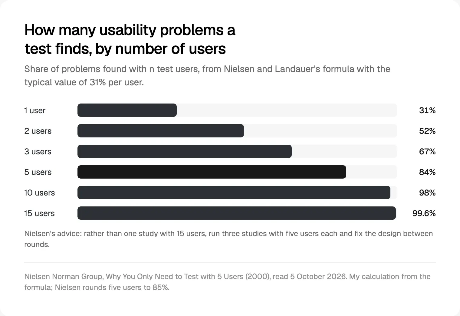
The same article recommends three rounds of five rather than one round of fifteen, fixing the design in between. If your product has two distinct groups, say teams posting tasks and workers doing them, it suggests 3 to 4 users from each.
Once the flow holds up, it becomes high-fidelity UI with every state: empty, loading, error, no permission, very long names, all on a design system from the start. NN/g's Design Systems 101 says they pay off when years of design work lie ahead; a startup product is that case. I start small: colour, type and spacing as Figma variables with light and dark modes, plus only the components the tested flow needs, published as a Figma library. Tokens can also be exported in the Design Tokens Format Module 2025.10, a W3C Community Group report from 28 October 2025, not a formal W3C standard.
Accessibility is checked here, not at the end. WCAG 2.2 asks for contrast of at least 4.5:1 for normal text and 3:1 for interface parts, and pointer targets of at least 24 by 24 CSS pixels.
Your decision: what changes after testing. Sometimes a test shows the idea itself is wrong. Better to learn that in week 3 than after launch.
Week 4: handoff, and the front end my team builds
Handoff happens in Figma's Dev Mode. I mark finished frames ready for development and annotate behaviour a static screen can't show; engineers inspect specs, see which variables a layer uses and compare versions. Figma says Dev Mode needs a paid plan and a Full or Dev seat, so check your engineers have one.
Then a recorded walkthrough with your engineers, flow by flow. I'd rather an engineer joined a week 2 review too: questions asked early cost less.
The last deliverable is a build plan: which components come first, which flow ships first, and what the next slice of design should be. Shape Up's betting table puts a two-week cool-down after each six-week cycle to choose what's next; the week 4 review does that job on a smaller scale.
You decide who builds. My team builds front ends in React and Next.js, and iOS and Android apps in React Native or Flutter; your own engineers can take the same files instead. If you're still weighing who that hire should be, I compare a design engineer, a product designer and a frontend developer.
The decisions that stay with you
I make plenty of calls during the month: layout, patterns, components. When you disagree, I'll give my reason, and you can still overrule me. Some decisions, though, are yours alone:
- Who the primary user is. Designing for everyone means designing for no one.
- The first problem and the success measure. Everything else follows from these two.
- What's out of scope. Saying no is a product decision, not a design one.
- What changes after testing. I bring the evidence; you weigh it against the business.
- Regulated wording. In fintech, your compliance team approves the words on payment and risk screens.
- What the AI may do on its own. Suggest, draft or act: my guide on how to ship AI features people trust sets out the options.
To see how they fit a full engagement, read what hiring me for product design includes.
What slows the first month down, and how I avoid it
None of these is about talent. Each is cheap to prevent and expensive to fix late.
| What happens | What it costs | What I do about it |
|---|---|---|
| Access arrives late | Week 1 research starts blind | An access checklist goes out with the scope |
| No users to talk to | Tests slip into week 4 | Recruiting starts before day one; support tickets fill gaps, with their limits stated |
| Decisions by committee | Reviews end without a yes | One decision maker is named in the scope |
| A new stakeholder appears in week 3 | Settled questions reopen | Everyone with a veto joins the first review |
| The scope keeps growing | The month overruns | Fixed time, variable scope: trade, don't add |
| Engineers join only at handoff | Designs that can't be built as drawn | An engineer joins the week 2 review |
| Compliance reviews at the end | Wording rewrites break layouts | Flows go to compliance in week 2 |
How this compares with a design sprint and Shape Up
Is my month a "product design sprint"? Partly. GV's Design Sprint takes five days: map the problem on Monday, sketch on Tuesday, decide on Wednesday, prototype on Thursday, test with real customers on Friday. It's excellent for one big, risky question. My weeks 2 and 3 run a similar loop, with research before it and a design system and handoff after.
Shape Up works in six-week cycles and says two weeks is too short to get meaningful work done. My weekly sprints are a review rhythm inside one fixed scope, not separate planning cycles. The Design Council's Double Diamond, from 2003, maps onto the month: week 1 discovers and defines, weeks 2 and 3 develop, week 4 delivers.
| Format | Length | Best for | You leave with |
|---|---|---|---|
| GV design sprint | Five days | One risky question | A tested prototype and a decision |
| Shape Up cycle | Six weeks, then two weeks of cool-down | Teams shipping features in-house | Built, shipped work |
| My first 30 days | Four weekly sprints after the scope | A startup's first core flows | Tested UI, a design system and a build plan |
Where I would start
If you're planning your first month with a designer, do three things this week. Write down the one problem you most want solved and how you'd measure it. List five users who'd agree to a call. Name the person who decides. If your product is already live, start with a UX audit checklist instead.
Then book the free intro call. A written scope and one fixed quote follow, and week 1 starts prepared. You can read more about me and my team, or see how I approach product design for SaaS, fintech and AI. If you're comparing budgets first, my guide to what UI/UX design costs in Dhaka covers the market.
Frequently asked questions
What does a product designer do in the first month?
In my process: week 1 is research, week 2 flows, wireframes and a clickable prototype, week 3 usability tests and high-fidelity UI on a design system, and week 4 handoff to engineers. The month covers one or two core flows end to end, with a written update every 48 hours and a weekly review call.
How long does the product design process take for a startup?
It depends on the number of core flows, roles and platforms. One or two flows can go from research to handoff in about a month. A full product takes longer, designed in slices, each built while the next is designed. The written scope sets the timeline flow by flow before work starts.
What should I prepare before working with a product designer?
Access to your product, analytics and support tickets; users willing to be interviewed and to test a prototype; one person who can decide; and your constraints, such as tech stack, deadlines and compliance review. Bring any brand assets you have. Recruiting users is the slowest step, so start it early.
What is a product design sprint?
Usually a time-boxed loop of designing, prototyping and testing. The best-known version is GV's five-day Design Sprint, which ends with a customer test on Friday. In my projects a sprint is one week of design work in Figma, closed by a review call. A month of four sprints adds research, a design system and handoff.
How many users should we test a prototype with?
Five per round is the standard guidance from Nielsen Norman Group: their model says five users find about 85% of usability problems. They recommend several small rounds, fixing the design between them, rather than one large study. If your product serves two distinct user groups, test 3 to 4 people from each.
Do we need a design system for an MVP?
You need the start of one. Colour, type and spacing as tokens, plus the components your first flows use, take little extra time and stop every new screen inventing its own button. The full documented system can grow with the product, which is when Nielsen Norman Group says design systems pay off.
What if user testing shows our idea is wrong?
Then the month did its job early. I bring the evidence to the weekly review, and you decide whether to change the flow, narrow the audience or rethink the feature. Because the scope fixes time, not every screen, we trade remaining work for the change instead of stretching the timeline.
Sources and method
I read every source on 5 October 2026. The usability percentages are my calculation from the formula and 31% figure in Nielsen's article, which itself quotes 85% for five users. The process is how I run projects, not any one client's story.
- Nielsen Norman Group, Why You Only Need to Test with 5 Users, 18 March 2000, read 5 October 2026: nngroup.com
- Nielsen Norman Group, When to Use Which User-Experience Research Methods, 17 July 2022, read 5 October 2026: nngroup.com
- Nielsen Norman Group, 10 Usability Heuristics for User Interface Design, updated 30 January 2024, read 5 October 2026: nngroup.com
- Nielsen Norman Group, Thinking Aloud: The #1 Usability Tool, 15 January 2012, read 5 October 2026: nngroup.com
- Nielsen Norman Group, UX Prototypes: Low Fidelity vs. High Fidelity, 18 December 2016, read 5 October 2026: nngroup.com
- Nielsen Norman Group, Design Systems 101, 11 April 2021, read 5 October 2026: nngroup.com
- GV, The Design Sprint, read 5 October 2026: gv.com
- Basecamp, Shape Up by Ryan Singer, chapters 3 (Set Boundaries), 4 (Find the Elements) and 8 (The Betting Table), read 5 October 2026: basecamp.com, basecamp.com, basecamp.com
- GOV.UK Service Manual, How the discovery phase works, updated 21 June 2021, read 5 October 2026: gov.uk
- Design Council, The Double Diamond, read 5 October 2026: designcouncil.org.uk
- Google Research, the HEART framework paper, CHI 2010, read 5 October 2026: research.google
- Figma Help Center, Guide to Dev Mode, read 5 October 2026: help.figma.com
- Figma Help Center, Guide to variables in Figma, read 5 October 2026: help.figma.com
- Figma Help Center, Guide to libraries in Figma, read 5 October 2026: help.figma.com
- Design Tokens W3C Community Group, Design Tokens Format Module 2025.10, 28 October 2025, read 5 October 2026: designtokens.org
- W3C, Web Content Accessibility Guidelines (WCAG) 2.2, Recommendation of 12 December 2024, read 5 October 2026: w3.org