
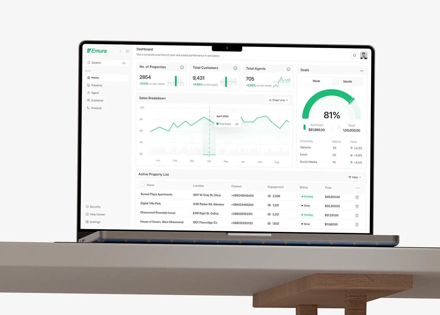
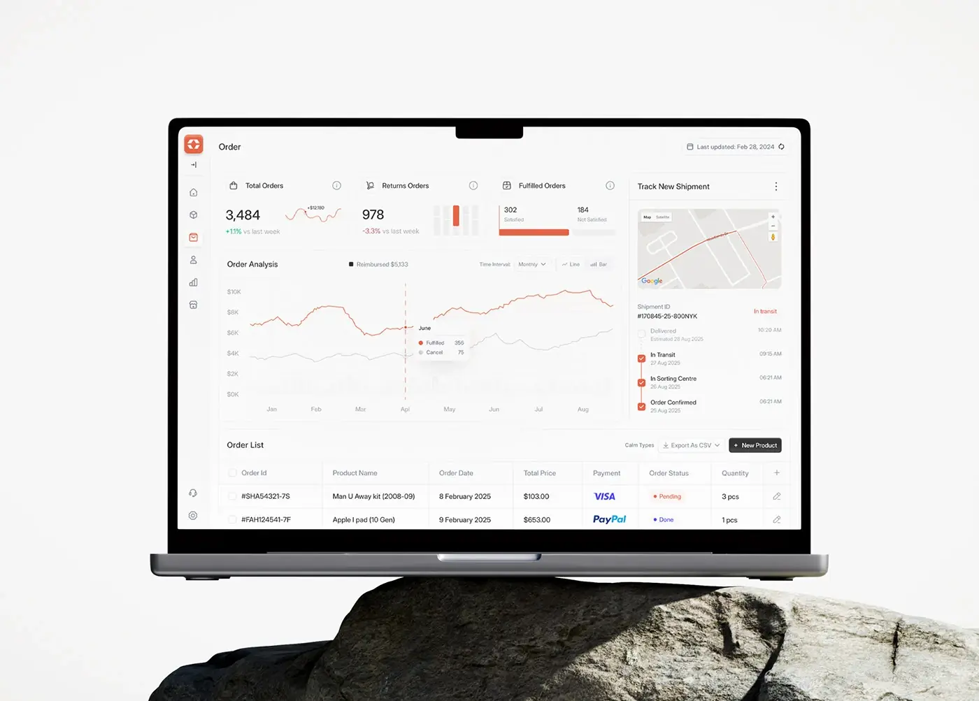


Card UI design is the craft of putting one item (an article, a product, a person, a metric, a plan) into a small self-contained container that people can scan, compare loosely and open. A good card has one job and one primary action, a clear title that works as its heading, consistent spacing and corner radius, visible hover and focus states, and, if the whole card is clickable, a single real link stretched over it rather than a link wrapped around everything. Cards are the right choice for browsing mixed content and dashboards. They're the wrong choice when people need to scan a long list or compare details line by line; use a list or a table for that.
I'm a design engineer: I design products and build them in production code, so I'll cover the card from both sides, the layout rules and the HTML, CSS and React that make them hold up. It's part of my product design work.
What a card is, and when not to use one
The Nielsen Norman Group's definition (Page Laubheimer, 2016) still holds: "A container for a few short, related pieces of information", roughly the shape of a playing card, linking to more detail. The same article draws the limits. Cards suit browsing and dashboards that mix content types. They're "less scannable than lists" and "a poor choice when users need to compare between multiple options".
So before I draw a card, I ask what the person is doing on that screen:
| The person is | Use |
|---|---|
| Browsing a varied feed, gallery or catalogue | Cards |
| Watching a few headline numbers | Stat cards |
| Searching for one item by name or price | A list |
| Comparing many rows on several attributes | A table |
| Choosing between two to four plans | Cards with identical structure, or a comparison table |
Most "the cards feel cluttered" problems I review are really "this should have been a table" problems.
Anatomy of a card
From top to bottom, a full card can hold:
- Media. An image, illustration or chart. Optional, and decorative images take an empty
alt. - Title. The item's name, marked up as a heading at the right level for the page. This is also the link target if the card opens something.
- Meta. Category, date, author, status. Short, quieter text.
- Body. One or two lines of description or the key figures.
- Actions. One primary action, and at most one or two secondary ones, such as save or a menu.
Not every card needs every part. A stat card might be a label, a number and a change indicator. The discipline is the same: one item per card, and the title tells you which.
Card types and what each needs
| Type | Typical content | The rule I follow |
|---|---|---|
| Content (article, post, video) | Image, title, meta, excerpt | Whole card links to the item; title is the link |
| Product | Image, name, price, rating, add to cart | Price and name stay in fixed positions so people can scan |
| Profile | Photo, name, role, contact | Name is the heading; contact actions are separate buttons |
| Stat or dashboard | Label, value, change, small chart | Label first, units visible, colour never the only signal for up or down |
| Pricing | Plan, price, feature list, button | Same features in the same order on every card |
Dashboard cards have their own pitfalls (too many, all the same weight); I've covered those in dashboard design examples.
Layout rules: one action, and whole-card links done properly
One primary action. A card that offers Open, Buy, Share, Save and Compare at equal weight asks the person to decide five things. Pick the one most people want and make it the obvious target.
Making the whole card clickable. People expect to click anywhere on a content or product card. The two common ways to do it are both wrong:
- Wrapping the whole card in
<a>. Screen readers then announce the entire card as one long link. Adrian Roselli's article on block links and cards shows how verbose and confusing that gets for screen reader and voice users. - Putting buttons or other links inside that
<a>. The HTML content model, summarised on MDN's `<a>` page, says no descendant of a link may be interactive content or another<a>. Nested links are invalid, and browsers handle them unpredictably.
The pattern that works, described by Heydon Pickering in Inclusive Components, keeps the link on the title and stretches its pseudo-element over the card:
<li class="card">
  <img src="cover.webp" alt="">
  <h3><a href="/blog/card-ui-design">Card UI design</a></h3>
  <p>Anatomy, states and code.</p>
  <button type="button" class="card-save">Save</button>
</li>
.card { position: relative; }
.card h3 a::after {
content: "";
position: absolute;
inset: 0;
}
/* Secondary actions sit above the stretched link */
.card-save { position: relative; z-index: 1; }
/* The link's focus ring is drawn on the whole card */
.card:has(a:focus-visible) {
outline: 2px solid var(--focus-ring);
outline-offset: 2px;
}
.card h3 a:focus-visible { outline: none; }The screen reader hears a short link ("Card UI design"), the mouse can click anywhere, and the Save button still works. Pickering notes the trade-off: text inside the card becomes hard to select. For cards whose text people copy, I link only the title and the image.
Spacing and radius: why concentric corners matter
Pick spacing from a scale and use it everywhere. Padding inside the card, the gap between its parts and the gap between cards should be three steps of one scale, not three guesses. I usually make the gap between cards at least as large as the padding inside them, so each card reads as one group.
Concentric radius. When something with rounded corners sits inside a rounded card, the two curves should share a centre. The rule: inner radius = outer radius minus the padding between them. A card with a 16px radius and 8px padding wants an 8px radius on the image inside it. With 16px of padding the inner radius drops to zero. Copying the outer radius onto inner elements is the most common reason a card looks slightly off without anyone knowing why.
Images that run to the card's edge are the exception: they share the card's radius on the touching corners, which is what shadcn/ui does with rounded-t-xl on a first image.
States: hover, focus, selected, loading and empty
A card has more states than its default look, and I draw them all before signing off the default:
- Hover. A subtle change of surface or border. If the card lifts, use
transform, never a change ofmarginortop, so nothing reflows. - Focus-visible. A clear ring around the whole card, as above. WCAG 2.2 success criterion 2.4.7, Focus Visible, is Level AA.
- Selected. For cards people pick (plans, options, rows in a bulk action), use a real control: a radio or checkbox inside the card, or
aria-pressedon a button. Show selection with more than colour, for example a tick and a thicker border. - Loading. A skeleton with the same size and layout as the real card, so nothing jumps when data arrives. Mark the region
aria-busy="true"while it loads. - Empty and error. A stat card with no data says so ("No data for this period") rather than showing a zero that looks real.
- Disabled. Rare for cards. If an item isn't available, say why in the card instead of greying it out silently.
Grids and container queries
For a responsive grid of cards, CSS Grid does most of the work in one line:
.cards {
  display: grid;
  grid-template-columns: repeat(auto-fill, minmax(16rem, 1fr));
  gap: var(--space-6);
}
Media queries know the viewport, but a card sits in a sidebar on one page and a wide grid on another. Container queries let the card respond to its own width, and webstatus.dev lists them as widely available since August 2025:
.card { container-type: inline-size; }

@container (min-width: 28rem) {
  .card-inner { display: grid; grid-template-columns: 10rem 1fr; }
}
Below 28rem the card stacks image over text; above it, the image moves to the side. In Tailwind, the same thing is the @container class on the card and container variants such as @md:flex-row on its children. To line up titles and buttons across a row of cards with different text lengths, subgrid is now widely available too.
Mark up a collection of cards as a list (<ul> and <li>), so screen readers announce how many there are.
Accessibility checklist for cards
- A heading on every card, at the right level, so people can jump from card to card by heading.
- A short link name. The title, not "Read more" repeated twelve times.
- Focus order follows the visual order, and the focus ring is never clipped. Watch
overflow: hiddenon the card: it clips rings drawn outside the link. - Targets of at least 24 by 24 CSS pixels for small secondary actions, from success criterion 2.5.8, Level AA.
- 3:1 contrast for the boundary when a border is what identifies a control, such as a selectable card, from success criterion 1.4.11, Non-text Contrast.
- Decorative images get
alt=""; images that carry meaning get a description.
Building cards with shadcn/ui, Tailwind and design tokens
shadcn/ui's Card installs with pnpm dlx shadcn@latest add card and is composed from Card, CardHeader, CardTitle, CardDescription, CardAction, CardContent and CardFooter. The docs, which now offer Base UI, Radix UI and React Aria versions, also document a size="sm" prop for tighter spacing. Three details I noticed reading the source on 10 November 2026:
CardTitlerenders adiv, not a heading. Put an<h3>(or the right level) inside it, or the card has no heading for screen readers.- The card has
overflow-hidden, which can clip focus rings inside it. Draw the focus ring on the card itself withhas-[a:focus-visible]. CardHeaderis a container (@container/card-headerin the Radix version), so it already uses container queries for the action slot.
<Card className="relative has-[a:focus-visible]:outline-2 has-[a:focus-visible]:outline-ring">
  <CardHeader>
    <CardTitle>
      <h3>
        <a href="/reports/weekly" className="after:absolute after:inset-0 focus-visible:outline-none">
          Weekly report
        </a>
      </h3>
    </CardTitle>
    <CardDescription>Sent every Monday</CardDescription>
    <CardAction>
      <Button variant="ghost" size="icon" className="relative z-10" aria-label="Report options">
        <MoreHorizontal />
      </Button>
    </CardAction>
  </CardHeader>
  <CardContent>Includes charts, tables and key metrics.</CardContent>
</Card>
The look comes from tokens. shadcn/ui's theming docs define --card and --card-foreground for the surface and text, and one --radius (0.625rem by default) from which --radius-sm to --radius-4xl are derived, so rounded-xl is --radius times 1.4. Change the base radius and every card, input and popover follows; work out inner radii from it with the concentric rule. Keep the same token names in Figma and in code, which is how I set up every design system; the details are in my design tokens guide.
Frequently asked questions
What is a card in UI design?
A small container for one item, such as an article, product, person or metric, that shows a short summary and usually links to more detail. Cards let people browse mixed content at a glance.
When should I not use cards?
When people need to scan a long list for one item, or compare many options on the same attributes. A list or a table is faster for both.
How do I make a whole card clickable and accessible?
Put a real link on the card's title, give the card position: relative, and stretch the link's ::after pseudo-element over the card with position: absolute; inset: 0. Raise any secondary buttons above it. Don't wrap the card in a link or nest links.
What border radius should a card have?
Any value that matches your system, applied consistently. What matters more is the inside: an element inside a rounded card should have the card's radius minus the padding between them.
How many actions should a card have?
One primary action, plus at most one or two secondary ones such as save or a menu. More than that usually means the card is doing the job of a detail page.
Can you design and build a card system for my product?
Yes. I design the cards and their states in Figma and build them in TypeScript, React and Next.js, including on shadcn/ui and Tailwind, with tokens named the same in both. See my product design work.
Sources and method
I read every source on 10 November 2026, including the shadcn/ui Card source served on its documentation page and in its GitHub repository.
- Nielsen Norman Group, Cards: UI-Component Definition, checked 10 November 2026: nngroup.com
- Heydon Pickering, Inclusive Components: Cards, checked 10 November 2026: inclusive-components.design
- Adrian Roselli, Block Links, Cards, Clickable Regions, Rows, Etc., checked 10 November 2026: adrianroselli.com
- MDN, The Anchor element, permitted content, checked 10 November 2026: developer.mozilla.org
- MDN, CSS container queries, checked 10 November 2026: developer.mozilla.org
- webstatus.dev, Container queries and Subgrid, checked 10 November 2026: webstatus.dev
- W3C, Understanding SC 2.4.7 Focus Visible, 2.5.8 Target Size (Minimum) and 1.4.11 Non-text Contrast (WCAG 2.2), checked 10 November 2026: w3.org
- shadcn/ui, Card documentation and source, checked 10 November 2026: ui.shadcn.com
- shadcn/ui, Theming, checked 10 November 2026: ui.shadcn.com
- Tailwind CSS, Responsive design: container queries, checked 10 November 2026: tailwindcss.com
If you're designing a product and want its cards, states and components designed and built as one system, book a free 30 minute intro call. After it, you get a written scope and one fixed quote.
Tags: Card UI, Components, Accessibility, Design systems, Product design