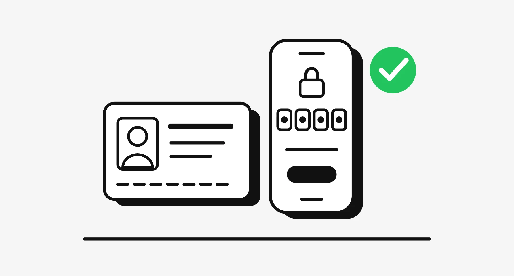
Good login page design gets a returning person into their account on the first try, with the fewest decisions and no memory test. In practice that means one clear first field (email or username), a passkey offered right in that field, a password field that password managers can fill, one or two other sign-in methods at most, error messages that say what to do next without revealing which accounts exist, and a recovery path one tap away. Most login page examples you'll find online are judged on looks. The ones that work are judged on states: loading, wrong password, locked out, code expired, passkey cancelled.
I'm a design engineer: I design products and build them in production code, so I see a login page from both sides, the screen and the HTML under it. This guide covers the patterns, what to copy from real login pages, and the markup that makes them work. It's part of my product design work.
What a login page has to do in 2026
A login page has one job and four audiences. The returning person wants in. The password manager needs to recognise the fields. The screen reader needs labels and errors it can announce. The attacker wants to learn which emails have accounts and to guess passwords quickly. Every decision below serves the first three and frustrates the fourth.
What has changed is the sign-in method, not the layout. Passkeys sit beside passwords, codes arrive by text and email, and business products route people to their company's identity provider. The page has to offer the right one without becoming a wall of buttons.
The sign-in methods, and where each fits
| Method | Best for | What the page needs |
|---|---|---|
| Passkey | Any consumer or business product with returning users | Autofill in the identifier field, plus a visible "Sign in with a passkey" fallback |
| Password | Still the default most people know | A field managers can fill, a show password control, paste allowed |
| One-time code (text or email) | Second factor, or passwordless sign-in for occasional users | A code field that reads codes from the keyboard, a resend timer, a way back |
| Magic link | Low-risk products used now and then | A clear "check your email" screen and a fallback code for a different device |
| Social sign-in (Apple, Google) | Consumer apps where people already have those accounts | Two buttons at most, above or below the form, never instead of it |
| SSO (SAML or OpenID Connect) | Business products sold to companies | Email first, then send work domains to their identity provider |
| National digital ID | Government, banking and regulated apps in some countries | The provider's own button and flow rules |
Passkeys are the method worth planning around. The FIDO Alliance calls passkeys always strong and phishing-resistant, built on public key cryptography. In practice the browser only offers a passkey to the site that created it, so a lookalike domain gets nothing to steal. The same page cites its own 2025 consumer survey: 48% of people had abandoned an online purchase because they forgot a password.
National IDs follow rules set by the provider, and those rules change the page. I've written separate guides for UAE PASS, Nafath in Saudi Arabia, Singpass and Smart-ID and Mobile-ID in the Baltics.
Login page UI: the layout that works
Identifier first. Ask for the email or username alone, then decide the next step. This one pattern handles passkeys, SSO domains and passwordless accounts without showing every option at once. If your users all use passwords, showing email and password together is fine; it saves a screen.
Label every field, above the field. A placeholder isn't a label: it vanishes as soon as someone types. Write "Email address", not "Enter your email".
One primary button. "Sign in" or "Continue", the same words every time. Social and SSO buttons are secondary, styled as such.
Show password. A toggle or checkbox beside the field. It cuts typing errors on phones and costs nothing.
Forgot password, next to the password field. Not in the footer, not after an error.
Sign up is a link, not a rival. "New here? Create an account" under the form. The person on a login page has usually already signed up.
Keep the page quiet. No carousel, no cookie banner covering the button. WCAG 2.2 success criterion 2.4.11, Focus Not Obscured (Minimum), Level AA, says a focused control must not be entirely hidden by content the author added, and sticky banners are the usual culprit.
Login page examples, read from the live pages
I looked at two public login pages on 9 November 2026 and read their HTML, not a screenshot.
GitHub. The heading reads "Sign in to GitHub". The first field is labelled "Username or email address" and carries autocomplete="username"; the password field carries autocomplete="current-password". "Forgot password?" sits with the password field, "New to GitHub? Create an account" sits below the form, and a separate "Sign in with a passkey" option is offered. The markup also includes passkey autofill support and an SSO label, "Sign in with your identity provider", for company accounts. That's the identifier-first, passkey-ready pattern in production.
Login.gov. The US government sign-in page uses two tabs, "Sign in" and "Create an account". The email field is type="email" and the password field has autocomplete="current-password" with a "Show password" checkbox. A second route reads "Sign in with your government employee ID", there's a "Forgot your password?" link, a language picker, and a "Need more time?" session warning. The one thing I'd add: the email field has no autocomplete="username" in the served HTML, which helps password managers pair the two fields.
Both are plain, labelled and complete. That's what to copy.
Error and recovery states
Most of a login flow is what happens when something goes wrong. I list every state before I draw the main screen:
- Wrong email or password
- Too many attempts, slowed down or locked
- Code expired, code wrong, code not received
- Passkey prompt cancelled, or no passkey on this device
- Magic link opened on a different device, or already used
- SSO domain recognised but the company's provider is down
- Session timed out halfway through
Say what to do, not only what failed. "That email and password don't match. Try again or reset your password" beats "Invalid credentials".
Don't reveal which accounts exist. The OWASP Authentication Cheat Sheet gives the correct login reply as "Login failed; Invalid user ID or password", one message for both cases. For password recovery it recommends "If that email address is in our database, we will send you an email to reset your password", the same reply whether or not the account exists. Its Forgot Password Cheat Sheet covers the reset flow itself.
Rate limiting needs a human message. NIST SP 800-63B-4, the US federal authentication guideline, requires limiting consecutive failed attempts on one account to no more than 100, and lists ways to slow attackers without locking people out, such as an increasing wait after each failure. On screen, that becomes: "Too many attempts. Try again in 2 minutes, or reset your password." A timer and an exit, never a dead end.
Recovery is part of the login page. Every error state links to reset or another method, including for someone who lost the phone holding their passkey.
Accessibility: WCAG 2.2 and accessible authentication
Success criterion 3.3.8, Accessible Authentication (Minimum), is Level AA in WCAG 2.2 (W3C Recommendation, current version dated 12 December 2024). It says no step of sign-in may require a cognitive function test, such as remembering a password or solving a puzzle, unless there's an alternative method or a mechanism to help. The W3C's own notes name password manager support and copy and paste as such mechanisms, and say a page that blocks autofill or paste fails the criterion unless it offers an alternative.
So a password field passes when managers can fill it and people can paste into it. A code field passes when the code can be pasted. A passkey passes outright, because nothing is remembered. NIST agrees on the security side: SP 800-63B-4 says verifiers should permit paste in password fields and allow password managers and autofill.
The rest of the checklist:
- Labels tied to inputs with
forandid, and errors tied witharia-describedbyso screen readers announce them. - Focus moves to the error summary or the first wrong field after a failed submit.
- Visible focus on every field and button.
- Targets of at least 24 by 24 CSS pixels, from success criterion 2.5.8, Level AA. I aim larger on phones.
- Input borders with 3:1 contrast against the background, from success criterion 1.4.11, Non-text Contrast.
- No timed puzzles. If the session expires, warn and offer more time, as Login.gov does.
The code side: markup that makes the design work
A login page can look right and still fight password managers. This is the markup I start from:
<form method="post" action="/sign-in">
  <label for="email">Email address</label>
  <input id="email" name="email" type="email"
         autocomplete="username webauthn" required>

  <label for="password">Password</label>
  <input id="password" name="password" type="password"
         autocomplete="current-password" required
         aria-describedby="password-error">
  <p id="password-error" role="alert" hidden></p>

  <button type="submit">Sign in</button>
</form>
The MDN autocomplete reference defines the values that matter here: username, current-password for sign-in, new-password for sign-up and reset (so browsers suggest a strong one rather than fill an old one), one-time-code for codes, and webauthn, which must come last and tells the browser to show passkeys when the field is focused. Google's sign-in form best practices on web.dev add: don't ask for the email twice, and don't let the phone keyboard cover the button.
For code fields, web.dev's SMS OTP form guide recommends type="text" inputmode="numeric" autocomplete="one-time-code", not type="number", and ending the text message with @yourdomain.com #123456 so the browser can tie the code to your site. Use one field for the whole code, not six boxes that break paste.
Passkeys in the same field. The passkeys.dev bootstrapping guide shows the pattern: add webauthn to the username field, check on page load whether autofill for passkeys (conditional mediation) is available with PublicKeyCredential.isConditionalMediationAvailable(), then call navigator.credentials.get() with mediation: "conditional".
if (window.PublicKeyCredential?.isConditionalMediationAvailable &&
    await PublicKeyCredential.isConditionalMediationAvailable()) {
  const options = await fetch("/passkey/options").then(r => r.json());
  const credential = await navigator.credentials.get({
    publicKey: options, // challenge from your server
    mediation: "conditional",
  });
  // send credential to your server to verify
}
The Web Authentication API needs HTTPS, and the challenge comes from your server, never from the page. The full spec is WebAuthn Level 3 at the W3C. Keep a visible "Sign in with a passkey" button as well, for browsers without autofill support.
Mobile login page design
On phones the keyboard is the layout. Put the primary button where the keyboard won't cover it, or scroll it into view on focus. Use the right keyboard per field (type="email", inputmode="numeric"). Turn off autocapitalise and autocorrect on the identifier field, as GitHub does.
Dark mode for login pages
Follow the system setting with `prefers-color-scheme`, and set the `color-scheme` property so the browser's own form controls and scrollbars match. The common failures are input borders that disappear on dark grey and error red that drops below contrast. Check every text and border pair in both themes; my free colour contrast grid scores a whole palette against WCAG 2.2 at once.
Frequently asked questions
What makes a good login page?
One clear first field, a password field managers can fill, at most one or two other methods, specific error messages that don't reveal accounts, and a recovery link next to the password.
Should I put email and password on one screen or two?
Two if you offer passkeys, SSO or passwordless accounts, because the first step decides the second. One if everyone uses a password.
Are passkeys ready to replace passwords?
They're ready to sit beside them. Offer passkeys in autofill and after sign-in, keep the password path for people without one, and never remove recovery.
Do CAPTCHAs break accessible authentication?
A puzzle that relies on memory or transcription is a cognitive function test under WCAG 2.2 success criterion 3.3.8, so it needs an alternative. Rate limiting with a clear wait usually protects the page with less friction.
Can you design and build my login and sign-up flow?
Yes. I design the flow and build it in TypeScript, React and Next.js, or React Native and Flutter for apps, with the states, markup and passkey support covered. See my design engineering work.
Sources and method
I read every source and both login pages on 9 November 2026. I read the login pages' served HTML, so anything added later by scripts may not appear in my description.
- FIDO Alliance, Passkeys, checked 9 November 2026: fidoalliance.org
- W3C, Web Content Accessibility Guidelines (WCAG) 2.2, checked 9 November 2026: w3.org
- W3C, Understanding SC 3.3.8 Accessible Authentication (Minimum), checked 9 November 2026: w3.org
- W3C, Understanding SC 2.5.8 Target Size (Minimum), checked 9 November 2026: w3.org
- OWASP, Authentication Cheat Sheet, checked 9 November 2026: cheatsheetseries.owasp.org
- OWASP, Forgot Password Cheat Sheet, checked 9 November 2026: cheatsheetseries.owasp.org
- NIST, SP 800-63B-4 Authentication and Authenticator Management, checked 9 November 2026: pages.nist.gov
- MDN, HTML autocomplete attribute, checked 9 November 2026: developer.mozilla.org
- MDN, Web Authentication API, checked 9 November 2026: developer.mozilla.org
- W3C, Web Authentication Level 3, checked 9 November 2026: w3.org
- passkeys.dev, Bootstrapping (sign-in with passkey autofill), checked 9 November 2026: passkeys.dev
- web.dev, Sign-in form best practices, checked 9 November 2026: web.dev
- web.dev, SMS OTP form best practices, checked 9 November 2026: web.dev
- MDN, prefers-color-scheme and color-scheme, checked 9 November 2026: developer.mozilla.org
- GitHub sign-in page and Login.gov sign-in page, HTML read 9 November 2026: github.com/login, secure.login.gov
If you're designing a login or sign-up flow and want the screens, states and code done as one piece of work, book a free 30 minute intro call. After it, you get a written scope and one fixed quote.
Tags: Login page design, Authentication, Passkeys, Accessibility, Product design