


Design tokens are named design decisions, such as surface-default or content-muted, stored once in a file that both the design tool and the code read. Each token has a value (a colour, a size, a duration) and a type, and it can point at another token instead of a raw value. Change the token and every screen that uses it follows. Tokens are the first thing I set up in MVP development for startups, before a single screen is built.
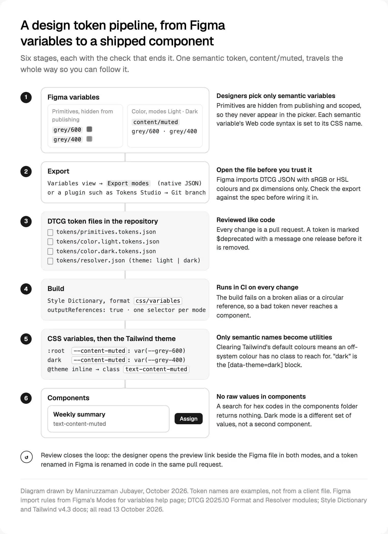
Since October 2025 they have a stable shared file format, and Figma reads and writes it natively. A working pipeline is short: Figma variables, a token file in your repository, a build step, CSS custom properties and a Tailwind theme, then components that only use semantic names.
This guide is for founders, product leads, and the designers and developers about to set up tokens for a web app, or rescue a set that has drifted.
What design tokens are, and what they are not
#6b6b6b is a value. grey-600 is a name for that value. content-muted is a decision: the colour for secondary text. The decision is what matters, because it survives a rebrand and the value doesn't. When the palette changes, content-muted points somewhere new and no component file is touched.
Not everything in Figma's variables panel is a token. Figma's overview of variables lists six types: colour, number, string, boolean, and timing and easing for Figma Motion. A boolean that hides a layer in a prototype is prototype state, not a design decision, so I keep those in their own collection, away from the token file.
Tokens are only the bottom layer of a design system; for how public systems stack the rest, see nine public design systems and what to copy. This guide is about the plumbing: the file, the build and the names.
The DTCG format: what reached a stable version in October 2025
What is confirmed, from the primary sources:
- On 28 October 2025 the Design Tokens Community Group published Design Tokens 2025.10, which its W3C community announcement calls the first stable version.
- It has three modules, each a Final Community Group Report: Format, Color and Resolver, the last for themes and modes.
- Its status section says it is "not a W3C Standard nor is it on the W3C Standards Track". A W3C Community Group wrote it, hence the common name, the W3C format.
- The announcement names Style Dictionary, Tokens Studio and Terrazzo as reference implementations, and Figma, Penpot, Sketch, Framer and others as supporting it.
- The same day, Figma's Schema 2025 recap said it had waited for the spec before shipping native variable import and export, due in November 2025.
My reading: "stable" means tool makers can stop chasing a moving draft. It doesn't mean every tool supports every part. Style Dictionary's DTCG page says full 2025.10 support is still a work in progress in version 5, and Tokens Studio's docs say the plugin doesn't yet support some spec types. So I treat the format as the shape I store, and test each tool against it.
Anatomy of a token file: types, groups and aliases
A token is a JSON object whose only required property is $value. Around it sit $type, $description, $deprecated (true, or a message naming the replacement) and $extensions for tool data, which tools must preserve. A $type on a group applies to every token inside, and tools must not guess a missing type.
Names can't start with $ or contain {, } or ., because those belong to the alias syntax. They are case-sensitive, so Grey and grey are two tokens.
The basic types are colour, dimension, font family, font weight, duration, cubic Bézier and number, plus composites such as border, shadow, gradient and typography. Two value shapes catch people out. Colours are objects, not hex strings: a colorSpace, components, and optional alpha and hex, across 14 colour spaces including oklch and display-p3. Dimensions carry units: { "value": 16, "unit": "px" }.
Aliases use curly braces: "{grey.600}" resolves to that token's $value, and circular references are errors. JSON Pointer $ref can target one property, such as a single colour channel, and $extends lets a group inherit another, which suits a second brand that changes a handful of values.
A trimmed light-mode file, primitives and semantic tokens together for readability:
{
  "grey": {
    "$type": "color",
    "0":   { "$value": { "colorSpace": "srgb", "components": [1, 1, 1], "hex": "#ffffff" } },
    "600": { "$value": { "colorSpace": "srgb", "components": [0.42, 0.42, 0.42], "hex": "#6b6b6b" } },
    "900": { "$value": { "colorSpace": "srgb", "components": [0.098, 0.098, 0.098], "hex": "#191919" } }
  },
  "surface": {
    "$type": "color",
    "default": { "$value": "{grey.0}", "$description": "Page and card background" }
  },
  "content": {
    "$type": "color",
    "default": { "$value": "{grey.900}" },
    "muted": { "$value": "{grey.600}", "$description": "Secondary text and metadata" },
    "subtle": { "$value": "{grey.600}", "$deprecated": "Use content.muted. Removed in 3.0." }
  }
}
The dark file points the same semantic names at other primitives.
Primitive, semantic and component tokens
Systems label the tiers differently, but the jobs are the same:
| Tier | Example | Points to | Who reads it | Changes when |
|---|---|---|---|---|
| Primitive | grey-600, blue-500 | Raw values | Only other tokens | The palette or scale is retuned |
| Semantic | content-muted, action-primary, border-focus | Primitives, one per mode | Every component and screen | A role changes, or a mode is added |
| Component | button-primary-bg | Semantic tokens | One component | That component must differ from its role |
Components read semantic tokens only. Semantic names describe the job (content-muted), never the look (grey-text), because a name that describes the look becomes a lie at the first redesign. I start with a small vocabulary: surface, content, border, action, status and focus.
Component tokens wait until a component must vary independently of its role, say, when a second brand wants rounder buttons. Before that, they double the names you maintain and change nothing on screen.
Modes and themes: light, dark and more than one brand
In Figma, a mode is a column of values in a collection. Figma's recap says the limit rose to 10 modes per collection on Professional, up from four, and 20 on Organization. For several brands, Enterprise customers with Full seats get extended collections: a child collection per brand that inherits the parent and keeps its own overrides, though variables and modes can only be added in the parent. Elsewhere, brands become modes or collections: two brands in light and dark is already four columns.
In the token files, the Resolver module does the same without copying files. A resolver lists sets of shared tokens, modifiers with contexts such as light and dark, and a resolutionOrder in which later entries win. Ask for { "theme": "dark" } and a tool loads the foundation, then the dark file. A brand is just another modifier.
In CSS, each mode becomes a selector. A trimmed example of build output, references kept:
/* tokens.css: generated from tokens/*.tokens.json, do not edit */
:root {
  --grey-0: #ffffff;
  --grey-400: #8f8f8f;
  --grey-600: #6b6b6b;
  --grey-900: #191919;
  --surface-default: var(--grey-0);
  --content-default: var(--grey-900);
  --content-muted: var(--grey-600);
}

[data-theme="dark"] {
  --surface-default: var(--grey-900);
  --content-default: var(--grey-0);
  --content-muted: var(--grey-400);
}
CSS also has `light-dark()`, Baseline since May 2024 per MDN, which picks one of two values once color-scheme: light dark is set. I still prefer selector blocks, because light-dark() only ever chooses between two values, and a high-contrast mode or second brand needs selectors anyway.
Getting tokens out of Figma
Four realistic routes, each as its maker documents it:
| Route | Who can use it | What you get | What to watch |
|---|---|---|---|
| Native Export mode or Export modes | Plans with modes | JSON of one mode, or all modes of a collection | The help page doesn't spell out the output shape |
| Native import | Plans with modes | DTCG JSON into a collection, one mode per file | sRGB or HSL colours, px dimensions, one font family name |
| Variables REST API | Enterprise; writes need a Full seat | Read and write variables from scripts | Built for sync in CI |
| Tokens Studio plugin | Figma plugin; theme export is Pro | Sync to GitHub, GitLab, Bitbucket, Azure DevOps and more | Defaults to its legacy format |
Figma's import rules matter before you round-trip: a token must appear in every imported file with the same supported type, nested groups become slashes, and if two tokens normalise to the same name, only the first is imported.
The setting most teams miss is code syntax. Figma lets you give each variable one code name each for Web, iOS and Android, shown in Dev Mode. Without it, Dev Mode normalises names into valid CSS on its own, which is rarely your codebase's name. Set the Web syntax to the real CSS variable so Dev Mode shows the right name; my design to code workflow with Figma MCP relies on names like these.
Building tokens: Style Dictionary, Tokens Studio and others
Described from each tool's own docs, not ranked; many teams use two together.
Style Dictionary is a build system: a config points at token files and declares platforms, each with transforms and outputs. It has had first-class DTCG support since version 4 and auto-detects the format. Version 5.6.1 came out on 10 October 2026, per its GitHub releases. Its `css/variables` format writes custom properties; outputReferences keeps aliases as var() references, and selector sets the block, so one output writes :root and another [data-theme="dark"].
Tokens Studio starts in Figma. The plugin manages tokens, attaches them to variables and styles, and syncs JSON to Git. Its token format setting switches between DTCG and legacy and converts the files. Per its variables guide, exporting themes creates one collection with several modes.
Terrazzo, the third reference implementation, describes itself as MIT-licensed tools built on the W3C token format.
What I check in any of them, on a sample file:
- Does it read 2025.10 colour objects, or only hex strings?
- Does it keep aliases, so
--content-mutedstill saysvar(--grey-600)? - Does it fail loudly on a broken or circular reference?
- Does it run in CI from the repository alone, with no plugin open?
Output to CSS custom properties and Tailwind v4
Tailwind v4.3 turns tokens into utilities through theme variables. Per Tailwind's theme docs, @theme creates utilities by namespace (--color-*, --radius-*, --text-* for font sizes, --shadow-* and more), @theme inline handles variables that reference other variables, and setting a namespace to initial removes Tailwind's defaults.
I import the generated tokens and map only semantic names into the theme:
@import "tailwindcss";
@import "./tokens.css";

@custom-variant dark (&:where([data-theme=dark], [data-theme=dark] *));

@theme {
  --color-*: initial;
}

@theme inline {
  --color-surface-default: var(--surface-default);
  --color-content-default: var(--content-default);
  --color-content-muted: var(--content-muted);
}
With the palette cleared and primitives never mapped, off-system colours have no class to reach for. Because values switch inside tokens.css, text-content-muted works in both modes without dark: on every element; the `@custom-variant` from Tailwind's dark mode docs is for exceptions.
One trap: keep token output names out of Tailwind's namespaces. A colour group called text would collide with --text-*, the font-size namespace, which is why my colour roles say content. The basic Next.js wiring, fonts included, is in how I take Figma to Next.js.
Naming that matches across Figma and code
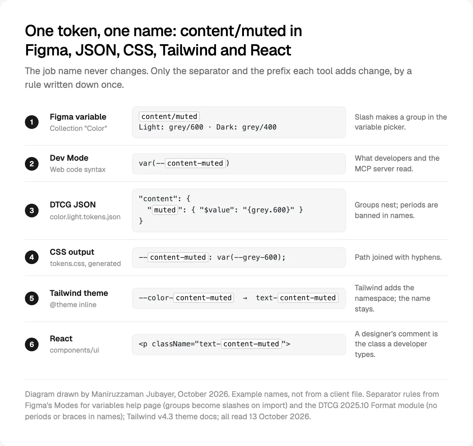
In my work, tokens and components carry the same names in Figma and in code. The rules I write on one page before anyone draws a variable:
- Name the job, not the value.
action-primary, neverblue-button. - One separator per tool, by rule. A slash in Figma, a nested group in JSON, a hyphen in CSS. The job name never changes.
- Lowercase letters, digits and hyphens only, so no tool rewrites anything.
- Code syntax set on every semantic variable, pointing at the real CSS name.
- No second name for one thing. If Figma says
surface-raisedand code sayscard-bg, one side is renamed in the same pull request. - Primitives hidden from publishing and scoped in Figma, so the picker offers semantic tokens only.
It's the same discipline behind how I build SaaS web applications: the system is named once, and every screen is assembled from it.
Governance: who owns the tokens and how they change
Tokens drift when nobody reviews changes. My process is small on purpose:
- One owner, usually the lead designer with one developer, approves every new semantic token and can say no.
- Every change is a pull request to the token files, never a hand edit to the generated CSS.
- CI builds the tokens and fails on broken aliases, circular references and duplicate names; a lint rule rejects raw hex in components.
- Contrast is checked per mode for each text and surface pair, using my WCAG 2.2 checklist for React components.
- Removal takes two releases:
$deprecatedwith the replacement named, then deletion in the next major version, with a line in the changelog. - The designer reviews the preview link in light and dark, beside the Figma file, before it merges.
Where I would start
Start with names, not tools. Write the one-page naming rules, list the semantic roles your first screens need, and set up two Figma collections: primitives, hidden, and semantic, with light and dark modes. Then run one token through to a component in both modes before adding the rest.
If you'd rather one person designed the system and wired it into production, that's what design engineering means in practice. A project with me starts with a free 30 minute intro call, then a written scope and one fixed quote, with weekly sprints and a written update every 48 hours. If that fits, design and build your product with me.
Frequently asked questions
What are design tokens in simple terms?
Design tokens are named values that record a design decision, such as the colour of secondary text. They live in one file that Figma and the code both read, so one change reaches every screen. Good tokens are named for their job, like content-muted, not their value.
Is the DTCG format a W3C standard?
No. The Design Tokens Community Group, a W3C Community Group, published version 2025.10 on 28 October 2025 as a Final Community Group Report, and the document says it is not a W3C Standard or on the Standards Track. Figma, Style Dictionary and Tokens Studio read it, with gaps.
What is the difference between primitive and semantic tokens?
Primitive tokens hold raw values, such as grey-600. Semantic tokens name a job, such as content-muted, and point at a primitive, a different one per mode. Components read only semantic tokens, so switching to dark mode or retuning the palette changes the token files and leaves every component untouched.
Are Figma variables the same as design tokens?
Not exactly. Figma variables are where many teams keep tokens, and Figma now imports and exports them in the DTCG format. But variables also hold prototype data, such as booleans that hide layers, which are not design decisions. Keep those in a separate collection, and treat the reviewed token file in your repository as the record.
How do I export Figma variables as design tokens?
In the Variables view, right-click a mode and choose Export mode, or right-click a collection and choose Export modes, to get JSON. Enterprise teams can script it with the Variables REST API, and plugins such as Tokens Studio sync token files to Git. Whichever route you use, check the output against the spec before your build depends on it.
How do design tokens work with Tailwind CSS v4?
Generate CSS custom properties from your token files, import them, then map semantic tokens into Tailwind's @theme inline block, for example --color-content-muted: var(--content-muted), which creates text-content-muted. Clearing the default palette with --color-*: initial removes off-system colours, and because values switch per mode in the token CSS, utilities work in light and dark.
Sources and method
I read every source on 13 October 2026. I ran no Figma exports or token builds for this post; the snippets are hand-written to the 2025.10 spec and the tools' docs, and the diagrams are drawn for it.
- Design Tokens Community Group, Design Tokens 2025.10 with its Format, Color and Resolver modules (28 October 2025), date read 13 October 2026: designtokens.org, designtokens.org, designtokens.org, designtokens.org
- W3C Design Tokens Community Group, first stable version announcement, 28 October 2025, date read 13 October 2026: w3.org
- Figma, Schema 2025 design systems recap, 28 October 2025, date read 13 October 2026: figma.com
- Figma Help Center, variables overview, modes (import and export), creating and managing variables, extended collections, variables in Dev Mode, date read 13 October 2026: help.figma.com, help.figma.com, help.figma.com, help.figma.com, help.figma.com
- Figma developer docs, Variables REST API, date read 13 October 2026: developers.figma.com
- Style Dictionary, DTCG support, configuration and predefined formats, date read 13 October 2026: styledictionary.com, styledictionary.com, styledictionary.com
- Style Dictionary, GitHub releases (v5.6.1, 10 October 2026), date read 13 October 2026: github.com
- Tokens Studio, docs home, token format and variables overview, date read 13 October 2026: docs.tokens.studio, docs.tokens.studio, docs.tokens.studio
- Terrazzo, project home, date read 13 October 2026: terrazzo.app
- Tailwind Labs, Tailwind CSS v4.3 theme variables and dark mode docs, date read 13 October 2026: tailwindcss.com, tailwindcss.com
- MDN Web Docs,
light-dark(), date read 13 October 2026: developer.mozilla.org
Tags: Design tokens, Design systems, Figma, Tailwind, CSS