

The design system examples worth studying publish more than a gallery of buttons: Material Design 3, Apple's Human Interface Guidelines, IBM Carbon, Shopify Polaris, Atlassian, GitHub Primer, Microsoft Fluent 2, the GOV.UK Design System and Adobe Spectrum. Each teaches something different: how to name tokens, how to keep Figma and code in step, how to write accessibility rules, how to survive a change of framework.
I opened all nine on 13 October 2026 and checked what each publishes. It's the homework I do before building a system as part of MVP development for startups.
Below: a table of what each system ships, the lesson I take from each, how I build a small system in Figma and React with the same names, and what I'd copy at each stage of a company. It's for founders and product leads about to start, or rescue, a design system for a web app.
Design system examples at a glance
What each system published when I looked, from its own pages. "Not confirmed" means I couldn't find it on the official site, not that it doesn't exist.
| System | Tokens | Components in code | Figma kit | Accessibility guidance |
|---|---|---|---|---|
| Material Design 3 (Google) | Reference, system and component tokens | Compose and Flutter; web and Android Views in maintenance mode | Yes, Material 3 Design Kit | Yes |
| Human Interface Guidelines (Apple) | No token file | Apple's system controls in SwiftUI and UIKit | Yes, iOS 27 and macOS 27 UI kits | Yes, with control sizes and text scaling |
| Carbon (IBM) | Core, component and AI tokens, four themes | React and Web Components, Apache 2.0 | Yes, on Figma Community | Yes, IBM checklist based on WCAG AA and Section 508 |
| Polaris (Shopify) | Inside the components; not overridable | Web components; React library archived 11 September 2026 | Not confirmed | In Shopify's app design guidelines |
| Atlassian | Tokens with light, dark and high-contrast themes | React packages | Yes, with tokens built in | Yes, plus content guidelines |
| Primer (GitHub) | Primer Primitives as CSS variables | Primer React, ViewComponents, Primer CSS | Yes, Primer Web | Yes, with role checklists |
| Fluent 2 (Microsoft) | Global and alias tokens | React, iOS, Android, Windows | Yes, web, iOS and Android kits | Yes; WCAG 2.1 AA components |
| GOV.UK Design System | Community library only | HTML and Nunjucks in GOV.UK Frontend v6.5.0 | No; prototypes are built in code | Yes, aims for WCAG AA |
| Spectrum (Adobe) | Tokens and component schemas, open repository | React Spectrum, React Aria, Web Components | Not confirmed | Built into React Aria |
None is better than the others; they serve different companies. What matters is which of their habits fits a team your size.
Material Design 3 and Atlassian: tokens named for their job
Material's design tokens overview splits tokens into reference, system and component classes, with names that read like a sentence: md.comp.fab.primary.container.color is the container colour of the primary floating action button. Designers and engineers reference one name, so a changed value never breaks the link between mock-up and code. How to set that up is in design tokens from Figma variables to code.
The page is also honest that tokens help less in an existing app full of hard-coded values unlikely to change in the next year or two. I agree: tokens pay off when the design will change, or when several products or themes share it.
Material's developer page carries a 19 May 2026 note that Material on Android is Compose-first, with the Android Views and web libraries in maintenance mode. For a React product, I'd take Material's naming and guidance, not its web components.
Atlassian's design tokens explained uses color.icon.success instead of one of many greens, and treats a theme as a set of token values: light, dark and high contrast, but also a compact view or reduced motion. Its migration guide describes a codemod that suggests a token for each colour in your files from the surrounding code, backed by lint rules.
What I take from both: a naming grammar written down before anyone draws a token (category, role, then state). And if your product already exists, plan migration tooling from the start, because nobody replaces hard-coded values by hand for long.
Apple's guidelines and GOV.UK: rules and research, not only parts
Apple's Human Interface Guidelines are mostly rules. The accessibility page gives a default control size of 44 by 44 points on iOS and iPadOS, with a minimum of 28 by 28, and asks apps to support text enlarged by at least 200 percent (140 percent on watchOS). Apple Design Resources offers iOS 27 and macOS 27 UI kits in Figma and Sketch.
The lesson: some rules can't live inside a component. A button can enforce its own size, not the gap between three of them. Those rules need a short written page that design review checks.
GOV.UK goes furthest on evidence. A component page such as the button shows the code in HTML and Nunjucks, the research behind it, and a dated list of changes with the release that made each one. The what's new page records GOV.UK Frontend v6.5.0 in August 2026, adding Feedback and Language navigation components.
Its patterns are named after the user's task: ask users for addresses, help users recover from validation errors. The accessibility strategy aims for WCAG level AA on the version published for at least a year. There's no official Figma kit; the prototyping guide has teams prototype in code with the GOV.UK Prototype Kit.
Two GOV.UK habits I bring to every client system: a short change log per component, and patterns named for the task rather than the widget.
Carbon, Fluent 2 and Primer: a Figma library that mirrors the code
Fluent 2's design guide puts it in one line: "The properties available in the UI kits map to the code." Its kits come in four tiers: a design language file holding the variables, core kits for web, iOS and Android, Copilot kits for AI patterns, and Labs kits for experiments. Its tokens page uses global tokens for raw values and alias tokens that add meaning, and its accessibility page says the components meet or surpass WCAG 2.1 AA.
Carbon's colour tokens come as core, component and AI tokens across four themes: White, Gray 10, Gray 90 and Gray 100. Its design resources point outside users to the v11 library on Figma Community, the code is on GitHub under Apache 2.0, and the accessibility overview says components follow an IBM checklist based on WCAG AA, Section 508 and European standards.
Primer's Figma libraries page describes one product library, Primer Web, whose components match Primer React, Primer ViewComponents and Primer CSS. Primer Primitives install as one npm package of CSS variables, and the accessibility section has checklists for designers, engineers and mobile.
One Figma library can sit above several code targets if both share one set of names. I'd copy that first; it costs only discipline.
Shopify Polaris and Adobe Spectrum: when the code underneath changes
The Polaris React repository was archived on 11 September 2026 and points developers to Polaris on shopify.dev, now built on web components. Shopify's guide to Polaris web components says they inherit the merchant's brand settings and their CSS can't be overridden.
That's right for apps inside the Shopify admin, which should look like the admin. It also makes Polaris a system to adopt when you build for Shopify, not one to borrow for your own product. The wider lesson: names and documentation outlive code. With good token and component names, a framework change rewrites the inside, not the system.
Spectrum shows a different split. Its documentation hub is organised by the language each team builds with: React and Web Components areas in beta, iOS and Android listed as coming. Underneath, React Aria offers over 50 unstyled components with behaviour, accessibility and internationalisation built in, and React Spectrum adds Adobe's styling. Tokens and component schemas sit in the open Spectrum design data repository.
I build the same way: behaviour from an accessible primitive library, looks from my own tokens. Dialogs, menus and comboboxes are where hand-written focus handling breaks, which my WCAG 2.2 checklist for React components covers.
How I build a small design system in Figma and React
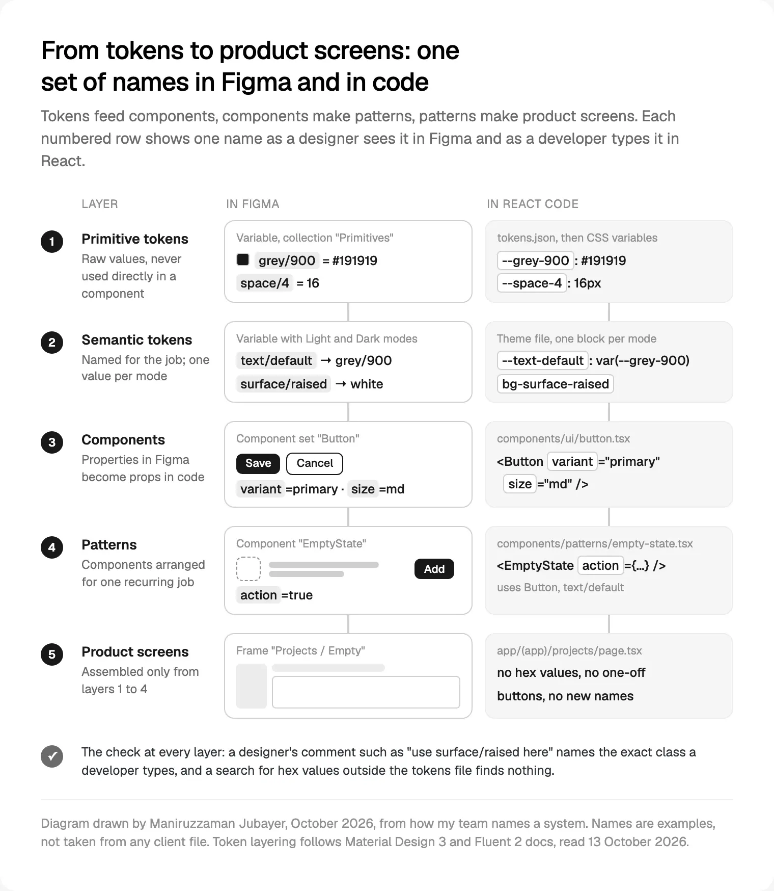
A startup needs a system that a designer and a few developers can keep true. This is the order I follow, with tokens and components named the same in Figma and in code from day one.
- List what repeats. Every part that appears on more than one screen, and every state: empty, loading, error, success, disabled, too much data.
- Agree the names once. A one-page naming document: the token grammar, component names, and the rule that a Figma property and a React prop share a name.
- Tokens in two layers. Primitives hold raw values; semantic tokens name the job and carry light and dark modes, as Figma variables with modes. They export to a tokens file in the Design Tokens Community Group format, then CSS variables; the Tailwind side is in how I take Figma to Next.js.
- Components in the same week, on both sides. I build the set with component properties, then the React component with props of the same names. Neither side ships a component the other lacks.
- Patterns next. Empty state with an action, form with errors, table with filters, page header.
- One page of every component and variant, each with a note on when to use it and when not to.
- Rules in review. No raw colours in components, no component without a Figma twin, no second name for one thing. AI tools follow the same rules, as in my design to code workflow with Figma MCP.
The system grows inside the product build, not before it. In the first sprint I name and build only what the first screens need, then add parts as features ask for them. That's the Next.js development with a matching component library I offer founders, so the system never becomes a side project nobody finishes.
What I would copy from public design systems at each stage
The right amount of system depends on how many people touch the product, not on how big the company wants to look.
| Stage | What your system needs | What I'd copy, and from where |
|---|---|---|
| Before launch, one small team | Two token layers, core components, every state | Material's naming grammar; React Aria's split of behaviour and style; Apple's control sizes as a rule |
| After launch, changing fast | Patterns, usage notes, a change log | GOV.UK's task patterns and change logs; Atlassian's content guidelines |
| A second team or product | Component tokens, contribution rules, versioning | Carbon's contribution process; Fluent's tiered kits; Primer's one library for several code targets |
| Existing product, hard-coded styles | A migration plan before new components | Atlassian's codemod and lint rules; Material's test of whether tokens are worth it yet |
At the first stage, the system is mostly naming and states. I'd skip component tokens, multiple brands and a public documentation site; nobody outside the team reads them yet.
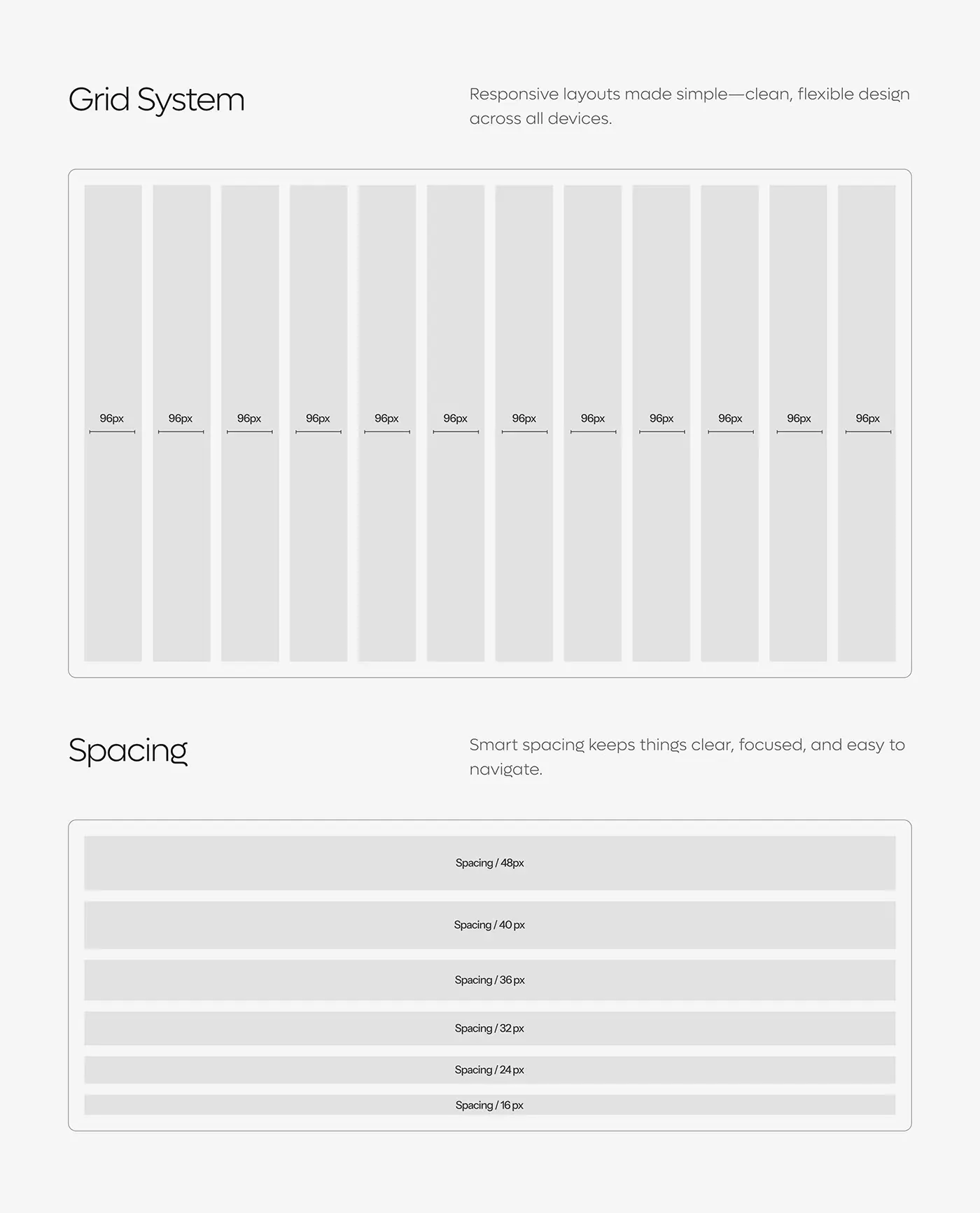
On OpsLoop, the foundations I drew were about that size: a twelve-column grid and one spacing scale, from 16 to 48 pixels, used across its screens.
At the second stage, gaps show up as screens built months apart that no longer match. Patterns fix that faster than more components. At the third, the system needs an owner and a way to say no; Carbon and GOV.UK both publish how contributions are proposed and judged, which is worth borrowing in spirit, if not in length.
Where copying a public design system goes wrong
What I check first when a founder shows me a system that isn't working:
- Copying the look, not the structure. Material's colours without its naming give you the colours and none of the consistency.
- Adopting someone else's scale. Fluent's four tiers of kits solve problems an MVP doesn't have.
- Building on code in maintenance mode. Material's web components and Polaris React still exist, but new work happens elsewhere.
- Two names for one thing.
Cardin Figma andPanelin code means every handoff needs a translator. Rename one side, once. - Treating the Figma kit as the system. Without code and usage notes, a kit is a drawing of a system.
- No owner. Without someone who can approve a new component or refuse it, a system drifts within a few releases.
Where I would start
Study two public systems, not nine: one close to your platform (Material or Apple for mobile, Primer or Atlassian for a web tool) and GOV.UK for how to document a pattern. Read their token naming and one component page each, then write your own one-page naming document before anyone draws a token.
If you'd rather one person designed and built it, that's what design engineering means in practice: the person who draws the button also reviews its code. A project with me starts with a free 30 minute intro call, then a written scope and one fixed quote, with weekly sprints and a written update every 48 hours. If that suits you, start your product's design system with me.
Frequently asked questions
Which design system examples should I study first?
The ones closest to your product. For an Android or Flutter app, Material Design 3; for iOS, Apple's Human Interface Guidelines; for a web tool, Primer, Atlassian or Fluent 2, which show a Figma library and code sharing names. Add the GOV.UK Design System for how to document patterns and research. Read the structure, not the colours.
What is the difference between a design system and a component library?
A component library is the code: buttons, fields, dialogs. A design system is that library plus the tokens it is built from, the matching Figma components, the patterns that combine them, and written rules for when to use each part. Primer and Fluent 2 publish all of these; a library alone gives you parts without the decisions behind them.
Should a startup use Material Design or build its own design system?
For an Android app in Jetpack Compose, using Material is sensible, because it is the platform's own library. For a React web product, Material's web components are in maintenance mode, so I would build a small system of your own on accessible primitives such as React Aria, and borrow Material's token naming and guidance.
Which public design systems publish design tokens?
Of the nine I checked, Material Design 3, Carbon, Atlassian, Primer, Fluent 2 and Spectrum publish tokens, in different forms: Material has reference, system and component classes, Fluent has global and alias layers, Primer ships CSS variables. Apple publishes no token file, and GOV.UK lists a community token library rather than an official one.
How do you keep a Figma library and React code in sync?
Use one set of names on both sides: the same token names as Figma variables and CSS variables, and Figma component properties named like the React props. Build each component on both sides in the same week, keep a page of every variant in code, and refuse any component that exists on only one side.
Is Shopify Polaris still available for React?
The Polaris React repository was archived on 11 September 2026 and is read-only. Shopify now documents Polaris as web components on shopify.dev, for apps in the Shopify admin and UI extensions. If you are building a Shopify app, use those. For your own product, Polaris is a good example to read, not a library to adopt.
Do I need a design system for an MVP?
You need a small one: two token layers, the components your first screens use, and every state drawn. That work happens inside the first sprints, not as a separate project. Skip public documentation sites, multiple brands and component tokens until a second team or product needs them.
Sources and method
I opened every page below on 13 October 2026, with curl and, for pages built in JavaScript, a browser. The table records what each official site said; I didn't install or benchmark any library.
- Google, Material Design 3 home, design tokens and developer page, date read 13 October 2026: m3.material.io, m3.material.io, m3.material.io
- Apple, Human Interface Guidelines, accessibility page and Design Resources, date read 13 October 2026: developer.apple.com, developer.apple.com, developer.apple.com
- IBM, Carbon home, colour tokens, design resources, accessibility and GitHub repository, date read 13 October 2026: carbondesignsystem.com, carbondesignsystem.com, carbondesignsystem.com, carbondesignsystem.com, github.com
- Shopify, Polaris on shopify.dev, Polaris web components guide and the archived Polaris React repository, date read 13 October 2026: shopify.dev, shopify.dev, github.com
- Atlassian, design system home, tokens explained and migrating to tokens, date read 13 October 2026: atlassian.design, atlassian.design, atlassian.design
- GitHub, Primer home, Figma libraries, Primitives and accessibility, date read 13 October 2026: primer.style, primer.style, primer.style, primer.style
- Microsoft, Fluent 2 home, design guide, tokens and accessibility, date read 13 October 2026: fluent2.microsoft.design, fluent2.microsoft.design, fluent2.microsoft.design, fluent2.microsoft.design
- GOV.UK Design System team, home, button, what's new, accessibility strategy and prototyping, date read 13 October 2026: design-system.service.gov.uk, design-system.service.gov.uk, design-system.service.gov.uk, design-system.service.gov.uk, design-system.service.gov.uk
- Adobe, Spectrum hub, React Aria, React Spectrum and the design data repository, date read 13 October 2026: spectrum.adobe.com, react-aria.adobe.com, react-spectrum.adobe.com, github.com
- Figma Help Center, variables and modes, and component properties, date read 13 October 2026: help.figma.com, help.figma.com
- Design Tokens Community Group, Format Module 2025.10 (28 October 2025), date read 13 October 2026: designtokens.org
Tags: Design systems, Design tokens, Figma, React, Component libraries