Overview
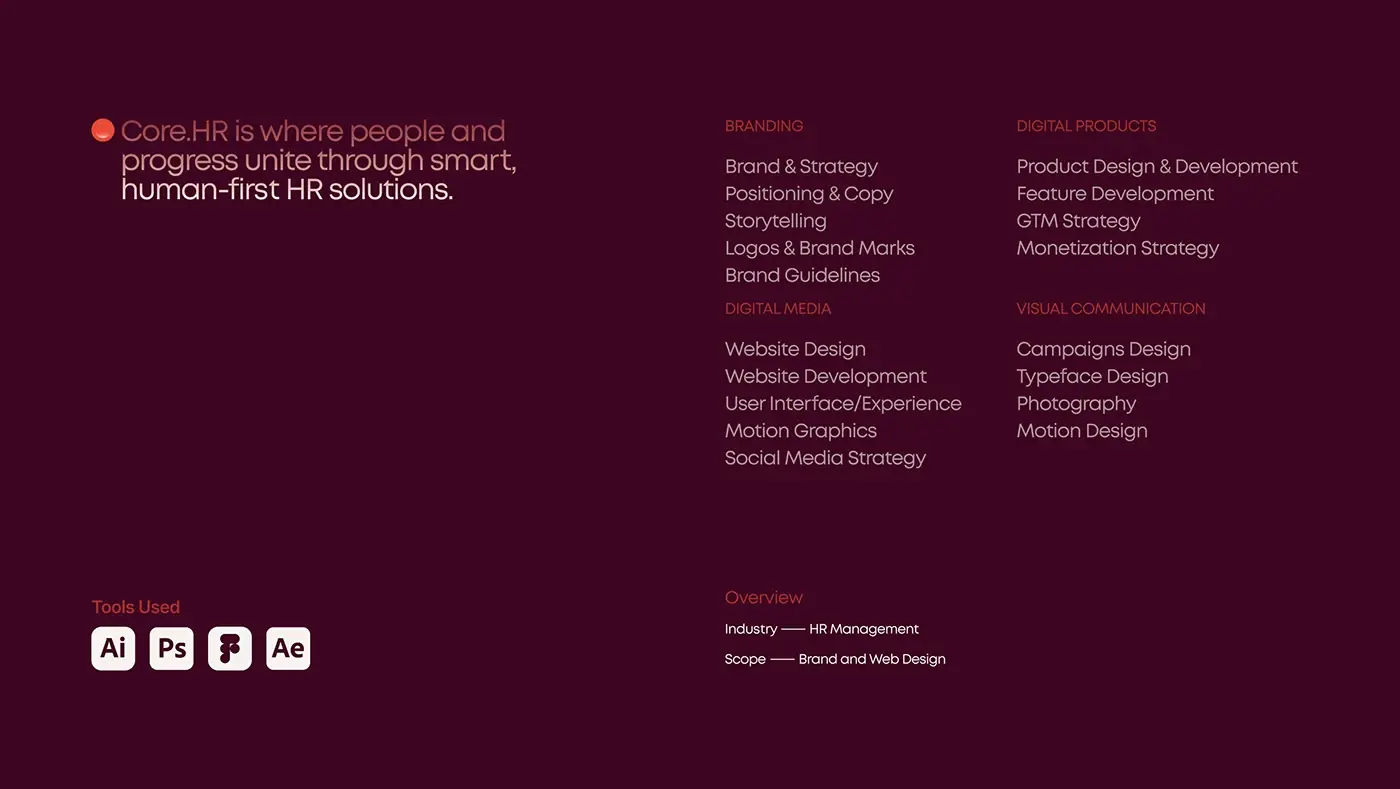
This is an HR software website design project for Core.hr, the HR technology company formerly CoreHR, whose product covers attendance, working time, leave, scheduling and reports. I designed its new website for desktop and mobile, plus the web dashboard and mobile app visuals the site shows.
The site has one job: let an HR buyer see the real product within seconds, then start a trial or book a consultation.
The challenge
An HR system is a big decision, so the site had to answer a buyer's first questions fast.
- Show what the system does on the first screen.
- Prove it with the real product: leave requests, shift plans and timesheets.
- Answer data security plainly, because HR data is personal.
- Make the site and the app look like one product.
The process
- Research, planned on one timeline with the web design.
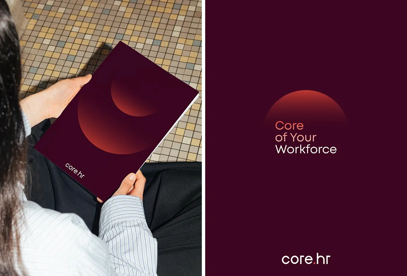
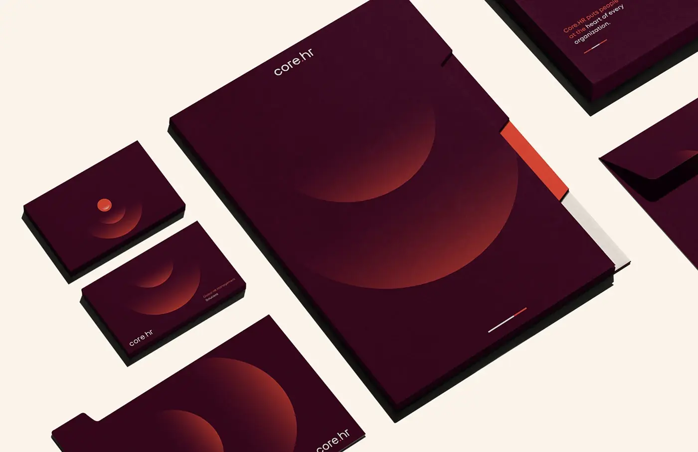
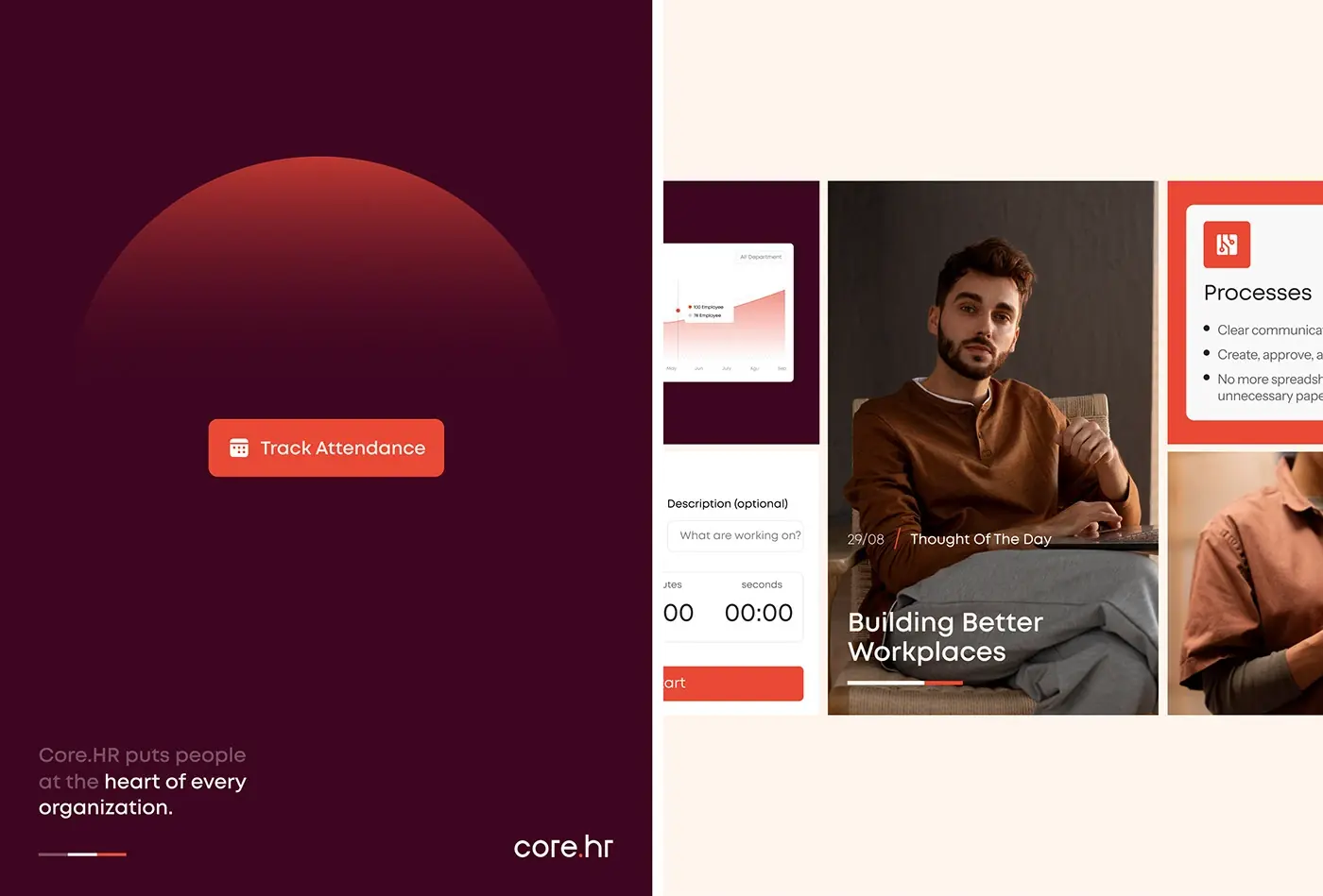
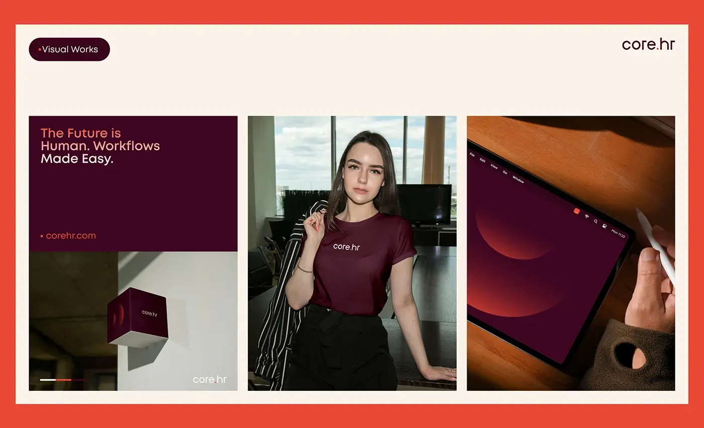
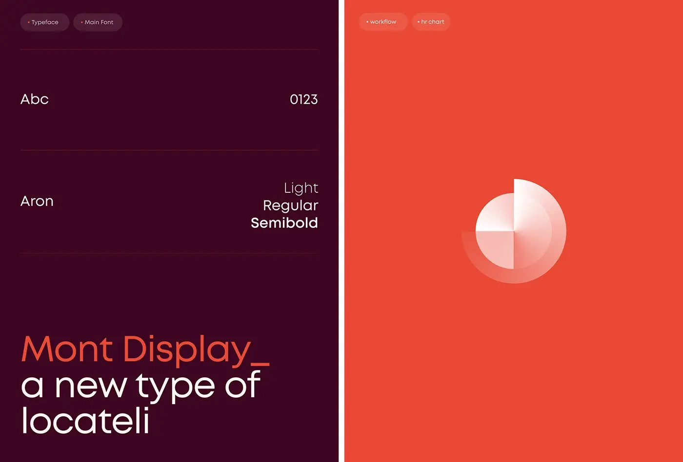
- A style guide: Mont Display in light, regular and semibold, with deep plum and coral.
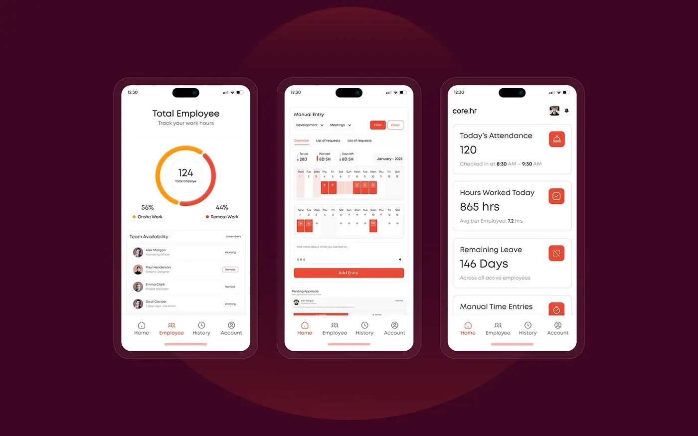
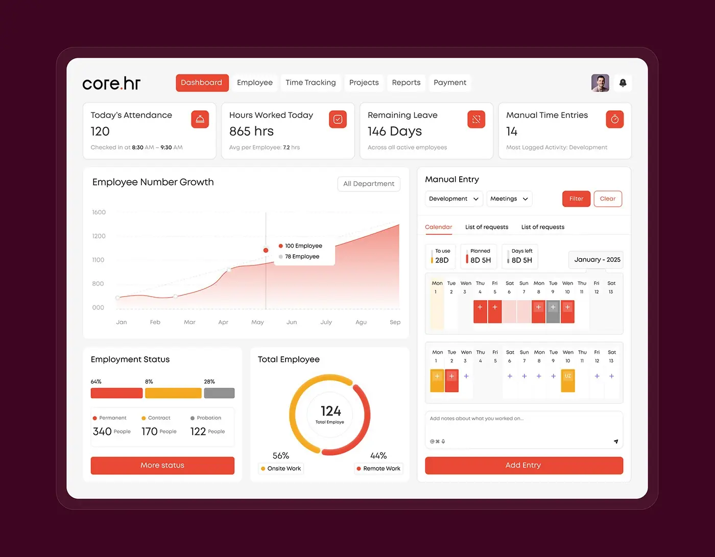
- App visuals: a web dashboard with six tabs, from Dashboard to Payment, and mobile screens.
- The website in high fidelity, section by section.
- A mobile responsive version of every section.
The solution
The site sells the product by showing it.
Hero with the dashboard
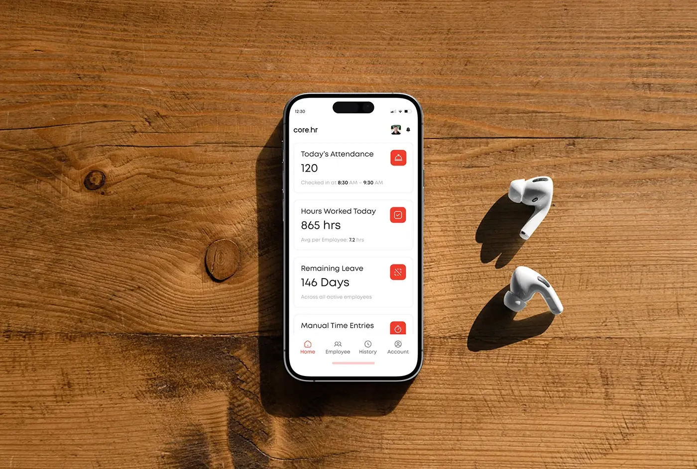
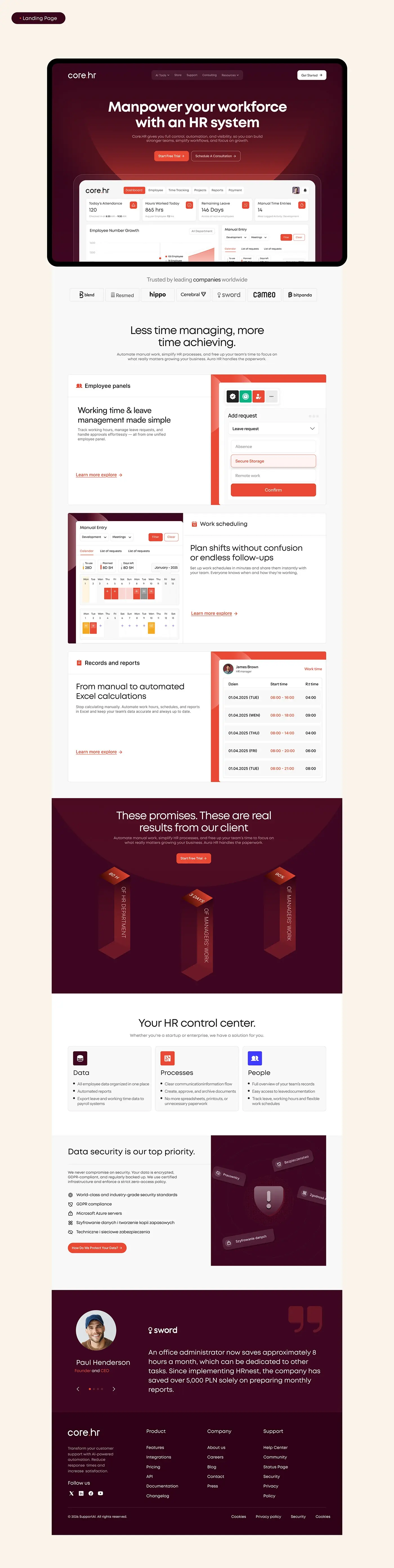
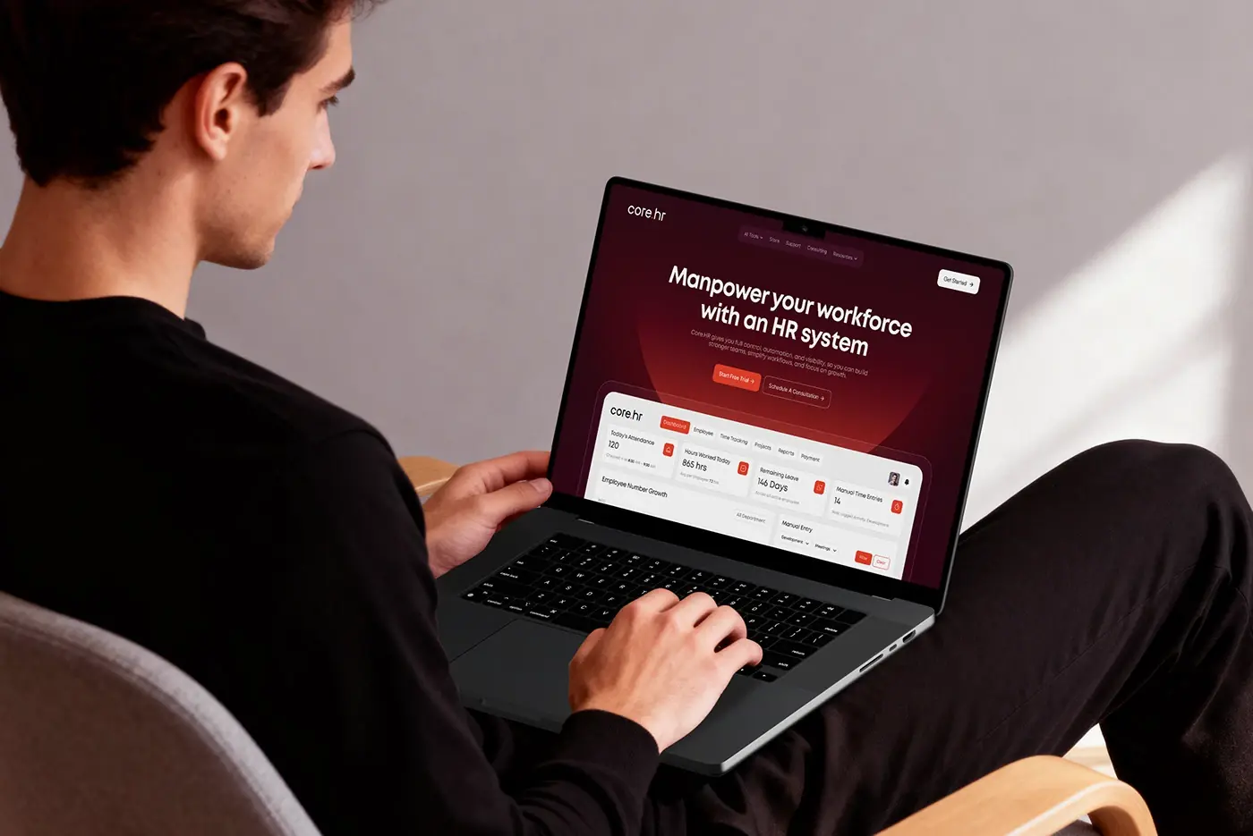
The headline "Manpower your workforce with an HR system" sits on deep plum under a soft coral arc, with Start Free Trial and Schedule A Consultation side by side. Below it, a dashboard preview shows today's attendance, hours worked, remaining leave and manual time entries, so visitors see the product before scrolling. A "Trusted by leading companies worldwide" logo strip follows, putting proof right under the promise.
Feature panels
Three panels pair one job each with real UI, alternating sides so the page keeps a rhythm:
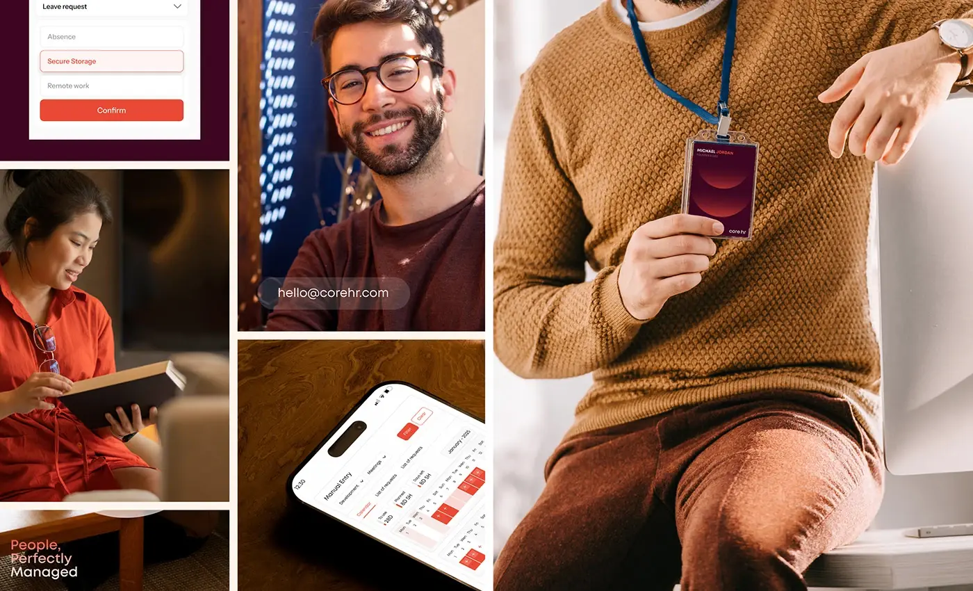
- Working time and leave: an Add request form with leave request, absence and remote work options and a Confirm button.
- Work scheduling: the Manual Entry calendar, with planned days marked across two weeks.
- Records and reports: an HR manager's work time table, under the promise of automated Excel calculations.
HR control centre and data security
A results band with three tall coral columns and a Start Free Trial button leads into the HR control centre: Data, Processes and People cards, each with three plain bullets, such as exporting leave data to payroll. Data security follows in its own section: encryption and backups, GDPR compliance and Microsoft Azure servers, beside a shield illustration. A testimonial slider and a three column footer close the page.
Web dashboard
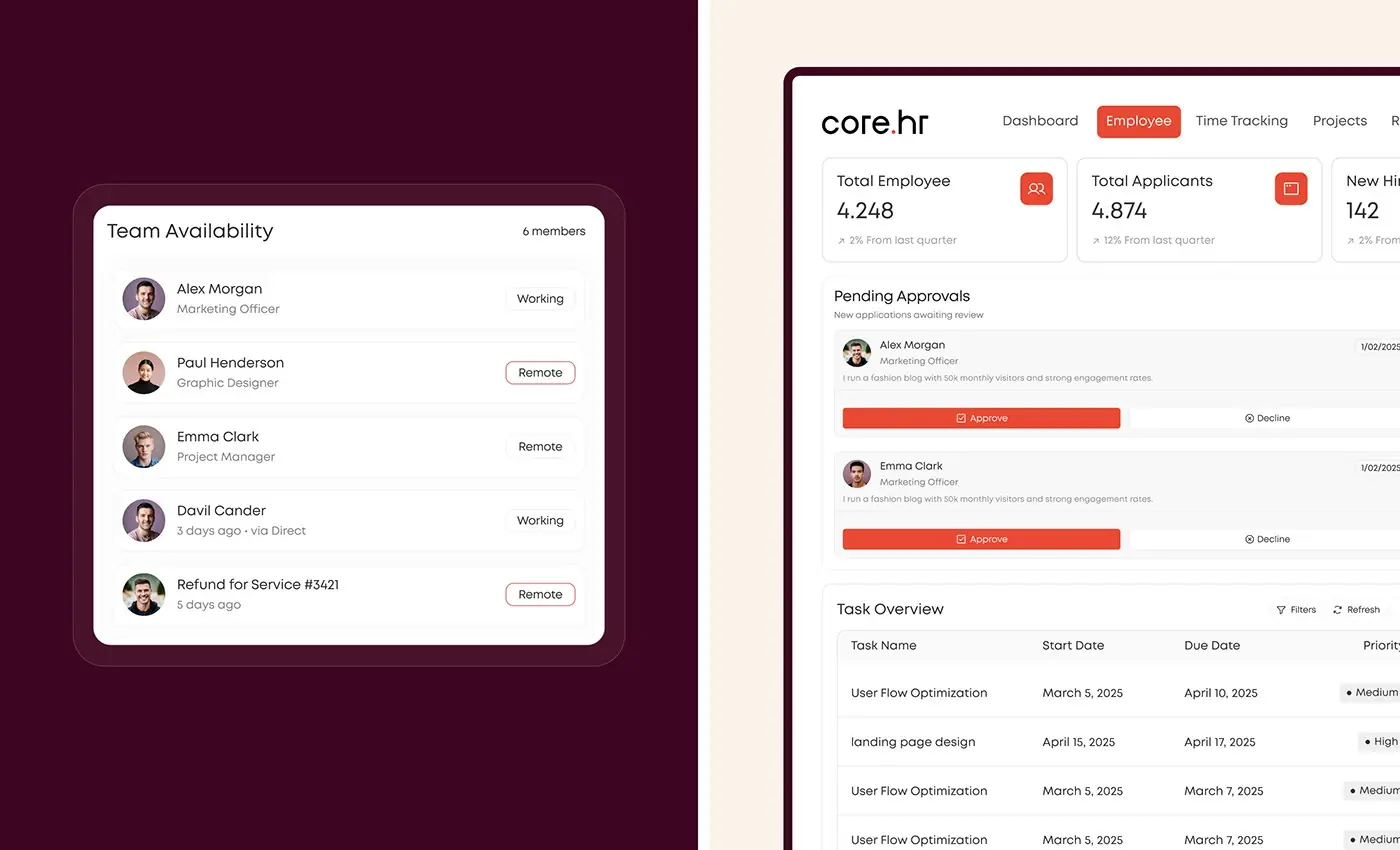
The previewed dashboard is designed in full. Four stat cards run across the top, an Employee Number Growth chart with an All Department filter sits below, and the Manual Entry calendar with an Add Entry button fills the right column. Under the chart, Employment Status splits staff into permanent, contract and probation, and a donut shows onsite against remote work. The Employee tab adds totals for employees, applicants and new hires, pending approvals with Approve and Decline, and a task overview table.
Mobile app
The app keeps the same cards in one column, with Home, Employee, History and Account tabs at the bottom:
- Home: stacked cards for attendance, hours worked, remaining leave and manual time entries.
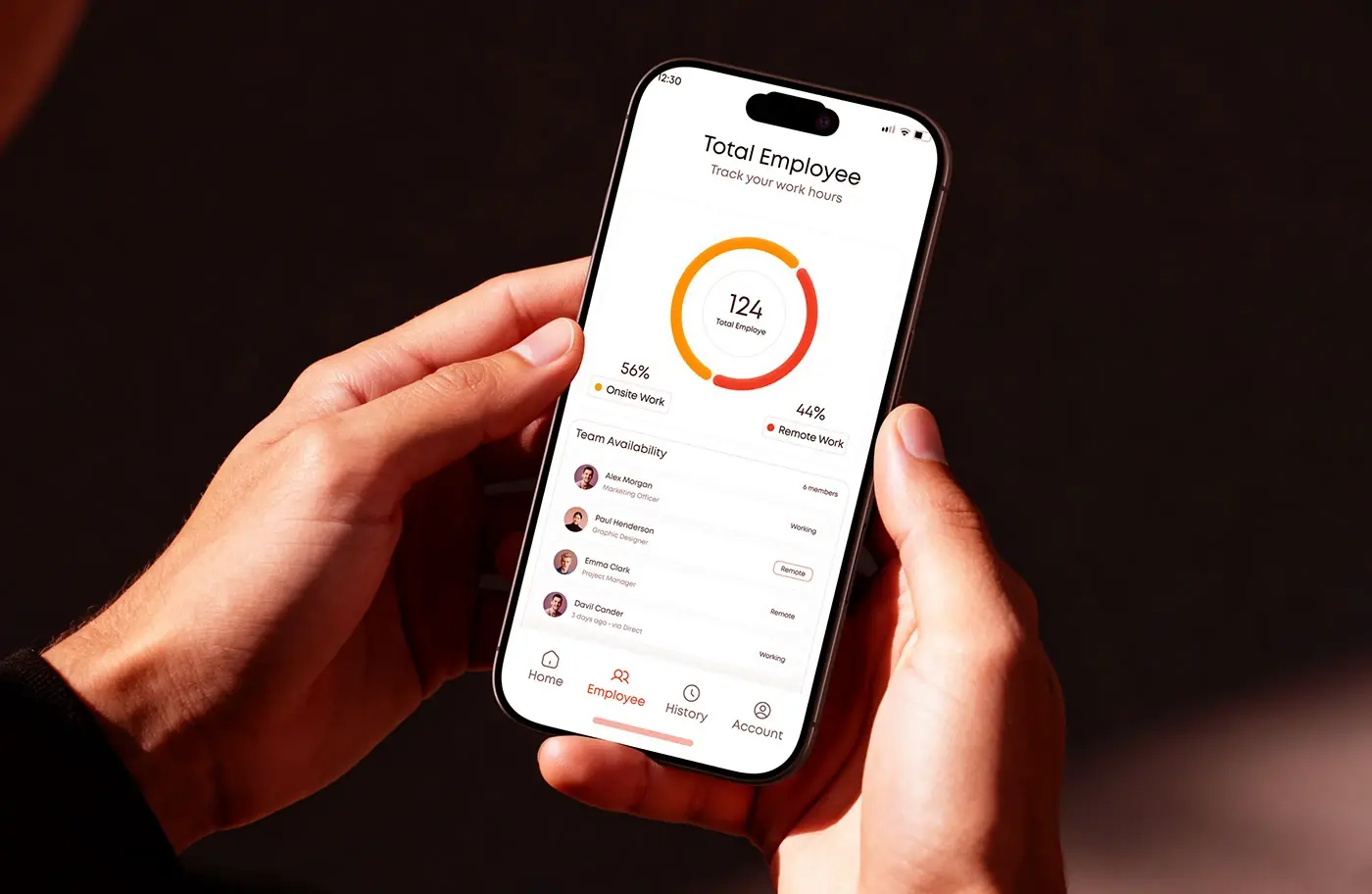
- Employee: a total employee donut split onsite and remote, then a Team Availability list with Working and Remote tags.
- Manual Entry: the shift calendar, a notes field and pending approvals.
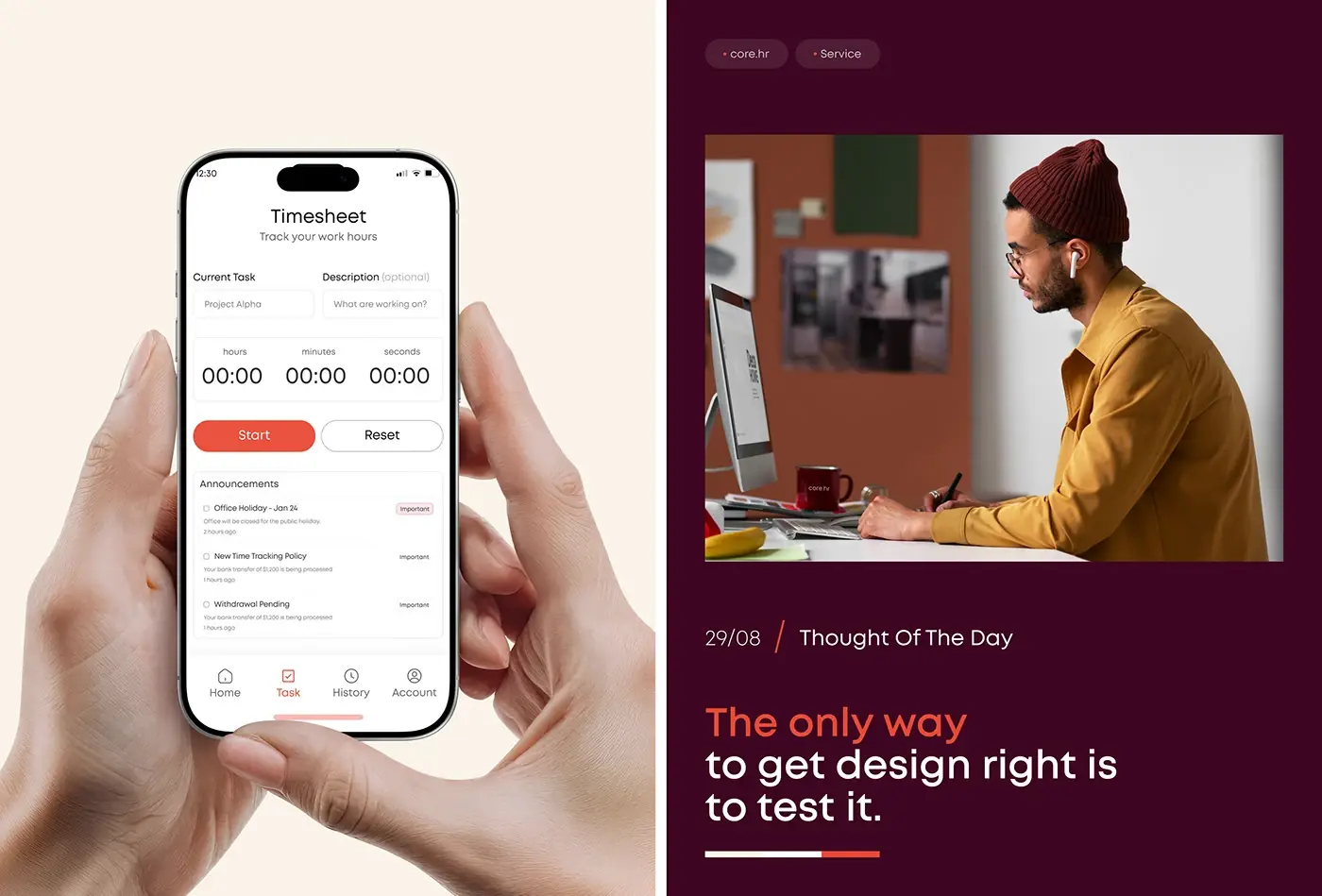
- Timesheet: current task, a timer with Start and Reset, and announcements.
Mobile responsive website
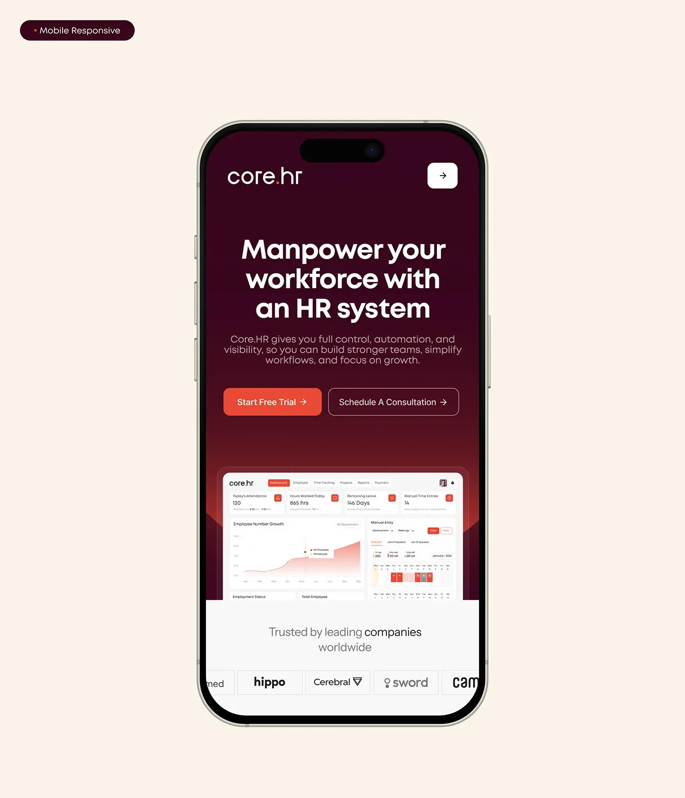
On a phone the hero headline breaks over three lines, both buttons stay visible on the first screen, and the dashboard preview is kept rather than cropped away. The logo strip becomes one sideways row. I laid each section out again for the narrow screen instead of scaling the desktop down.
The result
- The homepage for desktop and mobile.
- Web dashboard visuals: attendance, hours, leave, time entries and headcount charts, plus approvals and tasks.
- Mobile app screens: home, team availability, a time entry calendar and a timesheet.
- One type and colour style guide for site and app.
How it helps the client
Core.hr can show buyers the product instead of describing it, then let them start a trial or book a consultation from the first screen. Shared type and colour mean a new customer moves from website to dashboard without a jump in look. Security, which HR buyers ask about early, gets its own section. Planning a site for a software product? See how I approach website design for SaaS companies, or browse more website case studies.