Overview
This real estate landing page design is for Homelo, a company that connects buyers with homes, from apartments and villas to commercial spaces. I designed the page from market research through testing to the final presentation.
The challenge
Buying a home is slow and full of paperwork, so the page had to make Homelo feel like the easy route.
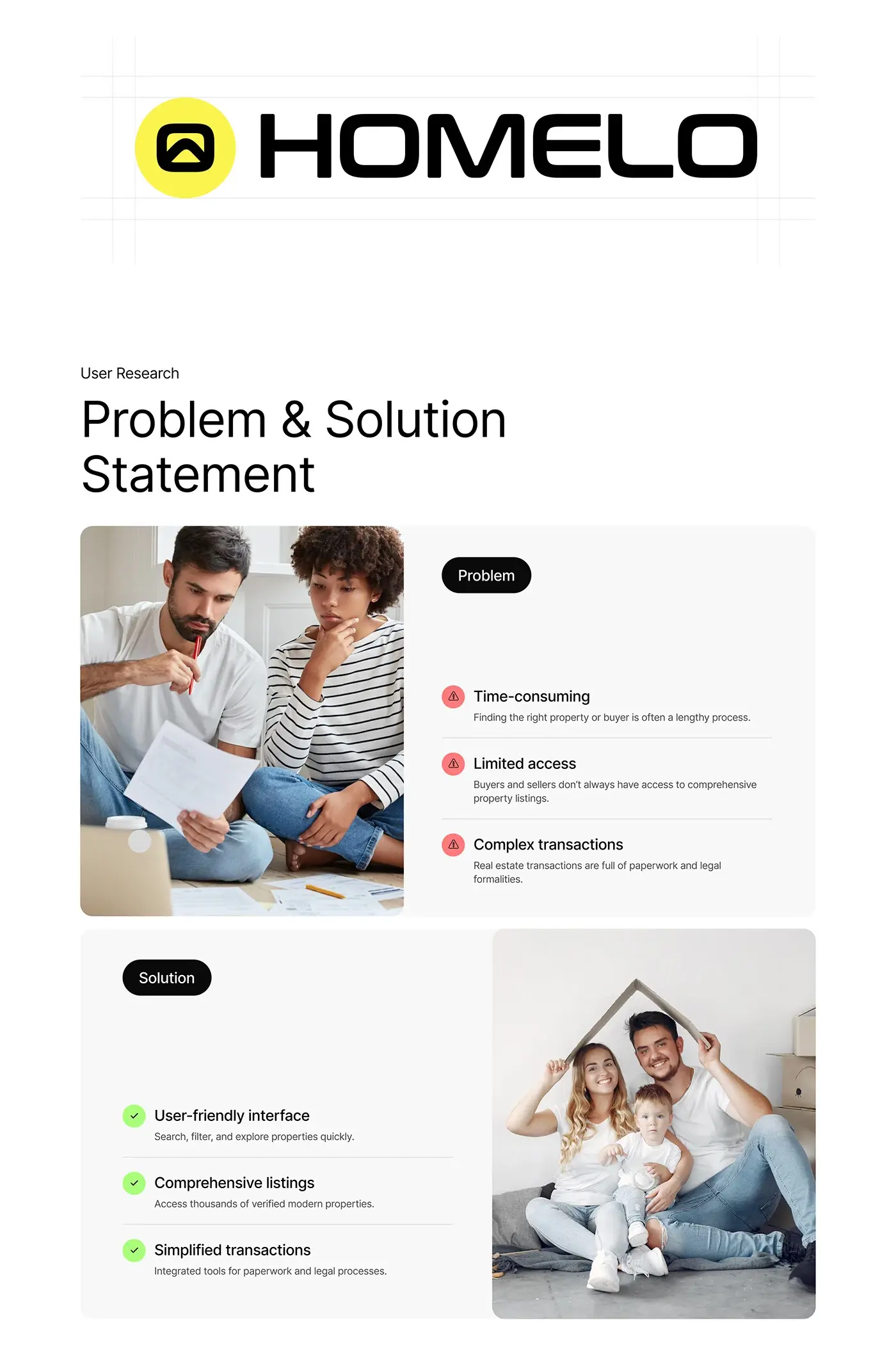
- Finding the right property, or the right buyer, takes a long time.
- Buyers and sellers don't always see a full set of listings.
- Transactions come with paperwork and legal formalities.
- Visitors need proof and real homes before they get in touch.
The process
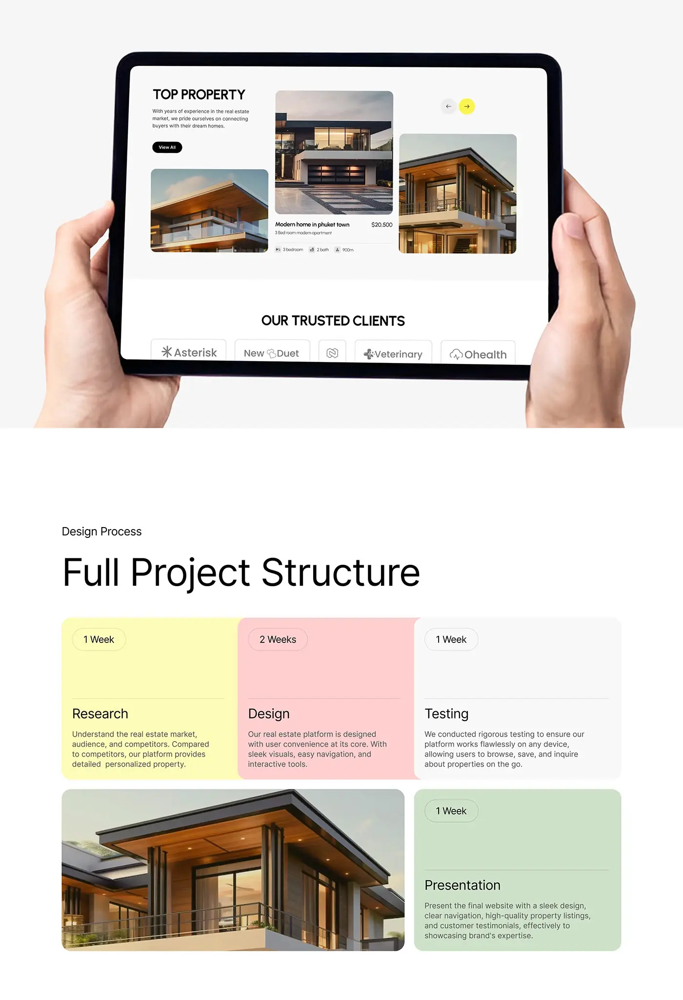
- Research, 1 week: the real estate market, the audience and competitors.
- A problem and solution statement on time, access and paperwork: an interface to search, filter and explore quickly, full listings, and tools for the paperwork and legal steps.
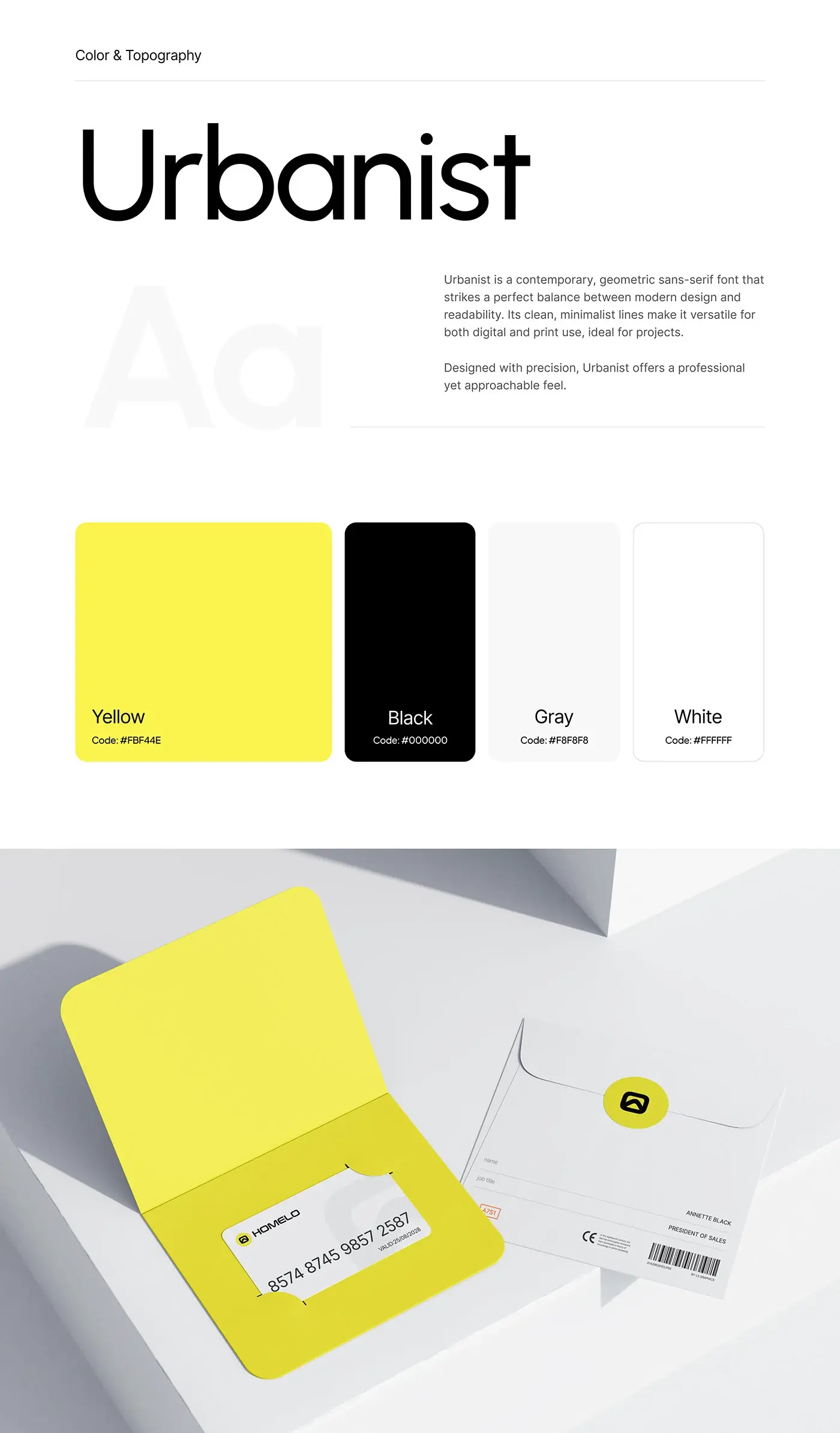
- Design, 2 weeks: a style guide in Urbanist with a bright yellow accent, then the full page.
- Testing, 1 week: browsing, saving and enquiring on any device.
- Presentation, 1 week.
The solution
The page answers a buyer's questions in order: who Homelo is, why trust them, who will help, and which homes are available.
Hero
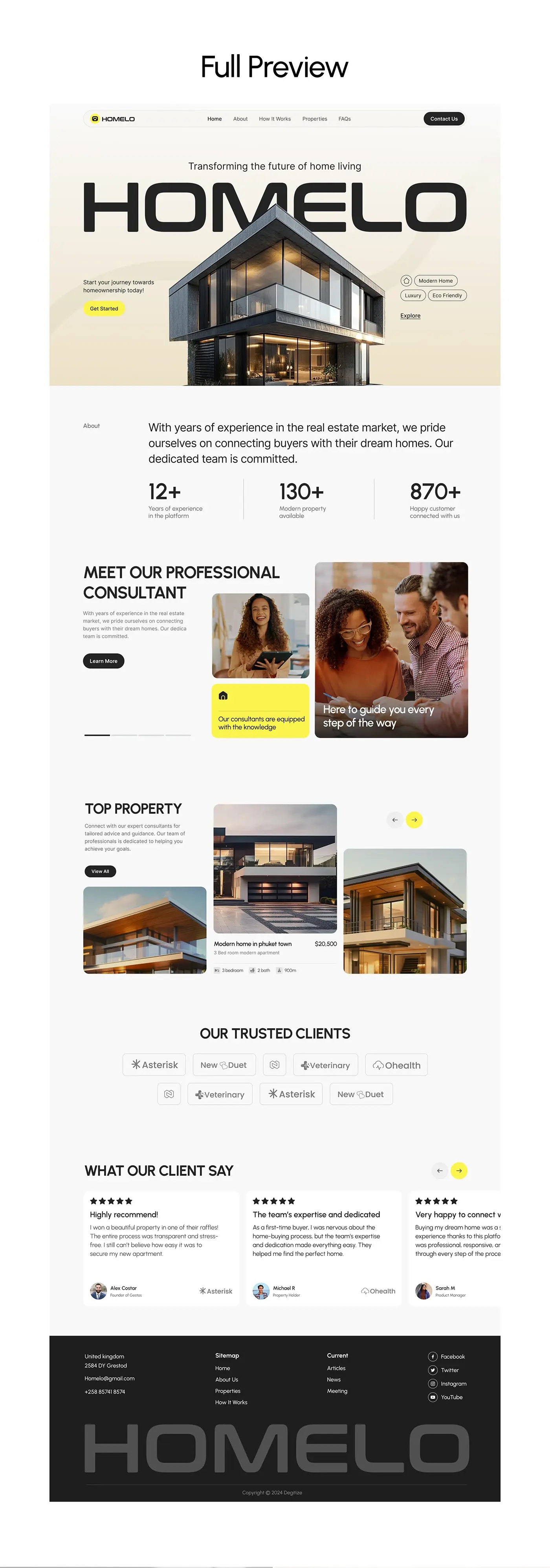
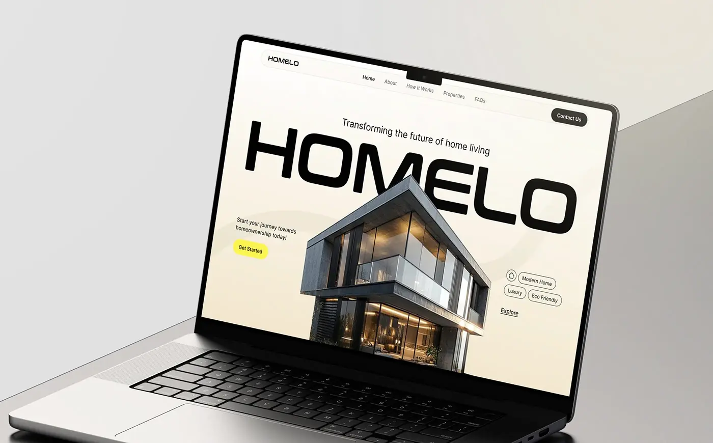
The name is set in huge black capitals across the top, with a modern glass house rising through the letters and "Transforming the future of home living" above. On the left, one line invites visitors to start their journey to owning a home, with a yellow Get Started button. On the right, tags for modern, luxury and eco friendly homes sit above an Explore link. The menu keeps five items: Home, About, How It Works, Properties and FAQs.
About and key numbers
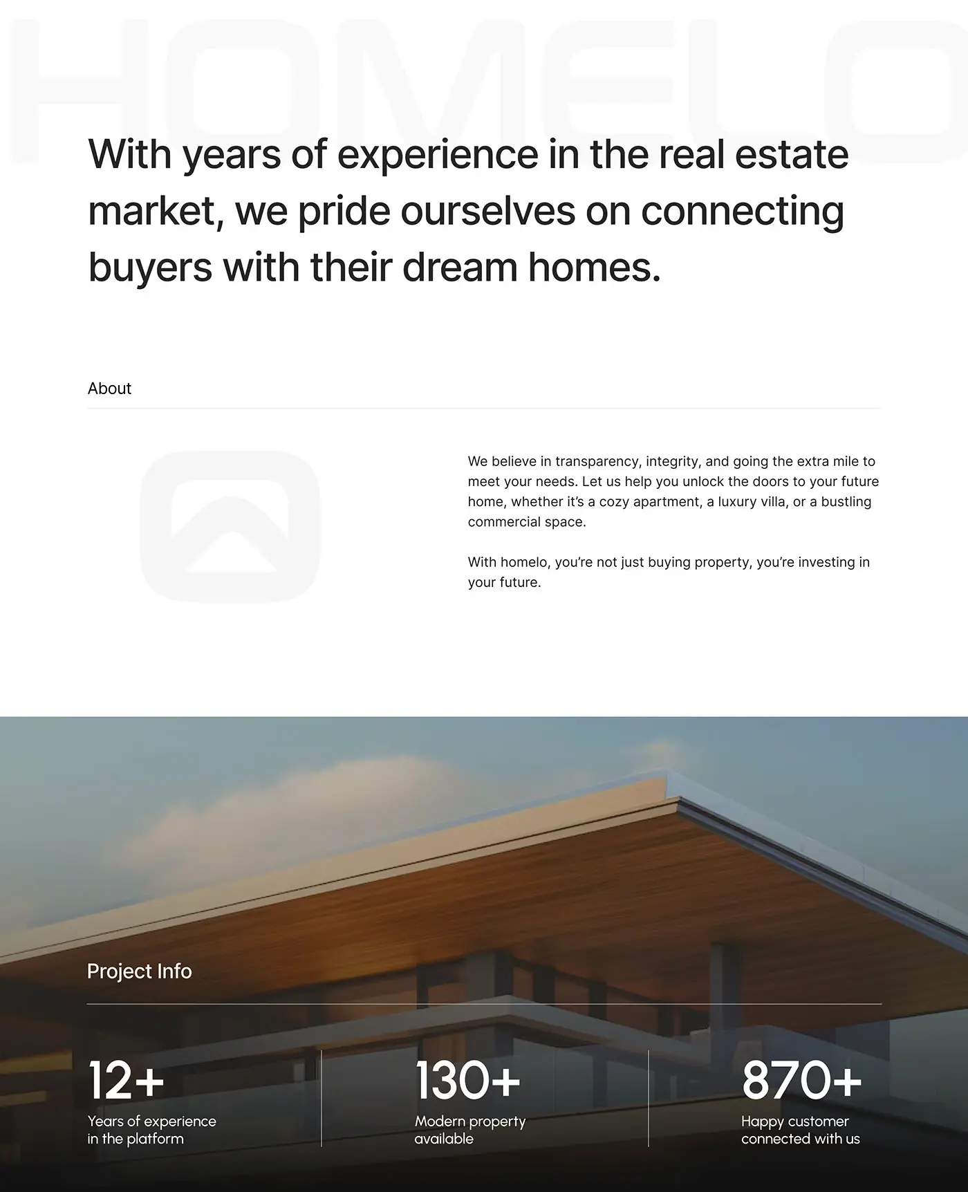
A short statement on transparency and integrity opens the about section, followed by three large figures: years of experience, properties available and customers connected. Big numbers with short labels give quick proof before a visitor reaches any listing, and thin dividers keep the three apart.
Consultants
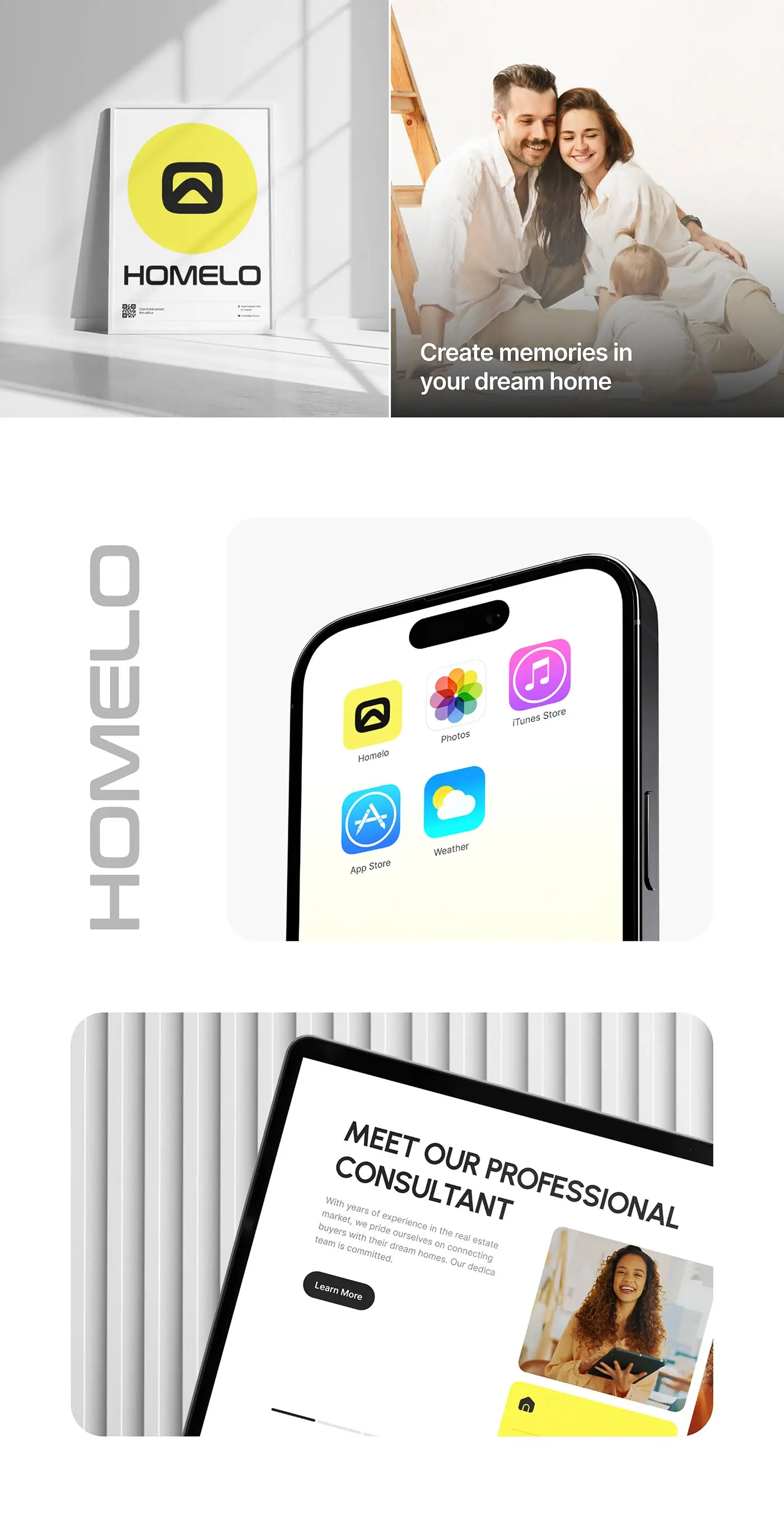
A large heading that introduces the professional consultants pairs a short paragraph and a Learn More button with a carousel of photos: a consultant holding a tablet, a yellow card about their knowledge, and a meeting photo captioned "Here to guide you every step of the way". Putting people before the listings speaks straight to the worry about paperwork and legal steps.
Top property
Top property is a carousel of homes, with yellow arrow buttons and a View All button. The open card shows a large photo, the home's name, a one-line description and its price, then icons for bedrooms, bathrooms and size. The cards on either side stay as photos, so the row reads as a gallery rather than a table.
Client logos and reviews
A trusted clients section lays out partner logos in two rows of outlined tiles. Under it, a client reviews carousel holds cards, each with five stars, a short title, a few lines of text and the reviewer's photo, name and role. Real faces next to the words make the reviews feel checkable.
Footer
A dark footer holds an address, an email and a phone number, a sitemap, a column of articles and news, and social links. The Homelo name runs large across the bottom in grey, which closes the page the way it opened.
The result
- The full landing page: hero, about, consultants, top properties, partner logos, client reviews and footer.
- Tablet views of the property and consultant sections.
- A UI style guide: Urbanist with yellow, black, grey and white.
How it helps the client
The design lets Homelo show real homes and the people behind them on one page, with Get Started at the top and a contact button in the menu. A buyer can compare homes by price and size, see who will help with the paperwork, then get in touch. That's the core of my landing page design for real estate, and you can see similar projects in my real estate case studies.