Human in the loop UX design is the design of the screen where a person checks, corrects or stops what an AI has done before it counts. In most products that screen is a review queue: a list of items the automation was unsure about, plus a detail view where someone makes the call.
A good review screen does four things. It shows the AI's answer next to the source it came from. It says how sure the AI is, per field, not per document. It offers a small set of clear actions: approve, fix, reject with a reason, escalate or defer. And it records who decided what, so the decision can be proved later.
This post is about that screen and the oversight around it. If you want the wider picture of trust in AI features, start with how to ship AI features people trust; for agents that act on their own, see agentic UX design patterns. Here I stay with the queue.
When to route an item to a person
The first decision is the rule for which items reach the queue at all. Send too much and reviewers drown, then start approving without reading. Send too little and errors post straight into the system of record.
I set the rule on two inputs. The first is the model's confidence for each field. The second is what a wrong answer costs: a misread invoice date is annoying, a wrong bank account or a wrong amount is expensive. Apple's Human Interface Guidelines for machine learning put it plainly: understand the significance of a mistake's consequences, because a wrong keyboard suggestion and a route that makes someone miss a flight are not the same failure.
So the threshold differs per field. A vendor name can pass at a lower confidence than a payment amount. Above the line, the step runs. Below it, the run pauses and the item goes to a person. Some fields, like anything that moves money above a set limit, go to a person every time whatever the score.
Apple adds a warning worth taking seriously: only show confidence if you know how it correlates with the quality of the results. If the scores are not calibrated against real outcomes, a threshold built on them is a guess. I ask for that check before I design the numbers into the screen.
What a review item must show
Most review time is spent hunting for evidence. Put it where the eye already is.
Source beside output. The original document, email or record sits on one side, the extracted fields on the other. Google's People + AI Guidebook says data sources have to be part of an explanation, since every prediction is based on data. On a review screen, the source is the explanation.
Confidence per field. One score for the whole document hides the one field that is wrong. A score per field lets the reviewer skip what is settled and look hard at what is not. PAIR's guidance is to prefer categories over raw numbers where people lack a feel for probability, and to say clearly what action each category calls for. For trained finance reviewers I still show the number, with colour and an outline doing the work of the category.
Reasons. Say why the item is here: low confidence on a named field, a mismatch with the purchase order, a vendor never seen before. Microsoft's Guidelines for Human-AI Interaction call this G11, make clear why the system did what it did. Apple's advice on attribution helps with tone: keep reasons factual and avoid statistical jargon.
Context from other systems. If the reviewer needs the ERP record or the email thread to decide, bring it into the item. Every tab they have to open is a chance to give up and click Approve.
The actions: approve, fix, reject, escalate, defer
A review screen needs a small, fixed set of verbs. Each one should say what happens next.
| Action | What it does | Design detail |
|---|---|---|
| Approve | Accepts the AI's answer and lets the run continue | Primary button, but never pre-focused on high risk items |
| Fix | Corrects one field, then continues | Inline edit on the field itself; keep the original value visible |
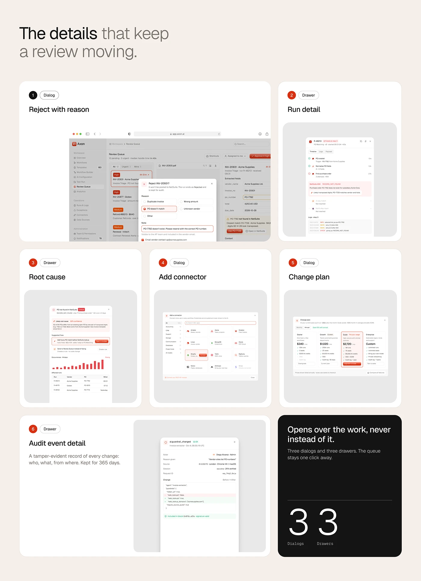
| Reject with reason | Stops this item | A short list of reasons plus free text; the reason feeds the model and the report |
| Escalate | Sends it to someone with more authority | Name the person or role; respect approval limits |
| Defer | Parks it with a note | Requires a reason and keeps the item's deadline visible |
Microsoft's G9, support efficient correction, is the line I design the Fix action against: correcting a field should take less effort than rejecting the item and starting again. Apple adds two rules I keep: give people immediate value when they make a correction, and let people correct their corrections. So the fix shows straight away, and it can be undone until the record posts.
Rejecting needs a reason because a rejection without one teaches nothing. Escalation needs to know who can approve what. That is a permissions question as much as a design one, so I put approval limits where reviewers and admins will see them.
Ranking the queue by risk and time left
A queue sorted by arrival time is a list, not a plan. Reviewers want to know what to do first.
I rank by two things: risk, which combines the cost of error with how unsure the model is, and time left before the item breaches a deadline or holds something up. A high value invoice due today sits above a low value one due next week, even if the second arrived first. Show the time left on each row, so people can see why the order is what it is.
Keep a count above the queue of items that need a decision and how many are urgent; on a wider dashboard it belongs where the eye lands after the headline figures, as in dashboard design examples and designing dashboards founders actually open.
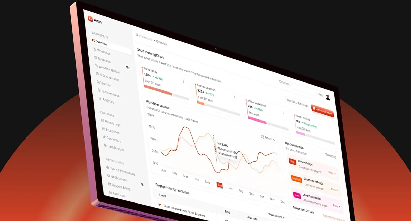
Axon does this at two levels. Its Overview has a Needs attention column with workflows tagged high, medium or low and the time left, and the Review Queue itself ranks items by risk.
Batching and keyboard flow
Once the queue is ranked, speed matters. A reviewer clearing dozens of items a morning will judge the product by how many clicks each one takes.
My defaults for a high volume queue:
- Open the next item automatically after a decision, with a short undo window.
- Give every action a keyboard shortcut and show it on the button.
- Allow batch approval only for items that share a cause and sit above the threshold, never for the risky ones.
- Keep the queue position visible, so people know how far they have to go.
There is a tension here. The faster approval becomes, the easier it is to approve without looking. Goddard and colleagues' systematic review of automation bias lists workload, task complexity and time pressure among the factors that push people to rely on automated advice. So I make speed safe rather than simply fast: batch actions are limited to low risk items, and high risk items need the reviewer to open the source.
Exceptions grouped by root cause
Not every problem is a single item to review. When a connector token expires, a hundred runs fail for the same reason. Showing those as a hundred queue items is noise.
A separate Exceptions view groups failures by root cause. Each row carries the cause, severity, how many runs it affects and who owns the fix. Fixing the cause resolves every run in the group. Known causes can get a rule that resolves them before they reach anyone.
Keep two questions apart. Runs and logs answer "what just failed, and why?" Exceptions answer "what do I fix first?" In Axon these are separate pages, and the Exceptions page shows root cause, severity, affected runs and assignee in one row. One expired connector can break many runs; one fix clears them all.
Audit trail and accountability
Every decision should log who made it, when, the AI's original answer, what was changed and the reason given.
I keep the audit trail one click from the item, in a drawer, rather than on a separate report page. Reviewers use it to check what a colleague did; auditors use it to check everyone. The record should be append only: nobody edits history, they add to it.
Accountability also changes behaviour. The Goddard review lists making users feel accountable for their decisions among the ways to reduce automation bias. A visible "you approved this" line in the history is a small design choice that supports that.
In Axon the audit drawer keeps a tamper-evident record of who changed what, and from where. Approval limits sit on each member row in Team & Permissions, because who can approve what is the first thing an audit asks.
The feedback loop, and measuring reviewers
Every fix and rejection is a label. PAIR's Feedback and Control chapter splits feedback into implicit signals, like how often people accept or reject a suggestion, and explicit ones, like a rating or a reason. It warns not to collect implicit data without telling people, and to tell users how their feedback will be used and when it takes effect.
For a review queue, that means:
- Store the original AI value next to the corrected one, per field.
- Make the reject reasons a fixed list first and free text second, so they can be counted.
- Tell reviewers, in plain words, that their corrections improve future runs, and only if that is true.
Then measure the reviewers as well as the model. Three numbers I put on an internal dashboard: override rate per reviewer and per field, agreement between reviewers on a sample of double-checked items, and time per item. An approval rate close to every item, with very short time per item, is a warning sign of rubber-stamping. The Goddard review found that, across four pooled healthcare studies, wrong advice from decision support raised the risk of an incorrect decision (risk ratio 1.26). People do follow bad advice, and a queue that is never challenged will not show it.
Human oversight in regulation: EU AI Act Article 14 and NIST AI RMF
If your product is a high-risk AI system under the EU AI Act, human oversight is a legal design requirement, not a nice extra. Article 14 says high-risk systems must be designed so they can be effectively overseen by natural persons while in use. Paragraph 4 then reads almost like a brief for a review screen. The people overseeing must be able to:
- understand the system's capacities and limitations, and monitor it for anomalies;
- remain aware of automation bias, the tendency to over-rely on the output;
- correctly interpret the output;
- decide not to use the output, or to override or reverse it;
- intervene or halt the system through a stop button or similar procedure.
Each line maps onto a pattern above. Whether a given product is high-risk is a legal question for counsel. I still use the list as a checklist, because it describes good oversight either way.
The NIST AI Risk Management Framework is voluntary but useful for the same reason. Its GOVERN 3.2 asks for policies that define and differentiate roles and responsibilities for human-AI configurations and oversight of AI systems. The Playbook's suggested actions include assigning responsibility for human oversight and managing known risks in human-AI teaming and in interface design. In product terms: roles, approval limits and a clear owner for every queue.
The AI industry page collects more of how I approach this kind of product.
Empty, loading and error states
The queue spends a lot of its life in states nobody draws first.
Empty. An empty queue is good news; say so, and say when the next run is due. Do not fill the space with tips.
Loading. Load the list first and the source document second, so reviewers can start reading fields while the PDF renders.
Source missing. If the original file cannot load, say that plainly and block Approve. A reviewer cannot oversee what they cannot see.
Conflict. If two reviewers open the same item, show who has it. If the run has moved on since the item opened, say so before the decision is saved.
Model unavailable. If the AI step fails entirely, send items to the queue with no prefilled values, clearly labelled, rather than holding them silently.
A human in the loop checklist
| Area | Question to answer before launch |
|---|---|
| Routing | Is the threshold set per field and tied to the cost of error? |
| Calibration | Have the confidence scores been checked against real outcomes? |
| Evidence | Does the source sit beside the output, with reasons for each flag? |
| Actions | Can the reviewer approve, fix, reject with a reason, escalate and defer? |
| Ranking | Is the queue ordered by risk and time left? |
| Speed | Are shortcuts and auto-advance in place, with batch actions limited to low risk? |
| Exceptions | Are repeated failures grouped by root cause with an owner? |
| Audit | Is every decision logged with the original answer and the reason? |
| Permissions | Do approval limits match who is allowed to decide? |
| Measurement | Are override rate, agreement and time per item tracked? |
| States | Are empty, loading, missing source and conflict states designed? |
| Oversight | Can someone pause or stop the automation from the interface? |
Where I would start
I start with the routing rule and one real item, not the dashboard: a reviewer clears ten real items on a prototype with the source beside the fields, and I watch where they hesitate.
More of this work is in the AI case studies and the dashboard case studies. If you want help designing review and oversight screens for your own web app, my product design page covers how I work, from research to the last interaction state. A project starts with a free 30 minute intro call, then a written scope and one fixed quote.
Sources and method
I opened every source below on 25 October 2026; EUR-Lex blocked automated access, so the AI Act text was read on the Commission's AI Act Service Desk, which shows the EUR-Lex consolidated version as at 27 July 2026. Facts about Axon come from my own case study.
- Google PAIR, People + AI Guidebook, Explainability + Trust, read 25 October 2026: pair.withgoogle.com
- Google PAIR, People + AI Guidebook, Feedback + Control, read 25 October 2026: pair.withgoogle.com
- Microsoft, Guidelines for Human-AI Interaction, HAX Design Library, read 25 October 2026: microsoft.com
- Apple, Human Interface Guidelines, Machine learning, updated 8 June 2026, read 25 October 2026: developer.apple.com
- European Commission, AI Act Service Desk, Article 14 Human oversight (Regulation (EU) 2024/1689), read 25 October 2026: ai-act-service-desk.ec.europa.eu
- NIST, AI Risk Management Framework, AI RMF 1.0 released 26 January 2023, read 25 October 2026: nist.gov
- NIST, AI RMF Playbook, Govern, read 25 October 2026: airc.nist.gov
- Goddard, Roudsari and Wyatt, Automation bias: a systematic review of frequency, effect mediators, and mitigators, JAMIA, January 2012, read 25 October 2026: pmc.ncbi.nlm.nih.gov
Tags: AI, SaaS, Dashboards, Automation, Product design