
Dashboard case studies: hospital, fleet, CRM, finance and real estate

Ten dashboard design case studies, from a hospital management dashboard and a fleet tracking system to a sales CRM and two AI money dashboards. Each one shows how the data is organised, why, and every screen.

case studies
12
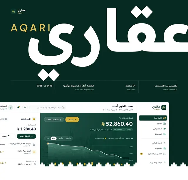
AQARI investor web app dashboard in Arabic with portfolio value chart, wallet balance and sidebar

Real estate · 2026

AQARI

A Shariah-compliant fractional real estate investing web app for Saudi Arabia
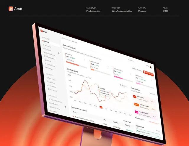
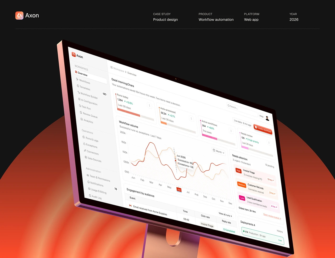
Axon workflow automation dashboard overview with KPI cards, workflow volume chart and needs attention queue on a desktop monitor

AI · 2026

Axon

An AI workflow automation web app that asks a person when it is unsure
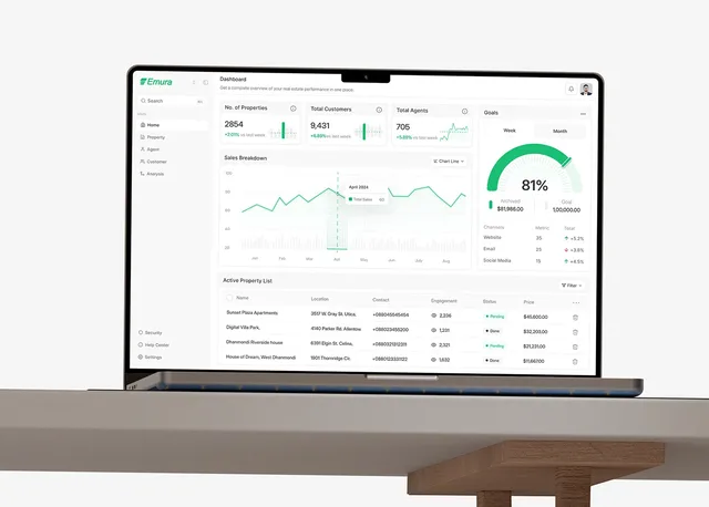
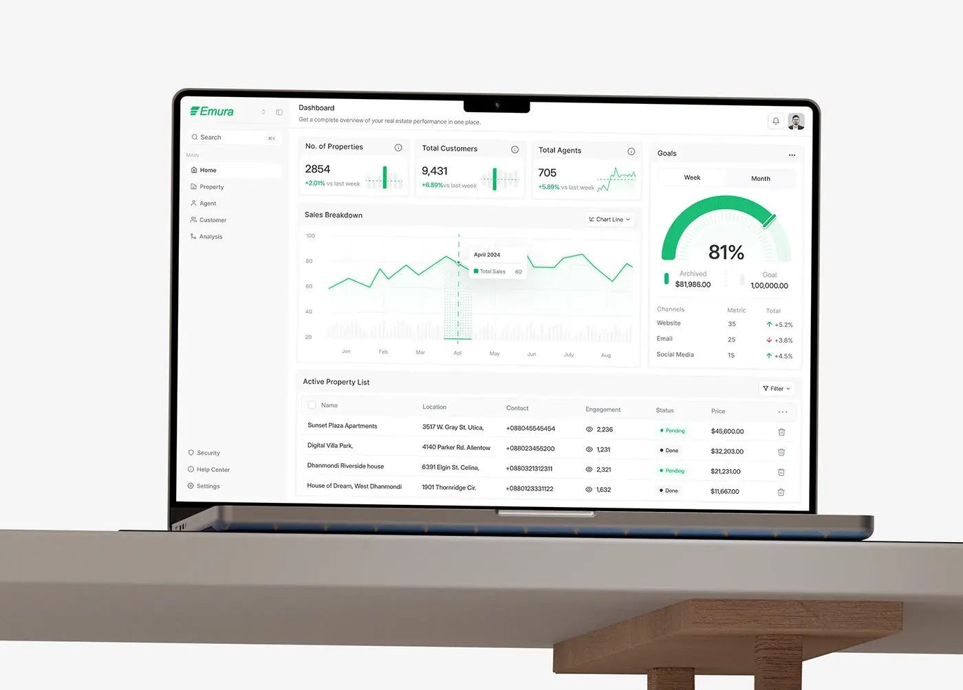
Emura real estate dashboard design on a laptop: property, customer and agent counts, sales chart, goals and listings

Real estate · 2025

Emura

One dashboard for a real estate operation
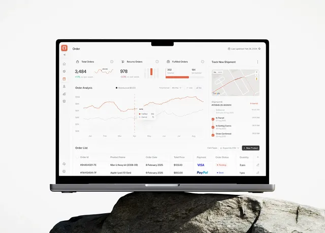
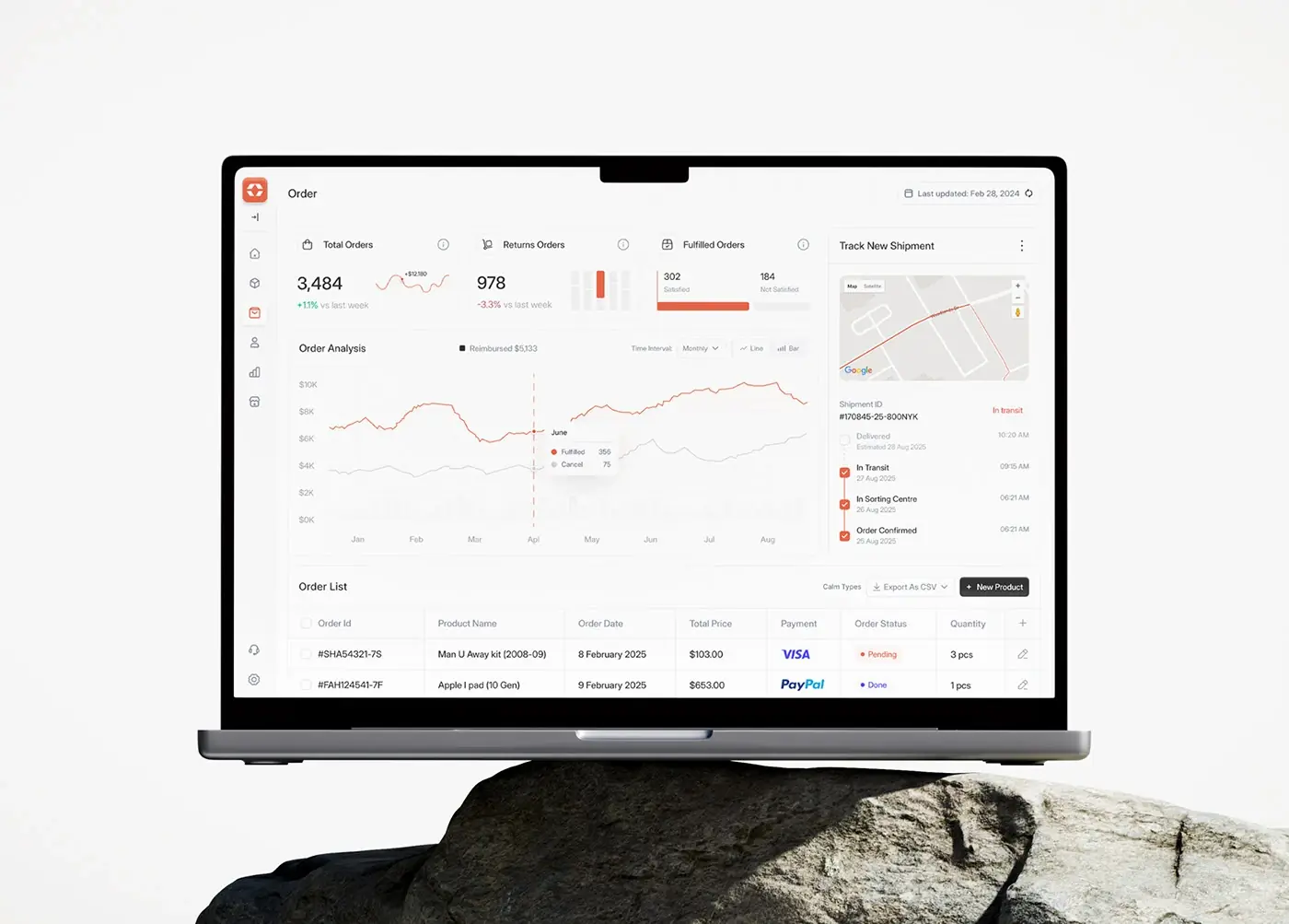
Alignify CRM dashboard design case study cover: order screen on a laptop with order counts, chart and shipment tracker

Sales and CRM · 2025

Alignify

A sales CRM that shows performance in real time
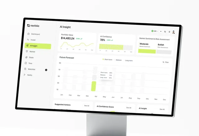
Nexfolio investment dashboard design: AI Insight screen with portfolio value, AI confidence, sentiment and a future forecast

Fintech · 2025

Nexfolio

An AI-powered investment dashboard

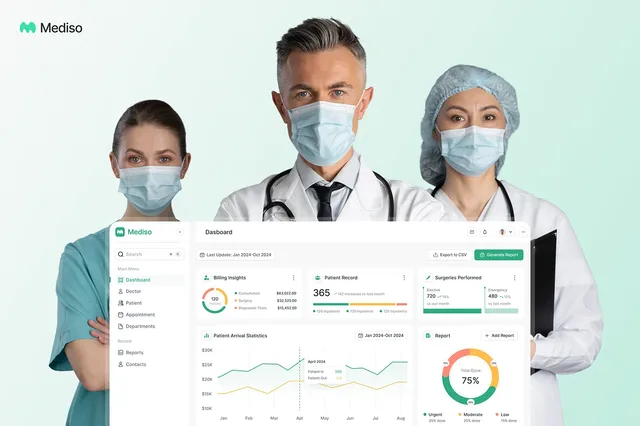
Mediso hospital management dashboard design cover: three clinicians behind the main dashboard with billing and patient charts

Healthcare · 2025

Mediso

A hospital management dashboard

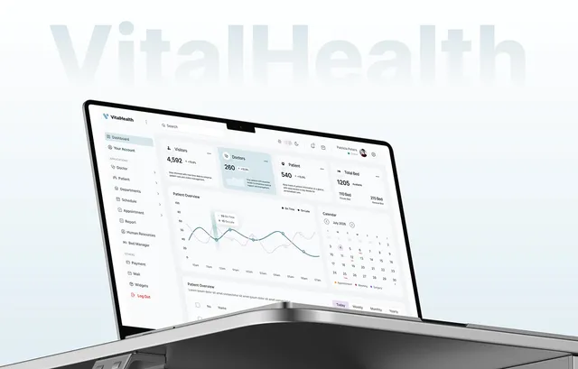
VitalHealth healthcare SaaS dashboard design on a laptop: visitor, doctor, patient and bed cards with a calendar

Healthcare · 2024

VitalHealth

A healthcare SaaS for finding and booking doctors

Agriculture app design case study cover: Kresho headline Cultivating The Future Of Agriculture over green hills and grazing horses

Agriculture · 2025

Kresho

App screens for a modern agriculture company
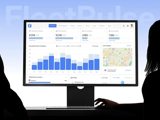
FleetPulse fleet management dashboard design on a desktop monitor, with KPI cards, a delivery chart and live tracking map

Logistics · 2025

FleetPulse

A fleet management dashboard

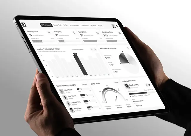
OpsLoop micro-task platform design: team dashboard on a tablet with task counters, productivity chart and budget tracker

Operations · 2025

OpsLoop

A micro-task platform for teams and workers
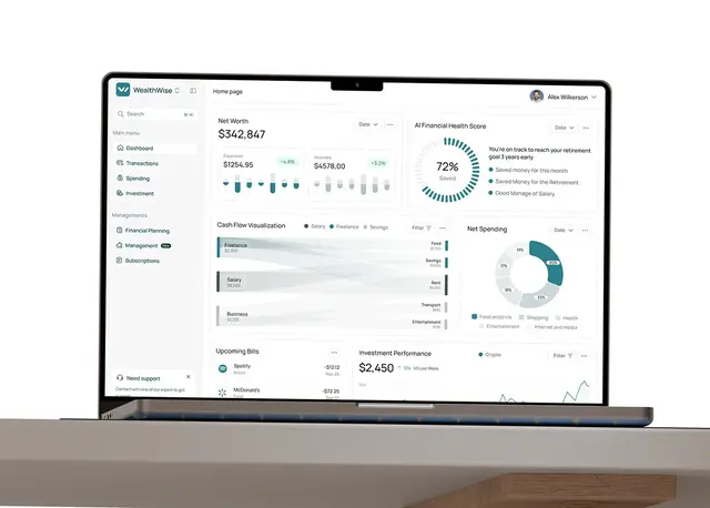
WealthWise personal finance dashboard design on a laptop: net worth, AI financial health score, cash flow and spending

Fintech · 2026

WealthWise

An AI personal finance dashboard

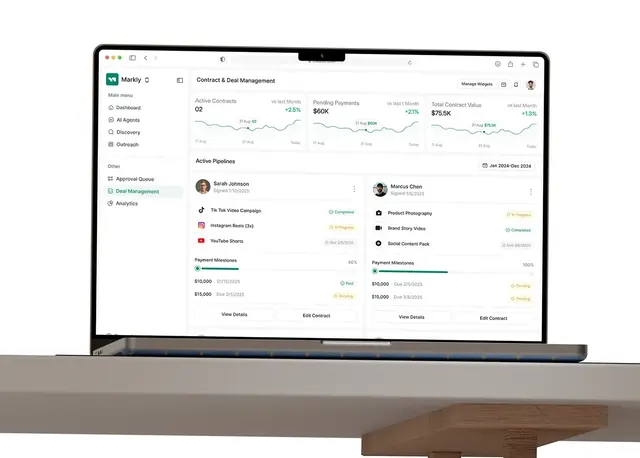
Markly influencer marketing platform design on a laptop: contract and deal management with deliverables and payment milestones

Marketing · 2026

Markly

An AI influencer marketing platform

What makes these dashboards work

A dashboard is a tool for deciding what to do next. The ones here follow the same idea: the few numbers that change today's work sit at the top, the list people work through sits underneath, and every row opens a detail view with everything about that one item. Charts are there to show change or comparison, never just to fill space.

Operations dashboards

  • Mediso is a hospital management dashboard: billing, surgeries, arrivals, urgent reports, doctors, patients and departments.
  • FleetPulse is a fleet management dashboard for real-time vehicle tracking, route planning and performance.
  • Emura runs a real estate operation: properties, agents, customers and revenue.
  • OpsLoop is a micro-task platform with a side for the teams posting work and a side for the workers doing it.
  • VitalHealth gives clinics a dashboard behind a doctor booking platform, more than 50 screens.
  • Kresho is a web dashboard and phone screens for tracking farm resources.

Sales, money and marketing dashboards

  • Alignify is a sales CRM dashboard that shows performance in real time.
  • Nexfolio is an AI-powered investment dashboard with goals and a watchlist.
  • WealthWise is an AI personal finance dashboard for cash flow, investments and goals.
  • Markly is an influencer marketing dashboard where AI agents help discover creators and run campaigns.

How I approach dashboard design

I start from the decisions, not the data: who opens the dashboard, what they need to decide, and what would make them act. Then I design one layout the whole product repeats, key figures in cards above a working list, so every section feels familiar. Tables get sorting, filters and clear empty states; numbers get a type scale that keeps them aligned and readable. See my product design page for how a project runs.

Frequently asked questions

  • Who uses the dashboard and for what, the information architecture, the main screen and the detail screens, and the design system. Look for the states real data creates, like empty lists, long tables and errors, not only the hero screen.

  • By putting the next decision first. In Mediso, billing, arrivals and urgent reports share the main screen; in FleetPulse, live vehicles and alerts come before reports. Everything else is one click away, in the same layout, so people learn it once.

  • Yes. I build dashboards and admin panels in React and Next.js from the same documented design system, so the build matches the screens. A project starts with a free 30 minute intro call, then a written scope and one fixed quote.

Product design services

More case study topics

Fintech case studiesHealthcare case studiesReal estate case studiesAI product case studiesSaaS case studiesMobile app case studiesWebsite design case studiesLanding page case studiesAll case studies

Let’s look at your product.

A free 30 minute call. You leave with a clear next step, whether we work together or not.

Book a free intro call