Overview
This law firm website design case study covers JurisLex, a Sydney firm that specialises in real estate law, from landlord and tenant disputes to commercial leases. I designed its website for desktop and mobile, with the type and colour behind it.
The challenge
Law firm websites often look interchangeable, and this one had to feel established without feeling old.
- The firm wanted to stand out in a crowded legal market.
- Its cases are complex, so each practice area had to read plainly.
- Service had to feel personal, so visitors meet the people they'd work with.
- Getting in touch had to be quick on any screen.
The page also lists four practice areas, so it had to show that breadth without burying the real estate work.
The process
- Brief: the firm's mission, vision and the challenges the site had to answer.
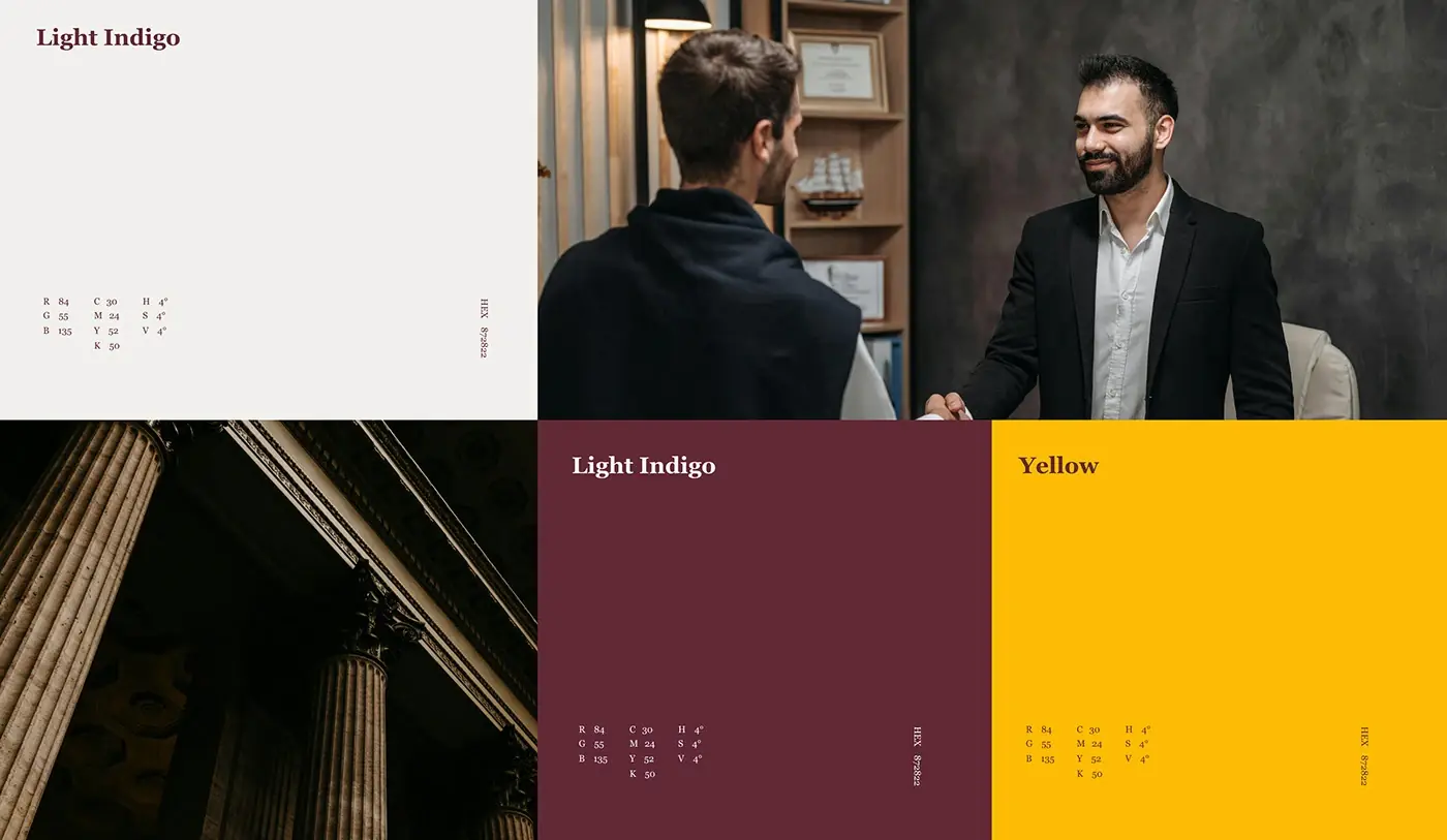
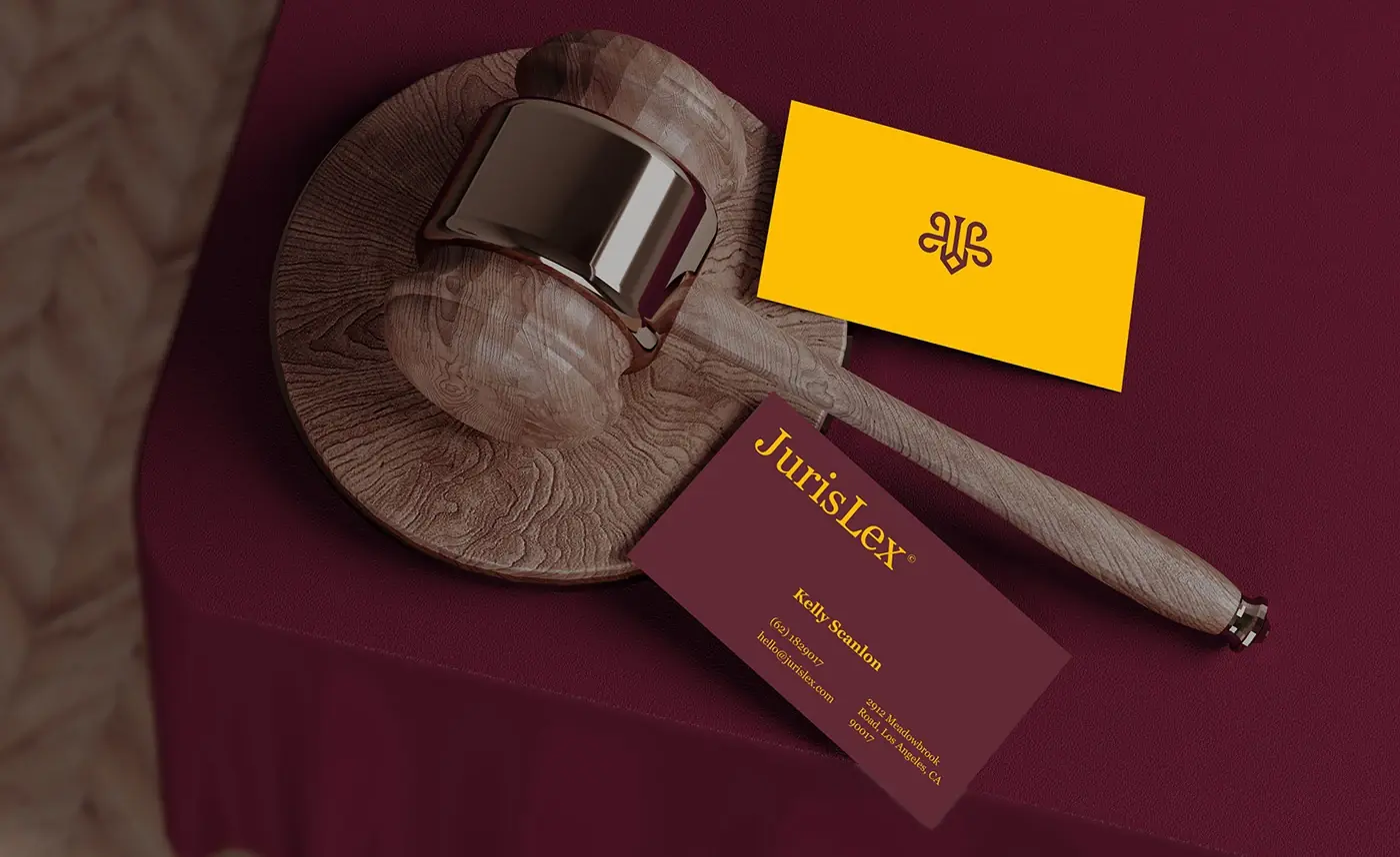
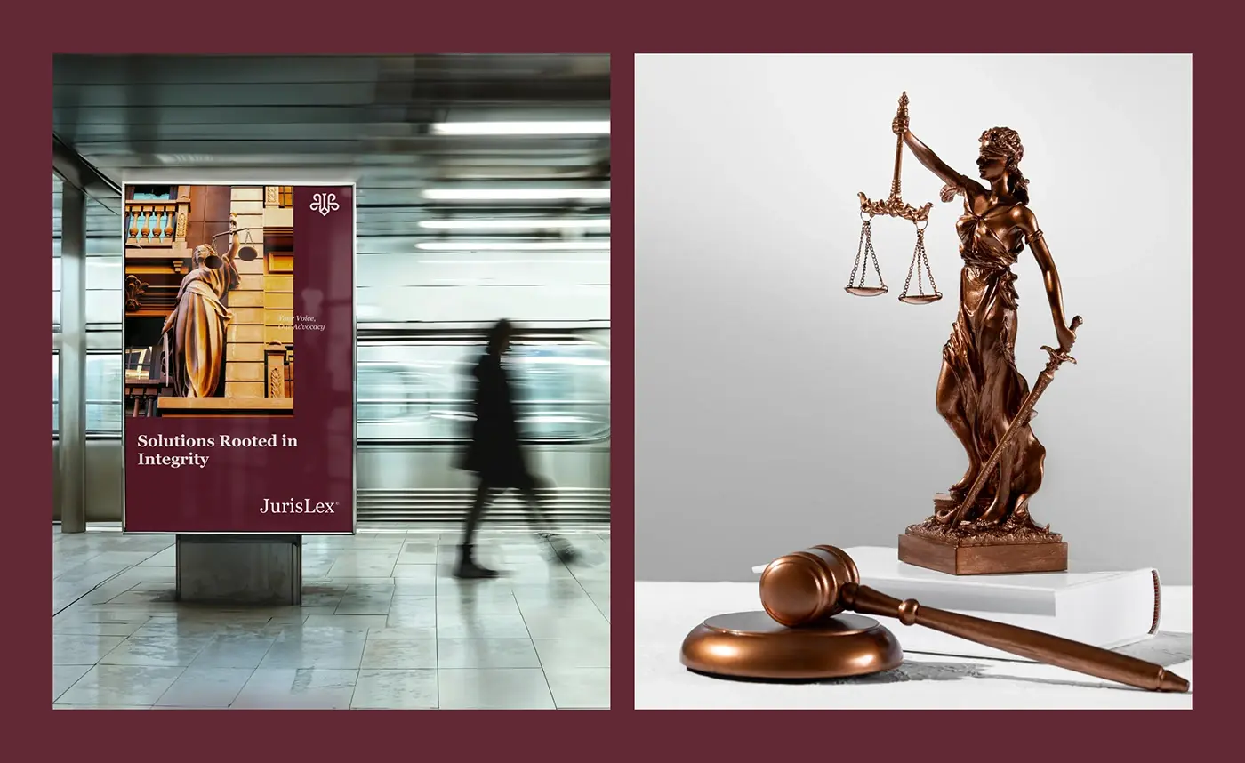
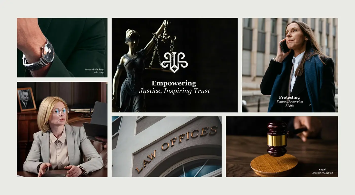
- Moodboard: Lady Justice, a gavel and law offices, to set a serious tone.
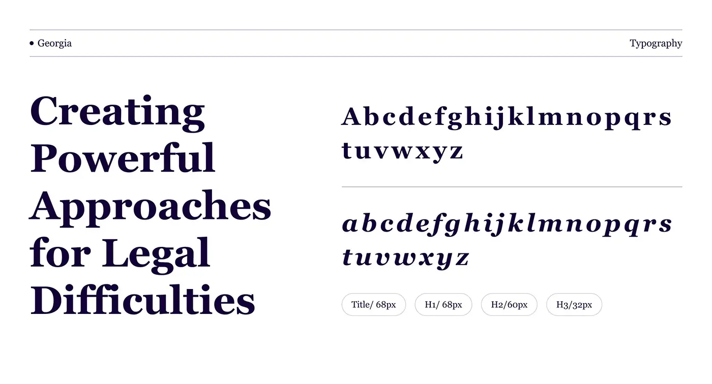
- Type: Georgia, a classic serif, with 68px titles and H1s, 60px H2s and 32px H3s.
- Colour: deep wine red, gold and off-white.
- The desktop homepage, then a responsive mobile version.
The solution
I paired a traditional serif with clean, modern layouts and let the wine red and gold do the rest. Each section opens with a thin rule, a small label and a number, so the long page reads like an ordered brief.
Hero with a real lawyer
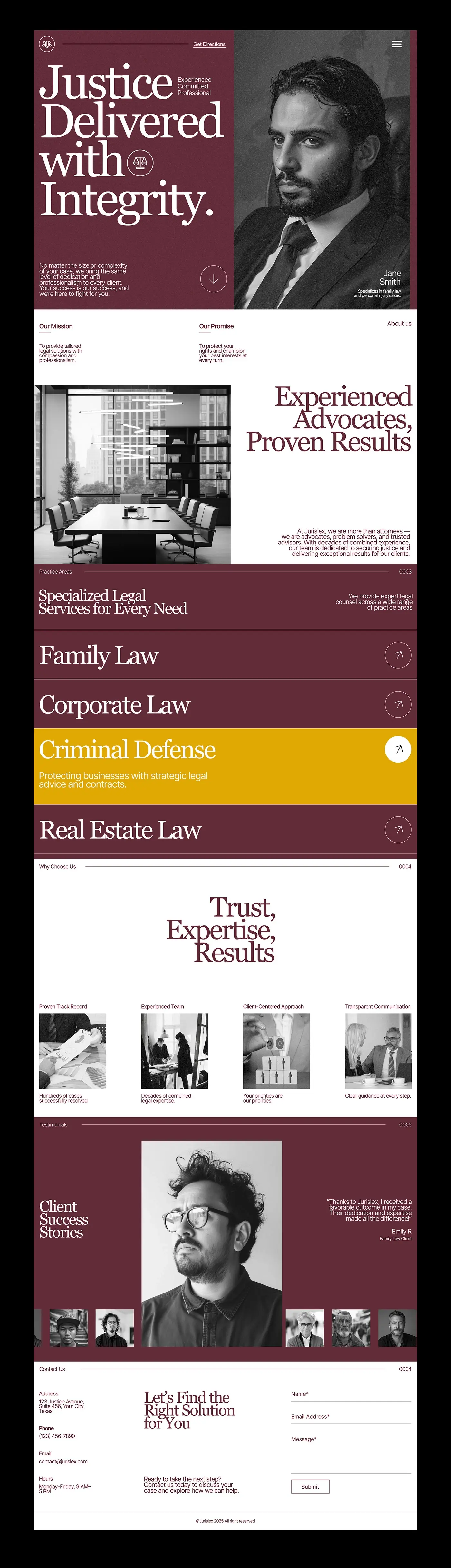
"Justice Delivered with Integrity." is set large on wine red, beside a black and white portrait of a lawyer with their name and specialism. Three words, experienced, committed and professional, sit next to the headline, with a short promise and a scroll arrow below. The top bar stays almost empty, with a Get Directions link and a menu icon. Leading with a person tells a nervous visitor who they would actually speak to.
Mission, promise and about
Two one-line statements open the next section: the mission, tailored legal help with compassion, and the promise, protecting the client's rights at every turn. Below them, "Experienced Advocates, Proven Results" faces a black and white meeting room photo and a short paragraph on the firm's experience. One sentence per statement means the values read at a glance.
Practice areas as rows
Family law, corporate law, criminal defence and real estate law each get a full-width wine red row with a large serif title and an arrow button. The active row turns gold and opens a one-line summary. Rows suit this list better than a grid of cards: the names stay big enough to scan on any screen, and a visitor can open one area without leaving the page.
Why choose the firm
Under "Trust, Expertise, Results", four columns pair a short title with a black and white photo and one line each: a track record of resolved cases, decades of combined experience, a client-centred approach and clear guidance at every step. Monochrome photos keep the section quiet, so the wine red headline stays the focus.
Client stories
A wine red testimonials section sets one large portrait beside a short client quote, the client's name and their area of law. A row of smaller portraits runs underneath, so the next story is always in view. Faces in black and white match the hero and keep the proof personal.
Contact in one place
"Let's Find the Right Solution for You" sits between two columns: address, phone, email and opening hours on the left, and a three-field form for name, email and message on the right. Everything a visitor needs to get in touch is on one screen, with no second page to load.
Mobile version
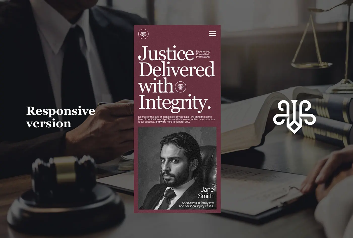
On a phone the hero stacks in the same order as desktop: the menu icon, the four-line headline with its three words, the short promise, then the lawyer's portrait with name and specialism. The serif stays large, so the first screen still reads as a law firm before anyone scrolls.
The result
- A desktop homepage: hero, mission and promise, about, practice areas, reasons to choose the firm, client stories and contact.
- A responsive mobile version.
- A UI style guide: the moodboard, the Georgia type scale and three colours.
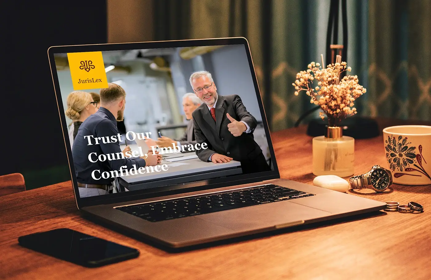
- Laptop and phone mockups, and the presentation.
How it helps the client
The site lets a specialist firm look established and still approachable: a visitor sees who they'd work with, finds their area of law in one scroll and can send a message from the same page. That's what I aim for in website design for law firms, and you can compare it with my other website case studies.