Good dark mode design is not an inverted light theme. It is a second set of values for the same roles: dark grey surfaces that get lighter as they come forward, text that passes the same contrast as in light, calmer accents, and redrawn images and charts. It's the standard I hold apps to when I provide mobile app design services.
Apple and Google agree on most of it and split on one thing founders care about: Apple says to avoid an in-app appearance setting, while Android recommends offering Light, Dark and System default. The contrast floor is WCAG 2.2: 4.5:1 for normal text, 3:1 for large text and for the parts of controls people need to see. APCA is not a standard yet; the September 2026 WCAG 3 draft still leaves its contrast measure "to be determined".
This is for founders and product leads adding dark mode to an iOS, Android or web product, with each rule tied to a dated primary source.
What Apple and Google actually say about dark mode
Apple's Dark Mode guidelines are firmer than most people remember. People "generally expect all apps and games to respect their preference", so Apple advises against an app-specific appearance setting: people may think your app is broken when it ignores their choice. Dark-only is allowed in rare cases such as immersive media. Contrast should be no lower than 4.5:1, and for custom colours Apple asks you to strive for 7:1, especially in small text.
On iOS, dark mode has two sets of backgrounds: base, which is dimmer, and a brighter set for interfaces in front, such as sheets and popovers. Apple's Color guidelines, last changed on 16 December 2025, ask for light and dark variants of every custom colour, plus an increased contrast option for each.
Material 3's colour roles are the same in light and dark; only the tones behind them change. Since the update in Material's tone-based surfaces post (23 March 2023), surfaces use five surface container roles, from lowest to highest, instead of a tinted overlay tied to elevation. The archived Material 2 dark theme guide still has the clearest written rules: a #121212 surface, desaturated primaries, and white text at 15.8:1 or more on dark surfaces, so body text still passes 4.5:1 on the lightest raised one.
| Question | Apple HIG | Material and Android |
|---|---|---|
| Who picks the theme | The system; avoid an app-only setting | Light, Dark, System default in the app |
| How depth shows | Brighter backgrounds for layers in front | Surface container roles, lowest to highest |
| Text contrast | At least 4.5:1; strive for 7:1 in small custom text | Accessible pairs built into the roles |
| Extra contrast | An increased contrast value for every colour | Standard, medium and high contrast levels |
One screen in light and dark: what changes
One screen drawn twice. Nothing moves; only values change. Dark mode is a theme on the same layout, not a second design.
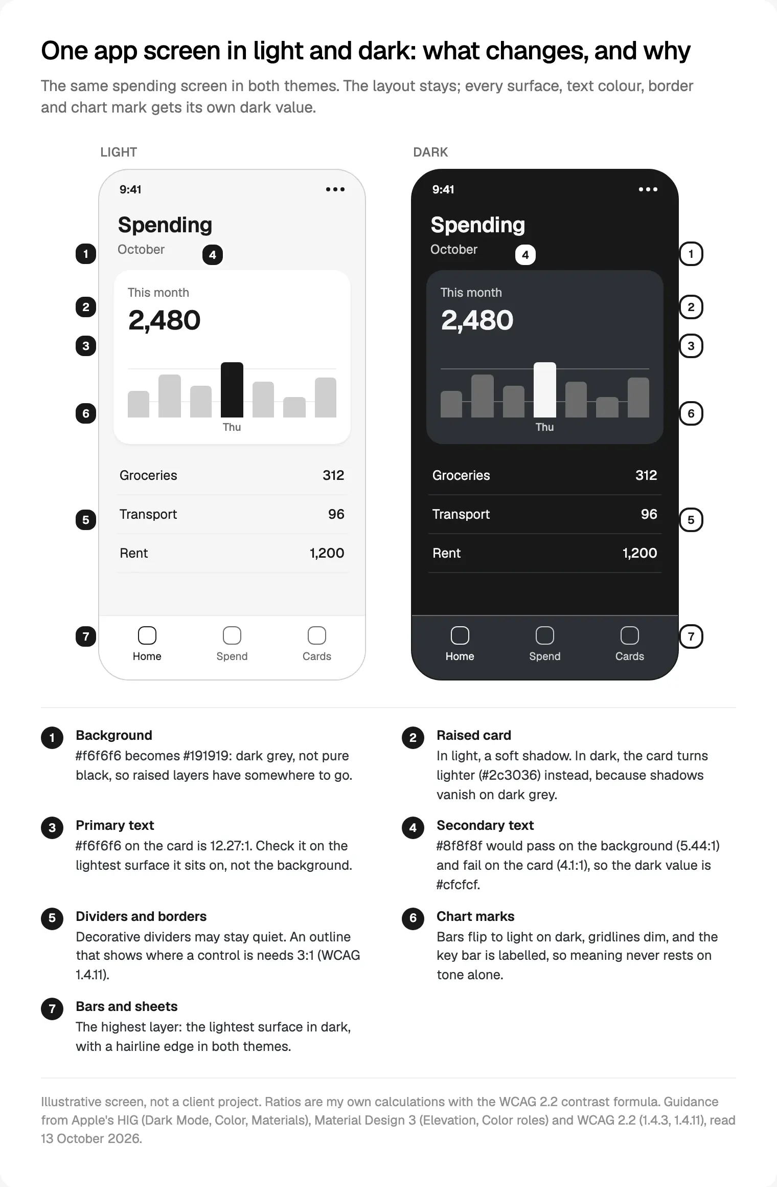
Callout 4 is the bug I see most. By the WCAG 2.2 formula, which I ran myself, #8f8f8f is 5.44:1 on #191919 and only 4.1:1 on #2c3036. The same grey passes on the page and fails on the card.
Elevation in dark mode: lighter surfaces, not heavier shadows
Material 3's elevation guidance says its surfaces "use tonal difference to indicate separation" by default, with shadows and scrims as other options. Material 2 used a white overlay from 0% on the lowest level to 16% on the highest. The higher a surface, the lighter it is.
I give a product four surface levels: background, surface, raised (cards) and overlay (sheets, menus, dialogs). Each has a light and a dark value and a role name; no component holds a hex value.
Shadows stay for things that lift, like a dragged card, and a scrim behind a modal does more than any shadow in dark. What I remove is the soft shadow on every card, which in dark is invisible weight.
Borders need the same split. Material 3 has outline for boundaries that must reach 3:1 against the surface, such as a text field, and outline variant for decorative dividers. That maps exactly onto WCAG 2.2 success criterion 1.4.11.
Colour in dark mode design: desaturate, then check every pair
Material 2's guide explains why a light palette can't be reused: saturated colours "produce optical vibrations" on dark backgrounds and often fail 4.5:1 for body text. Its baseline used the 200 tone of the primary colour in dark, lighter and less saturated than the 500 to 900 tones used in light.
This is where brand colours break. A deep blue that makes a strong button on white is usually too dark to read as a link on dark grey. The fix is a lighter, calmer tone of the same hue, not a new brand colour.
The order I build a dark palette in:
- List every role: surfaces, text levels, borders, primary, and each status (success, warning, error, info).
- Set dark surfaces first, then text values that pass on the lightest one.
- Move the brand colour up its tonal scale until text and icons in it pass 4.5:1 on every surface they appear on.
- Do the same for statuses. A red "overdue" badge that fades into the card has lost its meaning.
- Add an increased contrast value for each role, and write every pair's ratio into the tokens, so a change that breaks contrast fails a check.
How those values travel from Figma to code is covered in how design tokens carry light and dark modes. I keep one Figma collection with light and dark modes, and the same role names in code.
Contrast targets: WCAG 2.2 now, APCA later
These are the numbers I hold dark mode to, from WCAG 2.2, a W3C Recommendation updated on 12 December 2024:
| What | Minimum | Source |
|---|---|---|
| Normal text | 4.5:1 | 1.4.3 Contrast (Minimum), AA |
| Large text (18 pt, or 14 pt bold) | 3:1 | 1.4.3, AA |
| Control boundaries, focus, states, needed chart parts | 3:1 | 1.4.11 Non-text Contrast, AA |
| Normal text, enhanced | 7:1 | 1.4.6 Contrast (Enhanced), AAA |
The W3C's Understanding 1.4.11 page covers what dark themes forget most: input outlines, a toggle's on state, focus indicators and chart lines.
APCA, the Accessible Perceptual Contrast Algorithm, is often quoted for dark interfaces. Its repository says it was developed for WCAG 3 and lists the library as 0.1.9 beta. Apple's Accessibility guidelines name WCAG and APCA as two popular measures, but Accessibility Inspector uses WCAG AA values.
The standard hasn't chosen. The WCAG 3 Working Draft of 10 September 2026 lists "Text contrast sufficient" as a developing requirement whose measure is still a placeholder. The W3C's WCAG 3 introduction, updated on 25 September 2026, says WCAG 3 is "a few more years" from completion and that the best preparation is meeting WCAG 2.2 now.
My take: WCAG 2.2 is what audits and contracts name, so every pair must pass it. I use APCA as a second opinion on thin, small light text on dark grey, where WCAG 2's formula can be generous. If APCA calls a passing pair weak, I strengthen it; it never excuses a failing one.
Images, illustrations and charts in dark mode
Apple's guidance: slightly darken content images with white backgrounds so they don't glow, and give icons and illustrations separate dark versions where they lose detail. On the web, that's a <picture> source with prefers-color-scheme: dark. Uploaded photos I leave alone, with a hairline frame.
Charts need the most work, as on the dashboards in how I design dashboards founders open. Apple's Charts guidelines say not to rely on colour alone and to separate touching areas of colour; WCAG 1.4.11 asks 3:1 for the parts of a graphic needed to understand it. In dark mode:
- Series colours get their own dark values, chosen as a set.
- Gridlines and axes go quieter, because on dark they read brighter than you expect.
- Key values carry labels, so a highlighted bar still means something without colour.
- Tooltips and legends sit on the overlay level, the lightest surface.
System setting or in-app toggle?
The platforms disagree. Apple's HIG says avoid an app-only setting. Android's dark theme guide, updated on 1 October 2026, recommends Light, Dark and System default, with System default as the default.
Apple's review side is softer: its Dark Interface evaluation criteria, behind the Accessibility Nutrition Label, accept the system Dark Mode or a custom dark scheme, as long as the interface stays dark: even brief flashes of bright content count against you. The labels themselves are in my mobile app design trends for 2027.
Should dark be the default? A Nielsen Norman Group review of the research (February 2020) found people with normal vision tend to perform better in light mode, and recommends letting people switch.
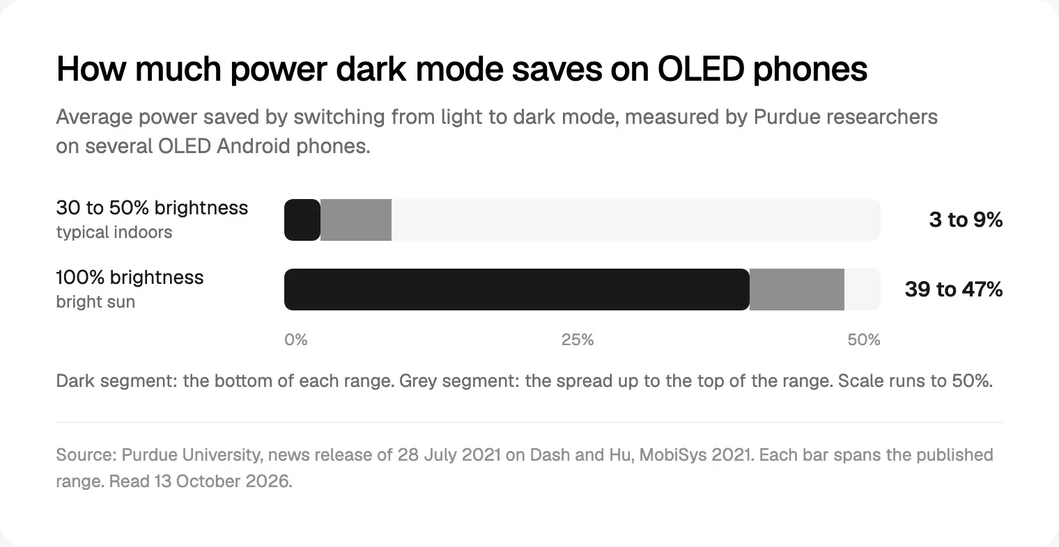
Battery is a weaker argument than it sounds. Purdue's 2021 study of OLED Android phones found dark mode saved 3 to 9% of power on average at 30 to 50% brightness, and 39 to 47% at full brightness. Auto-brightness, the release notes, tends to sit at 30 to 40% indoors.
What I recommend:
- iOS: follow the system with no switch, unless the app is mainly for reading or media, where a System, Light or Dark choice earns its place.
- Android and web products: offer System default, Light and Dark, with System default selected.
- Never ship dark-only to look premium. Apple allows it for immersive media, not a banking app.
Theming in code: iOS, Android, React Native, Flutter and the web
The table I hand developers at kickoff, mine or the client's:
| Stack | Follow the system | Override in app | The detail that bites |
|---|---|---|---|
| iOS | Semantic colours, colour assets | overrideUserInterfaceStyle | Hard-coded hex values never adapt |
| Android | DayNight, MODE_NIGHT_FOLLOW_SYSTEM | setApplicationNightMode on API 31+ | Skip it and the splash can show the wrong theme |
| React Native | useColorScheme() | Appearance.setColorScheme() | Expo defaults to light without userInterfaceStyle |
| Flutter | ThemeMode.system, the default | ThemeMode.light or .dark | No darkTheme means the light theme is used |
| Web | prefers-color-scheme | A saved class or attribute | Without color-scheme, form controls stay light |
The sources: Apple's `overrideUserInterfaceStyle` docs, React Native's Appearance docs ('auto' hands control back to the system) and Expo's colour themes guide, which also says Android development builds need expo-system-ui. Android's Force Dark is opt-in; I treat it as a stopgap.
In Flutter, `MaterialApp.themeMode` defaults to ThemeMode.system, and `ColorScheme.fromSeed` builds the dark scheme from the same seed with brightness: Brightness.dark, plus a contrastLevel.
prefers-color-scheme lives in Media Queries Level 5 and color-scheme in CSS Color Adjustment Level 1, a Candidate Recommendation Snapshot of 16 December 2025. With a toggle, read the saved choice before first paint, or the page flashes light first.
It's part of how I design iOS and Android apps in both themes: the theme decision goes in the scope, not QA.
How I test dark mode before it ships
My checklist:
- Switch theme while the app is open. Apple's Auto setting can change it mid-session.
- Turn on Increase Contrast and Reduce Transparency, separately and together, as Apple suggests.
- Open every state: empty, loading, errors, offline banners, the launch screen.
- Check what you don't draw: web views, payment sheets, maps.
- Check notifications and widgets. Android asks you to use system notification templates.
- Run contrast on tokens, not screenshots: every text and border pair on every surface.
- Look at it outdoors and in a dark room. Apple notes colours look more muted in bright light and more saturated in the dark.
- Try Smart Invert, so photos don't invert and a red delete button doesn't turn green.
Where I would start
With no dark mode yet, start with roles, not screens: four surfaces, three text levels, two border roles, primary and statuses. Give each a dark and an increased contrast value, check every pair against WCAG 2.2, switch the whole app over at once, then fix what looks wrong.
With a dark mode that feels off, look first at shadows, secondary text on cards, and charts.
To work through it on your product, book a free 30 minute intro call about my mobile app design work for startups. After it, I write a scope and one fixed quote for the whole project.
Frequently asked questions
What is the best background colour for dark mode?
Dark grey rather than pure black, so raised surfaces can be lighter. Material's archived dark theme recommended #121212, dark enough for white text to reach at least 15.8:1. On iOS, use the system background colours, which brighten automatically for sheets and popovers. Whatever you choose, check text contrast on the lightest surface, not only the background.
Should my app follow system dark mode or have its own switch?
Follow the system by default. Apple advises against an app-only setting, because people may think your app is broken when it ignores their choice. Android recommends offering Light, Dark and System default, with System default selected. I offer that choice on Android and web products, and on iOS only for reading or media apps.
What contrast ratio does dark mode need?
The same as light mode under WCAG 2.2: 4.5:1 for normal text, 3:1 for large text, and 3:1 for control boundaries, focus indicators and the chart parts people need. Apple asks you to strive for 7:1 for custom colours in small text. Test each pair on every surface it sits on, because cards are lighter in dark mode.
Is APCA replacing WCAG contrast ratios?
Not yet. APCA was developed as a candidate method for WCAG 3, but the Working Draft of 10 September 2026 still leaves its contrast measure undecided, and the W3C says WCAG 3 is a few years from completion. WCAG 2.2 remains what audits use. I check every pair against WCAG 2.2 and use APCA as a second opinion.
Does dark mode really save battery?
On OLED phones, a little at normal brightness and a lot at full brightness. Purdue researchers measured average savings of 3 to 9% at 30 to 50% brightness and 39 to 47% at 100% on several OLED Android phones in 2021. It's a fair side benefit, not a reason to make dark the default.
How do I add dark mode to a React Native or Flutter app?
In React Native, read useColorScheme() and pick theme tokens from it; Appearance.setColorScheme handles an in-app override. In Expo, set userInterfaceStyle to automatic, or the app stays light. In Flutter, pass both theme and darkTheme to MaterialApp and leave themeMode on ThemeMode.system.
Sources and method
I read every source on 13 October 2026. The diagram is illustrative, not a client project; its ratios are my own WCAG 2.2 calculations. Reading research is thin.
- Apple, HIG: Dark Mode (change log 6 August 2024), date read 13 October 2026: developer.apple.com
- Apple, HIG: Color (updated 16 December 2025), date read 13 October 2026: developer.apple.com
- Apple, HIG: Accessibility (updated 9 June 2025), date read 13 October 2026: developer.apple.com
- Apple, HIG: Charts, date read 13 October 2026: developer.apple.com
- Apple, App Store Connect Help, Dark Interface evaluation criteria, date read 13 October 2026: developer.apple.com
- Apple Developer, UIKit overrideUserInterfaceStyle, date read 13 October 2026: developer.apple.com
- Google, Material Design 3, Color roles, date read 13 October 2026: m3.material.io
- Google, Material Design 3, tone-based surfaces (23 March 2023), date read 13 October 2026: m3.material.io
- Google, Material Design 3, Applying elevation, date read 13 October 2026: m3.material.io
- Google, Material Design 2 (archived), Dark theme, date read 13 October 2026: m2.material.io
- Android Developers, Implement dark theme (updated 1 October 2026), date read 13 October 2026: developer.android.com
- W3C, WCAG 2.2, Recommendation 12 December 2024, date read 13 October 2026: w3.org
- W3C WAI, Understanding 1.4.11 Non-text Contrast, date read 13 October 2026: w3.org
- W3C, WCAG 3.0 Working Draft, 10 September 2026, date read 13 October 2026: w3.org
- W3C WAI, WCAG 3 Introduction (updated 25 September 2026), date read 13 October 2026: w3.org
- Myndex, APCA repository for W3C and WCAG 3 (0.1.9 beta), date read 13 October 2026: github.com
- W3C, Media Queries Level 5, Working Draft 19 February 2026, date read 13 October 2026: w3.org
- W3C, CSS Color Adjustment Level 1, Candidate Recommendation Snapshot 16 December 2025, date read 13 October 2026: w3.org
- React Native, Appearance docs, date read 13 October 2026: reactnative.dev
- Expo, Color themes guide, date read 13 October 2026: docs.expo.dev
- Flutter, MaterialApp.themeMode, date read 13 October 2026: api.flutter.dev
- Flutter, ColorScheme.fromSeed, date read 13 October 2026: api.flutter.dev
- Nielsen Norman Group, Dark Mode vs. Light Mode: Which Is Better? (2 February 2020), date read 13 October 2026: nngroup.com
- Purdue University, news release on dark mode and battery (28 July 2021), date read 13 October 2026: purdue.edu
Tags: Dark mode, Mobile apps, Accessibility, Design systems, iOS, Android