Good fintech website design does one job before anything else: it makes a careful visitor feel safe enough to take the next step. That means one plain promise and one main button above the fold, real product screens instead of vague claims, fees and rates stated with the disclosures your regulator expects, a security answer that's easy to find, and a phone layout designed on its own. A banking website needs all of that plus the signs and wording that insured banks are required to show. Everything else, from colour to motion, serves those parts.
I'm a design engineer: I design websites and products and build them in React and Next.js. Below is how I'd approach a fintech or bank marketing site, walked through on Fintus, a website I designed for a banking and saving platform. It's the work behind my website design service.
What a fintech or banking website must include
This post is about marketing websites: the public site that explains the product and sends people to sign up. The app behind the login is a different design problem, which I cover in my fintech app design best practices.
One promise and one primary action
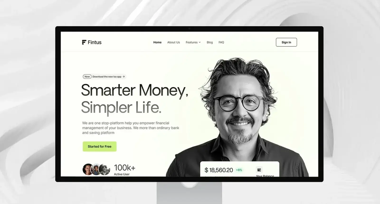
A visitor should get what you do from one line. On Fintus the hero says "Smarter Money, Simpler Life.", one line explains what the platform does for a business, and a lime Started for Free button is the only filled button in the hero. Sign In stays an outline in the navigation, so it doesn't compete.
Proof from the product itself
Claims like "secure" cost nothing to write, so readers discount them. Fintus floats a balance card with the monthly change over the hero portrait. The fintech SaaS site I designed puts its services list beside a card screen with the balance, masked card number and credit limit, and its analytics heading beside a savings chart.
Fees, rates and the words around them
In finance the copy is part of the compliance surface. The UK's Financial Conduct Authority says all financial promotions must be "clear, fair and not misleading" whatever the medium, and gives a website and a social post as examples; product rules such as BCOBS for banking add detail. In the US, Regulation DD says a deposit account can't be called "free" if a maintenance or activity fee may apply, and a stated rate of return has to be the "annual percentage yield", with details such as the date the rate is accurate as of, the minimum balance and a note that fees could reduce earnings. The internet isn't exempt.
For design, that means rate components with room for the disclosure beside the number, and rates your team can update in the CMS.
The signs a bank has to show
If you're an FDIC insured bank, the FDIC's final rule published on 29 January 2026 requires the official digital sign on the homepage, the login page and the page where a consumer first starts opening a deposit account. Compliance is due by 1 April 2027. If you're a fintech that works with a partner bank, the FDIC's rules on misrepresenting deposit insurance still apply to how you describe where money is held. I design a clear line on product pages and in the footer saying who holds the funds, and your counsel approves the words.
Security answered first
The question a banking visitor is most likely to have is "is my money safe here?", so it gets a home. On Fintus the FAQ opens with the platform security answer already expanded. A security page with specifics your security team can stand behind is better still.
A phone layout designed on its own
StatCounter put mobile at 59.9% of worldwide web traffic in October 2026, with desktop at 38.51%. On Fintus the hero on a phone keeps the headline, the line of copy and the green button above the portrait, so the call to action is on screen without scrolling.
Accessibility you can show
The European Accessibility Act has applied since 28 June 2025, and banking services and e-commerce are among the services it covers. In the US the Department of Justice's guidance says businesses open to the public must make their online services accessible, and points to WCAG as helpful guidance rather than a set rule. I design to WCAG 2.2 level AA: at least 4.5:1 contrast for body text, visible focus states and forms that work with a keyboard. A bright accent such as lime rarely reaches 4.5:1 as text on white, one reason Fintus uses lime for button fills and bands, not body copy.
Pages for the reader who isn't ready yet
Most visitors to a money product don't sign up on the first visit. Fintus has features, about, blog, article and FAQ pages, each opening with the same title band, so the slower buyer has something to read and search engines have something to rank.
Common mistakes I see on fintech websites
- Trust badges instead of trust. A row of padlocks and "bank grade security" means little. Say what you do, in plain words, and link to the detail.
- Rates without context. A big APY with no as-of date or minimum balance is a regulatory problem and a credibility problem.
- Three calls to action in the hero. Sign up, book a demo, download the app and talk to sales all at once means none of them leads.
- Compliance review as the last step. If legal sees the copy only at launch, expect rewrites and a late launch. I share copy with them from the first draft.
- Numbers that only a developer can change. Rates, fees and legal lines change. Put them in the CMS as structured fields.
How I'd approach your fintech website
- A free 30 minute intro call. I ask who the site is for, what a visitor should do first, which licences or partner banks are involved and who reviews copy.
- A written scope and one fixed quote for the whole project. No retainer, nothing billed by the hour.
- Design goals before layouts. On Fintus they were ease of use, natural language, centralised management, and safety and security.
- A competitor analysis and quick sketches, with early feedback, then visual design in weekly sprints in Figma, a written update every 48 hours and a review call each week.
- A design system with tokens and components named the same in Figma and in code, and layouts for desktop, tablet and mobile.
- The build. I build marketing sites in React and Next.js, or prepare the files for a Webflow build, as the fintech SaaS site was planned. Rates, fees and legal lines live in the CMS.
- Checks, then launch. Your compliance team signs off the copy on the real pages, and I test keyboard use, contrast and phone layouts before go live.
Case study: Fintus, a banking and saving website
Fintus is a banking and saving platform that brings a business's money management into one place. I designed its marketing website in 2024: home, features, about, blog, blog article and FAQ pages, on desktop, tablet and mobile, then handed the designs over to developers.
The problem. A money platform has to look simple and safe before anyone signs up, so the site had to explain a lot without feeling heavy. Three services (finance tools, AI-powered features and virtual assets) had to read as one offer, and questions on security, fees and devices needed a clear home.
The visual system. A style guide in Oakes Grotesk with lime green, near black and light grey. Black and white photos and a quiet palette let the lime buttons carry the next step on every page.
The homepage. After the hero, "Explore Financial Solutions and Services" puts the three services side by side as cards, the first filled lime. A forward-thinking section pairs a short statement with three figures, then a lime band asks "What Are You Waiting For?". Testimonials, article cards and a dark footer close the page.
Reuse as a decision. The features and about pages are built from the homepage sections: the services carousel, the numbered topics list, the testimonial and the call to action. That keeps the build small and the site consistent, and new pages can be put together from the same parts.
The FAQ. One accordion, one question open at a time, security first.
Notice the order: goals, competitors, sketches, and only then colour and type. The result was six page designs, mobile layouts for four of them plus a tablet blog view, and a UI style guide.
For contrast, the fintech SaaS website I designed goes dark and product-led: "Fintech Made Easy." over deep navy, then a logo row and four figures straight under the hero so proof comes before the pitch. Both follow one rule: one promise, then proof from the product. More are in my fintech case studies and on the fintech industry page.
What decides the cost of a fintech website
I give one fixed quote after the intro call, so I won't put my own figures here. Public market data gives a sense of range. Clutch's web design pricing guide, updated 21 September 2026, puts the average web design project reviewed on its platform at $38,105.39 over an average of 7 months, says most projects cost less than $10,000, and lists $100 to $149 an hour as typical for agencies it shortlists. Those averages mix very different projects, so treat them as context, not a quote.
What moves the price on a fintech or bank site:
- Templates. Six templates that reuse sections, as on Fintus, cost far less than twenty unique pages.
- Compliance rounds. Each review cycle adds time; early drafts keep it down.
- Dynamic content. Live rate tables and calculators need structured CMS fields and testing.
- Integrations. Sign-up handoff to the app, analytics with consent, a help centre.
- Markets. Each can bring its own disclosures and translation.
- Platform. Webflow or Next.js, and who maintains it afterwards.
How to choose who designs and builds it
Be honest about what you need. If you have an in-house engineering team and a design system, you may only need design. If you have neither, someone who designs and builds avoids the handover gap where details get lost.
Look for finance work, and ask to see whole sites, not hero shots. Ask how they handle compliance review, where rates and legal lines will live, how they test accessibility, and who you'll talk to each week. Ask what they'd leave out, too. My SaaS website examples post shows patterns worth asking about.
Frequently asked questions
What should a fintech website include?
A one line promise with one primary action, real product screens, plain fees and rates with their disclosures, a security answer, a line saying who holds the money, a phone layout designed on its own, and pages for visitors not ready to sign up.
How is banking website design different from a fintech website?
An insured bank carries extra duties: in the US, the FDIC official digital sign on the homepage, login page and account opening page by 1 April 2027, and Regulation DD wording for deposit ads. A fintech that partners with a bank must describe deposit insurance accurately. The design principles are the same.
How long does a fintech website take?
It depends on page count, compliance rounds and whether the build is included. Clutch's guide puts the average web design project at 7 months; a focused site with reusable sections is usually shorter. I give a timeline in the written scope.
Can you work with our compliance and legal team?
Yes, from the first draft. I share copy early and put rates and legal lines in the CMS, so approved changes don't need a redesign. This post is general information, not legal advice; your counsel decides the wording.
Should a fintech website be built in Webflow or Next.js?
Webflow suits a marketing team that wants to edit pages itself. Next.js suits sites that share components with the product or pull live data such as rates. The fintech SaaS site was designed for Webflow; I build in React and Next.js when that's the better fit.
Sources and method
I read every source on 1 November 2026. The regulatory points are a general summary, not legal advice. Clutch's figures come from reviews on its platform and mix project sizes.
- Financial Conduct Authority, Financial promotions and adverts (last updated 28 May 2024), date read 1 November 2026: fca.org.uk
- Consumer Financial Protection Bureau, Regulation DD, 12 CFR 1030.8 Advertising, date read 1 November 2026: consumerfinance.gov
- Federal Register, FDIC final rule on official signs and advertising requirements, 12 CFR Part 328 (29 January 2026), date read 1 November 2026: govinfo.gov
- European Commission, European Accessibility Act, date read 1 November 2026: commission.europa.eu
- AccessibleEU, A new era of inclusion begins as the European Accessibility Act enters into force (27 June 2025), date read 1 November 2026: accessible-eu-centre.ec.europa.eu
- US Department of Justice, Guidance on web accessibility and the ADA (18 March 2022), date read 1 November 2026: ada.gov
- W3C, Web Content Accessibility Guidelines 2.2 (Recommendation, version of 12 December 2024), date read 1 November 2026: w3.org
- StatCounter, Desktop vs mobile vs tablet market share worldwide (October 2026), date read 1 November 2026: gs.statcounter.com
- Clutch, Web design pricing guide (updated 21 September 2026), date read 1 November 2026: clutch.co
If you're planning a fintech or banking website, book a free 30 minute intro call. I'll ask about your product, your market and who signs off the copy, and a written scope and one fixed quote follow if you go ahead.
Tags: Fintech, Website design, Banking, Accessibility, Case studies