

The SaaS website examples worth studying aren't galleries of pretty hero sections. They're sites where a stranger can answer four questions within a minute: what is this, does it work, what will it cost, and how do I start. The best product companies answer each one with a pattern you can borrow without copying a single pixel.
I do SaaS website design for B2B companies, and these are the eleven sites I opened on 13 October 2026 to check the patterns I design with. They cover developer tools, fintech, B2B operations and AI products, grouped by the pattern each shows best.
This is for founders, marketers and product leads planning a SaaS site or a redesign. For single campaign pages, my landing page examples sorted by the job they do cover that ground; this post is about the whole site, from the menu to the docs. I quote no conversion numbers, because none were published for these patterns.
The SaaS website examples at a glance
Each pattern answers one question a buyer brings. Some sites appear twice, because good sites do more than one thing well.
| # | Pattern | The buyer's question | Sites I opened | Category |
|---|---|---|---|---|
| 1 | The homepage answer in one line | What is this? | Resend, Replicate | Developer tools, AI |
| 2 | The product shown, not described | Does it really work? | Clerk, Attio, ElevenLabs | Developer tools, B2B ops, AI |
| 3 | A pricing page that answers | What will it cost me? | PostHog, Clerk, Supabase | Developer tools |
| 4 | Proof beside the claim | Who else trusts it? | Vercel, Brex, Plaid | Developer tools, fintech |
| 5 | Docs as marketing | Can my team build with it? | Resend, Supabase, Plaid | Developer tools, fintech |
| 6 | A sign-up path for each buyer | How do I start? | Deel, Brex, PostHog, Plaid | B2B ops, fintech, developer tools |
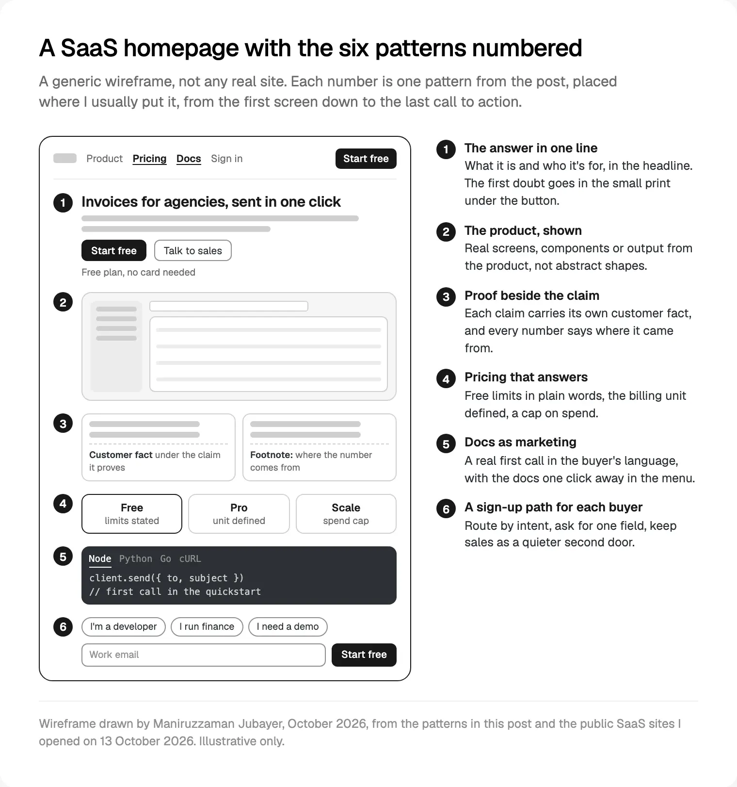
1. The homepage answer in one line
The first question on any SaaS homepage is "what is this?", and the best answer fits in the headline or the sentence under it. A buyer who has to scroll to find out is usually reading a competitor's site in the next tab.
What I saw. Resend's homepage leads with three words, email for developers, and the line under it says which email (transactional and marketing) and the outcome people care about: the inbox, not the spam folder. Replicate's homepage does the same for AI infrastructure: run AI with an API, then what that means (run models, fine-tune them, deploy your own), with real public models and their run counts a scroll below.
Take this. Category plus audience in the headline, scope or outcome in the subhead.
Skip that. A brand line that only makes sense once you know the product. For a Series A team, it loses the visitor from a comparison search.
How I do it. I write several candidate headlines before any layout exists and test each against one question: could a competitor truthfully use this line? If yes, it isn't specific enough.
2. The product shown, not described
For software, a real screen is better evidence than any adjective. The pattern puts the product's actual surfaces (components, output, interface) where most sites put an illustration.
What I saw. Clerk's homepage places its own sign-in, user button and user profile components in a hero demo with tabs, so a developer sees exactly what would ship inside their app. Attio's homepage builds its hero from the CRM's own surfaces: a sales call transcript, a question to its assistant about which deals need attention, the answer, and an agent run in a terminal. ElevenLabs' homepage sells AI voice, so it lets you hear it, with samples sorted by use, such as narration, advertising and characters.
Take this. Show the one moment the product saves time. For an AI product, show real output (audio, an answer, a finished file), not a chat bubble with the word AI in it.
Skip that. Rebuilding the whole app in the hero; on a phone, crop to one panel. And keep sample data clearly fictional, so the demo never looks like a real customer's records.
How I build it. I design the product scene from the product's own components, named the same in Figma and in code, so the website demo changes when the product does.
3. A pricing page that answers the second question
The next question is cost. Jakob Nielsen's 2006 NN/g article on showing prices for common scenarios still holds: when pricing is complicated, show sample prices for typical orders, because a buyer early in research only needs the rough level. Usage-based SaaS pricing is exactly that kind of complicated.
What I saw. PostHog's pricing page leads with what's free every month for each product (for example 1 million analytics events and 5,000 session recordings), says usage stops at the free limits so nobody is charged by surprise, and offers a billing limit per product and a calculator. Clerk's pricing page defines its billing unit in one sentence: a user counts as retained when they return 24 hours or more after signing up. Supabase's pricing page puts the free plan's limits on the card itself: projects pause after a week of inactivity, and you get two active projects.
Take this. Entry limits in plain words, the billing unit defined where the price sits, a way to cap spend, and one worked example for your most typical customer. For twelve full pricing pages, see pricing page examples sorted by decision.
Skip that. "Contact us" as the only price for a self-serve product, or a calculator with ten inputs before any number appears. Nielsen's example was exactly that: a calculator too complex for a quick estimate, beside a competitor's simple table.
If you mark pricing up for search, Google's SoftwareApplication structured data needs a name, a price offer and a rating or review. I only add it where a genuine rating exists.
4. Proof placed beside the claim it supports
Proof works hardest next to the sentence it proves. A logo strip proves you have customers; a customer fact under a claim proves that claim.
What I saw. Vercel's homepage pairs each main claim with one customer fact: the section on building agents names Notion, the one on scaling apps names Zapier, the one on hosting platforms names Mintlify. Brex's homepage shows its headline metrics with a note saying they're based on internal metrics from March 2025, so the reader knows where they came from. Plaid's homepage puts its network figures inside the section arguing that its network makes your product better, so they become part of the argument.
Take this. One claim, one fact, and a source and date for every number. Put compliance proof (an audit, a regulator, where data is stored) on a security page the menu links to; Clerk states its SOC 2 Type 2 status in the security part of its homepage.
Skip that. Testimonials you can't trace to a real person. The FTC's final rule on fake reviews and testimonials, announced on 14 August 2024, bans fake testimonials in the US, AI-generated ones included, and requires insiders' reviews to disclose their connection. Logos you have no permission to show belong in the same bin.
5. Docs as marketing
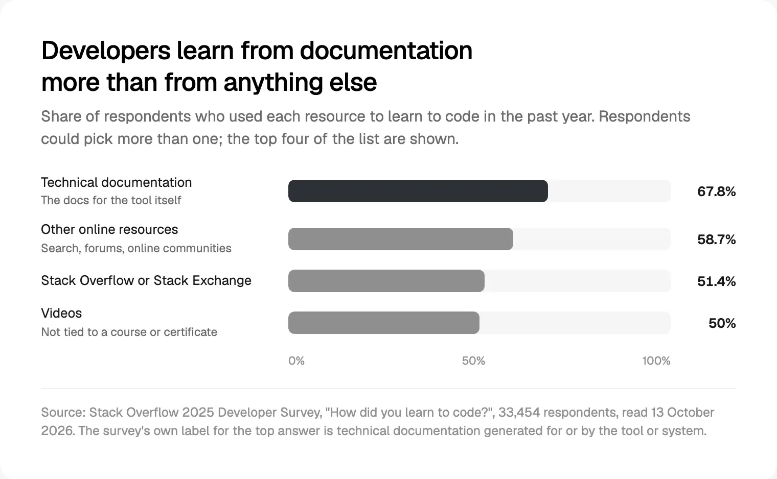
For any product with an API, the documentation is a sales page. The developer evaluating you reads the quickstart before the sales deck. In the Stack Overflow 2025 Developer Survey, 67.8% of 33,454 respondents had used technical documentation to learn to code in the past year.
What I saw. Resend's docs open with one sentence on what Resend is and quickstarts for more than ten languages and frameworks, and the homepage carries a real code sample with a tab for each SDK. Supabase's docs start with connecting a framework, then the backend, then migration guides for teams arriving from another provider, with a set-up prompt to copy into an AI coding assistant. Plaid's docs give every product a one-line description of what it does, which doubles as a product overview.
My reading, not a measured trend: docs written for coding agents, like Supabase's prompt and Clerk's copyable agent prompt, are the newest form of this pattern. I'd treat them as a bonus on top of good human docs.
Take this. Docs in the main menu, one real first call on the homepage in your buyer's language, and a one-line description for every product or endpoint.
Skip that. Docs with a different design and search from the marketing site, and a code sample that doesn't run. Developers copy it straight away, and it becomes the first promise you break.
6. A sign-up path for each kind of buyer
A SaaS site sells to several people: the developer who tries it, the manager who budgets for it, the person who signs. Each needs a door, with the self-serve one easiest to find.
What I saw. Deel's homepage asks what you'd like to do and offers five choices, such as hiring anywhere or running payroll, before its demo button. Brex's homepage asks for one thing in the hero, a work email, in a field marked for email autofill. PostHog's homepage offers developers a terminal command instead of the browser sign-up. Plaid's homepage ends with a sales form whose fields carry autocomplete values (name, email, organisation, phone), with the phone number marked optional.
Take this. One field to start, the right input type and autocomplete value on every field (MDN documents the autocomplete attribute), and a quieter second door for sales. Let paste and password managers work: the W3C's guidance on WCAG 2.2 Accessible Authentication (Minimum), level AA, says blocking them in sign-in fields fails unless another way in exists.
Skip that. A long demo form as the only way in, and "Start free" and "Book a demo" as twin buttons of equal weight.
What I check when I design a SaaS website
I run this list in the first week of a SaaS website project with me, on the client's current site and a few sites their buyers also visit.
- The five-second read. I show the first screen to someone outside the industry and ask what the company sells. If they can't say, pattern 1 comes first.
- The menu. Pricing, Customers, Security and, for any product with an API, Docs, one click from every page.
- Every product image. From the real product or its components. No invented dashboards.
- Every number. A source and a date, on the page or in a footnote.
- The pricing page. Entry limits, the billing unit, a spend cap and one worked example.
- The sign-up paths. One per buyer, tested on a real iPhone and Android phone with autofill and a password manager.
- Speed. Google's Core Web Vitals thresholds call a Largest Contentful Paint of 2.5 seconds or less good, an Interaction to Next Paint of 200 milliseconds or less and a layout shift score of 0.1 or less, at the 75th percentile of visits. Heavy product demos and autoplay video usually cause the misses.
- Who edits it next year. Collections for what marketing changes most: customers, integrations, changelog, posts. The platform follows from that; I explain how I choose between Framer, Webflow or Next.js for a startup site.
If you're also weighing new CSS, AI search and accessibility changes, my web design trends for 2027 on SaaS sites covers what I'd use and skip.
How a SaaS website differs from a landing page
The patterns overlap, but the jobs differ. A landing page serves one visitor from one source, with one action. A SaaS website is visited many times, by several people at the same company, over weeks of evaluation.
| Landing page | SaaS website | |
|---|---|---|
| Who arrives | One visitor, from one ad or launch | Several buyers from one company, many times |
| The job | One action | Answer every buyer's questions, then a door each |
| Pages that matter | One | Home, pricing, docs, security, customers, changelog |
| Who edits it | Often one marketer, once | Marketing, product and developers, every week |
That's why patterns 5 and 6 rarely appear in landing page lists: docs and several doors only matter when the same company comes back.
Where I would start
Open your site next to three of the sites above and score it on the six patterns, one point each. The gaps I fix first are usually the headline answer and the pricing page, because every buyer brings those two questions. Then proof, then the sign-up paths, then the docs.
If you'd rather hand it over, a project starts with a free 30 minute intro call, then a written scope and one fixed quote, with no retainer. I work in weekly design sprints in Figma, with a Slack update every 48 hours and a review call each week, and build in Framer, Webflow or Next.js. See my website design work for SaaS and B2B teams, or read more about me.
Frequently asked questions
What are good SaaS website examples to study?
Study each site for one pattern rather than copying it whole. On 13 October 2026, Resend and Replicate said what they were in a few words, Clerk showed its real components in the hero, PostHog's pricing led with free limits, Vercel paired claims with customer facts and Deel routed visitors by intent. These sites change often, so check again.
What should a SaaS homepage include?
A headline that says what the product is and who it's for, a real view of the product, proof beside the claims it supports, routes to pricing, docs and security, and a sign-up path for each buyer. Keep the first screen fast: Google calls a Largest Contentful Paint of 2.5 seconds or less good.
Should a SaaS website show pricing?
Yes, if any part of it is self-serve. State the entry limits, define the billing unit and offer a spend cap. If pricing depends on usage, NN/g's long-standing advice is to show sample prices for typical customers, not only a calculator. Sales-led tiers can say what decides the price instead of a bare contact form.
How is a SaaS website different from a landing page?
A landing page serves one visitor with one action, usually from one campaign. A SaaS website serves several people at the same company over weeks: the user, the manager and the person who signs. It needs pricing, docs, security and customer pages, a menu that is part of the pitch, and a way in for each buyer.
Do SaaS websites need documentation on the marketing site?
If the product has an API or integrations, yes: link Docs in the main menu, in the same design and search as the marketing site. In Stack Overflow's 2025 Developer Survey, 67.8% of respondents had learned to code from technical documentation in the past year, so docs are often what a technical evaluator reads first.
How many calls to action should a SaaS website have?
One primary action per page, usually the self-serve start, repeated in the same words, plus a quieter secondary action for sales or a demo. On the homepage, a short chooser that routes visitors by intent, as Deel's does, can replace a row of competing buttons. Twin buttons of equal weight make the visitor choose, and some choose neither.
Can I copy another SaaS company's website design?
Copy the pattern, never the page. Proof beside a claim, a pricing card with its limits stated or a code sample in the hero are ideas anyone can use. The words, images, logos and illustrations belong to that company, and a site built from someone else's parts tells buyers you can't describe yourself.
Sources and method
I opened every example page on 13 October 2026 and read its visible text and, for forms, its HTML. I reproduce no screenshots, copy or logos, and rank no company against another. Figures for PostHog, Clerk, Supabase and Brex are their own statements. Gartner's B2B buying research page refused my requests, so I left it out.
- Nielsen Norman Group, Show Prices for Common Scenarios, Jakob Nielsen, 9 April 2006, read 13 October 2026: nngroup.com
- Stack Overflow, 2025 Developer Survey, Developers section, how did you learn to code, read 13 October 2026: survey.stackoverflow.co
- Federal Trade Commission, final rule banning fake reviews and testimonials, 14 August 2024, read 13 October 2026: ftc.gov
- Google Search Central, SoftwareApplication structured data, read 13 October 2026: developers.google.com
- web.dev (Google), Web Vitals, read 13 October 2026: web.dev
- W3C, Understanding WCAG 2.2 success criterion 3.3.8, Accessible Authentication (Minimum), read 13 October 2026: w3.org
- MDN Web Docs, the HTML autocomplete attribute, read 13 October 2026: developer.mozilla.org
- Example pages, opened 13 October 2026: Resend resend.com and its docs resend.com, Replicate replicate.com, Clerk clerk.com and its pricing clerk.com, Attio attio.com, ElevenLabs elevenlabs.io, PostHog posthog.com and its pricing posthog.com, Supabase pricing supabase.com and docs supabase.com, Vercel vercel.com, Brex brex.com, Plaid plaid.com and its docs plaid.com, Deel deel.com
Tags: Website design, SaaS, Developer tools, Fintech, AI products, Pricing pages