

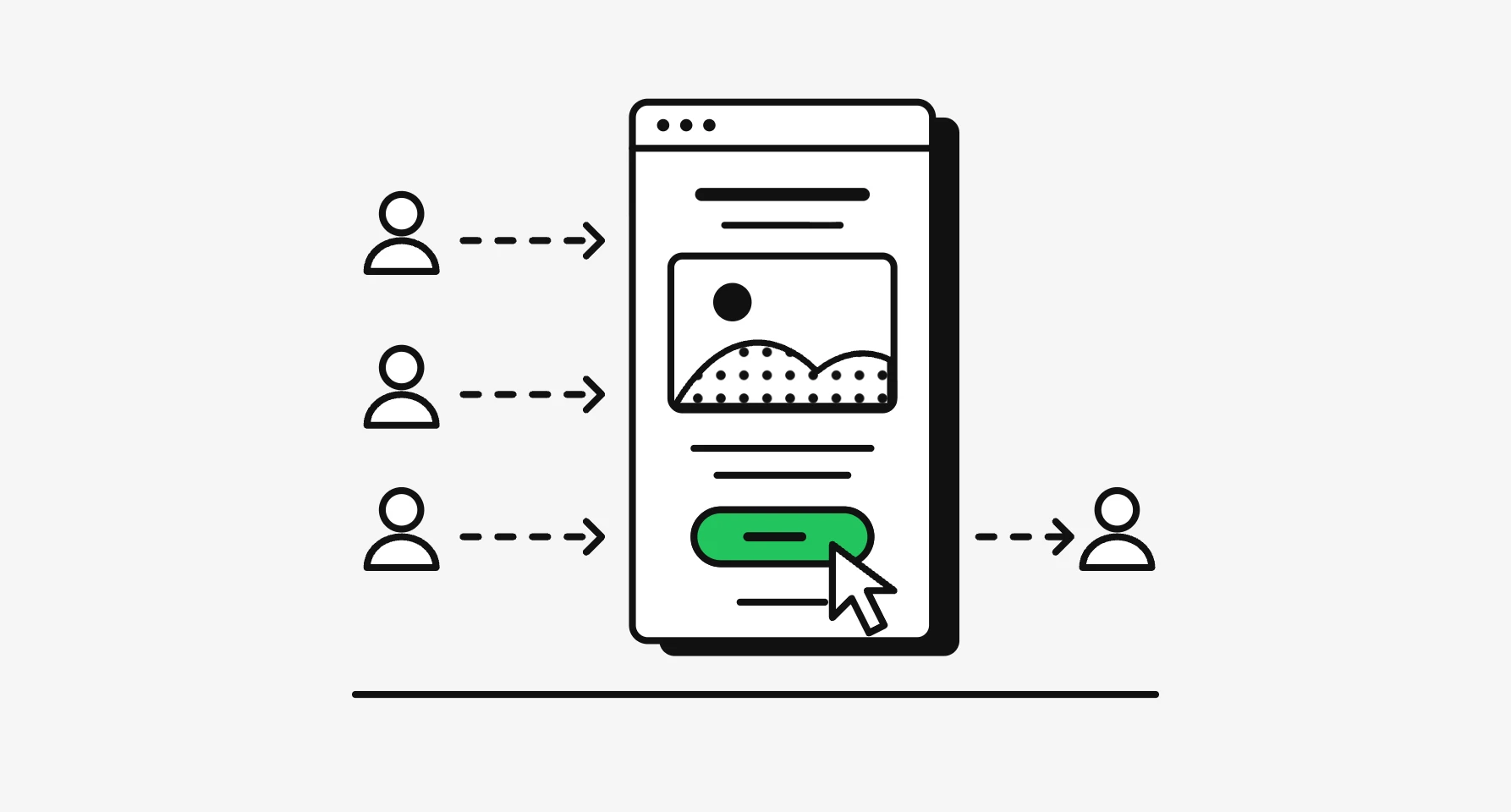
Good landing page copywriting is mostly not writing. It's finding the words your customers already use, putting them in the order a visitor's doubts arrive, and cutting the rest. The headline says what the product is and who it's for. Proof sits beside each claim, objections get answered in the order people raise them, and the button says what happens when you press it.
That's how I work when founders hire my landing page design services: words first, then the wireframe, then the visual design, because the layout depends on what the copy has to carry.
It's for founders, marketers and product leads writing a page, briefing one, or fixing one that doesn't convert.
The landing page copywriting structure I start from
Every block on a landing page answers one question a visitor has, so I list the questions before writing, then give each block one job. The page below is invented (online booking for small physio clinics), so you can see the roles without anyone's real wording.
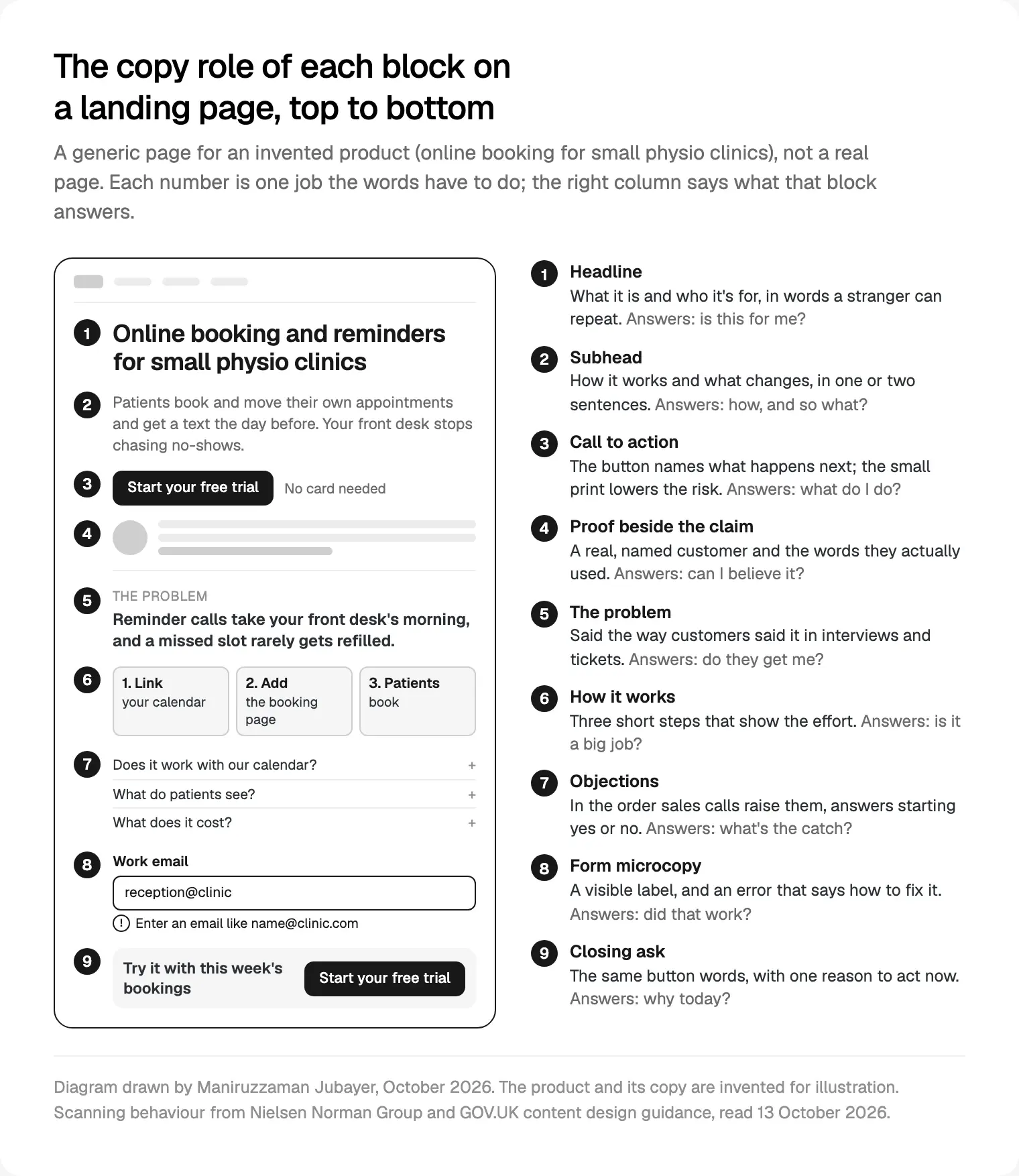
The order matters because of how people read. In Jakob Nielsen's How Users Read on the Web (1997), 79% of test users scanned any new page and only 16% read word by word. NN/g's F-shaped pattern research (2017) found people on unformatted text mostly read the top and the left edge. GOV.UK's guidance on creating a clear structure says most people read only 20 to 28% of a page's text.
So I write headings, buttons and first sentences so that someone who reads only those still gets the argument. For how live pages lay these blocks out, see eight landing page patterns with live examples; this post is about the words inside them.
Where the words come from: customers, not a brainstorm
The best line on most pages I've worked on was said by a customer first. Founders know their product too well to describe it as a stranger would; customers describe the problem and the old way in phrases a new visitor recognises.
GOV.UK's guidance on using clear language says to use the words your users know and use themselves, and to check common search terms to find them. So before I write, I ask the founder for the raw material.
| Source | What I look for | Where it usually goes |
|---|---|---|
| Customer interviews | How they describe the problem, in their words | Problem block and headline |
| Support tickets and chat | Setup fears, "does it work with" questions | Objections and how it works |
| Sales call notes | Questions asked before buying, in order | FAQ order |
| Reviews of your product | The outcome people mention unprompted | Proof beside the claim |
| Search and ad queries | The plain name people give the category | Headline and page title |
I paste phrases into a message sheet with their source, how often they came up and the block they belong to. A phrase from five tickets beats a clever line from a workshop. With no customers yet, I run a few short calls with people in the target group.
The headline and subhead: what it is, and who it's for
A visitor from an ad reads the headline with nothing around it. NN/g's guide to writing headlines and microcontent (2017) says headlines should work out of context, front-load the key phrase and tell readers something useful.
My test: the headline names the thing (a booking tool, a payroll app) and who it's for. Clever comes third, if at all. I write ten or more options, read each aloud as a stranger would, and drop any that need the subhead to make sense.
The subhead says how it works and what changes, in one or two sentences with concrete nouns. Under "Online booking and reminders for small physio clinics", it says patients book and move their own slots and get a text the day before, so the front desk stops chasing no-shows.
Then I test both. Digital.gov's guide to testing for understanding describes paraphrase testing, where people read text and say what it means in their own words. My light version: show the first screen to three or four people in the target group for a few seconds and ask what the product does. If they can't say, it isn't done.
Proof next to every claim
A claim with nothing beside it reads as marketing; with a named customer, a screenshot or a sourced number, it reads as a fact. So every promise gets its evidence in the same block, and the two must match. If the claim is "works with your calendar", the proof is the list of calendars, not a star rating.
NN/g's Concise, Scannable and Objective study (John Morkes and Jakob Nielsen, 1997) shows what promotional language costs. It gave 51 users five versions of one seven page site. Removing the promotional language alone scored 27% better on an overall usability measure (task time, errors, memory and satisfaction); concise, scannable and objective together scored 124% better.
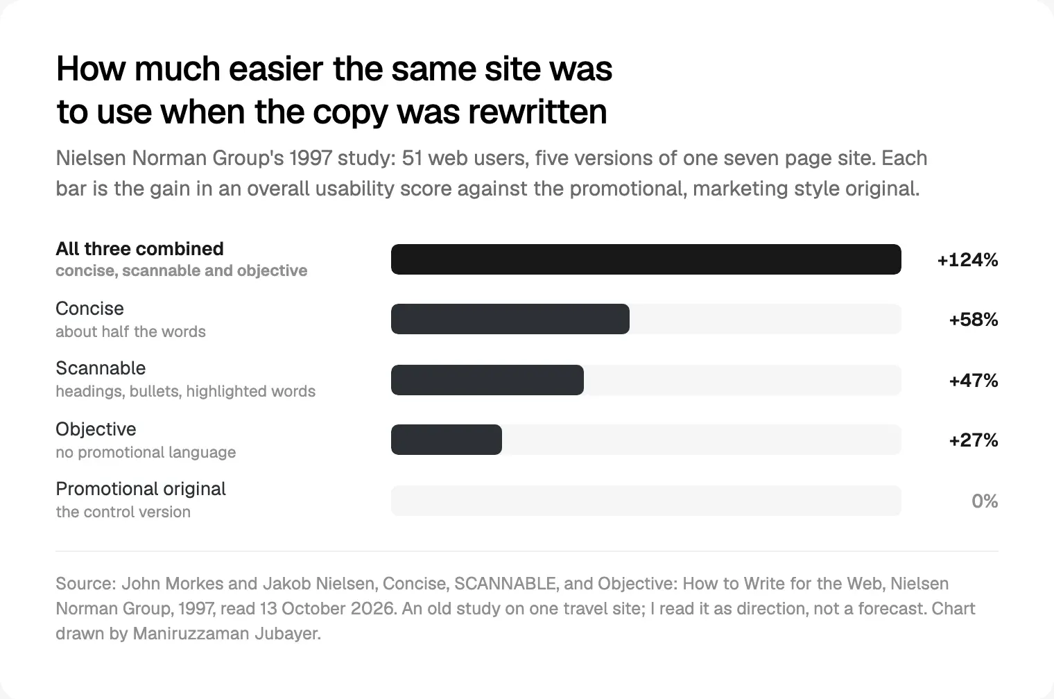
It was one travel site, decades ago, so I read it as direction, not a forecast.
Testimonial copy and the rules behind it
Testimonials are where page copy most often crosses a legal line, usually by accident. Three rules shape how I edit them.
Quotes stay true. The FTC's Endorsement Guides, revised in 2023, say in 16 CFR 255.1 that endorsements must reflect the endorser's honest opinion and experience, and can't be presented out of context or reworded to distort it. Quotation marks signal exact words, so if I shorten a quote, the customer approves the edit.
A standout result implies a typical one. Under 16 CFR 255.2, a testimonial about a key attribute will likely be read as what customers generally achieve. Without evidence that it's typical, the ad must clearly disclose the generally expected result. One clinic's dramatic drop in no-shows needs data across customers or an honest line about typical results.
No fake or undisclosed reviews. The FTC announced its final rule banning fake reviews and testimonials on 14 August 2024, and the Federal Register notice made it effective on 21 October 2024. The rule, 16 CFR Part 465, covers fabricated testimonials, reviews bought for a set sentiment and undisclosed insider reviews, and the notice says AI-generated reviews are covered. In the UK, the CMA published its fake reviews guidance on 4 April 2025 for the law changes that month; traders who publish reviews must take reasonable steps to prevent and remove fake and concealed incentivised ones.
I'm not a lawyer, so on regulated products I flag testimonial lines for the client's counsel. Every brief says: real people, real words, written permission, connections disclosed.
Objections, answered in the order people raise them
After the first screen, the copy answers the doubts that stop a click. I take them from sales call notes and tickets, count them, and order them as they come up. Usually: is this for someone like me, does it work with what I use, how much setup, what does it cost, and what happens to my data.
A three step "how it works" answers the effort question better than any FAQ line. The rest go in an FAQ near the end, in the visitor's words, answers starting yes or no. GOV.UK's guidance on writing for user interfaces says that if you find yourself explaining how the interface works, fix the interface. Same for a page: an FAQ answer that runs to a paragraph points to a gap in the story above it.
Price is the objection founders most want to dodge. Show a simple price; for a complex one, say what decides it. I covered pricing page patterns and billing FAQs separately.
Call to action wording: name what happens next
My rule for buttons: the label names the result, not the act. "Start your free trial", "Book a demo" and "See plans" each say what's on the other side.
NN/g's "Get Started" Stops Users (Aurora Harley and Kim Flaherty, 2017) explains the cost of the vague version: it can draw clicks, then drop people into a survey or sales flow they didn't expect, which erodes trust. GOV.UK's interface guidance trims further: "apply", not "apply now".
Three more rules I hold to:
- Same words everywhere. The hero button and the closing button match, so nobody wonders whether they lead to different places.
- Small print touching the button. "No card needed" or "Cancel any time" sits right beside it, and only if true.
- The visible label is the accessible name. WCAG 2.2's Label in Name criterion asks that a control's accessible name contains its visible text, so voice control users can say what they see.
Forms and microcopy: the words that close the deal
Form copy decides whether the click becomes a lead, so I write it with the rest of the page, not last.
Every field gets a visible label. NN/g's Placeholders in Form Fields Are Harmful (Katie Sherwin, 2014) explains why placeholder text can't stand in: it vanishes as people type, so they can't check what the field wanted, and it's often low contrast.
Errors follow NN/g's error message guidelines (Tim Neusesser and Evan Sunwall, 2023): next to the field, plain words, a suggested fix, the person's input kept, and no blame. "Enter an email like name@clinic.com" beats "Invalid input".
Then the small lines: what you'll send to that email, the consent text, and what happens after submitting. For input types and tracking, the checklist I run before launch covers what I test on real phones.
A before and after rewrite
Here's the first screen and one section of the invented physio product. The "before" shows common habits, not anyone's real page.
| Block | Before (invented) | After (invented) | What changed |
|---|---|---|---|
| Headline | The smarter way to run your clinic | Online booking and reminders for small physio clinics | Names the product and the reader |
| Subhead | Our intelligent all-in-one platform transforms how modern practices manage their day | Patients book and move their own appointments and get a text the day before. Your front desk stops chasing no-shows. | How it works and what changes |
| Button | Get started | Start your free trial, with "No card needed" beside it | Names the result, lowers the risk |
| Section body | Innovative technology. Best-in-class support. Trusted by clinics everywhere. | Reminder calls take your front desk's morning, and a missed slot rarely gets refilled. Patients pick a time on your site and move it themselves if something comes up. | The problem in customers' words, then the fix |
| Proof | Five stars with no source | A named clinic owner's words, used with permission | Matched to the claim, and true |
"Trusted by clinics everywhere" goes because nothing stands behind it; a real number would go in with its source. The "after" is longer in places; every word still does a job.
Cutting: the last pass
Once the draft is complete, I cut. Nielsen's 1997 advice was half the words of conventional writing, or fewer. Hoa Loranger's Plain Language Is for Everyone, Even Experts (NN/g, 2017) suggests sentences of about 15 to 20 words and a reading level around US grades 6 to 8 for general audiences. GOV.UK's clear language page cites research where 80% of people preferred clear English, more so the more specialist they were.
My cutting pass, in order:
- Read only headings, buttons and first sentences. If the argument breaks, fix those first.
- Delete every sentence that restates the one before.
- Swap adjectives for the fact behind them, if you can source it.
- Turn nouns ending in -tion and -ment back into verbs.
- Check every claim has proof beside it, or remove the claim.
- Read the page aloud on a phone. Wherever you stumble, shorten.
On landing pages I write and build, copy lives in a shared document your team can comment on, and the real headline sits in the wireframe, not lorem ipsum, so late cuts don't leave holes.
Where I would start
Read only your headline, subhead and button on a phone, and ask someone outside the company what the product does. If they can't say, rewrite those three with phrases from your last ten support tickets or sales calls. Then check proof beside each claim, the order of your objections and your form errors.
If you'd rather hand it over, a project starts with a free 30 minute intro call, then a written scope and one fixed quote for the whole page, with weekly design sprints in Figma and a Slack update every 48 hours. On the FundFlo finance SaaS landing page, I designed the hero for phones as well as desktop, so the headline and subhead read in full on a small screen. See my landing page copywriting and design work.
Frequently asked questions
What is landing page copywriting?
It's writing the words on a page built for one action, such as starting a trial or booking a demo: headline, subhead, proof, objections, buttons and form microcopy. The aim is that someone who only scans still knows what the product is, who it's for, why to believe it and what to do next.
How do you structure landing page copy?
Start from the visitor's questions in order: is this for me, how does it work, can I believe it, what's the catch, and what do I do now. Give each block one of them. A typical order is headline, subhead, button with small print, proof, the problem, how it works, objections, the form and a closing ask.
How do you write a good landing page headline?
Name the product and who it's for, in plain words, key phrase first. Write ten or more options and read each as a stranger arriving from an ad. Then show the first screen to a few people in your target group for a few seconds and ask what it does. If they can't say, rewrite it.
What should a call to action button say?
Say what happens when it's pressed: "Start your free trial", "Book a demo", "See plans". NN/g found generic labels like "Get started" can draw clicks and then surprise people, which costs trust. Use the same words every time the button appears, with a true risk reducer such as "No card needed" beside it.
Can I edit customer testimonials on my landing page?
Only without changing their meaning, and inside quotation marks only once the customer approves the exact words. The FTC's Endorsement Guides say testimonials can't be taken out of context or reworded to distort them, and since 21 October 2024 its rule bans fake reviews and testimonials. Get written permission.
Can I use AI to write landing page copy?
For drafts, variations and cutting, yes; I use AI tools where they save time. But AI can't supply your customers' words or your proof, and those carry the page. Never use it to produce reviews or testimonials: the FTC's 2024 rule covers AI-generated ones. A person who knows the product should approve every line.
Sources and method
I read every source below on 13 October 2026. The physio product and all its copy are invented. I treat NN/g's 1997 numbers as direction. The FTC's site refuses scripted link checks, so I read its press release through a fetch tool and the regulations at Cornell's Legal Information Institute. This isn't legal advice.
- Nielsen Norman Group, How Users Read on the Web, Jakob Nielsen, 30 September 1997, read 13 October 2026: nngroup.com
- Nielsen Norman Group, F-Shaped Pattern of Reading on the Web, Kara Pernice, 12 November 2017, read 13 October 2026: nngroup.com
- Nielsen Norman Group, Concise, Scannable and Objective, John Morkes and Jakob Nielsen, 1997, read 13 October 2026: nngroup.com
- Nielsen Norman Group, Microcontent, Hoa Loranger and Jakob Nielsen, 29 January 2017, read 13 October 2026: nngroup.com
- Nielsen Norman Group, "Get Started" Stops Users, 20 August 2017, read 13 October 2026: nngroup.com
- Nielsen Norman Group, Plain Language Is for Everyone, Even Experts, 8 October 2017, read 13 October 2026: nngroup.com
- Nielsen Norman Group, Placeholders in Form Fields Are Harmful, 11 May 2014, read 13 October 2026: nngroup.com
- Nielsen Norman Group, Error-Message Guidelines, 14 May 2023, read 13 October 2026: nngroup.com
- GOV.UK, Writing to GOV.UK standards: clear structure and clear language, read 13 October 2026: guidance.publishing.service.gov.uk, guidance.publishing.service.gov.uk
- GOV.UK Service Manual, Writing for user interfaces, read 13 October 2026: gov.uk
- Digital.gov (US GSA), plain language guide: test for understanding, read 13 October 2026: digital.gov
- Federal Trade Commission, final rule banning fake reviews and testimonials, press release, 14 August 2024, read 13 October 2026: ftc.gov
- Federal Register, Trade Regulation Rule on the Use of Consumer Reviews and Testimonials, 22 August 2024, read 13 October 2026: govinfo.gov
- Legal Information Institute, 16 CFR Part 465 and 16 CFR 255.1 and 255.2, read 13 October 2026: law.cornell.edu, law.cornell.edu, law.cornell.edu
- Competition and Markets Authority, Fake reviews guidance (CMA208), 4 April 2025, read 13 October 2026: gov.uk
- W3C, Understanding WCAG 2.2 success criterion 2.5.3, Label in Name, read 13 October 2026: w3.org
Tags: Landing pages, Copywriting, Content design, Forms, Conversion