The best mobile app onboarding examples share one habit: they get out of the way. Instead of a welcome carousel, good apps open on the main task, ask for a permission when a feature needs it, ask for an account when there is something to save, and show the paywall after the first result. Around that sit system sign-in and passkeys, a question or two that changes the first screen, single tips and empty screens that explain themselves.
Apple asks for onboarding that is "fast, fun, and optional", and Android says to ask for permissions "in context". Below, each pattern gets the platform rule, a real app I checked, and how I'd design it.
This is for founders comparing mobile app design services and product leads planning an app's first session on iOS or Android. For web products, see my guide to onboarding design for web SaaS products.
Mobile app onboarding examples at a glance
I name an app only where its developer's own pages describe the flow, checked on 13 October 2026. Otherwise I describe the pattern alone, because onboarding screens change often.
| Pattern | Use it when | What the platform says | Example I checked |
|---|---|---|---|
| No onboarding | The main task is obvious | Apple: fast, fun, optional; Material: Quickstart | Shazam |
| Permission priming | A feature needs the camera, location or notifications | Apple: ask when people use the feature; Android: ask in context | Shazam (microphone asked on first use) |
| Account deferred | Value comes before anything worth saving | Apple: "Delay sign-in for as long as possible" | Shazam (with or without an account) |
| System sign-in and passkeys | You need an account | Apple: prefer passkeys; Android: one Credential Manager sheet | PayPal (passkeys in its iOS app) |
| Personalisation questions | Answers change what people see first | Material 1: fewer than ten choices on one screen | Apple Music |
| Progressive tips | A feature isn't obvious but is simple | Apple: tips for tasks of three actions or fewer | Pattern only |
| Empty states that teach | A screen starts with nothing in it | Material 1: starter or educational content | Pattern only |
| Paywall after value | You sell a subscription | Apple: experience first; Google Play: full terms, visible dismiss | Pattern only |
No onboarding at all: open straight onto the task
Apple's onboarding guidance (last changed 10 June 2024) opens with the line I quote most: ideally, people understand your app simply by using it. It asks for interactive teaching, reasonable defaults instead of setup, and any tutorial skippable and findable later in settings.
Google's older Material Design onboarding page calls this Quickstart: people land directly in the interface, on the first key action. Material 1 is no longer maintained, so I treat it as useful history, not current rules.
Nielsen Norman Group's analysis of mobile-app onboarding (June 2020) recommends skipping onboarding where possible. It justifies it when the app needs information to start, depends on personal context, or has a truly unfamiliar feature.
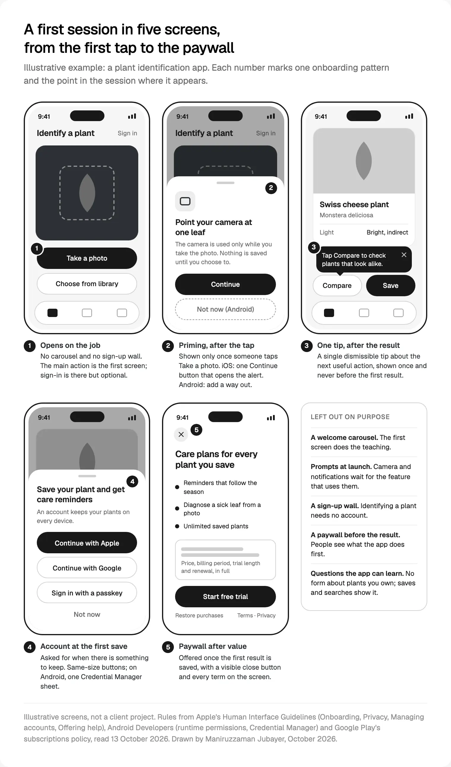
Example: Shazam. Apple's Shazam User Guide says you identify a song by opening the app and tapping the Shazam button, and that first-time users follow onscreen instructions for microphone and location access. Shazam's privacy summary says you can use it with or without an account. One button, one job, and every request arrives when the job needs it.
Testing the bare app is the first step in how I design the first session of an iOS and Android app: if people find the first action unaided, onboarding leaves the scope.
Permission priming before the system prompt
Priming means a short screen of your own, before the system dialog, saying what the access is for. iOS and Android disagree on one detail.
Apple's privacy guidance says to wait until people use the feature, and to avoid launch-time requests unless the app can't work without the data, as a navigation app can't without location. A custom screen before the alert gets one button, labelled "Continue" or "Next", not "Allow", and no way to leave without seeing the alert.
Android's guide to requesting runtime permissions (updated 1 October 2026) says the opposite: always let people cancel an explanation screen. It shows that screen when shouldShowRequestPermissionRationale() returns true, usually after a first refusal, and warns that after more than one Deny, the dialog stops appearing.
| iOS | Android | |
|---|---|---|
| When to ask | When people first use the feature | When people start to interact with the feature |
| Your own screen first | Optional; one button that opens the alert | When the system says a rationale is due; include "No thanks" |
| After a no | Offer another route, such as typing an address (5.1.1(iv)) | Degrade gracefully; don't nag |
| Notifications | Provisional authorisation can send quiet trial notifications | Runtime permission on Android 13 and later |
Apple's notification permission article suggests asking after, say, someone schedules a first task, and describes provisional authorisation: quiet notifications in Notification Center with Keep and Turn Off buttons, so people decide after seeing one. Android's notification permission page lets apps targeting Android 13 choose the moment, suggesting a related tap or the third or fourth launch; apps targeting 12L or lower get the dialog at startup.
In React Native or Flutter, I design one priming component with a platform switch: one Continue button on iOS, the same copy plus "Not now" on Android. Every permission also gets a refused state in Figma, with the other route drawn. My design fixes that avoid App Store rejection cover purpose strings.
Account creation deferred until there is something to keep
Apple's guidance on managing accounts is plain: ask for an account only if core functionality needs it, and "Delay sign-in for as long as possible". Its example is a shopping app asking at purchase. The Sign in with Apple guidance goes further: let people buy as a guest, then offer an account on the order confirmation page.
App Review guideline 5.1.1(v) (updated 8 June 2026) makes it a rule: without significant account-based features, people must be able to use the app without a login.
Shazam again: its privacy summary says that without an account your data sits against an anonymous Shazam ID, and reinstalling removes your history. That's the honest trade: the account is offered for what it adds, not demanded at the door.
Sign in with Apple, Google and passkeys on one screen
The fastest sign-up is the one the phone already knows. Apple says that if you don't use Sign in with Apple, you should prefer a passkey and name the method on the button ("Sign In with Face ID"). Its Sign in with Apple page adds: welcome people straight in, never ask for a password, and ask for optional details later.
On Android, Credential Manager puts passkeys, passwords and Sign in with Google in one bottom sheet over your app. Google's passkey design guidance (updated 14 October 2024) asks for passkeys as the default sign-up, other options kept, a button labelled "Create a passkey", the benefit before the word, and an offer right after a password sign-in. It says not to show a separate button per method. On Android 15, creating one takes a single tap.
Example: PayPal. PayPal's help article on passkeys lists the PayPal app on iOS 16 or later among the places you can use one, and says a lost phone doesn't lock you out: you can still log in with your password or a one-time passcode.
Offer Google sign-in on iOS and guideline 4.8 usually applies too. My diagram's iOS sheet has three equal buttons; on Android it's one Credential Manager call. Why passkeys keep gaining ground is in my mobile app design trends for 2027.
Personalisation questions that change the first screen
A question earns its place only if the answer changes what people see next. Material 1's Self-Select guidance gives three tests I still use: a noticeable difference, nothing normal use would reveal, and one screen with fewer than ten choices. NN/g agrees: skill level can belong in onboarding; a colour theme doesn't.
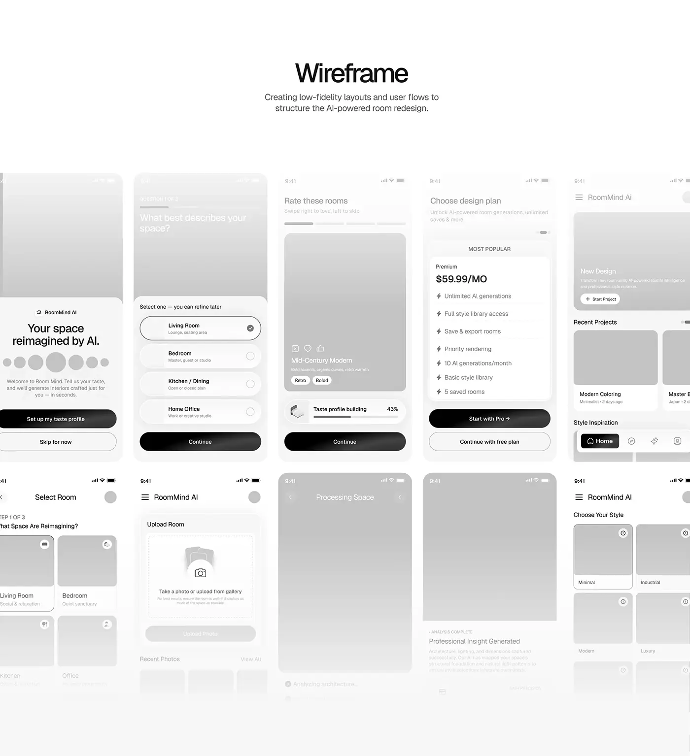
Example: Apple Music. Apple's iPhone User Guide says that when you first tap Home, Apple Music asks what you like: tap the genres you like, double-tap those you love, then do the same with artists. Two details I'd copy: the questions come when you first open the screen they shape, not at install, and you can later turn off Use Listening History.
Progressive tips instead of a tour
Apple's guidance on offering help (tips added 12 September 2023) is the most practical text here. A feature needing more than three actions is probably too complicated for a tip. Keep tips to one or two sentences, show them only to people who haven't used the feature, and space them out, for example once every 24 hours. Apple's TipKit framework, from iOS 17, handles those rules in code.
My tip list has one row per tip: its trigger event, the sentence, where it points, and when it retires. Past five tips in the first week, I treat it as a design problem. On Android or cross-platform, the same rules go into one shared tip component.
Empty states that teach
On mobile, the empty state often is the onboarding. Material 1's empty states pattern offers starter content people can delete, or short educational content they can dismiss. On iOS 17 and later, SwiftUI's ContentUnavailableView gives you the system's empty-state layout.
Phones add two cases. The first launch may be offline, so Apple advises shipping enough content that nobody waits for downloads. And a refused permission needs its own words: not "Nothing here yet" but "Photos are off for this app. You can still take a new photo." I keep three versions of every empty screen in Figma: first use, cleared, and blocked.
Paywalls placed after the first result
Apple's onboarding guidance settles it: prefer letting people experience your app before prompting them for ratings or purchases. Guideline 3.1.2(c) adds that, before asking people to subscribe, you should clearly describe what they get for the price.
Google Play's subscriptions policy lists what a paywall must show: cost, billing period, renewal terms and whether a subscription is needed at all; for a trial, its length, the later price, when it converts and how to cancel. Its non-compliant examples read like common paywalls: a hidden dismiss button, an annual plan shown only monthly, an introductory price without the later one.
How I place it:
- After the first result, at the first save or paid feature, as in screen 5.
- A close button people can see, never faded out.
- Every term in readable type, with Restore purchases, Terms and Privacy under the button.
- If the whole app is paid, I say so before any question screen.
How I measure a mobile onboarding flow
Google Analytics logs first_open automatically at the first launch after install, and its recommended events include tutorial_begin and tutorial_complete, useful only if you keep a tutorial.
| Event | Where it fires | What it answers |
|---|---|---|
first_result (custom) | The first time the core job succeeds | Did people reach value, and how fast? |
permission_prompt (custom) | Your priming screen and the system result | Which permissions people refuse, and on which screen |
sign_up with a method | Account created | Which sign-in method people pick |
paywall_view (custom) | Paywall shown | How many saw the price after a result |
The custom names are mine; settle yours before the build. The number I watch first is the share of new installs reaching first_result in their first session.
Where I would start
If your first session needs work, I'd go in this order:
- Install your app on a clean phone and time the path to the first useful result, counting every screen, field and prompt.
- Delete what that result doesn't need: carousels, launch-time prompts, sign-up walls.
- Move each permission to the tap that needs it, and draw its priming and refused states for iOS and Android.
- Move the account to the first save, with system sign-in and passkeys.
- Keep only questions that change the first screen, write the empty states and tips, and move the paywall after the first result.
- Add the events above and compare the next cohort with the last.
I do this in the first sprint of an app project, because every other screen depends on it. I work in weekly Figma sprints and can build it in React Native or Flutter. Start with a free 30 minute intro call about my mobile app design work with founders, then I write a scope and one fixed quote.
Frequently asked questions
What is mobile app onboarding?
Mobile app onboarding is everything between the first launch and the first useful result: the first screen, permission requests, sign-up, setup questions, tips and the empty states a new user meets. Good onboarding is often nearly invisible. Apple's guidelines say people should ideally understand an app simply by using it, with any onboarding flow fast and optional.
What are good mobile app onboarding examples?
Shazam opens on one button, asks for the microphone on first use, and works without an account. Apple Music asks about genres and artists when you first open Home. PayPal offers passkeys in its iOS app, with a password or one-time code as fallback. Each asks only when the next step needs it.
How many onboarding screens should a mobile app have?
As few as testing allows, often none. Nielsen Norman Group recommends skipping onboarding where possible and improving the interface instead. For questions, Google's older Material guidance suggests one screen with fewer than ten choices. A tutorial should be optional, never shown again after a skip, and findable in settings.
Should an app ask for permissions during onboarding?
Usually not. Apple advises waiting until people use the feature that needs access and avoiding launch-time requests unless the app can't work without the data. Android says to ask in context, keep a cancel option on explanation screens, and degrade gracefully after a refusal. Navigation apps needing location are the classic exception.
Should users have to sign up before using an app?
Only when the app can't work without an account, as with a bank or a wallet. Apple tells developers to delay sign-in as long as possible, and App Review guideline 5.1.1(v) requires access without a login if the app has no significant account-based features. Ask at the first save or purchase, and use Sign in with Apple, Google or a passkey.
Where should a paywall go in mobile app onboarding?
After people have seen what the app does, usually at the first save or the first paid feature. Apple's guidelines prefer letting people experience the app before asking for purchases. Google Play requires the price, billing period, renewal terms and trial details on the offer, and treats a missing or hard-to-see dismiss button as non-compliant.
How do you measure mobile app onboarding?
Track the share of new installs that reach the first useful result in their first session, and how long it takes. Google Analytics logs first_open automatically; add events for the first result, permission outcomes, sign-up method and paywall views, then compare each cohort with the last using the same window.
Sources and method
I read every source and checked every example page on 13 October 2026. Apps are named only where their developer's own help or privacy pages describe the flow; I didn't install them, and flows change. Material Design 1 is no longer maintained. The diagram is illustrative, not a client project. I found no independent onboarding benchmarks I'd trust, so there are none here.
- Apple, Human Interface Guidelines: Onboarding (changed 10 June 2024), Privacy, Managing accounts, Sign in with Apple, Offering help, date read 13 October 2026: developer.apple.com, developer.apple.com, developer.apple.com, developer.apple.com, developer.apple.com
- Apple, App Review Guidelines, updated 8 June 2026, date read 13 October 2026: developer.apple.com
- Apple Developer, notification permission, TipKit and ContentUnavailableView, date read 13 October 2026: developer.apple.com, developer.apple.com, developer.apple.com
- Android Developers, runtime permissions and notification permission (both updated 1 October 2026), date read 13 October 2026: developer.android.com, developer.android.com
- Android Developers, Credential Manager (updated 13 May 2026) and passkey UX guidelines (updated 14 October 2024), date read 13 October 2026: developer.android.com, developer.android.com
- Google, Material Design 1, onboarding and empty states (no longer maintained), date read 13 October 2026: m1.material.io, m1.material.io
- Google Play Console Help, subscriptions policy, date read 13 October 2026: support.google.com
- Google Analytics, automatic and recommended events (updated 16 September 2026), date read 13 October 2026: support.google.com, developers.google.com
- Nielsen Norman Group, mobile-app onboarding analysis (June 2020), date read 13 October 2026: nngroup.com
- Apple and Shazam, Shazam User Guide and privacy summary, date read 13 October 2026: support.apple.com, shazam.com
- Apple, iPhone User Guide, recommendations in Music, date read 13 October 2026: support.apple.com
- PayPal, help article on passkeys, date read 13 October 2026: paypal.com
Tags: Mobile apps, Onboarding, iOS, Android, Permissions, Passkeys