A real estate landing page is one page with one goal: get a buyer, seller or investor to take the next step on one offer, such as a new development, a listing or a free valuation. It needs a hero that names the offer and the place, real homes with price, bedrooms, bathrooms and size, the people who will help, proof a visitor can check, and one clear way to enquire that works on a phone.
I'm a design engineer: I design landing pages and build them in React and Next.js, the work behind my landing page design services. Below: what the page needs, common mistakes, my process, and a walkthrough of the Homelo real estate landing page I designed for a company that connects buyers with homes.
What a real estate landing page has to include
A hero that names the offer and the place. "Two and three bedroom apartments in a named district, with a viewing button" beats a slogan about dream living. People arrive from an ad or a search with one question; the first screen should answer it.
One primary call to action. Book a viewing, get the brochure or request a valuation. Pick one and repeat it down the page. A phone or WhatsApp button is fine if it serves the same goal.
Homes shown the way buyers compare them. A large photo, the name, a one-line description, the price, then bedrooms, bathrooms and size. A few homes shown well beat a long grid that turns the page into a portal.
The people. The consultant or agent who will answer, with a real photo. Buying a home means paperwork and legal steps, and visitors want to know someone will guide them.
Proof a visitor can check. Partner logos, reviews with the reviewer's face, name and role, and figures the company can stand behind.
Location and practical detail. A map or neighbourhood summary, floor plans for a development, and the answers buyers ask for: payment plan, handover, service charges.
A short form. Name, contact and one qualifying question are usually enough.
Speed. Property pages are heavy with photos. Google's Core Web Vitals set "good" at a Largest Contentful Paint within 2.5 seconds, an Interaction to Next Paint of 200 milliseconds or less and a Cumulative Layout Shift of 0.1 or less, at the 75th percentile of page loads. Oversized hero photos usually break the first one.
The rules that apply to real estate ads
This is general information, not legal advice; the rules depend on your country and licence.
In the US, 24 CFR 100.75 makes it unlawful to publish an advertisement for the sale or rental of a dwelling that "indicates any preference, limitation or discrimination because of race, color, religion, sex, handicap, familial status, or national origin". Its examples include "using words, phrases, photographs, illustrations, symbols or forms" that convey that dwellings are or aren't available to a group, and "selecting media or locations for advertising" that deny parts of the market information about housing.
For a designer that covers more than copy: who appears in lifestyle photos, phrases such as "perfect for young couples", and the ad targeting behind the page. I raise it in the intro call and leave final wording to whoever holds the licence. Other markets have their own rules; Dubai requires a permit for property ads, as my post on real estate website rules in Dubai explains.
If the page sits behind Google Ads, Google lists three parts of Quality Score: expected clickthrough rate, ad relevance and landing page experience, defined as "how relevant and useful your landing page is to people who click your ad". Google calls Quality Score a diagnostic, "not an input in the ad auction", but a page that matches the ad is still the cheapest fix most campaigns have.
Common mistakes on real estate landing pages
- Sending ad traffic to the homepage. Someone who clicked an ad for one development shouldn't have to find it.
- Too many choices. A full menu, five buttons and a search bar pull people away from the action you're paying for.
- Listings without the numbers. No price, size or bedroom count sends people elsewhere to find them.
- No people. Anonymous pages feel risky for a purchase this big.
- A long form up front. Budget, timeline and mortgage status before a single conversation lose enquiries.
- Unoptimised carousels that push the first screen past 2.5 seconds on a phone.
How I'd approach your real estate landing page
Every project starts with a free 30 minute intro call. I ask what the page is for (a launch, a listing, sellers or investors), where traffic will come from, what a good enquiry looks like, and who approves copy and photos. If the page isn't the real problem, I'll tell you.
After the call you get a written scope and one fixed quote for the whole project. No retainer, nothing billed by the hour. Then weekly design sprints in Figma:
- Research: the market, the audience and the competition.
- A problem and solution statement, so every section answers a real worry.
- A style guide, then the full page on desktop and mobile.
- Testing the paths that matter: browsing, saving a home and enquiring, on any device.
- Build and launch, if you want me to build it, in Next.js, with images sized for each screen and the form wired to your CRM or inbox.
You get a written update every 48 hours, a review call each week, and at handoff a documented design system named the same in Figma and in code. My landing page launch checklist lists the checks I run before a page goes live.
Case study: the Homelo real estate landing page
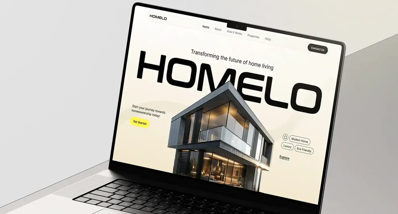
Homelo connects buyers with homes, from apartments and villas to commercial spaces. I designed its landing page from market research through testing to the final presentation. Buying a home is slow and full of paperwork, so the page had to make Homelo feel like the easy route: finding a property takes time, buyers don't always see a full set of listings, and visitors want proof and real homes before they get in touch.
The project took one week of research, a problem and solution statement on time, access and paperwork, two weeks of design, one week of testing and one week for the presentation. The style guide uses Urbanist with a bright yellow accent, alongside black, grey and white. The page answers a buyer's questions in order: who Homelo is, why trust them, who will help, and which homes are available.
Hero. The name runs in huge black capitals, with a modern glass house rising through the letters and "Transforming the future of home living" above. On the left, one line and a yellow Get Started button; on the right, tags for modern, luxury and eco friendly homes above an Explore link. The menu keeps five items.
About and key numbers. A short statement on transparency and integrity, then three large figures with short labels: years of experience, properties available and customers connected.
Consultants before listings. A carousel shows the consultants, with a meeting photo captioned "Here to guide you every step of the way". The problem I designed against was paperwork, so the people come before the homes.
Top property. A carousel with yellow arrows and a View All button. The open card shows a large photo, the name, a one-line description and the price, then icons for bedrooms, bathrooms and size. The cards either side stay as photos, so the row reads as a gallery, not a table.
Logos and reviews. Partner logos in two rows of outlined tiles, then review cards with five stars, a short title and the reviewer's photo, name and role.
Footer. Address, email, phone, a sitemap, articles and social links, with the Homelo name large across the bottom.
The delivery was the full page, tablet views of the property and consultant sections, and the style guide. See every screen in the Homelo case study.
What decides the cost of a real estate landing page
I don't publish prices, because the honest answer depends on scope. What moves it most:
- The offer: a development with floor plans and a payment plan is a different page from a seller valuation offer.
- Listings: a few fixed homes are simple; live listings from a feed or CRM need build time.
- Photography and renders: they matter more than any layout choice.
- Languages: each adds copy and checks, and right-to-left scripts need their own layout work.
- Integrations: CRM, WhatsApp, call tracking, analytics and ad pixels.
- Variants: separate pages per ad group or audience multiply the work.
For a market reference, the US Bureau of Labor Statistics puts the median annual wage at $104,000 for web and digital interface designers and $92,650 for web developers, both for May 2025. Those are employee wages, not project prices, but they show what skilled time costs in the US. Compare quotes against the same written scope.
How to choose who builds it
- See their real estate or landing page work on a phone, and ask why the sections are in that order.
- Ask who designs and who builds, and how the design reaches the live page intact.
- Ask what counts as a lead and where you'll see it. My guide to landing page conversion rates covers what to track.
- Ask who checks copy and photos against your market's rules.
- Ask who owns the page, domain and data at the end. It should be you.
To be plain about me: I design and build, I'm based in Dhaka on UTC+6 with evening calls for the Americas, and I don't run your ads or hold a property licence.
Frequently asked questions
What should a real estate landing page include?
A hero that names the offer and the place, one call to action, a few homes with photo, price, bedrooms, bathrooms and size, the consultants who help, logos and reviews with real faces, location detail and a short form.
What is the difference between a real estate website and a landing page?
A website serves every visitor with many pages and choices. A landing page serves one audience with one offer and one action, usually for a campaign, a launch or a valuation. Many companies need both.
How long does it take to design a real estate landing page?
Homelo took one week of research, two of design, one of testing and one for the presentation. Your timeline depends on the offer and content, and I agree it in the written scope.
Do Fair Housing rules apply to a landing page?
In the US, yes. 24 CFR 100.75 covers advertisements for the sale or rental of dwellings, including words, photographs and the media chosen. Check with your broker or lawyer; this isn't legal advice.
Can you design and build the landing page?
Yes. I design in Figma and build in React and Next.js from the design system I hand over, so the live page matches on every screen. A project starts with a free 30 minute intro call, then a written scope and one fixed quote.
Sources and method
I read every source on 1 November 2026. The NAR figure is from its release on the 2025 Profile of Home Buyers and Sellers, covering US transactions from July 2024 to June 2025. Nothing here is legal advice. Case study facts come only from the Homelo project.
- National Association of Realtors, First-time home buyer share falls to historic low of 21%, median age rises to 40 (4 November 2025), date read 1 November 2026: nar.realtor
- 24 CFR 100.75, Discriminatory advertisements, statements and notices, Legal Information Institute, date read 1 November 2026: law.cornell.edu
- Google Ads Help, About Quality Score for Search campaigns, date read 1 November 2026: support.google.com
- Google, Web Vitals, date read 1 November 2026: web.dev
- US Bureau of Labor Statistics, Occupational Outlook Handbook, Web Developers and Digital Designers (pay for May 2025), date read 1 November 2026: bls.gov
If you're launching a development, a listing campaign or a valuation offer, book a free 30 minute intro call. I'll look at the offer and the traffic with you and tell you what I'd put on the page first; if it's a fit, a written scope and one fixed quote follow. More on my landing page design services page.
Tags: Real estate, Landing pages, Case study, Fair Housing, Conversion