Arabic and RTL interface design: a practical guide for UAE products
How to design an interface that feels native in Arabic and English, from mirroring rules and Arabic type to numbers, icons and the parts that should never flip.

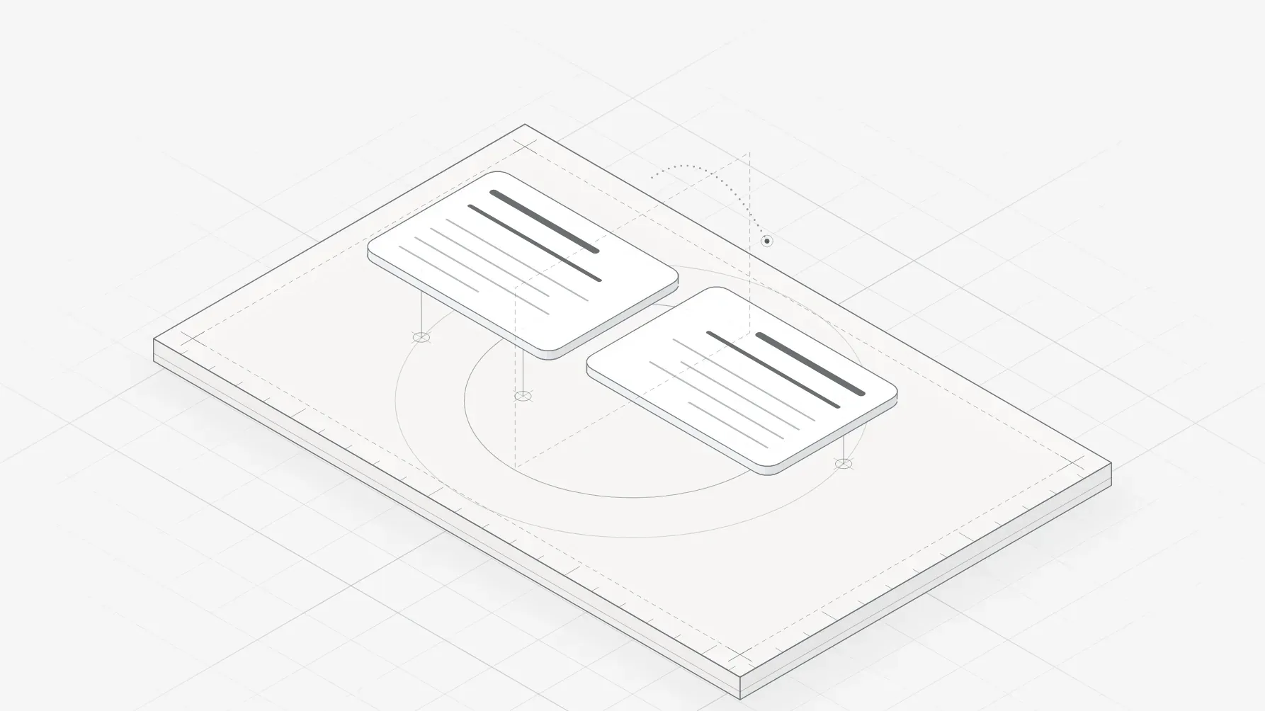
Designing for the UAE means designing for two reading directions at once. Arabic runs right to left, English left to right, and most UAE products need both from day one. The good news: right-to-left (RTL) design follows a small set of rules. The bad news: most products break those rules because Arabic was added at the end, as a translation, instead of being designed in from the first screen.
This guide covers what to mirror, what to leave alone, how to handle Arabic type and numbers, and how to build a design system that works in both directions. It is written for founders and product teams, so it stays practical.
What actually changes in right to left
When a screen switches to Arabic, the whole layout mirrors along its vertical axis. The rule of thumb is simple: anything that implies reading order or direction flips, because the eye now starts on the right.
| Element | In Arabic (RTL) | Why |
|---|---|---|
| Page layout, navigation, sidebars | Mirror | Reading starts on the right |
| Text alignment | Right aligned | Follows the reading direction |
| Back and forward arrows, chevrons | Mirror | "Back" points to where you came from, which is now the right |
| Progress bars, steppers, sliders | Mirror | Progress moves in the reading direction |
| Form labels, icons inside inputs | Mirror | Labels lead the field from the right |
| Media playback controls | Do not mirror | Play and rewind follow the tape, not the text |
| Logos, photos, illustrations | Do not mirror | They are not directional |
| Clocks, circular timers | Do not mirror | Clocks run clockwise everywhere |
| Charts with a time axis | Usually do not mirror | Many Arabic readers expect time left to right in charts; test with your users |
| Phone numbers, card numbers, codes | Keep left to right | They are read in a fixed order |
The last two rows are where teams most often get it wrong. Flipping a line chart can make a rising trend look like a fall to people who read finance charts every day. Test it rather than assuming.
Icons: which ones flip
Most icons are not directional and should stay as they are: a search magnifier, a bell, a settings gear. The ones that must mirror are those that point somewhere or show a sequence:
- arrows, chevrons and "send" icons
- undo and redo (they swap, as well as flip)
- list and indent icons, text alignment icons
- icons of a person walking or a vehicle moving
Some icons contain something that must not flip, such as a checkmark or a question mark. A help icon with a question mark keeps its question mark the right way round, even in Arabic. When you build the icon set, mark each icon as "mirror", "do not mirror" or "custom RTL version" so developers never have to guess.
Arabic type is not Latin type
Arabic is a connected script: letters change shape depending on their position in a word, and many have dots and marks above or below the baseline. That has three practical consequences for interface design.
Pick a typeface that was designed for screens. Many Latin interface fonts have no Arabic, and the system fallback is often a poor match. Good options include Noto Sans Arabic, IBM Plex Sans Arabic, Tajawal, Cairo and Almarai, all with several weights. Pair the Arabic face with your Latin face so the two feel like one family in weight and size.
Give it more room. Arabic usually needs more line height than Latin text, because of the marks above and below the letters. A line height that works for English body text often clips or crowds Arabic. As a starting point, try 10 to 20 percent more line height for Arabic body text, then check real copy.
Do not fake bold or letter spacing. Arabic letters connect, so adding letter spacing breaks the joins and looks wrong. Use real weights instead of faux bold, and never set Arabic in all caps styles (it has no capitals).
Text length changes too. Arabic copy can run shorter or longer than English depending on the phrase, so design buttons and labels to grow, and avoid fixed-width containers for text.
Numbers, dates and mixed text
Numbers are a decision, not a default. Arabic can be written with Western digits (0123456789) or Eastern Arabic digits (٠١٢٣٤٥٦٧٨٩). In the UAE, many consumer products use Western digits even in Arabic interfaces, but government and some banking contexts use Eastern digits. Choose one per product, document it, and apply it everywhere, including charts and tables.
Whatever the digits, numbers inside Arabic text still read left to right. A price, a phone number or a date keeps its internal order, and the browser's bidirectional algorithm handles most of this if the markup is right. Where it fails, usually with mixed punctuation, your developers can isolate the number with the right Unicode controls or HTML attributes.
Dates need care as well: some UAE users expect the Hijri calendar alongside the Gregorian one, especially for official or religious dates. If your product shows dates that matter, such as deadlines or appointments, test which format your audience expects.
Building one design system for both directions
The cheapest way to support Arabic is to design for it in the system, not on each screen.
- Use start and end, not left and right. In design tokens, components and code, name spacing and alignment by logical direction. In CSS this means properties such as
margin-inline-startandpadding-inline-end, which flip automatically when the page direction is set to RTL. - Design key screens in both directions from the first sprint. Not every screen, but the ones that carry the product: onboarding, the main dashboard, forms, checkout. Problems show up early and cheaply.
- Keep a mirroring spec. One page in the design system that lists what flips, what does not, and the icon decisions.
- Test with real Arabic content. Lorem ipsum in Arabic hides real problems. Ask your translator or team for actual copy as early as possible.
- Review with native speakers. A designer can get the layout right without reading Arabic fluently. The words, tone and cultural fit need a native speaker, so build that review into every release.
A quick checklist before you ship Arabic
- The layout mirrors, and the logo, photos and media controls do not.
- Every directional icon is mirrored, and no question marks or checkmarks are flipped.
- Arabic body text has its own line height and is never letter spaced.
- One digit style is used everywhere, and numbers read correctly inside sentences.
- Forms handle Arabic names, right-aligned input and mixed Arabic and English entries.
- Charts have been checked with users for direction.
- A native speaker has reviewed every Arabic screen.
If you are building a product for the UAE and want it to feel native in both languages from the first screen, that is exactly the work we do. See how we approach product design for Dubai startups, or start with a trial week on one real piece of your product.